Copperplate script wins for the widest range of wedding styles in 2026, Spencerian wins for heirloom-look formal invitations, and Chancery Italic wins for small-print readability on save-the-dates and envelope inserts.
- Copperplate script is the safest, most legible calligraphy font for 2026 wedding invitations.
- Spencerian delivers the most ornate, heirloom look but needs larger point sizes to stay readable.
- Chancery Italic and Engraver's Script both hold up best at the tiny sizes used on envelopes and RSVP cards.
- Blackletter suits gothic or dark-academia weddings but reads poorly for guests over 40.
- Century Library's archive holds hand-restored versions of every script style listed here, sourced from real 19th- and early 20th-century specimens.
Why this matters
A wedding invitation gets read once, closely, by people who are deciding whether to RSVP and what to wear. Pick a calligraphy font that looks gorgeous on a screen but collapses into an illegible tangle at 9-point type on card stock, and guests either squint or guess. The wrong script also fights the printing method: foil stamping and letterpress both punish thin hairlines and tight kerning that look fine on a monitor.
Century Library's archive holds restored antique scripts pulled from real historical specimens rather than AI-generated lettering, which matters here specifically because authentic calligraphy fonts were engineered by hand for legibility problems modern display fonts often ignore. The rankings below sort six script families by where they actually work on a real invitation suite, not just how they look in a font preview.
What makes the best calligraphy font for a wedding invitation
- Legibility at small sizes — most invitation text sits between 8pt and 14pt; a script that looks elegant at 60pt can blur badly at that scale.
- Print compatibility — foil, letterpress, and engraving all need consistent stroke weight; scripts with extreme thick-thin contrast can drop out.
- Historical authenticity — genuine 19th-century penmanship scripts carry proportions and connections that digital-native "calligraphy" fonts often fake.
- Formality range — some scripts only work for black-tie affairs; others flex across casual and formal suites.
- Letterform consistency — connected scripts need clean joins between letters, or names and dates start looking like one smeared word.
- Commercial licensing — a font used on printed goods sold or given at scale needs a license that actually covers that use.
At a glance
| Script | Best for | Standout feature | Key limitation |
|---|---|---|---|
| Copperplate Script | Classic formal invitations | Even stroke weight, high legibility | Feels slightly generic if overused |
| Spencerian Script | Heirloom, ornate suites | Flourished, hand-penned character | Needs 14pt+ to stay readable |
| Engraver's Script | Engraved or foil-stamped cards | Consistent thin strokes suited to metal-plate look | Loses detail on soft paper stocks |
| Chancery Italic | Envelopes and small print | Compact, upright, legible at tiny sizes | Less "romantic" than flourished scripts |
| Blackletter (Old English) | Gothic or dark-themed weddings | Strong historical weight and drama | Poor readability for older guests |
| Modern Calligraphy / Brush Script | Casual and destination weddings | Loose, hand-lettered energy | Inconsistent baseline can look unpolished |
1. Copperplate Script: best calligraphy font for classic formal invitations
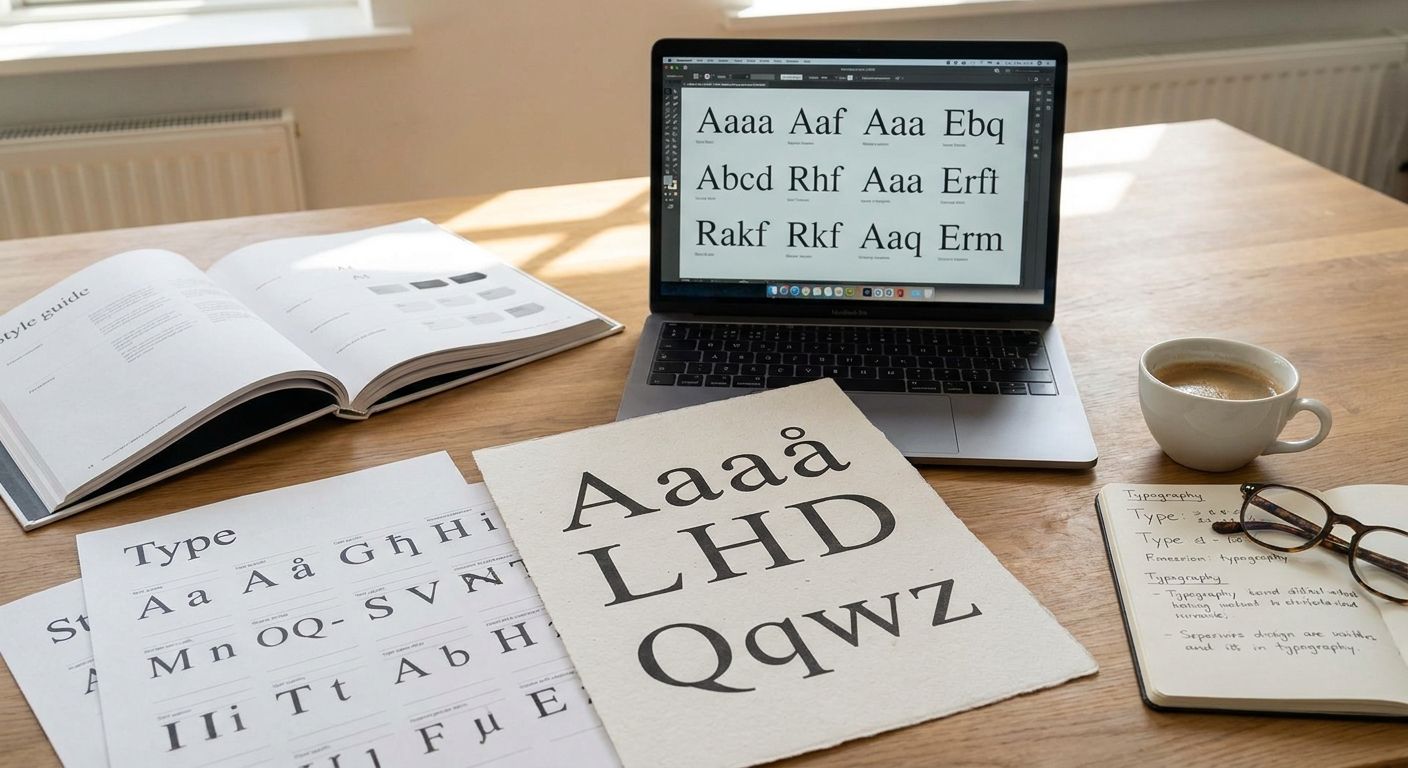
Copperplate is the pointed-pen script that most people picture when they hear "wedding calligraphy." It descends from 18th-century engraving manuals and keeps a consistent thick-thin stroke contrast that photographs and prints cleanly at almost any size.
Copperplate pros:
- Reads clearly from 9pt on envelope calligraphy up through 40pt on names
- Pairs well with nearly every paper stock, including textured cotton
- Wide cultural recognition as "formal wedding" typography
Copperplate cons:
- Common enough that it can feel like the default choice rather than a deliberate one
- Flourishes need careful spacing or names run into each other
Copperplate pricing: Century Library offers restored Copperplate-style faces through subscription access to the archive rather than a one-off purchase.
Best for: couples who want a safe, universally legible formal script.
Verdict: Use it. Copperplate is the lowest-risk pick on this list for 2026 invitation suites.
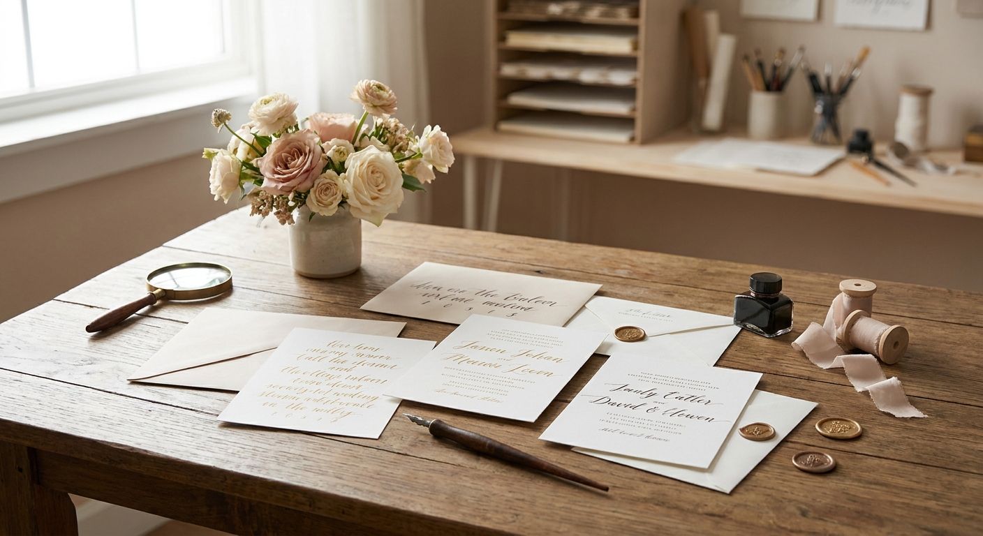
2. Spencerian Script: best calligraphy font for heirloom, ornate suites
Spencerian is the looser, more flourished American penmanship style taught in 19th-century schools before Copperplate's engraving-house cousins took over commercial print. It carries more personality and visible pen movement, which reads as handmade rather than mechanically engraved.
Spencerian pros:
- Genuinely ornate without needing extra decorative elements added around it
- Feels warmer and more personal than engraver's scripts
- Strong choice for save-the-dates and vow booklets, not just the invitation itself
Spencerian cons:
- Loops and flourishes blur together below roughly 12-14pt
- Harder to pair with a modern sans-serif for names or dates without clashing
Spencerian pricing: available through the same subscription archive, not sold as an individual font license.
Best for: couples building a full heirloom-style paper suite, not just a single card.
Verdict: Use it. Reserve Spencerian for headline text and larger names; keep body copy in something plainer.
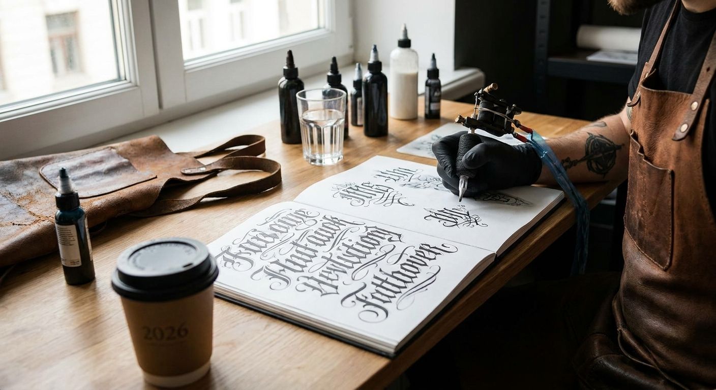
3. Engraver's Script: best calligraphy font for foil-stamped or engraved cards
Engraver's Script was built to mimic actual copperplate engraving on metal plates, which is exactly the process foil stamping and letterpress try to replicate on paper. The strokes stay thin and even by design, which is what a metal die needs to cut cleanly.
Engraver's Script pros:
- Matches the visual logic of foil stamping and letterpress almost exactly
- Formal without tipping into overly decorative
- Holds up well on darker card stocks where thin gold or silver foil needs a clean edge
Engraver's Script cons:
- Thin strokes can vanish on soft, absorbent paper without foil or letterpress
- Less flexible for casual sections of an invitation suite (menus, programs)
Best for: couples printing with foil stamping, engraving, or letterpress.
Verdict: Use it. Match the print method first, then pick this script — it's built for that pairing.
4. Chancery Italic: best calligraphy font for envelopes and small print
Chancery Italic comes from Renaissance-era administrative handwriting, designed for speed and legibility rather than decoration. That history makes it the most practical script on this list for the smallest text on a wedding suite: return addresses, RSVP fine print, and inner envelope names.
Chancery Italic pros:
- Stays crisp and legible well below 10pt
- Upright, compact letterforms take up less horizontal space per line
- Reads as elegant without demanding a large point size to prove it
Chancery Italic cons:
- Less overtly romantic than a fully flourished script
- Can look plain if used for large display text like the couple's names
Best for: the small, functional text blocks every invitation suite still needs.
Verdict: Use it. Pair Chancery Italic for small print with a more ornate script for names and headlines.
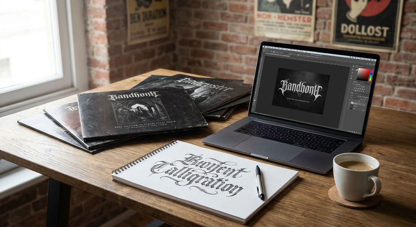
5. Blackletter (Old English): best calligraphy font for gothic or dark-academia themes
Blackletter is the heavy, angular script associated with medieval manuscripts and early European printing — genuinely calligraphic in origin, even though most people don't file it under "calligraphy fonts" first. It carries real historical weight for couples building a gothic, dark-academia, or Victorian-inspired wedding.
Blackletter pros:
- Unmistakable visual drama and historical authenticity
- Works well for themed monograms, wax seal designs, and program covers
Blackletter cons:
- Legibility drops sharply for guests unfamiliar with the letterforms, especially older relatives
- Wrong tone entirely for a bright, garden-party style wedding
Best for: gothic, dark academia, or Victorian-themed weddings specifically.
Verdict: Skip it unless the wedding's whole aesthetic already leans this direction — it's a theme font, not a general-purpose one.
6. Modern Calligraphy / Brush Script: best calligraphy font for casual or destination weddings
This category covers the looser, brush-pen-inspired scripts that became popular through modern hand-lettering rather than 19th-century penmanship. It sits apart from the historical scripts above but earns a place on the list because so many 2026 couples search for it specifically.
Modern Calligraphy pros:
- Relaxed, hand-lettered feel suits beach, backyard, and destination weddings
- Easier to customize with irregular baselines and playful spacing
Modern Calligraphy cons:
- Lacks the historical pedigree and print consistency of the older scripts on this list
- Inconsistent stroke weight can read as unpolished on formal cotton stock
Best for: casual, destination, or non-traditional wedding suites.
Verdict: Hold. Fine for casual weddings; skip it for a formal black-tie suite.
How the ranking works
Each script above gets scored against the same six criteria: legibility at invitation-scale type, print compatibility, historical authenticity, formality range, letterform consistency, and licensing clarity. Copperplate and Chancery Italic rank highest on legibility and print compatibility, which is why they anchor the top and the small-print slot respectively. Blackletter and Modern Calligraphy sit lower because they trade legibility or historical grounding for a narrower stylistic niche.
“If a calligraphy font goes soft below 10 point, it doesn't belong on the RSVP card.”
Which calligraphy font should you choose?
For most 2026 wedding suites, start with Copperplate Script for the main invitation and Chancery Italic for small print — that pairing covers formality and legibility without any tradeoffs. Add Spencerian or Engraver's Script for a more ornate or engraved-specific look, and reserve Blackletter or Modern Calligraphy for couples whose wedding theme already calls for them by name.
All six script families exist as hand-restored, authentic faces inside the Century Library archive, catalogued from original historical specimens rather than generated from scratch.
Explore restored calligraphy fonts
Browse the full archive of hand-restored antique scripts and fonts.
FAQ
What's the best calligraphy font for wedding invitations in 2026?
Copperplate Script is the best general-purpose choice for 2026 wedding invitations because it stays legible from small print sizes up to large display names. Spencerian works better for couples who want a more ornate, heirloom look.
Is Copperplate or Spencerian better for a formal wedding?
Copperplate reads more consistently at small sizes, making it the safer pick for a formal suite with lots of text. Spencerian looks more heirloom and personal but needs larger point sizes to stay legible.
What font should I use for the return address on a wedding envelope?
Chancery Italic is built for small, functional text and stays legible well below 10 point, which makes it a strong fit for return addresses and RSVP fine print.
Are antique or restored fonts different from modern calligraphy fonts?
Restored antique fonts are digitized from real historical specimens like 19th-century engraving manuals or penmanship books, while modern calligraphy fonts are newer designs inspired by brush lettering. Both work for weddings, but restored fonts carry more historical authenticity.
Does calligraphy font choice matter for foil stamping or letterpress?
Yes. Foil stamping and letterpress both need consistent stroke weight, so scripts like Engraver's Script, built to mimic metal-plate engraving, hold up better than heavily flourished scripts with very thin hairlines.
Is Blackletter a good font for wedding invitations?
Blackletter works only for gothic, dark academia, or Victorian-themed weddings, since its angular letterforms are harder for many guests to read quickly. For most weddings it's the wrong tone entirely.
Can I use a calligraphy font from a subscription archive for commercial wedding stationery?
Licensing terms vary by provider, so check the specific commercial-use terms before printing and selling stationery that uses a subscription font.
One last thing
The detail most couples skip: test the chosen script printed at actual size on the actual paper stock before ordering the full run. A flourished script that looks perfect on a laptop screen at 400% zoom can turn into a smudge on cotton card stock at 11pt — and by 2026 print run minimums, that's an expensive way to find out.