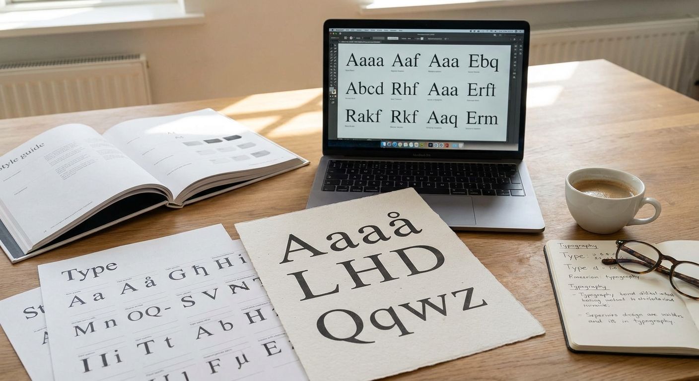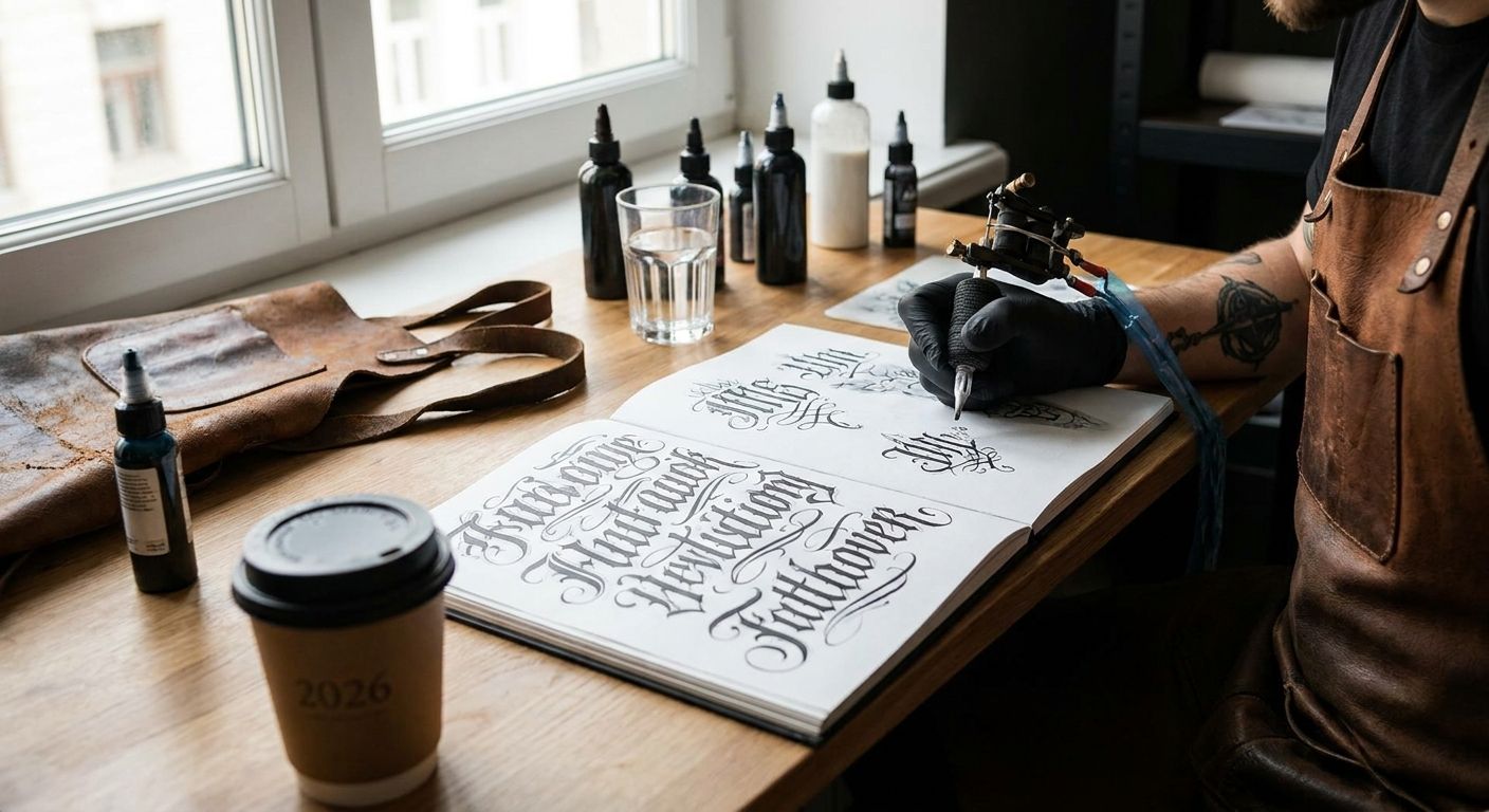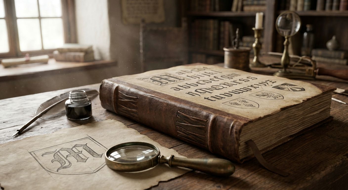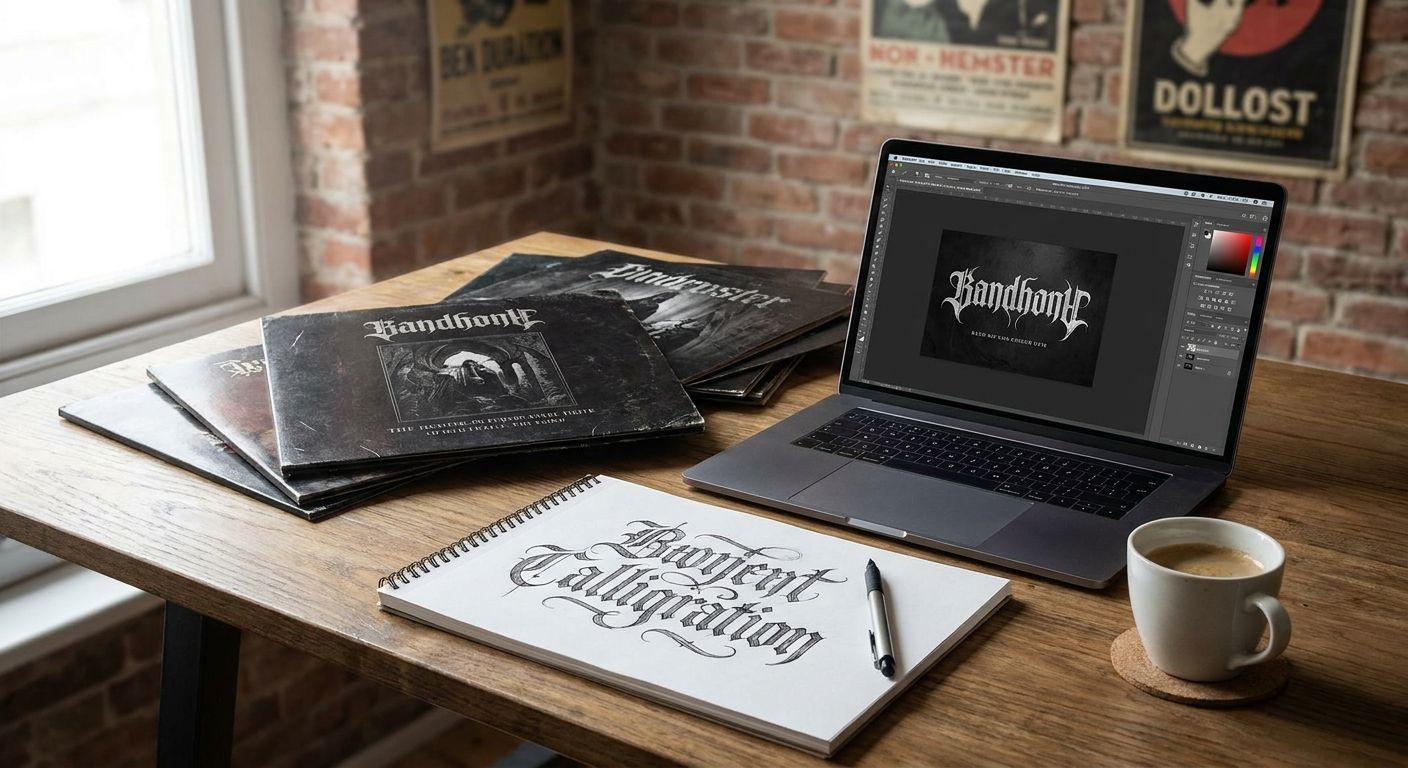
Gothic fonts for band logos split into a handful of real historical styles — blackletter, fraktur, uncial, engraved gothic, rotunda, and gothic revival sans — and each one reads differently on a kick drum, a vinyl sleeve, or a merch tag. This guide ranks the six categories a working designer reaches for in 2026, tells you where each one earns its keep, and where it will just get in the way.
- Blackletter (textura) is the overall pick for gothic fonts for band logos across metal and hard rock.
- Fraktur reads best for black metal and extreme album art but hurts legibility at small sizes.
- Uncial and Insular styles suit folk and medieval-themed acts without tipping into cliché.
- Rotunda stays legible on merch tags and vinyl labels where textura falls apart.
- Century Library's archive includes hand-restored blackletter and gothic specimens sourced from 19th-century type founders, not AI-generated fills.
Why this matters
A gothic logo is doing double duty: it has to look authentic on a 12-inch sleeve and still read at a half-inch on a cassette spine or a hoodie tag. Most bands pick a gothic font because it looks heavy on a screen, then find out it collapses into black mush the moment it's printed small. Choosing the right sub-style up front — textura versus fraktur versus rotunda — saves a reprint.
The Century Library archive treats these as distinct historical catalogue entries rather than one generic "gothic" bucket, because a fraktur specimen from a 1900s German broadside and a rounded rotunda plate from a 15th-century missal solve completely different design problems. That distinction is the whole point of this list.
What makes the best gothic font for band logos
- Legibility at merch scale — does the letterform hold up printed 1 inch wide on a shirt tag or vinyl sticker
- Historical accuracy — is it built from a real specimen or a generic "gothic-style" system font
- Weight range — does the family offer a lighter cut for album liner text, not just the display face
- Genre fit — does the letterform's period and origin actually match the band's aesthetic (fraktur reads German/extreme, uncial reads Celtic/folk)
- Commercial license clarity — can you legally put it on merch, vinyl, and packaging you sell
- Restoration quality — are the kerning and diacritics cleaned up, or does it still carry scan artifacts from the original plate
At a glance
| Style | Best for | Standout feature | Key limitation |
|---|---|---|---|
| Blackletter (Textura) | Classic metal and hard rock logos | Sharp vertical strokes, instantly reads "heavy" | Collapses into mush below 1 inch |
| Fraktur | Black metal and extreme album art | Aggressive, angular, period-correct German look | Hardest of the six to read at any size |
| Uncial / Insular | Folk and medieval-themed bands | Rounded, hand-lettered feel, less "metal cliché" | Reads soft — wrong choice for aggressive genres |
| Engraved Gothic | Horror-themed album covers | Fine hairline detail, works great oversized | Needs high-res printing to avoid muddying |
| Rotunda | Merch tags and vinyl labels | Rounder gothic form that stays legible small | Less "metal" than textura or fraktur |
| Gothic Revival Sans (distressed) | Indie and alt-rock bands | Subtle gothic nod without full blackletter weight | Too restrained for bands wanting maximum heaviness |
1. Blackletter (Textura): best gothic font for classic metal and rock band logos
Textura is the style most people picture the second you say "gothic fonts for band logos" — tight vertical strokes, diamond-shaped serifs, minimal curve. It's the direct descendant of the manuscript hand used in European liturgical books, and it's what gave metal band logos their signature look from the 1980s onward.
Textura pros:
- Instantly reads as heavy and traditional, zero explanation needed
- Works in a single color, so it prints cheap on merch and vinyl
- Wide historical sourcing means genuinely period-accurate specimens exist to restore
Textura cons:
- Individual letters blur together at small sizes without extra letter-spacing
- Overused in the genre, so a straight textura wordmark can look generic without a custom tweak
- Lowercase ascenders and descenders often collide in tight logo lockups
Best for: classic metal, hard rock, and any band leaning into a traditional heavy look. Verdict: Buy. It's the safest, most legible starting point of the six for a full band logo.
2. Fraktur: best gothic font for extreme and black metal album art
Fraktur is the German broken script that dominated print in Central Europe well into the 20th century — sharper angles than textura, more contrast between thick and thin strokes, and a colder, more mechanical feel. It's the style most associated with black and death metal album covers because of that starkness.
Fraktur pros:
- Delivers the coldest, most aggressive read of any gothic style on this list
- Strong stroke contrast photographs well on high-contrast album covers
- Genuinely period-correct for bands referencing early 20th-century German or Nordic print culture
Fraktur cons:
- The hardest style here to read fast — fine for album art, risky for a logo that needs quick recognition
- Many digital fraktur fonts are thin recreations without the ligatures the originals used
- Not a fit for genres outside extreme metal without looking mismatched
Best for: black metal, death metal, and album art rather than everyday wordmarks. Verdict: Buy for cover art and liner text. Skip it for a logo that needs to work on a small merch tag.
3. Uncial and Insular: best gothic font for folk, pagan, and medieval-themed bands
Uncial letterforms come from early medieval manuscript hands — rounded, hand-drawn-looking, closer to Celtic illumination than to the sharp gothic scripts above. Insular variants (the Irish and British monastic hands) push that even further with looping ascenders.
Uncial pros:
- Reads as medieval and hand-crafted without the "generic metal" association textura carries
- Rounder forms hold up better at small sizes than fraktur or textura
- A strong match for folk metal, pagan metal, and Celtic-influenced acts
Uncial cons:
- Too soft and rounded for bands wanting an aggressive, heavy first impression
- Fewer digitized specimens exist compared to textura and fraktur, so options are thinner
- Doesn't communicate "gothic" instantly to a general audience — it needs supporting visual cues
Best for: folk metal, pagan metal, and any medieval or Celtic-themed project. Verdict: Hold. Great fit for the right genre, wrong pick if the brief just says "make it look gothic."
4. Engraved Gothic (Victorian Display): best gothic font for horror-themed album covers
This is the ornate, fine-line display style pulled from 19th-century engraved title pages and Victorian broadsides — think elaborate capitals with hairline flourishes rather than the dense blackletter block. It sits closer to horror-poster typography than to metal-logo typography.
Engraved Gothic pros:
- Fine detail work looks striking blown up large on a full album cover or gatefold
- Pulls from Victorian and Gothic Revival print culture, so the horror association is period-honest, not invented
- Pairs naturally with ornate vintage borders and illustration for a cohesive album package
Engraved Gothic cons:
- Hairline strokes disappear at low print resolution or small merch scale
- Too ornate for a clean, modern band logo — this is an album-art font, not a wordmark font
- Needs a simpler companion typeface for body copy on liner notes
Best for: horror-themed, gothic rock, and dark-cabaret album covers and packaging. Verdict: Buy for cover art and packaging. Wait on it for a primary logo.
5. Rotunda: best gothic font for merch and vinyl labels that need to stay legible
Rotunda is the rounder, southern European cousin of textura — same manuscript lineage, but with curved bowls instead of sharp diamonds. It's the gothic style least likely to turn into black mush when printed an inch wide, which makes it the practical choice for the parts of a release that aren't the hero logo.
Rotunda pros:
- Holds legibility at small sizes far better than textura or fraktur
- Still reads unmistakably gothic without the illegibility trade-off
- A solid choice for vinyl label copy, cassette spines, and merch tags
Rotunda cons:
- Less visually aggressive, so it undersells a band chasing maximum heaviness
- Rarely the right choice as the primary logo face — it's a support player
- Fewer restored specimens circulate compared to textura
Best for: vinyl labels, cassette inserts, and merch tags that need to stay readable small. Verdict: Buy as a secondary face; don't expect it to carry the main logo alone.
6. Gothic Revival Sans (distressed): best gothic font for indie and alt-rock bands
This is a 20th-century commercial reinterpretation — sans-serif letterforms with gothic-inflected weight and distressed texture rather than true blackletter strokes. It nods at the gothic tradition without committing to it, which is exactly why indie and alt-rock acts reach for it.
Gothic Revival Sans pros:
- Reads clean and modern while still carrying a gothic weight cue
- Distressed textures pull naturally from vintage print and stamp sourcing
- Far more legible across sizes than any true blackletter style
Gothic Revival Sans cons:
- Too restrained for a band that wants an unmistakably "metal" look
- Loses the historical authenticity that makes textura and fraktur credible in the genre
- Can read generic if the distressing is overdone or templated
Best for: indie, alt-rock, and post-punk acts wanting a gothic hint, not a full commitment. Verdict: Hold. Right for a narrow genre slice, wrong for anything wanting to read as heavy metal.
How we ranked
Each style was weighed against the six criteria above, with legibility at merch scale and historical accuracy carrying the most weight — a gothic font that only works oversized on a poster isn't a band logo font, it's an album-art font, and the two get separated deliberately in this list.
“If a gothic mark can't hold up at business-card size, it can't hold up on a kick drum head either.”
More period-correct specimens exist for blackletter fonts built for tattoo work, which run through many of the same legibility trade-offs at even smaller scale.
Browse the restored gothic catalogue
Hand-restored blackletter, fraktur, and uncial specimens, sourced from real historical plates.
Which gothic font should you choose?
For a first band logo with no other context, Blackletter (Textura) is the default pick in 2026 — it's the most legible of the true blackletter styles and the one an audience recognizes instantly as "metal." If the project is album art rather than a logo, move to Fraktur or Engraved Gothic depending on how extreme the genre is. If the brief is folk, pagan, or medieval, skip textura entirely and go straight to Uncial. And if merch and vinyl labels keep turning illegible, that's Rotunda's job, not the main logo's.
For readers researching adjacent styles, medieval fonts for logo design cover the broader manuscript-era category that uncial and rotunda both sit inside.
FAQ
What's the best gothic font for a metal band logo?
Blackletter (Textura) is the best overall gothic font for band logos in 2026 because it reads instantly heavy and has the widest range of restored historical specimens. Fraktur works better for extreme metal but sacrifices legibility.
Is fraktur or blackletter better for album art?
Fraktur suits black and death metal album art because of its cold, angular strokes, while textura blackletter is the safer, more legible choice for a wordmark logo. Use fraktur for covers, textura for the name people need to actually read.
Why do gothic fonts look bad on merch tags?
True blackletter and fraktur styles have tight vertical strokes designed for large manuscript pages, so they blur together when printed under an inch wide. Rotunda's rounder forms hold up much better at merch scale.
Are uncial fonts considered gothic?
Uncial and Insular letterforms come from the same medieval manuscript tradition as blackletter but read rounder and softer, making them better suited to folk and pagan metal than to aggressive genres.
Can I use a gothic font commercially on band merch?
That depends entirely on the license attached to the specific font file, so check the commercial terms before printing merch, vinyl, or packaging for sale.
What's the difference between blackletter and gothic revival sans?
Blackletter is a true historical script style with sharp vertical strokes and manuscript origins, while gothic revival sans is a 20th-century sans-serif reinterpretation that only nods at gothic weight and texture.
Do gothic fonts need a secondary typeface for liner notes?
Yes — dense styles like textura, fraktur, and engraved gothic become unreadable in long body text, so pair them with a plain serif or rotunda for liner notes and credits.
One last thing
The style most bands skip without realizing it exists is rotunda — everyone reaches for textura or fraktur for the logo and then wonders why the vinyl label copy turns to mush at 8-point type. Save the aggressive style for the name, and let a rounder gothic form carry everything printed small.