A serif font sets the tone of an editorial page before a reader consciously registers a single word — it signals whether the piece feels like a glossy feature, a scrappy zine, or a formal report. This guide ranks seven restored serif fonts from the Century Library archive by the specific editorial job each one does best, from mastheads to captions, so a layout reads like a magazine spread instead of a slide deck.
- CL Antique No. 96 is the best serif font for editorial headlines and mastheads in 2026.
- Oldstyle Serif Font with Distressed Ink Texture handles long-form body text better than decorative picks.
- Full glyph coverage — ligatures, numerals, punctuation — separates a working serif font from a display-only specimen.
- Pair a restored serif font with a plain sans body face to keep dense editorial pages readable.
Why this matters
Century Library hand-restores every typeface from an original 19th- or early-20th-century specimen — no AI-generated letterforms, no synthetic revival pretending to be old. That matters for editorial work specifically because a magazine spread, a newsletter masthead, or a branded zine lives or dies on whether the type has enough character variation to carry a headline, a byline, a pull quote, and a caption without feeling like one font doing four jobs badly.
Most "best serif font" lists compare software features. This one compares typographic roles, because editorial design in 2026 still runs on the same hierarchy print has used for a century: display type up top, a readable body face underneath, and a handful of supporting styles for quotes and captions.
What makes the best serif font for editorial design
- Readability at body-copy sizes — not just headline scale
- Full glyph range: uppercase, lowercase, numerals, punctuation, ligatures
- A distinct personality that still pairs cleanly with a plain sans-serif companion
- Historical authenticity — restored from a real specimen, not a synthetic pastiche
- Enough style variation to cover headline, byline, and caption roles without switching families
- Clear commercial usage rights for magazines, zines, and branded editorial projects
At a glance
| Serif font | Best for | Standout feature | Key limitation |
|---|---|---|---|
| CL Antique No. 96 | Feature headlines & mastheads | Diagonal cross-hatch engraved detailing | Too heavy for dense body text |
| Oldstyle Serif Font with Distressed Ink Texture | Long-form body text | Softly bracketed oldstyle forms, full glyph set | Texture fades at very small sizes |
| Elegant Serif Font with Italic Accents | Pull quotes & bylines | Built-in italic ligatures | Slanted accents strain at tiny caption sizes |
| Oldstyle Decorative Serif Font with Bracketed Serifs | Drop caps & decorative openers | Teardrop terminals, bracketed wedge serifs | Not built for paragraph-length use |
| Elegant Italic Serif Font from Early 1900s | Captions & photo credits | Cursive lowercase with classic f-ligatures | Reads slow above one sentence |
| Classic Serif Font with Rustic Textured Finishes | Cover lines & book-style headlines | Rustic textured letterforms, full glyph coverage | Texture competes with busy photography |
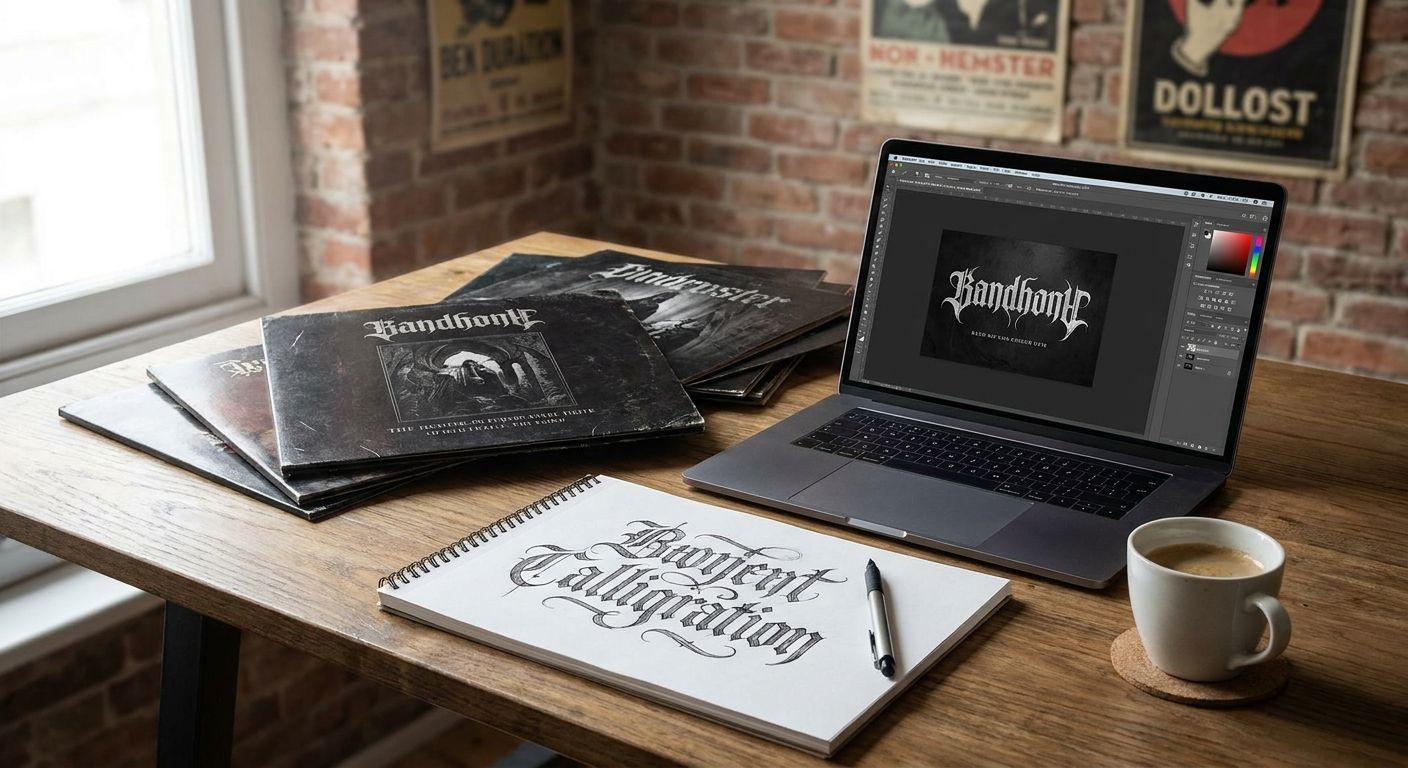
| Gothic Revival Serif Font (CL Antique No. 2) | Masthead logotypes | Stylized 1800s display capitals | All-caps only use case |
1. CL Antique No. 96: best serif font for feature headlines and mastheads
This is an engraved serif with diagonal cross-hatch detailing across both cases, restored specifically for the kind of display work that needs to hold attention at large sizes — think section openers, cover lines, or a magazine masthead. The detailing reads as intentional craft rather than a filter effect, which is the difference between a headline that looks designed and one that looks decorated.
CL Antique No. 96 pros:
- Full uppercase and lowercase detailing built for large display sizes
- Reads as hand-engraved, not digitally distressed
- Strong standalone presence for a masthead or cover line
CL Antique No. 96 cons:
- The cross-hatch detail disappears below headline size
- Not intended for paragraph text
Best for: Editorial headlines, mastheads, feature openers. Verdict: Buy.
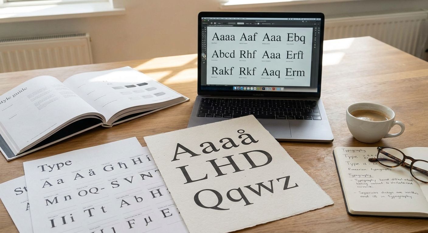
2. Oldstyle Serif Font with Distressed Ink Texture: best serif font for long-form body text
Oldstyle forms exist because they were designed for reading, long before screens existed — the softly bracketed shapes and even stroke contrast keep dense paragraphs from tiring the eye. This restoration keeps that structure while adding a light, hand-inked texture, and it ships with uppercase, lowercase, numerals, punctuation, and ligatures, which is the full kit an editorial body face actually needs.
Oldstyle Serif Font pros:
- Full glyph set covers real body-copy needs
- Bracketed oldstyle structure holds up at 9-11pt
- Texture is subtle enough not to fight small type
Oldstyle Serif Font cons:
- The ink texture softens further at very small sizes
- Too quiet for a standalone headline role
Best for: Magazine body copy, long-form articles, newsletter columns. Verdict: Buy.
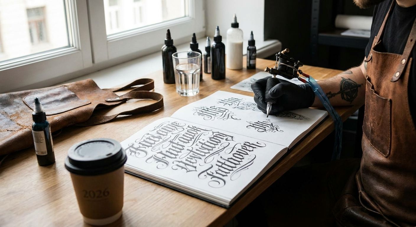
3. Elegant Serif Font with Italic Accents: best serif font for pull quotes and bylines
This classic typeface leans slightly italic with distinctive ligatures across its lowercase, which makes it a natural pick for the sentence-length text that sits outside the main body — pull quotes, bylines, and formal captions where a little visual lift is welcome.
Elegant Serif Font pros:
- Built-in ligatures add polish without extra kerning work
- The italic lean separates quotes from body copy at a glance
- Suits book titles and formal invitations as well as editorial work
Elegant Serif Font cons:
- Slanted characters lose clarity at caption-sized text
- Not built to carry a full article of body copy
Best for: Pull quotes, bylines, book-style credits. Verdict: Buy.
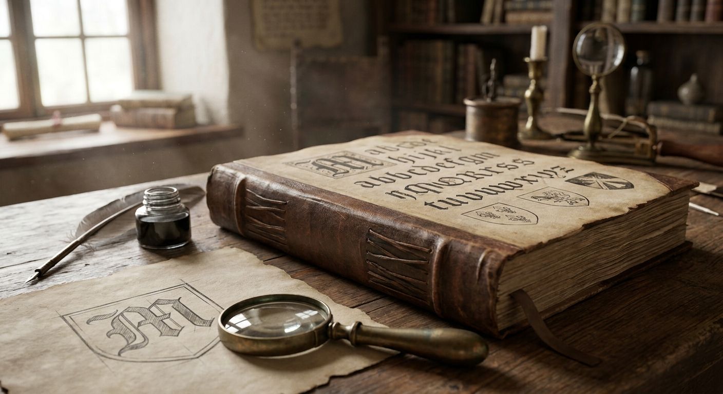
4. Oldstyle Decorative Serif Font with Bracketed Serifs: best serif font for drop caps
Bracketed serifs exist for a practical reason — the small curved wedge connecting serif to stroke keeps ink from clogging a letterform at small sizes on a printing press. That same structure is exactly what makes a drop cap legible against a busy layout, and this restoration pairs bracketed wedge serifs with teardrop terminals across a full uppercase and lowercase set, numerals, and punctuation.
Oldstyle Decorative Serif pros:
- Bracketed serifs give the letterform weight without clutter
- Teardrop terminals photograph well as a large opening capital
- Full glyph range beyond just decorative caps
Oldstyle Decorative Serif cons:
- Too ornamental for continuous paragraph use
- Overkill for a simple caption or footer
Best for: Drop caps, section openers, decorative first letters. Verdict: Buy.
5. Elegant Italic Serif Font from Early 1900s: best serif font for captions and photo credits
Restored from an early-1900s specimen, this cursive-lowercase italic includes classic f-ligatures and a full punctuation set, which makes it well suited to the short, quiet lines under a photo or figure in an editorial spread — the kind of text that should read like a whispered credit line, not a second headline.
Elegant Italic Serif pros:
- Genuine early-1900s cursive structure, not a digital slant filter
- Classic ligatures add period authenticity to short captions
- Full punctuation and numeral set for real caption use
Elegant Italic Serif cons:
- Slows down reading past a single sentence
- Poor choice for a headline or body block
Best for: Photo captions, figure credits, footnotes. Verdict: Buy.
6. Classic Serif Font with Rustic Textured Finishes: best serif font for cover lines and book-style headlines
This typeface pairs rustic, textured letterforms with complete glyph coverage, which gives it the worn, printed-book feel that works well on a cover line or a standalone feature title — the kind of headline that needs to look like it was already in print, not freshly typed.
Classic Serif Font pros:
- Rustic texture reads as authentically printed, not artificially aged
- Full glyph coverage supports real headline variety
- Strong fit for book-style or vintage-inspired covers
Classic Serif Font cons:
- The texture competes with busy photography behind it
- Not built for dense body paragraphs
Best for: Cover lines, book-style feature titles. Verdict: Buy.
7. Gothic Revival Serif Font (CL Antique No. 2): best serif font for masthead logotypes
Restored from an 1800s display specimen, this typeface carries stylized capitals built for one job — a masthead logotype or a short, all-caps title line that needs to look established rather than trendy.
Gothic Revival Serif pros:
- Stylized capitals give a masthead instant gravitas
- Genuine 1800s display structure, not a modern pastiche
Gothic Revival Serif cons:
- Effectively all-caps only
- No practical role beyond short display lines
Best for: Masthead logotypes, short display titles. Verdict: Buy for mastheads, skip for anything else.


How we ranked
Each font above earned its spot by matching one editorial role — headline, body, quote, drop cap, caption, cover line, or logotype — against the criteria listed earlier: glyph completeness, historical authenticity, and readability at the size it's actually meant to run. None of these fonts was scored as a generalist; a serif font that tries to do every job in an editorial layout usually does none of them well.
“If a decorative serif can't survive at caption size, it doesn't belong anywhere near body copy.”
Which serif font should you choose?
For most editorial projects in 2026, start with CL Antique No. 96 for the masthead or feature headline, then drop in the Oldstyle Serif Font with Distressed Ink Texture for body copy — that combination covers the two roles that carry 90% of a typical layout. Add the Elegant Serif Font with Italic Accents for pull quotes once the main hierarchy is set, and only reach for the decorative or all-caps picks (drop caps, mastheads) once the working pair is locked in.
FAQ
What's the best serif font for editorial design in 2026?
CL Antique No. 96 is the best serif font for editorial headlines and mastheads in 2026 because its engraved detailing holds up at display size without needing a second display face. For body text, an oldstyle serif with a full glyph range reads better at paragraph sizes.
Is a serif font better than sans serif for long-form reading?
For printed long-form editorial text, oldstyle serif fonts generally read more comfortably at small sizes than most sans serifs, because their bracketed forms and stroke contrast were designed for exactly that job. Sans serifs still work well for captions, labels, and screen-first layouts.
What's the difference between an oldstyle serif and a slab serif?
An oldstyle serif has bracketed, tapered serifs and moderate stroke contrast built for body-text readability, while a slab serif has thick, blocky, unbracketed serifs meant for display impact. Slab serifs suit headlines and posters; oldstyle serifs suit paragraphs.
Can restored antique serif fonts be used in commercial editorial projects?
Restored fonts from Century Library are cleared for commercial use in projects like branding, packaging, and editorial design, but usage rights should always be checked on the specific font's page before publishing. Terms can vary by license type.
How many serif fonts should one magazine layout use?
Most editorial layouts work best with two to three type roles — a display serif for headlines, a body serif for paragraphs, and an italic accent for quotes or captions. Stacking more than three unrelated serif fonts on one page usually reads as cluttered.
What is a drop cap and which serif fonts work best for it?
A drop cap is an enlarged first letter that opens a paragraph or section, and it works best in a decorative serif with bracketed serifs and strong terminals, like the Oldstyle Decorative Serif Font with Bracketed Serifs. Plain body serifs usually look thin when blown up to drop-cap size.
Should I use an italic serif for pull quotes or a separate italic style?
A dedicated italic serif with built-in ligatures, such as the Elegant Serif Font with Italic Accents, reads more naturally in a pull quote than a synthetically slanted version of a body font. True italics have different letterforms, not just a tilt.
Does a restored vintage serif font include full punctuation and numerals?
Not always — check the glyph range listed on each font's page, since some display-only restorations cover uppercase and lowercase only. Fonts labeled with a full glyph set include numerals, punctuation, and ligatures alongside both cases.
One last thing
Bracketed serifs weren't a stylistic choice originally — they existed to keep ink from clogging a letterform on a physical press at small sizes, which is exactly why oldstyle serif fonts still hold up better than most decorative faces once you drop them into a real caption or footnote in 2026. The detail that looks decorative on screen was solving a production problem a century ago, and that history is still doing the readability work today.