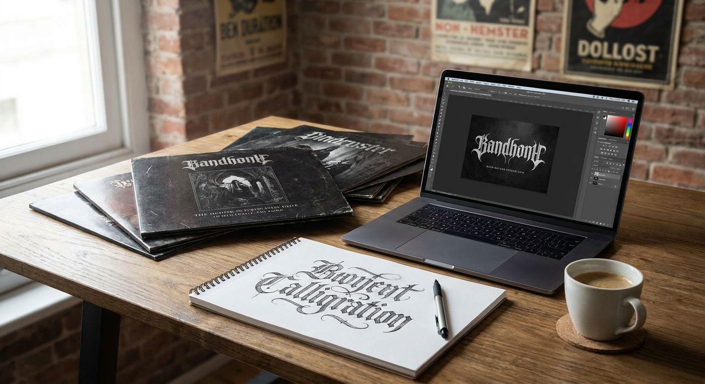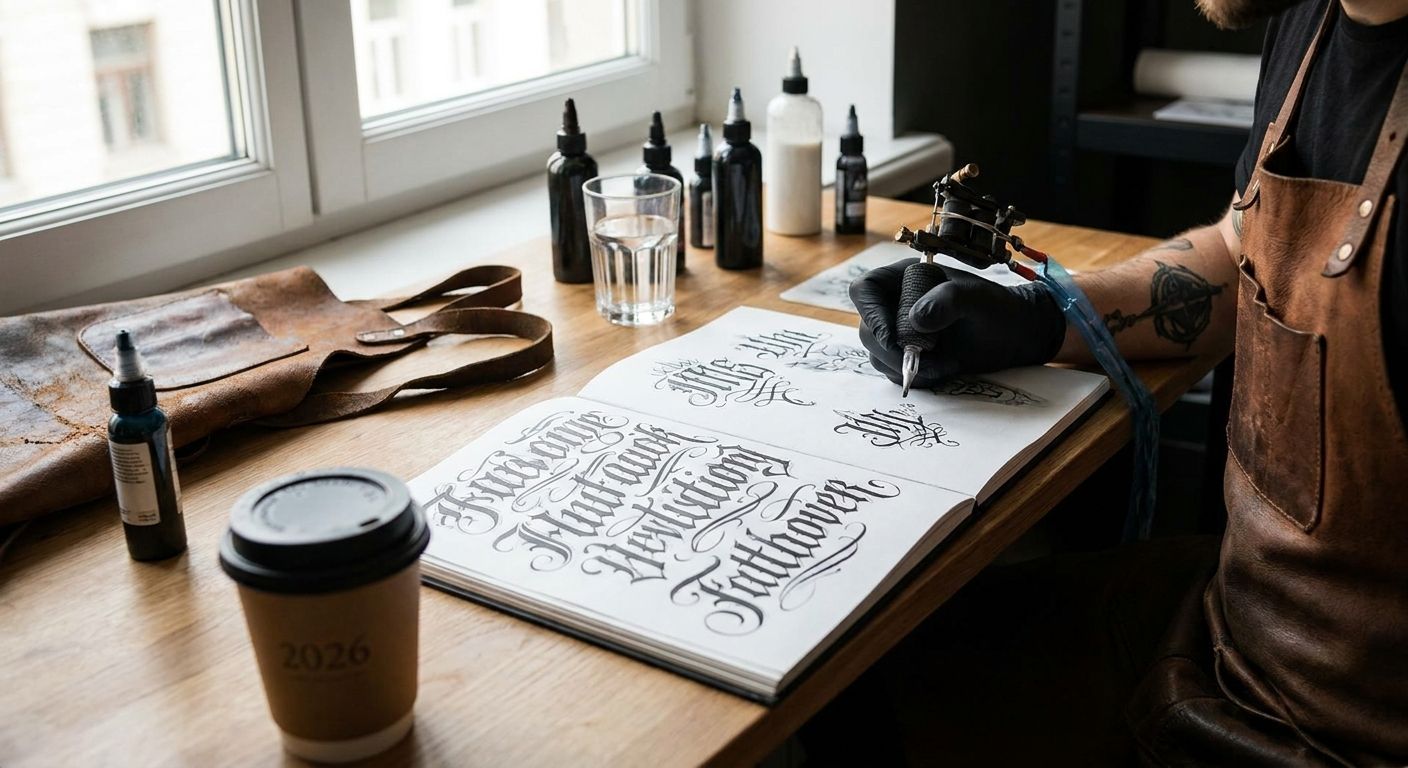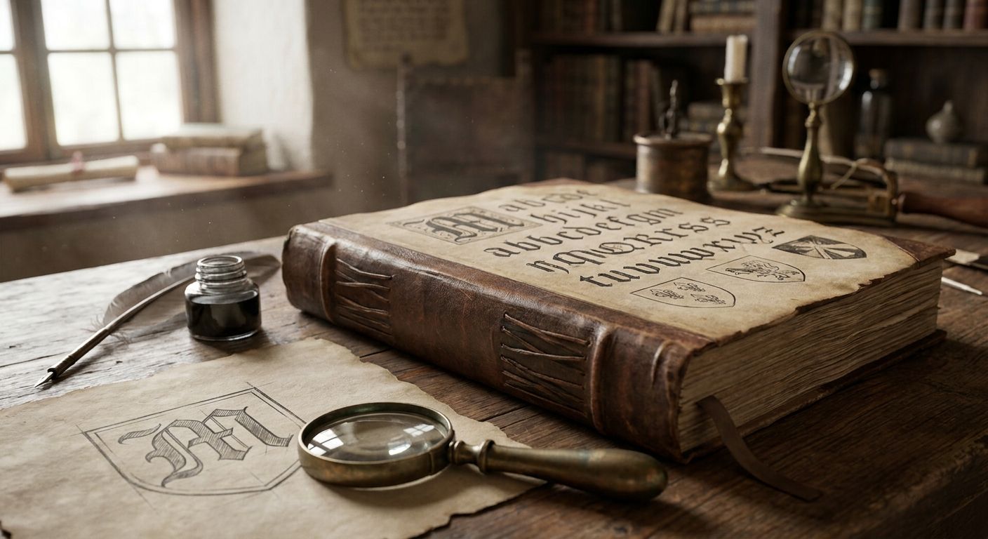
Blackletter (also called Textura or Old English) is the strongest all-around choice for a medieval font in a 2026 logo, but it's not the right pick for every brand — and picking the wrong medieval script is how a logo ends up looking like a Renaissance Fair flyer instead of a heritage mark.
- Blackletter (Textura) is the best overall medieval font for gothic, luxury, and heritage logo marks in 2026.
- Rotunda solves the legibility problem blackletter has at small sizes without losing the historical feel.
- Uncial and Insular script fit fantasy, game, and Celtic-heritage branding better than true blackletter does.
- Hand-restored 19th-century blackletter revivals from Century Library's archive skip AI-generated glyphs entirely.
- Lombardic Versals work as standalone monogram marks, not full logotypes — pair them with a plain sans for the rest of the name.
Why this matters
A medieval font is doing a specific job in a logo: it signals age, craft, or authority in about half a second. Get the script wrong and the mark reads as costume-party gothic instead of established heritage brand. Get the weight wrong and the logo turns into a smudge on a phone screen.
Century Library restores antique fonts and illustration plates from real 19th-century specimens rather than generating them, which matters here because most of what people call "medieval font" today is actually a 19th-century blackletter revival, not a script pulled straight from a monastery scriptorium. Knowing which era you're actually borrowing from changes which style fits your brand.
This guide ranks the seven medieval and medieval-revival script families designers reach for most in 2026, tells you which logo use case each one actually fits, and flags where each one falls apart.
What makes the best medieval font for logo design
- Legibility at small sizes — a script that only works at 72pt is a poster font, not a logo font.
- Historical accuracy vs. legibility trade-off — the more authentic the script, the harder it usually is to read fast.
- Glyph completeness — ligatures, swash caps, and alternate letterforms matter for a wordmark, not just a display headline.
- Commercial licensing clarity — logo use is permanent brand use; the license needs to say so explicitly.
- Genuine restoration vs. AI generation — a font drawn from a scanned historical specimen holds up under scrutiny in a way an AI-approximated "medieval style" typeface does not.
- Scalability across weight — packaging, signage, and favicon sizes all need the same script to survive.
Medieval fonts for logo design at a glance
| Script | Best for | Standout feature | Key limitation |
|---|---|---|---|
| Blackletter (Textura) | Gothic and luxury heritage logos | Dense, vertical strokes read as "established since" instantly | Nearly unreadable below 14pt in a wordmark |
| Uncial | Fantasy and game branding | Rounded, monastic letterforms with no sharp gothic edges | Too soft-looking for law firms or finance brands |
| Rotunda | Logos needing legibility at a glance | Rounder blackletter variant, easier lowercase reading | Less "authentic medieval" than true Textura |
| Fraktur | Heritage beverage and craft branding | Strong German gothic revival association | Carries specific national/cultural baggage some brands should avoid |
| Lombardic Versals | Monograms and initials | Ornate, illuminated-manuscript capital letters | Capitals only — no lowercase, no full wordmark |
| Carolingian Minuscule | Readable historical branding | The actual ancestor of modern lowercase letterforms | Doesn't read as "medieval" to most viewers |
| Insular/Celtic script | Celtic heritage and tattoo-adjacent brands | Interlace-style flourishes and knotwork compatibility | Very stylized — poor fit for anything outside its niche |
1. Blackletter (Textura): best medieval font for gothic and luxury logo marks
Textura is the tall, narrow, heavily-vertical script most people picture the second you say "medieval font." It's technically a 13th-century book hand that got revived hard in the 19th century, which is why most usable digital blackletter typefaces trace back to Victorian-era specimens rather than actual medieval manuscripts.
Blackletter pros:
- Instant heritage and gothic signaling, works for breweries, metal bands, and legal firms alike
- Wide availability of restored, commercially licensed digital versions
- Strong contrast between thick and thin strokes photographs and embosses well on packaging
Blackletter cons:
- Lowercase letters (especially m, n, u, w) are easy to confuse at small sizes
- Overused in the tattoo and craft-beer space, so differentiation takes real design work
- Needs a clean sans-serif tagline underneath to stay legible as a full lockup
Verdict: Buy. Textura is the correct default when the brief says "old, serious, established" and the logo will run large — signage, bottle labels, letterhead.
2. Uncial: best medieval font for fantasy and game branding
Uncial predates blackletter by centuries — it's the rounded majuscule script Irish and British monks used from roughly the 4th through 8th centuries, long before Textura existed. Its soft curves read as "ancient" without the gothic sharpness of blackletter.
Uncial pros:
- Reads as genuinely ancient rather than Victorian-gothic, which suits fantasy IP and tabletop game branding
- Rounded strokes hold up better at mid-size than blackletter does
- Pairs cleanly with illuminated border or Celtic knotwork art
Uncial cons:
- Too soft for finance, law, or anything needing gravitas
- Fewer commercially restored digital versions exist compared to blackletter
- Limited glyph sets in many available fonts, weak on numerals
Verdict: Buy for game studios, tabletop publishers, and fantasy-adjacent brands. Skip for anything corporate.
3. Rotunda: best medieval font for logos that need legibility at a glance
Rotunda is the rounder, Southern-European cousin of blackletter — think Italian and Spanish scribes softening the sharp Germanic strokes. It kept the gothic feel while making the lowercase actually readable.
Rotunda pros:
- Rounder bowls on letters like o, e, and a make the wordmark scannable at a glance
- Still reads unmistakably "medieval," just friendlier
- Works well at favicon and app-icon sizes where true Textura falls apart
Rotunda cons:
- Less dramatic than full blackletter, so it can undersell a very heritage-heavy brand story
- Smaller font libraries than Textura, harder to find a full commercial family
- Some digital Rotunda revivals lack small caps or alternate ligatures
Verdict: Buy when the logo has to work on a phone screen and a storefront sign with equal clarity.
4. Fraktur: best medieval font for heritage beverage and craft branding
Fraktur is the specific German blackletter variant that dominated German-language printing from the 16th century into the 20th. It's sharper and more angular than generic Textura, with distinctive looping ascenders.
Fraktur pros:
- Strongest possible signal for German-heritage beer, whiskey, and bakery branding
- Extremely high contrast strokes stand out on embossed labels and metal signage
- Deep cultural specificity reads as authentic rather than generic-old
Fraktur cons:
- Carries real national and historical associations that don't fit every brand story
- Even harder to read than standard blackletter at small point sizes
- Narrow use case outside German-heritage or Nordic-heritage positioning
Verdict: Hold unless the brand story genuinely involves German or Central European heritage — otherwise it reads as misapplied.
5. Lombardic Versals: best medieval font for monograms and initials
Lombardic Versals are the ornate, illuminated capital letters found at the start of medieval manuscript chapters — decorative, rounded, sometimes filled with flourish patterns. They were never meant to be read in sequence, only used as single dropped capitals.
Lombardic Versals pros:
- Exceptional for a single-letter monogram mark or crest-style initial
- Pairs naturally with vintage border and frame design for wedding and stationery branding
- Highly ornamental without needing an illustrator — the letterform does the work
Lombardic Versals cons:
- No usable lowercase, so it can't carry a full wordmark
- Overly decorative for anything needing a clean, modern feel
- Limited to short brand names or initials, not full company names
Verdict: Buy for monogram marks, wedding invitation suites, and crest-style badge logos. Skip as a primary wordmark font.
6. Carolingian Minuscule: best medieval font for readable historical branding
Carolingian minuscule is the actual ancestor of the lowercase letters you're reading right now — standardized under Charlemagne in the 8th and 9th centuries specifically to fix how unreadable earlier scripts had become. It's the most legible "medieval" option on this list by a wide margin.
Carolingian pros:
- Genuinely legible at small sizes, unlike every gothic script above it
- Historically accurate to the actual medieval period, not a 19th-century revival
- Clean enough to use for full body copy, not just a headline mark
Carolingian cons:
- Most viewers won't clock it as "medieval" at all — it looks closer to a plain serif
- Weak choice when the brief explicitly wants a gothic or ornate feel
- Very few dedicated commercial digital revivals compared to blackletter
Verdict: Hold. Use it when the brand wants historical accuracy over historical drama, otherwise it undersells the "old" signal.
7. Insular/Celtic script: best medieval font for Celtic heritage branding
Insular script developed in Ireland and Britain alongside Uncial and is the script most associated with illuminated manuscripts like the Book of Kells, known for its tight interlace and knotwork-compatible letterforms.
Insular pros:
- Distinct visual identity tied specifically to Celtic and Irish heritage branding
- Pairs naturally with knotwork borders and illustration for a cohesive package design
- Stands apart from generic blackletter-as-medieval-shorthand
Insular cons:
- Very stylized — poor legibility outside short brand names
- Extremely narrow fit, doesn't generalize to "old" or "heritage" broadly
- Sparse commercial font libraries compared to blackletter or Uncial
Verdict: Wait unless the brand is explicitly Celtic or Irish heritage — for anything else, pick blackletter or Rotunda instead.
How we ranked these medieval fonts
Each script above is scored against the six criteria listed earlier — legibility at logo scale, historical accuracy, glyph completeness, licensing clarity, restoration authenticity, and cross-size scalability. Blackletter and Rotunda rank highest because they balance the "reads as old" signal against the "actually works as a logo" requirement; Lombardic Versals and Insular script rank as specialists rather than generalists because their use case is genuinely narrower.
“If you can't read the wordmark at 16 pixels, the font is more authentic than it is useful.”
Which medieval font should you choose in 2026?
For most heritage, luxury, or craft brands building a 2026 logo, Blackletter (Textura) is the default pick — it's the fastest route to "established, serious, old-world" signaling and has the widest range of commercially licensed, restored digital versions available. If the logo needs to survive a phone screen and a storefront sign equally well, drop down to Rotunda instead. If the brand is fantasy, tabletop gaming, or explicitly Celtic, skip blackletter entirely and go with Uncial or Insular script.
Whatever the pick, the source matters as much as the style. A blackletter or Uncial typeface pulled from a genuine 19th-century specimen and hand-restored letter by letter holds its detail under scrutiny — on an embossed label, a large sign, a printed invitation — in a way an AI-approximated "medieval style" font does not. Century Library's archive is built specifically around that distinction: no AI-generated glyphs, just fonts rebuilt from real historical source material as part of its 50,000+ item catalogue of restored illustrations, antique fonts, patterns, and ephemera.
Browse restored antique fonts
Hand-restored blackletter and antique type, sourced from real 19th-century specimens.
FAQ
What is a medieval font called?
There's no single "medieval font" name — the category covers several distinct historical scripts, including blackletter (Textura), Uncial, Rotunda, and Carolingian minuscule. Most digital versions sold today are 19th-century revivals of these medieval hands rather than direct medieval originals.
Is blackletter still popular for logo design in 2026?
Yes, blackletter remains the most common medieval-style script for gothic, luxury, and heritage logos in 2026. Its main competition for legibility-sensitive brands is Rotunda, a rounder blackletter variant.
What's the difference between blackletter and gothic fonts?
"Blackletter" and "gothic" are often used interchangeably for the same dense, angular script family, including Textura and Fraktur. Some type historians reserve "gothic" more narrowly for German blackletter variants like Fraktur.
Can medieval fonts be used commercially in a logo?
Only when the specific font file carries a commercial license that covers logo and trademark use, not just personal or editorial use. Check the license terms of the individual font, since restoration and licensing terms vary by source.
What's the most legible medieval font style?
Carolingian minuscule and Rotunda are the most legible medieval-style scripts, since both were historically developed or revived specifically to improve readability over earlier, denser scripts. True Textura blackletter is the least legible at small sizes.
Are AI-generated medieval fonts as good as hand-restored ones?
No — AI-generated "medieval style" fonts approximate the look without the letterform accuracy of a font rebuilt from a real historical specimen. Hand-restored fonts trace actual strokes from period printing or manuscript sources, which holds up better at large scale and under close inspection.
What font style did actual medieval manuscripts use?
It depended on the century and region — Carolingian minuscule dominated the 9th through 12th centuries, Uncial and Insular script came earlier in Ireland and Britain, and Textura blackletter emerged later, around the 13th century, in Northern Europe.
How do I make a medieval font readable in a small logo?
Switch from true blackletter to a rounder variant like Rotunda, increase letter spacing slightly, and pair the script with a plain sans-serif tagline for any supporting text. Test the logo at favicon size (16-32px) before finalizing.
One last thing
The blackletter script everyone associates with "medieval" is mostly a 19th-century invention — actual 13th-century Textura looked rougher and far less standardized than the clean revival fonts sold today. That's worth knowing before you pick a script purely on "historical accuracy" grounds: the polished, legible version of medieval type most designers reach for in 2026 is itself a restoration project, which is exactly the kind of sourcing detail worth checking before licensing any font for permanent logo use.