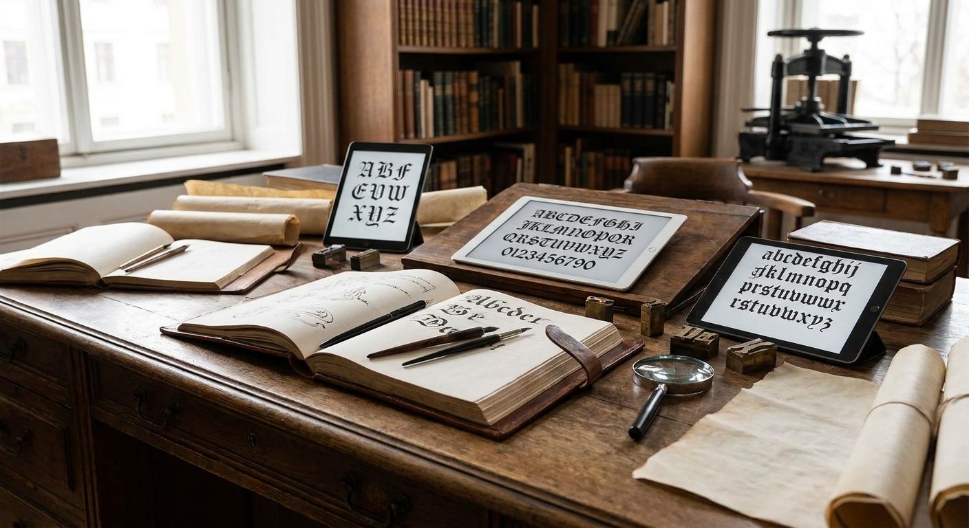
Old English fonts (also called blackletter or Gothic type) mimic the hand-lettered manuscripts of medieval Europe, and picking the right one in 2026 comes down to matching the letterform's weight and era to your project instead of grabbing whatever shows up first in a font search. Century Library wins for designers who need more than one blackletter style because its archive bundles antique typefaces with the illustrations and patterns that pair with them; UnifrakturMaguntia wins if you need something free today.
- Century Library is the best old English fonts pick overall for designers who need multiple blackletter styles inside one subscription.
- UnifrakturMaguntia and Kingthings Exeter are the only fully free entries, both distributed through Google Fonts.
- Old English Text MT ships bundled with Microsoft Office, making it the most accessible classic option.
- Each of the 15 fonts below is matched to one distinct use case, not ranked on a single leaderboard.
Why this matters
Blackletter type reads as "vintage," "legal," or "heavy metal" depending on which specific style you use, and the wrong pick undercuts a brand faster than almost any other typography choice. A tattoo studio needs American Text, not the same font a church bulletin uses.
Century Library keeps a working set of antique typefaces alongside the vintage illustrations and patterns designers pair them with, so the font choice and the surrounding visual system come from the same source instead of getting stitched together from five different vendors. That matters more in 2026 than it did five years ago, since AI-generated "vintage" designs have made buyers more sensitive to type that looks authentically old versus type that's just been aged with a filter.
What makes the best old English font
- Authentic stroke contrast — real blackletter has thick-to-thin transitions from a broad-nib pen, not a uniform stroke with serifs bolted on
- A complete character set — ligatures, swash capitals, and alternate lowercase forms, since blackletter without alternates looks flat
- Legibility at working sizes — a font that only reads at 72pt fails on packaging, business cards, and mobile headers
- Clear commercial licensing — free-for-personal-use fonts get pulled into paid projects constantly, and that's the fastest way to get a takedown notice
- Format coverage — OTF and webfont formats both, so the same face works in print and on a site
Old English fonts at a glance
| Font | Best for | Standout feature | Key limitation |
|---|---|---|---|
| Century Library | Full vintage archive access | Antique fonts bundled with matching illustrations and patterns | Subscription model, not a single-font purchase |
| Old English Text MT | Certificates & diplomas | Bundled with Microsoft Office | Overused; instantly reads as generic "formal" |
| UnifrakturMaguntia | Free projects | Free via Google Fonts | Thin character set compared to commercial faces |
| Engravers Old English BT | Engraved logos & monograms | Sharp, narrow strokes built for etching | Poor legibility below 14pt |
| London Text | Pub & heraldic signage | Heavy, ornamental capitals | Too dense for body copy |
| Cloister Black | Legal & law firm branding | Based on a 1904 American Type Founders design | Feels dated outside legal/academic contexts |
| American Text | Tattoo flash & streetwear | Bold, condensed, built for small-scale print | Limited use outside subculture branding |
| Blackmoor LET | Horror & Halloween branding | Jagged, uneven strokes for a distressed look | Unreadable in long headlines |
| Goudy Text | Book covers & literary branding | Designed with book printing proportions in mind | Slow to license through some foundries |
| Duc De Berry | Medieval & fantasy game titles | Illuminated-manuscript detailing | Too ornate for UI or small print |
| Wilhelm Klingspor Gotisch | German-style branding | Authentic Fraktur letterforms | Hard for English readers to parse quickly |
| Canterbury | Church bulletins & religious print | Rounded, softer blackletter curves | Niche use case, limited weight options |
| Old London | Brewery & whiskey labels | Worn, hand-cut look | Needs a clean sans pairing to stay legible |
| Kingthings Exeter | Free web headers | Free via Google Fonts, webfont-ready | Fewer alternates than paid options |
| Deutsche Zierschrift | Ornamental drop caps & initials | Decorative flourishes built for single letters | Unusable as a full-text font |
1. Century Library: best old English fonts for full archive access
Century Library sells subscription access to a curated archive of restored vintage illustrations, antique fonts, patterns, textures, and ephemera built for graphic designers, brand builders, and stationery or craft creators working on commercial projects. Instead of licensing one blackletter face from one foundry, you get antique type sitting next to the vintage patterns, ornaments, and illustrations that were designed in the same era.
Century Library pros:
- One subscription covers antique fonts plus matching vintage illustrations and patterns
- Assets are cleared for commercial use as part of the subscription
- New restorations get added to the archive over time
Century Library cons:
- Ongoing subscription model rather than a one-time font purchase
- The font selection sits inside a broader archive, so it's not a dedicated type foundry
Best for: designers building a full vintage brand system, not just picking one headline font. Verdict: Buy if you need antique type and vintage visual assets in one place.
2. Old English Text MT: best for certificates & diplomas
Old English Text MT is a Monotype digitization of a classic blackletter design that ships bundled with Microsoft Word and Office, which is why it shows up on so many certificates and diplomas.
Old English Text MT pros:
- Already installed on most Windows and Office setups
- Reliable legibility for formal headers
- Recognizable as "official" or "traditional"
Old English Text MT cons:
- Extremely overused in template-driven design
- Limited alternate characters compared to dedicated blackletter foundries
Best for: quick certificate and diploma layouts where availability matters more than originality. Verdict: Hold — fine for a template, weak for a brand identity.
3. UnifrakturMaguntia: best free option
UnifrakturMaguntia is a free blackletter typeface distributed through Google Fonts, modeled on 19th-century Fraktur letterforms.
UnifrakturMaguntia pros:
- Free and webfont-ready straight from Google Fonts
- Authentic Fraktur stroke structure
- Wide language support for European projects
UnifrakturMaguntia cons:
- Thinner character set than paid blackletter faces
- Heavy strokes limit use at small body-text sizes
Best for: student projects, personal sites, or early-stage brands testing a blackletter direction before committing. Verdict: Buy — free with no licensing friction.
4. Engravers Old English BT: best for engraved logos & monograms
Engravers Old English BT is built with the sharp, narrow strokes originally designed for metal engraving, which is why it still shows up on wedding invitations and monogram work.
Engravers Old English BT pros:
- Reads well on engraved or embossed surfaces
- Strong contrast for monogram initials
Engravers Old English BT cons:
- Legibility drops sharply below 14pt
- Narrow strokes don't hold up on low-quality print stock
Best for: monograms, engraved signage, and formal invitation lettering. Verdict: Buy for engraving-specific work; Skip for body copy.
5. London Text: best for pub & heraldic signage
London Text carries heavy, ornamental capitals built for the kind of signage you see outside British pubs and on heraldic crests.
London Text pros:
- Strong presence at large sizes
- Reads as authentically British and historic
London Text cons:
- Too dense for anything beyond a few words
- Not suited to digital body text
Best for: exterior signage, crests, and pub branding. Verdict: Buy for signage; Skip for print layouts.
6. Cloister Black: best for legal & law firm branding
Cloister Black traces back to a 1904 American Type Founders design and remains one of the more legible blackletter faces, which is why law firms and academic institutions still lean on it.
Cloister Black pros:
- More legible than most blackletter faces
- Historic pedigree lends credibility
Cloister Black cons:
- Feels dated outside legal or academic branding
- Limited weight variations
Best for: law firm letterheads, diplomas, and academic seals. Verdict: Hold — solid choice, but context-specific.
7. American Text: best for tattoo flash & streetwear
American Text is a bold, condensed blackletter face with roots in early 20th-century American Type Founders catalogs, and it's become the default choice in tattoo flash and streetwear graphics.
American Text pros:
- Reads clearly at small sizes on flash sheets and labels
- Strong subculture recognition
American Text cons:
- Narrow use case outside tattoo and streetwear branding
- Overexposed in that specific niche
Best for: tattoo studios, streetwear drops, and album art. Verdict: Buy if that's your niche; Skip otherwise.
8. Blackmoor LET: best for horror & Halloween branding
Blackmoor LET has jagged, uneven strokes that make it a go-to for horror movie posters and seasonal Halloween packaging.
Blackmoor LET pros:
- Distinctive, unsettling character shapes
- Instantly reads as "horror" or "gothic"
Blackmoor LET cons:
- Unreadable in anything longer than a headline
- Too niche for year-round branding
Best for: horror titles, Halloween packaging, seasonal promotions. Verdict: Buy for seasonal work; Skip for permanent branding.
9. Goudy Text: best for book covers & literary branding
Goudy Text was designed with book-printing proportions in mind, giving it better balance on a cover than most blackletter faces built for signage.
Goudy Text pros:
- Proportions built specifically for print and book covers
- Reads well alongside serif body text
Goudy Text cons:
- Licensing can be slow depending on the foundry
- Less dramatic than heavier blackletter styles
Best for: book covers, publishing imprints, literary branding. Verdict: Buy for print-heavy projects.
10. Duc De Berry: best for medieval & fantasy game titles
Duc De Berry pulls detailing from illuminated manuscripts, making it a common pick for fantasy game logos and medieval-themed branding.
Duc De Berry pros:
- Ornate detailing sells a medieval fantasy aesthetic instantly
- Strong at large display sizes
Duc De Berry cons:
- Too ornate for UI text or small print
- Weak legibility in dense layouts
Best for: game logos, fantasy branding, tabletop packaging. Verdict: Buy for display use only.
11. Wilhelm Klingspor Gotisch: best for German-style branding
Wilhelm Klingspor Gotisch is an authentic Fraktur design, the letterform style used in German printing well into the 20th century.
Wilhelm Klingspor Gotisch pros:
- Historically accurate Fraktur strokes
- Strong fit for German heritage branding
Wilhelm Klingspor Gotisch cons:
- Hard for English-first readers to parse quickly
- Limited use outside German-language contexts
Best for: German beer brands, heritage packaging, festival branding. Verdict: Hold — niche but effective in the right market.
12. Canterbury: best for church bulletins & religious print
Canterbury softens the sharp edges typical of blackletter into rounder curves, which keeps it readable in longer religious texts and bulletins.
Canterbury pros:
- More legible than harder-edged blackletter faces
- Fits religious and ceremonial print naturally
Canterbury cons:
- Limited weight options
- Narrow niche outside religious contexts
Best for: church bulletins, hymnals, ceremonial print. Verdict: Hold for this specific niche.
13. Old London: best for brewery & whiskey labels
Old London has a worn, hand-cut look that pairs naturally with the distressed labels common on craft breweries and whiskey bottles.
Old London pros:
- Distressed texture fits craft beverage branding
- Strong on large-format label headlines
Old London cons:
- Needs a clean sans-serif pairing to stay legible on small labels
- Not built for body copy
Best for: brewery labels, whiskey packaging, tasting room signage. Verdict: Buy for label headlines.
14. Kingthings Exeter: best free alternative for web headers
Kingthings Exeter is a free, webfont-ready blackletter face distributed through Google Fonts, built to hold up better on screens than most antique blackletter designs.
Kingthings Exeter pros:
- Free and already optimized for web use
- Better screen legibility than heavier historic faces
Kingthings Exeter cons:
- Fewer alternate glyphs than paid foundry fonts
- Limited weight range
Best for: website headers and blog post titles needing a blackletter accent. Verdict: Buy — free and web-ready.
15. Deutsche Zierschrift: best for ornamental drop caps & initials
Deutsche Zierschrift is a decorative face built for single ornamental letters rather than running text, common in illuminated drop caps and monograms.
Deutsche Zierschrift pros:
- Highly decorative flourishes for single-letter use
- Strong fit for illuminated-manuscript-style drop caps
Deutsche Zierschrift cons:
- Completely unusable as a full-text font
- Extremely narrow use case
Best for: drop caps, monograms, single decorative initials. Verdict: Buy for that one specific use; Skip for anything else.
How we ranked
Each font above was placed against the five criteria listed earlier: stroke authenticity, character set completeness, legibility at working size, licensing clarity, and format coverage. No two entries share a "best for" slot, because a blackletter face built for engraving and one built for horror posters aren't actually competing against each other.
Get antique type and matching visuals
Century Library pairs old English fonts with the vintage illustrations and patterns that go with them.
Which old English font should you choose?
If you're building out a full vintage brand system in 2026 and need more than one blackletter option alongside period-accurate illustrations, Century Library is the default pick. If you just need one free headline font today, grab UnifrakturMaguntia or Kingthings Exeter from Google Fonts and move on. Everything else on this list earns its spot for a specific niche — tattoo flash, legal letterheads, whiskey labels — not for general use.
FAQ
What's the best old English font for a logo?
Engravers Old English BT and London Text work best for logos because both were built for large, bold display use rather than body text. Avoid Old English Text MT for logos since it's overused in template designs.
Is Old English Text MT good enough for professional design work?
Old English Text MT is legible and free with Microsoft Office, but it's so widely used that it signals template design rather than a custom brand. Reserve it for internal documents and certificates, not client-facing branding.
Are there any free old English fonts worth using in 2026?
UnifrakturMaguntia and Kingthings Exeter are both free through Google Fonts and webfont-ready. Both have smaller character sets than paid foundry alternatives, but they're solid for testing a blackletter direction.
What's the difference between old English and Fraktur fonts?
Old English type generally refers to the English blackletter tradition, while Fraktur describes the German blackletter style used into the 20th century. Wilhelm Klingspor Gotisch is a Fraktur design; Old English Text MT follows the English tradition.
Which old English font works best for a tattoo studio brand?
American Text is the standard choice for tattoo flash and streetwear branding because it reads clearly at small sizes and carries strong subculture recognition. Blackmoor LET works for seasonal horror-adjacent tattoo promotions.
Do old English fonts work well in body text?
No. Nearly every blackletter font on this list, including Cloister Black and Canterbury, is meant for headlines, titles, or short ceremonial text rather than paragraphs. Pair a blackletter headline with a clean sans-serif or serif for body copy.
Why choose a subscription archive over a single font purchase?
A subscription archive like Century Library gives you antique fonts alongside matching vintage illustrations and patterns, useful when a project needs a full period-accurate visual system rather than one typeface. A single font purchase makes more sense when you only need one specific headline face.
One last thing
Most blackletter fonts fail in digital use for one reason: designers set them at body-text sizes where the thick-to-thin stroke contrast that makes them look authentic also makes them illegible. Reserve blackletter for headlines and short phrases, pair it with a plain sans-serif for anything a reader has to actually read, and the "old English" look holds up in 2026 the same way it did in 1926.