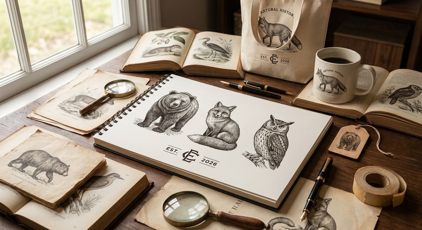
Vintage animal illustrations sit at the center of a lot of the branding that feels grounded rather than trendy — apothecary labels, wine packaging, pet brands, wedding suites, nature-adjacent logos. This guide ranks the five illustration categories inside Century Library's archive that designers reach for most, tells you exactly what each is best for, and where each one falls short.
- Natural History Plate illustrations win overall for premium packaging and label design in 2026.
- Heraldic & Emblem Beasts are the top pick for crest-style logo marks.
- Victorian Trade Card Animals fit retail mascots and product characters best.
- Audubon-style bird studies suit wedding stationery and invitation suites.
- Every set in Century Library's vintage animal illustrations catalogue is hand-restored, not AI-generated.
Why this matters
A logo built on a real 19th-century engraving reads differently than one built on a stock vector — the linework has irregularities a human hand made, and buyers notice. Century Library restores its plates from original prints rather than generating imagery, so the texture and imperfection stay intact.
The problem most designers run into isn't finding an animal illustration — it's finding the right era and style for the brand they're building. A pharmacy label needs a different animal illustration than a children's cereal box, even though both might say "vintage" in the brief. That's the gap this ranking closes.
What makes the best vintage animal illustrations for branding
- Verifiable historical source — engraved from real 19th-century or earlier prints, not synthesized
- Restoration quality — clean scan lines, no compression artifacts, printable at commercial resolution
- Licensing clarity — clear terms for commercial use in logos, packaging, and merchandise
- Stylistic range — line engraving, woodcut, lithograph, and full-color plate all read differently in a layout
- Cataloguing depth — searchable by species, plate number, or era so you're not scrolling blind
- Use-case fit — some styles work in a wordmark, others only work as a full illustration panel
Vintage animal illustrations at a glance
| Category | Best for | Standout feature | Key limitation |
|---|---|---|---|
| Natural History Plate Illustrations | Premium packaging and label design | Full-color detail with scientific accuracy | Dense linework shrinks poorly below 2 inches |
| Heraldic & Emblem Beasts | Logo marks and crest-style branding | Symmetrical, built for a badge or seal | Reads formal — wrong tone for playful brands |
| Victorian Trade Card Animals | Retail mascots and product characters | Animals shown mid-action, already characterful | Color palettes are era-specific, need matching |
| Folk Art & Fable Creatures | Children's brand identity and storybook packaging | Simplified shapes, high legibility at small sizes | Limited species variety compared to plate sets |
| Audubon-Style Bird Studies | Wedding stationery and invitation suites | Single-subject compositions frame well on a card | Birds-only — no mammal or insect coverage |
1. Natural History Plate Illustrations: best vintage animal illustrations for premium packaging
These are the engravings modeled on 19th-century zoological reference works — full-color or hand-tinted plates showing a single animal with scientific labeling conventions (fig. numbers, Latin names in the margin). They carry the most visual weight of any category in the archive and read as credible rather than decorative.
Natural History Plate Illustrations pros:
- Highest color and line detail of the five categories
- Scientific framing reads as trustworthy on food, spirits, and apothecary packaging
- Available at resolution that holds up on large-format labels
Natural History Plate Illustrations cons:
- Too dense for small logo applications
- Not suited to brands wanting a playful or casual tone
Best for: packaging and label design where the brand wants gravitas. Verdict: Buy.
2. Heraldic & Emblem Beasts: best vintage animal illustrations for logo marks
Lions, unicorns, griffins, and stags rendered in the symmetrical, shield-adjacent style of European heraldry. These pieces were built for a crest from the start, which makes them unusually easy to drop into a circular or shield-shaped logo lockup without redrawing.
Heraldic & Emblem Beasts pros:
- Naturally symmetrical — minimal rework needed for a badge logo
- Strong recognition value; buyers read "established" and "authority" instantly
- Works in single color for embossing, foil stamping, or engraving
Heraldic & Emblem Beasts cons:
- Overused in certain categories (craft beer, private clubs) — check for saturation in your niche
- Formal tone doesn't fit brands targeting a younger or casual audience
Best for: crest-style logo marks and brands built on tradition or authority. Verdict: Buy.
3. Victorian Trade Card Animals: best vintage animal illustrations for retail mascots
Trade cards were the 19th-century equivalent of a business card handout, and the animals on them were drawn to be memorable, not accurate — a cat in a bonnet, a dog reading a newspaper. That built-in personality is exactly what a retail mascot needs.
Victorian Trade Card Animals pros:
- Already characterful — animals are posed and expressive, not static
- Color palettes have a warm, printed-paper feel that suits retail and gift brands
- Smaller file sizes than full plate illustrations, easier to scale across packaging lines
Victorian Trade Card Animals cons:
- Period color palettes sometimes clash with a modern brand's existing scheme
- Fewer species options than the natural history plate set
Best for: product mascots and retail brand characters. Verdict: Buy.
4. Folk Art & Fable Creatures: best vintage animal illustrations for children's brands
These draw from folk printmaking and fable illustration traditions — simplified shapes, bold outlines, and animals that read at a glance even at business-card size. They're the least detailed category in the archive, and that's the point.
Folk Art & Fable Creatures pros:
- Legible at small sizes where plate illustrations fall apart
- Approachable tone fits children's products, storybooks, and gift packaging
- Simple shapes are easy to recolor to match a brand palette
Folk Art & Fable Creatures cons:
- Narrower species selection than the plate or trade card sets
- Too simple for brands wanting a premium or luxury feel
Best for: children's brand identity and storybook packaging. Verdict: Buy.
5. Audubon-Style Bird Studies: best vintage animal illustrations for wedding stationery
Modeled on the single-subject bird studies popularized by John James Audubon's Birds of America (published 1827-1838), these compositions place one bird in a naturalistic pose against open space — which is exactly the framing an invitation card or place setting needs.
Audubon-Style Bird Studies pros:
- Composition already leaves negative space for typography
- Elegant without being heraldic or formal
- Reads well in both full color and single-line etching versions
Audubon-Style Bird Studies cons:
- Birds only — no mammals, insects, or reptiles in this category
- Less bold than trade card animals; may read too quiet for retail packaging
Best for: wedding stationery and invitation suites. Verdict: Buy.
Browse the vintage illustration archive
Search 50,000+ restored plates, fonts, and patterns by era or subject.
How we ranked
Each category was scored against the six criteria above — source authenticity, restoration quality, licensing clarity, stylistic range, cataloguing depth, and use-case fit. No category swept all six; the ranking reflects which single use case each one dominates, not a generic quality score. That's why this reads as five different "bests," not one winner and four runners-up.
If you're building brand identity work around botanical rather than animal subjects, the same restoration standard applies to Century Library's vintage botanical illustration catalogue, which follows an identical plate-and-fig-number cataloguing system.
Which vintage animal illustrations should you choose?
For most branding projects in 2026, start with Natural History Plate Illustrations — the detail and scientific credibility carry the widest range of packaging and label work. If your project is a logo mark that needs to feel established, move to Heraldic & Emblem Beasts instead. Retail mascots and wedding stationery each have a clear single answer above — don't force a plate illustration into a mascot role or a trade card into a wedding suite.
FAQ
What's the best vintage animal illustration style for packaging in 2026?
Natural History Plate illustrations are the best vintage animal illustrations for packaging in 2026 because their scientific detail and full color hold up at large label sizes. They read as credible on food, spirits, and apothecary products.
Are vintage animal illustrations better than stock vector animals for branding?
Vintage animal illustrations sourced from real historical engravings carry linework irregularities that stock vectors don't, which reads as more authentic and less generic. The tradeoff is that vintage illustrations need more careful color and scale matching to a modern brand system.
Can vintage animal illustrations be used in a commercial logo?
Yes, as long as the licensing terms explicitly cover commercial use, which Century Library's archive provides for its restored plates. Always confirm the specific license terms before finalizing a logo built on any vintage source.
What's the difference between heraldic animal illustrations and natural history plates?
Heraldic animal illustrations are symmetrical, crest-style compositions built for badges and shields, while natural history plates are single-subject, scientifically detailed renderings meant for reference works. Heraldic beasts suit logo marks; plates suit packaging and labels.
Which vintage animal illustration style works best for a children's brand?
Folk Art & Fable Creatures work best for children's brands because their simplified shapes stay legible at small sizes where more detailed plate illustrations lose clarity. They also carry a warmer, more approachable tone than heraldic or scientific styles.
Do vintage animal illustrations work for wedding invitations?
Audubon-style bird studies are the strongest fit for wedding stationery because their single-subject compositions leave open space for typography. Full plate illustrations or heraldic beasts tend to compete with the invitation text instead of framing it.
Are Century Library's vintage animal illustrations AI-generated?
No. Century Library restores every illustration from an original historical print or engraving rather than generating imagery, which is a core distinction from most modern stock libraries.
One last thing
The detail that trips up most designers isn't the animal at all — it's the era mismatch between the illustration and the typography sitting next to it. A Victorian trade card animal paired with a clean 2026 sans-serif logotype reads as a costume, not a brand. Pair each vintage animal illustration category with a typeface from roughly the same decade and the whole mark stops looking like a mashup.