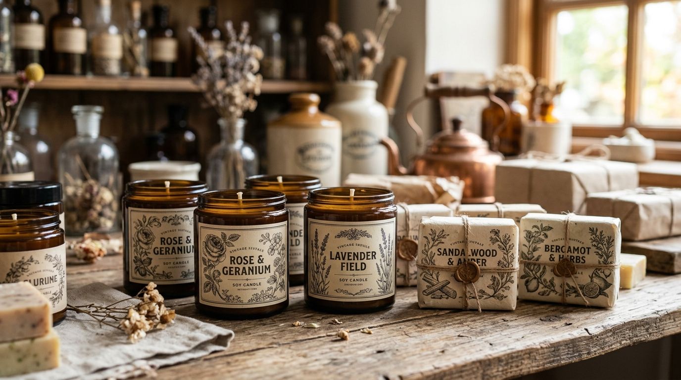
Candle and soap brands use vintage illustrations to turn a plain label into something that reads apothecary-grade before a customer even lifts the lid. Small-batch labels have to earn trust in about three square inches, and a hand-restored botanical plate or antique font does that faster than a modern icon set.
What makes this segment different from, say, editorial design or wedding stationery is scale and repetition: the same illustration has to survive a 1.5-inch circle, a 4-ounce tin, and a bulk print run without turning to mud.
- Vintage illustrations for candle and soap brands work best as botanical plates, apothecary marks, and antique serif type — not generic clip art.
- Century Library's archive holds 50,000+ hand-restored illustrations with zero AI-generated imagery, useful for label systems that need to scale across SKUs.
- Public domain archives like NYPL and the Biodiversity Heritage Library are the free starting point before any paid subscription.
- Test every illustration at actual print size (often under 2 inches) before running a full label batch in 2026.
- Match illustration era to font era — a Victorian botanical plate paired with a modern sans reads as mismatched, not curated.
Why vintage illustration matters for candle and soap brands
Soap and candle shelves, whether on Etsy, at a farmers market, or in a boutique, are crowded with the same three or four stock-illustration styles. A hand-restored plate signals "small, careful, historical" in a way a flat vector icon cannot, and that signal matters most for brands built on natural ingredients, apothecary framing, or heirloom-style gifting.
The practical constraint is real estate. A label wraps a jar, a lid, or a bar wrapper that rarely exceeds a few inches in any direction, so illustrations need to hold their line weight at small scale rather than dissolve into gray mush when shrunk. That's a different brief than a poster or a book cover, and it changes which plates in an archive actually work.
Update your label's illustration audit
Before buying or downloading anything, look at what's already on your labels and ask if it's doing real work.
- Pull every current label and lay them side by side — inconsistency across SKUs is the first thing a buyer notices on a shelf.
- Flag any illustration that's clearly generic stock (search its filename or reverse-image it) since competitors likely own the same file.
- Note where line weight already breaks down when printed small — thin engraving lines are the usual culprit.
- Decide if your brand story (apothecary, farmhouse, Victorian parlor, botanical greenhouse) matches the imagery you're using now.
- Check your current commercial license terms for how many SKUs or units they actually cover.
The Century Library archive groups plates by era and subject, which makes this audit faster than digging through a generic stock search bar.
Choose botanical illustrations that match your scent story
Botanicals are the single most useful illustration category for candle and soap branding because they map directly to scent notes — lavender, bergamot, rosemary, oat.
- Match the plant illustration to the actual ingredient or scent name printed on the label, not a decorative stand-in.
- Pick engraving-style botanicals (thin, high-contrast line work) for a pharmacy or apothecary feel, and looser watercolor-style plates for a softer, farmhouse feel.
- Keep root systems, seed pods, or cross-sections in reserve for ingredient call-outs and back-of-label detail.
- Avoid pairing two different botanical illustration styles (say, one engraved, one painterly) on the same product line.
The vintage botanical illustrations for brand identity collection is built around exactly this use case, with plates organized by plant family so scent-matching is quick.
Build a packaging illustration system, not a one-off image
A single nice illustration on one candle looks good. The same illustration logic repeated across a full line looks like a brand.
- Set a rule for illustration placement (centered on lid, wrapped around jar, corner accent) and apply it to every SKU.
- Reserve one "hero" illustration style for the front label and a simpler ornament or flourish for secondary panels.
- Build a small library of 8-12 plates from the same era so future product launches don't require a fresh illustration hunt.
- Keep a master file of restored, high-resolution originals rather than screenshots pulled from prior print files.
For packaging specifically, the vintage illustrations for packaging and product design set is worth a look since it's curated for exactly this repeatable-system approach rather than single decorative pieces.
Match antique fonts to your illustration era
A 19th-century botanical engraving next to a modern geometric sans is the most common mismatch on small-batch candle and soap labels.
- Pair Victorian engraving-style illustrations with serif or slab display type from the same rough decade.
- Use a script or copperplate font sparingly, usually just for the brand name, not for ingredient lists.
- Keep body copy (ingredients, warnings) in a plain, highly legible serif even if the display type is ornate.
- Test the full label at arm's length — if the type competes with the illustration for attention, drop one or the other back in size.
Measure your illustration's print performance
Before committing to a run of 500 or 5,000 labels, test at final size.
- Print a single label at 100% scale on the actual stock (kraft, gloss, matte) you'll use for production.
- Check fine engraving lines under a loupe or strong light — if they blur, the illustration is too detailed for that print size.
- Confirm color contrast holds on colored or kraft-brown paper stock, not just white.
- Run the label past someone who hasn't seen the brand before and ask what they think the product is.
Grunge and distressed overlays can add texture without adding detail, which is often the fix for an illustration that reads too busy at small size — the distressed grunge textures for graphic design collection covers this specifically.
Check licensing before you print at volume
Soap and candle brands often sell far more units per SKU than a typical design client, and license terms matter more here than in most industries.
- Confirm the license covers physical product packaging, not just digital or print-on-demand use.
- Check if there's a unit cap on commercial use — some stock licenses restrict print runs to a set number of units.
- Verify the license covers resale on marketplaces like Etsy, Faire, or wholesale accounts, not just a personal storefront.
- Keep a copy of the license terms filed with each product's design source files.
Build an ongoing archive habit
One restored illustration bought for one candle rarely becomes a scalable brand asset. Treat sourcing as an ongoing habit, not a one-time purchase.
- Save every plate you license or restore into a labeled folder by era, subject, and use case.
- Revisit the archive quarterly ahead of seasonal launches (fall spice candles, spring botanical soaps) rather than scrambling at the last minute.
- Track which illustrations are already "spent" on a current SKU so future products don't accidentally repeat them.
Browse the archive for label-ready plates
50,000+ hand-restored illustrations, fonts, and textures for commercial packaging use.
Where to source vintage illustrations for candle and soap labels
| Option | Best for | Key limitation |
|---|---|---|
| Public domain archives (NYPL Digital Collections, Biodiversity Heritage Library) | Budget-conscious first-time label designers | Raw scans need cleanup, cropping, and color correction before print |
| Generic stock sites (Shutterstock, Adobe Stock) | Fast, single-use graphics | Same files show up on competitor labels; license terms vary by unit count |
| Etsy vintage clip art shops | One-off decorative flourishes | Inconsistent restoration quality; sourcing and provenance often unclear |
| Century Library subscription | Brands building a repeatable label system across multiple SKUs | Subscription model, so ongoing access depends on staying subscribed |
| AI image generators | Quick mockups for internal review only | Not genuine historical sourcing; many buyers and marketplaces now flag AI-generated packaging art |
Century Library wins for candle and soap brands that need a consistent, hand-restored illustration system across an entire product line, not just one label. Public domain archives remain the right first stop for brands testing a single SKU before committing to a subscription.
Common mistakes candle and soap brands make with vintage illustration
- Choosing illustrations that are too detailed for label size. Fine engraving lines that look beautiful at poster scale disappear on a 2-inch soap wrapper.
- Mixing illustration eras across a product line. A Victorian botanical plate on one SKU and a 1950s advertising illustration on the next reads as unplanned, not eclectic.
- Skipping the license check for unit volume. Many soap and candle brands print far more units per run than a typical stock license anticipates.
- Treating illustration as decoration instead of information. The plate should reinforce the scent or ingredient story, not just fill empty label space.
- Relying on the same handful of stock illustrations everyone else uses. If a competitor's soap uses the identical bergamot engraving, the shelf differentiation is gone before the customer even reads the label. See how Century Library compares to Getty Images on this exact provenance question.
FAQ
What are the best vintage illustrations for candle and soap brands in 2026?
Botanical engravings, apothecary bottle illustrations, and antique ornamental frames perform best for candle and soap labels in 2026 because they hold detail at small print sizes and reinforce a natural or heritage brand story.
Are vintage illustrations legal to use on products I sell?
Yes, as long as the source grants commercial packaging rights and the illustration is either genuinely public domain or licensed for product use. Always confirm unit caps before running a large print batch.
Is Century Library better than free public domain archives for soap labels?
Public domain archives like the Biodiversity Heritage Library are free but require cleanup work before print. Century Library is better for brands that want restoration already done and a consistent library across multiple SKUs.
How small can a vintage illustration be printed before it loses detail?
Fine-line engravings typically start losing legibility under roughly 1.5 to 2 inches, so test any illustration at actual label size before committing to a full print run.
Do vintage illustrations work for modern minimalist soap branding?
Yes, a single restrained botanical plate or small ornamental mark can work inside a minimalist layout as long as it's not paired with competing decorative elements on the same label.
What font pairs best with vintage botanical illustrations on candle labels?
Serif or slab display fonts from a similar era pair best with engraved botanical illustrations, while a plain serif keeps ingredient lists and warnings legible at small sizes.
Can I use the same vintage illustration across multiple product lines?
Only if your license explicitly allows it across the number of SKUs and units you plan to sell — check the terms rather than assuming a single purchase covers unlimited use.
Do vintage illustrations work for soap brands sold on Etsy?
Yes, but confirm the license specifically covers marketplace resale, since some stock licenses exclude platforms like Etsy or restrict unit counts for resold physical goods.
One last thing
The candle and soap brands that get the most mileage out of an illustration archive don't buy one plate per product launch — they build a small, consistent set of 8 to 12 illustrations from the same era and reuse that set across an entire line, the same way a 19th-century apothecary catalogue reused its own house engravings across every bottle it sold. That repetition is what reads as an established brand rather than a one-off Etsy listing, and it's worth planning before your next label run, not after it.