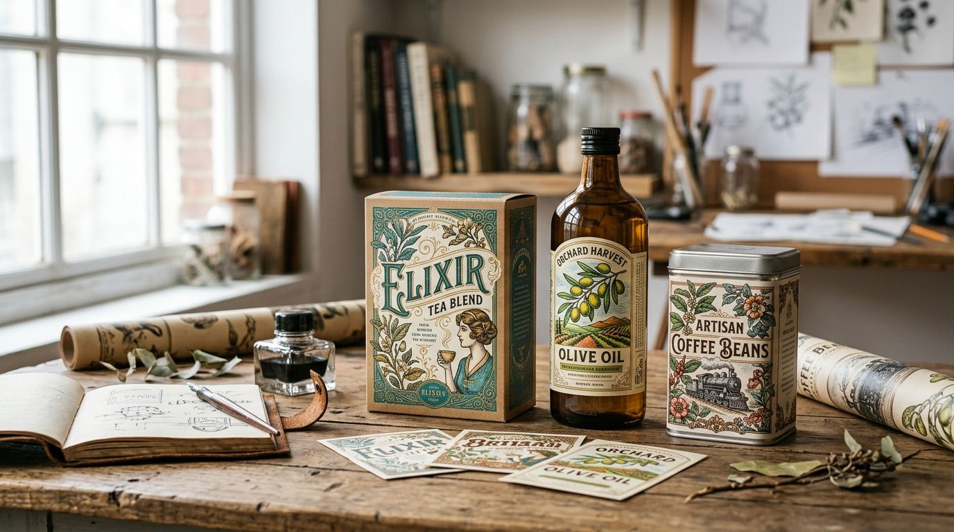
Packaging that reads as inherited rather than printed almost always starts with a restored vintage illustration, not a stock photo or an AI render. This guide ranks seven vintage illustration styles for packaging and product design in 2026, from botanical plates to ornamental borders, and tells you which one actually fits your product.
- Botanical vintage illustrations win overall for packaging in 2026, versatile across food, beverage, and wellness lines.
- Baroque and ornamental borders signal premium pricing on cosmetics, spirits, and gift packaging.
- Vintage ephemera like ledgers, stamps, and ticket stubs fits apothecary and nostalgic product lines best.
- Distressed grunge textures take the least design effort and suit rustic or farmhouse-style brands.
- Commercial license terms matter more than style choice, so check them before running a print job.
Why this matters
Shelf competition in 2026 runs against a wall of AI-generated "vintage-style" art that looks close enough to fool nobody who's actually held a 19th-century engraving in their hands. Century Library built its archive of more than 50,000 restored vintage illustrations specifically to give designers plates sourced from real period material, not a diffusion model's guess at what old looks like.
Buyers notice the difference between a genuine restored plate and a filtered stock photo, even when they can't name why. Packaging built on authentic vintage illustrations signals craft and permanence, the same reason apothecary brands, small-batch spirits, and heritage food lines keep reaching for engraved botanicals and ornamental borders instead of flat vector icons. The question isn't whether vintage illustration works for packaging in 2026, it's which style fits your product category.
The verdict on vintage illustrations for packaging in 2026
Best overall: botanical illustrations. Best for premium packaging: baroque and ornamental borders. Best budget-friendly option: distressed grunge textures. Ephemera wins for apothecary and nostalgic lines, animal illustrations for artisan brands, toile patterns for textile packaging, and coronet illustrations for anything selling heritage or status.
What makes the best vintage illustration for packaging design
- Commercial license built for print, not just mockups — a license that only covers digital use won't clear a physical packaging run
- High-resolution restoration — 300 DPI minimum so fine crosshatching survives foil stamps and embossing
- Style-to-category fit — the same botanical plate that works on a tea box reads wrong on a whiskey label
- Enough variation per set — multiple plates or fig. numbers so a full product line doesn't repeat the same illustration
- Authentic period sourcing — restored from real engravings, lithographs, or specimen plates, each one functioning like a catalogue entry with a source period attached, not an AI approximation of "old"
- Legible at small scale — packaging shrinks illustrations onto labels a few inches wide, and detail that reads on a poster can turn to mud on a jar
At a glance: vintage illustration styles for packaging in 2026
| Style | Best for | Standout feature | Key limitation |
|---|---|---|---|
| Botanical illustrations | Food, beverage, wellness packaging | Wide plant and fig. variety across centuries of specimens | Overused in this category if not sourced carefully |
| Vintage animal illustrations | Artisan and craft brand packaging | Character-driven plates suited to playful branding | Can skew twee with modern sans-serif type |
| Baroque and ornamental borders | Premium and luxury packaging | Frames a label without adding a competing illustration | Heavy detail crowds small labels |
| Vintage ephemera | Apothecary and nostalgic packaging | Ticket stubs, ledgers, and stamps read as found, not designed | Legibility drops at small print sizes |
| Distressed grunge textures | Rustic and farmhouse packaging | Fast overlay, low design effort | Can look dated fast if overused |
| Vintage toile patterns | Textile and soft goods packaging | Repeats cleanly across fabric, ribbon, and wrap | Busy at small scale, needs generous white space |
| Coronet and crown illustrations | Heritage and royal-themed branding | Instant signal of status and tradition | Narrow use case outside luxury and heritage niches |
1. Botanical Illustrations: best vintage illustrations for food, beverage, and wellness packaging
Botanical illustrations restored from 18th- and 19th-century scientific plates, herbaria, seed catalogs, and pharmacopoeias, sit at the center of most packaging work built on vintage illustrations because they scale across so many categories. A single plate of chamomile or citrus works on a tea tin, a soap wrapper, or a spirits label without feeling forced into any of them.
Botanical illustrations pros:
- Cross-category flexibility across food, beverage, skincare, and wellness lines
- Reads as clinical-but-warm, suited to ingredient-forward positioning
- Archive depth means a full product line rarely repeats the same specimen
- Pairs cleanly with both serif and slab serif type on primary labels
Botanical illustrations cons:
- Overused in the natural and organic aisle when the source plate is generic
- Hand-tinted color needs care, since it can clash with a modern brand palette if picked at random
Best for: food, beverage, and wellness brands that want a shelf presence rooted in ingredient authenticity.
Verdict: Buy. Botanical illustrations remain the safest, most versatile pick for packaging in 2026.
2. Vintage Animal Illustrations: best vintage illustrations for artisan and craft brand packaging
Restored animal engravings, including game birds, farm animals, insects, and working dogs, carry personality that botanical plates don't. Artisan food brands, pet product lines, and small-batch craft goods use them to put a character on the front of the package instead of a plant or a pattern.
Vintage animal illustrations pros:
- Instant personality and memorability on shelf
- Works well as a single hero mark, not just a repeating pattern
- Strong fit for gift and seasonal packaging
Vintage animal illustrations cons:
- Can read as novelty when paired with playful modern type
- Narrower category fit than botanicals, harder to stretch across a full product range
Best for: artisan and craft brands that want one memorable character rather than a decorative system.
Verdict: Buy for hero packaging pieces; hold for full-line rollouts where consistency across dozens of SKUs matters more than personality.
3. Baroque and Ornamental Borders: best vintage illustrations for premium and luxury packaging
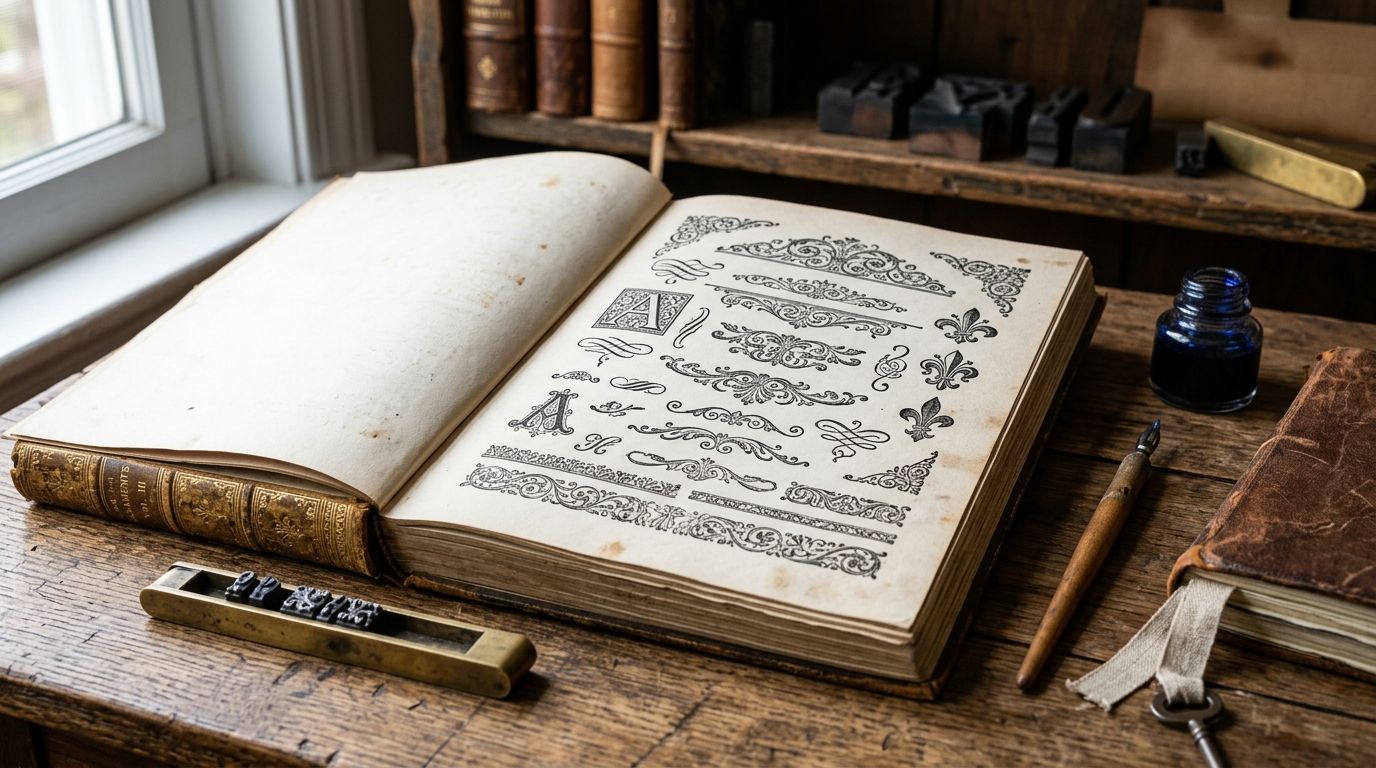
Engraved baroque frames and ornamental borders do the opposite job of an illustration: they don't depict a subject, they dress the label around it. Restored 17th- and 18th-century frame work, scrollwork, and cartouche borders push a package toward apothecary-luxury territory fast, which is why cosmetics, spirits, and gift packaging reach for baroque borders more than any other style on this list.
Baroque borders pros:
- Signals premium pricing without adding another illustrated subject to the label
- Frames a logo or product name instead of competing with it
- Works across print, foil, and embossing techniques
Baroque borders cons:
- Fine detail crowds small labels under 2 inches wide
- Common on a crowded shelf of "heritage" brands, so differentiation depends on which specific border you pick
Best for: cosmetics, spirits, and gift packaging aiming for a premium, engraved feel.
Verdict: Buy for premium tiers; skip on budget or mass-market lines where ornate detail won't survive cheap print stock.
4. Vintage Ephemera: best vintage illustrations for apothecary and nostalgic packaging
Ephemera, ticket stubs, ledger marks, postage stamps, and pharmacy labels, reads as found rather than designed, which is exactly the effect apothecary, candle, and nostalgic gift brands chase. It works best as a supporting texture layer behind a botanical or type-driven main design, not as the lead visual.
Vintage ephemera pros:
- Adds authenticity cues a clean illustration alone can't
- Cheap to apply as a background layer across an entire product line
- Pairs naturally with distressed textures and antique type
Vintage ephemera cons:
- Legibility drops fast at small print sizes
- Too literal a use, like an actual old label, can look like a reproduction gimmick instead of a brand
Best for: apothecary, candle, and nostalgic gift lines layering texture behind a primary illustration.
Verdict: Buy as a supporting layer; wait if it's meant to carry the whole label alone.
5. Distressed Grunge Textures: best vintage illustrations for rustic and farmhouse packaging
Grunge and distress overlays, including cracked ink, foxed paper, and worn stamp texture, do the least design work and the most atmosphere work of anything on this list. Rustic, farmhouse, and small-batch brands drop them over a plain label to age it in seconds.
Distressed grunge textures pros:
- Fastest style to apply, since one overlay layer changes the entire feel of a flat design
- Cheapest route to a vintage look when a full illustration budget isn't there
- Scales down cleanly, unlike detailed engravings
Distressed grunge textures cons:
- Looks dated fast once a category oversaturates on the same effect
- Doesn't carry a brand story the way a specific illustration or border does
Best for: rustic and farmhouse-style brands that need a fast, low-effort vintage cue.
Verdict: Buy for budget-conscious lines; hold if the brand needs a distinct identity beyond "old-looking."
6. Vintage Toile Patterns: best vintage illustrations for textile and soft goods packaging
Toile, repeating pastoral scenes originally printed on 18th-century fabric, works differently from every other style here because it's built to repeat edge-to-edge. Ribbon wrap, fabric pouches, tissue paper, and box liners use it as a full-surface pattern rather than a focal illustration.
Vintage toile patterns pros:
- Repeats seamlessly across fabric, ribbon, and wrap without visible seams
- Reads as textile-grade rather than paper-grade, suited to soft goods packaging specifically
- Works at large scale on box liners and small scale on ribbon with the same file
Vintage toile patterns cons:
- Too busy for primary labels or anywhere small text needs to sit on top
- Narrow use case, mostly textile, gift wrap, and soft packaging, rarely a hero label
Best for: textile, ribbon, and soft goods packaging that needs a full pattern, not a focal image.
Verdict: Buy for soft goods and wrap; skip for hard-good primary labels.
7. Coronet and Crown Illustrations: best vintage illustrations for heritage and royal-themed branding
Restored coronet and crown plates carry the narrowest use case on this list and the strongest single signal: status. A crown mark on a label reads as heritage or royal warrant-adjacent whether or not the brand has any actual history to back it up.
Coronet and crown illustrations pros:
- Immediate, unambiguous signal of prestige
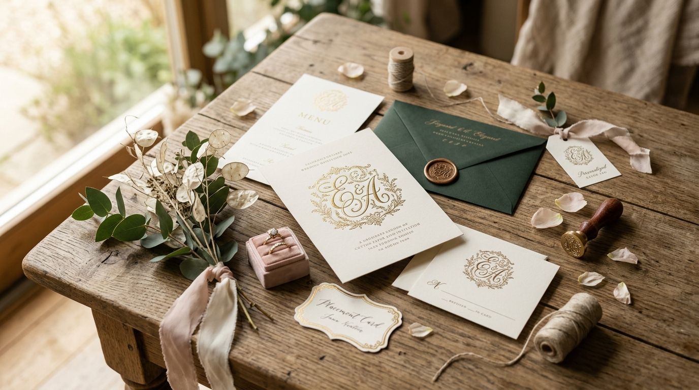
- Works as a small mark, like an embossed seal, or a full illustrated crest
- Pairs well with Victorian display type for stationery and gift packaging
Coronet and crown illustrations cons:
- Only fits heritage, royal-themed, or luxury positioning, wrong on most categories
- Risks looking presumptuous if the brand has no story to support the imagery
Best for: heritage, royal-themed, and luxury gift brands with a story that earns the signal.
Verdict: Buy for the right heritage brand; skip for anything without a status story to tell.
How the ranking works
Every style above gets judged against the same six criteria: license clarity for print runs, restoration resolution, style-to-category fit, variation depth across a full product line, authentic period sourcing, and legibility at small packaging sizes. Botanical illustrations win overall because they clear all six without a narrow category ceiling. Baroque borders and coronet illustrations score high on impact but lose points on category breadth, since they're specialists, not generalists.
Which vintage illustration should you choose?
Default to botanical illustrations if you're unsure — they cover the widest range of packaging categories and rarely clash with existing branding. Move to baroque borders once the product justifies premium pricing, and reach for ephemera or grunge textures when the brand story leans nostalgic or rustic rather than elegant.
Toile patterns and coronet illustrations are the two picks with real ceilings: strong when the category fits, wrong everywhere else. Match the illustration style to what's already true about the product in 2026, not the other way around.
Find your packaging illustration style
Browse over 50,000 restored vintage illustrations, fonts, and patterns for commercial use.
FAQ
What are vintage illustrations used for in packaging design?
Vintage illustrations serve as the primary visual anchor on labels, boxes, and wraps, with botanical plates, ornamental borders, and engraved animals as the three most common picks for packaging in 2026. They replace stock photography or flat vector icons with restored period artwork that signals craft and history.
Are vintage illustrations free to use commercially?
Most vintage illustrations require a commercial license even when the original source artwork is public domain, because the restoration work itself is copyrighted. Check the license terms of any vintage illustration subscription before running a full print job.
What's the best vintage illustration style for food packaging in 2026?
Botanical illustrations are the best vintage illustration style for food packaging in 2026 because they read as ingredient-forward without narrowing the brand to one product category. Restored herbarium and seed-catalog plates are the most common picks.
How is a restored vintage illustration different from public domain clip art?
A restored vintage illustration has been cleaned, repaired, and often re-inked from the original period source, while raw public domain clip art is usually an unedited scan with tears, foxing, and inconsistent contrast. Restoration is what makes an illustration print-ready at packaging resolution.
Do vintage illustrations work for digital-first product packaging?
Yes, vintage illustrations work as well on a product page or app icon as they do on a printed box, provided the file resolution supports both screen and print use. Botanical and animal illustrations translate especially well to digital thumbnails.
What resolution do vintage illustrations need for packaging print runs?
Vintage illustrations used on packaging need at least 300 DPI at final print size to hold fine crosshatch detail through foil stamping or embossing. Anything restored below that resolution loses detail once scaled to a label.
Are AI-generated vintage-style illustrations the same as restored vintage illustrations?
No, AI-generated vintage-style images approximate an old aesthetic without any real period source, while restored vintage illustrations come from actual 18th- and 19th-century engravings, lithographs, or specimen plates. The difference shows up in fine detail and historical accuracy.
How large is Century Library's vintage illustration archive in 2026?
Century Library's archive holds more than 50,000 restored vintage illustrations, fonts, patterns, and textures as of 2026, curated for commercial use in branding, packaging, and stationery projects.
One last thing
Steel-plate engravings, the source material behind most restored botanical and ornamental illustrations, hold fine crosshatch detail at smaller sizes than woodcuts or halftone-era prints do. That's why a 1.5-inch jar label built on a steel engraving still reads clean at arm's length in 2026, while the same detail level from a coarser source turns to mud. Check the source technique before scaling any vintage illustration down to label size, not just the final resolution.