Grunge and decay textures separate a flat vector logo from something that looks like it survived a century in a drawer. Best overall for brand identity work: paper grain and foxing textures. Best for band logos and album art: ink bleed and letterpress impression textures. Best for fast, editorial-ready decay: halftone and newsprint textures. The rest of this guide breaks down seven distressed grunge texture categories inside the Century Library archive, what each one is actually built for, and where it falls short.
- Paper grain and foxing textures win for brand identity and packaging work that needs a real archival feel in 2026.
- Ink bleed and letterpress impression textures are the strongest pick for band logos, album art, and gig posters.
- Halftone decay and newsprint textures give editorial and poster layouts fast, print-ready degradation without overworking the file.
- Every category in Century Library's archive is hand-restored from real 19th and early 20th century source material, not synthetic filters.
- Match texture opacity to 15-30% for text overlays or the grunge reads as dirt instead of design.
Why this matters
Most "grunge pack" downloads online are the same three or four Photoshop brush sets recycled since roughly 2012, run through a filter and resold. Designers who use them end up producing work that all looks the same, because it is the same file.
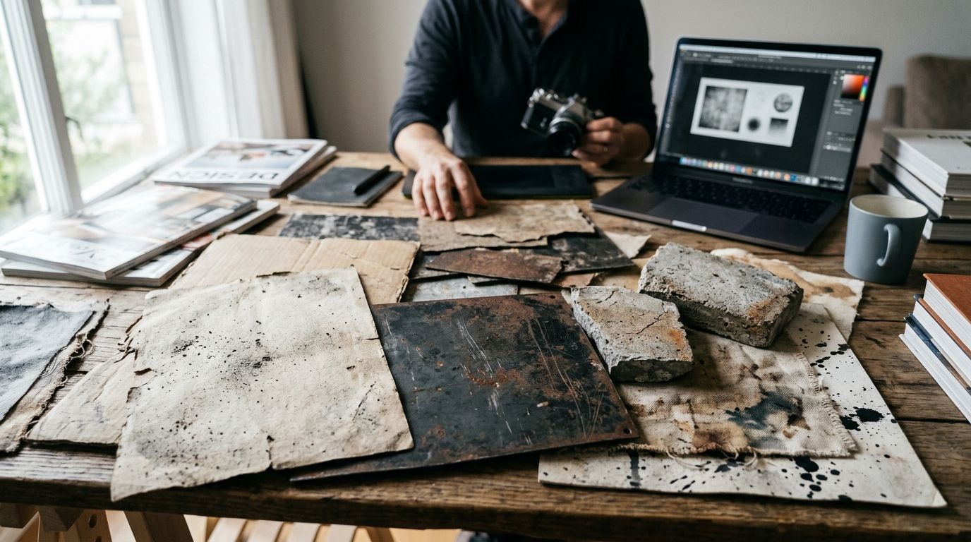
A distressed grunge texture pulled from an actual scanned surface, foxed paper, cracked emulsion, ink bleed from a real press, carries irregularities no filter replicates convincingly. That's the difference between a design that reads as "vintage-inspired" and one that reads as authentic. Century Library restores its texture plates from physical ephemera, so no two grain patterns repeat the way a stock brush does.
The stakes are practical, too. Packaging clients, wedding stationers, and band merch buyers in 2026 can tell the difference between a lazy overlay and a textured surface with real tonal depth, even if they can't name why one design feels cheap and the other doesn't.
What makes the best distressed grunge textures
- Authentic source material — scanned from real paper, ink, or film, not generated or filtered synthetically
- Print-ready resolution — tiles or full-bleed files at 300 dpi or higher so the grain survives large-format printing
- Layering flexibility — transparent PNG or TIFF masks that sit over type and imagery without flattening the design
- Tonal range — a spread from light bloom and subtle grain to heavy decay, so one category covers multiple project stages
- Commercial licensing clarity — plain terms for packaging, merch, and branding use, not vague "personal use only" fine print
- File format options — vector-friendly outlines alongside raster textures for scaling across print and digital
Distressed grunge textures at a glance
| Category | Best for | Standout feature | Key limitation |
|---|---|---|---|
| Paper grain & foxing | Brand identity & stationery | Real age-spotting, no repeat pattern | Too subtle for high-contrast poster work |
| Ink bleed & letterpress impression | Band logos & album art | Genuine press-plate depth and bleed | Can muddy fine type below 10pt |
| Halftone decay & newsprint | Editorial & poster design | Fast, print-ready degradation | Reads flat without a base photo or illustration |
| Torn edge & deckle border | Wedding invitations & stationery | Soft, tactile edge with no digital crispness | Limited use outside frame/border applications |
| Dust, scratch & film grain | Social & video overlays | Motion-friendly, works as looping layer | Weakest option for static print packaging |
| Water stain & mildew bloom | Packaging & label design | High-contrast decay reads at small sizes | Overpowering if layered above 40% opacity |
| Cracked ink & peeling paint | Streetwear & gig posters | Heaviest decay in the archive | Too aggressive for corporate or editorial use |
1. Paper grain & foxing textures: best for brand identity work
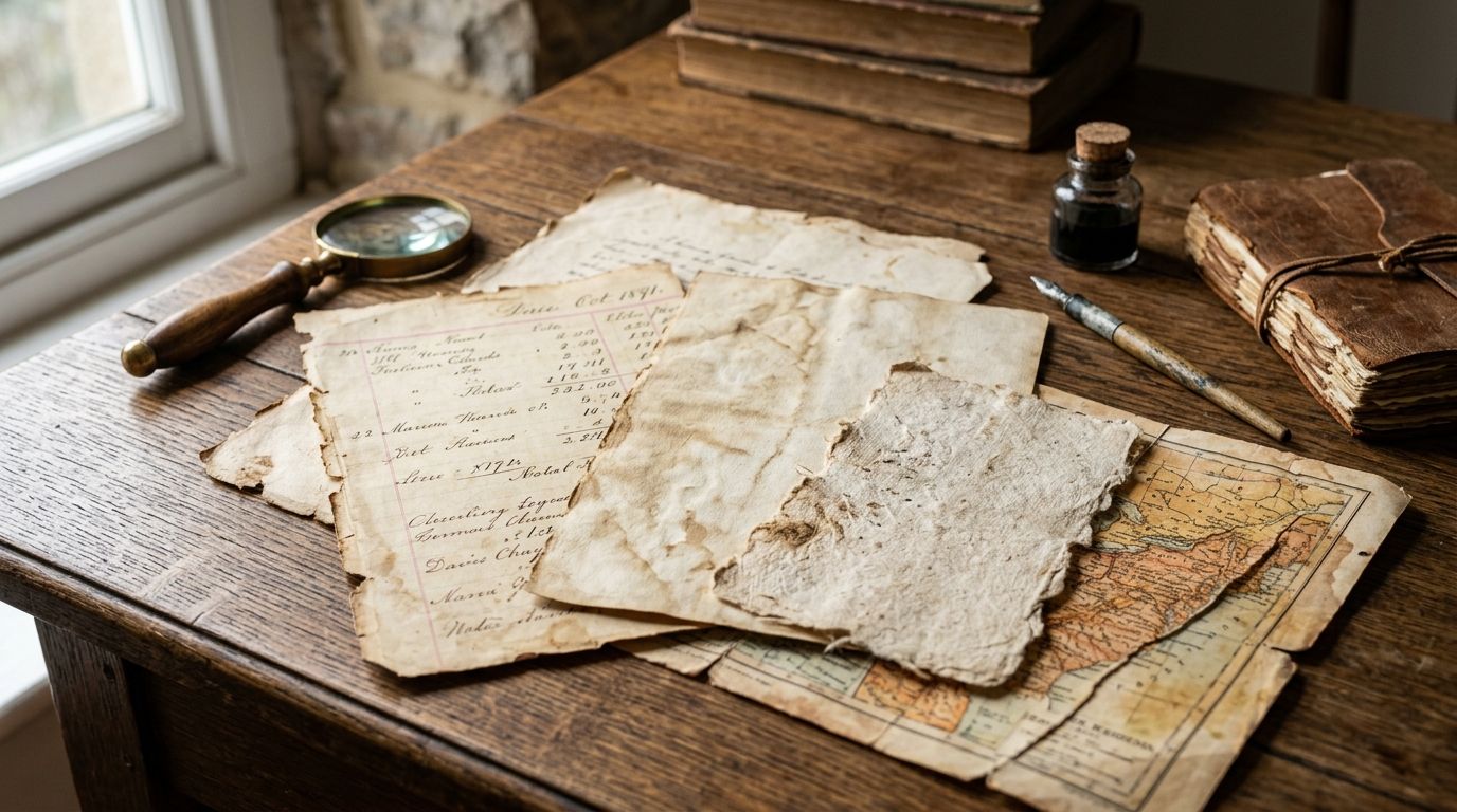
These are scans of aged, foxed paper stock, the brown-spotted discoloration that shows up on documents left untreated for decades. Used at low opacity behind a logo or wordmark, foxing textures give a brand system quiet age without shouting "vintage theme."
Designers pulling reference for botanical or naturalist branding often pair these grain files with the illustrations covered in Century Library's guide to vintage botanical illustrations for brand identity, since both share the same restoration approach.
Paper grain & foxing pros:
- Reads as subtle and premium rather than costume-like
- Works across packaging, stationery, and digital brand assets
- Tiles cleanly at large sizes without visible seams
Paper grain & foxing cons:
- Too understated for projects that need visible decay
- Loses effect entirely if scaled down below business-card size
Verdict: Buy. This is the default starting texture for any brand identity project needing archival warmth in 2026.
2. Ink bleed & letterpress impression textures: best for band logos and album art
Letterpress leaves a physical dent in the paper along with slight ink spread at the edges. That combination is nearly impossible to fake convincingly with a filter, and it's exactly what gives metal, punk, and folk album art its weight.
Ink bleed & letterpress pros:
- Genuine press-plate depth, not a drop shadow trick
- Pairs naturally with blackletter and gothic display type
- Holds up at merch print sizes (shirts, patches, vinyl sleeves)
Ink bleed & letterpress cons:
- Bleed can blur fine type below 10pt
- Heavier files need careful masking to avoid muddying illustration detail
Verdict: Buy. Pair it with blackletter or gothic type covered in Century Library's best gothic fonts for band logos and album art guide for a matched set.
3. Halftone decay & newsprint textures: best for editorial and poster design
Halftone dot patterns that have degraded, missing dots, ink spread, uneven registration, mimic the look of a newspaper photo reprinted one generation too many. It's the fastest way to age a modern photo or illustration for editorial spreads.
Halftone decay pros:
- Fast to apply, works as a single overlay layer
- Reads correctly at both poster scale and thumbnail scale
- Strong contrast makes it legible even in black-and-white print
Halftone decay cons:
- Needs a base image or illustration underneath; looks flat alone
- Overuse across a full layout can feel like a filter rather than a design choice
Verdict: Buy. The strongest pick when a deadline is tight and the project needs decay applied in one pass.
4. Torn edge & deckle border textures: best for wedding invitations
Deckle edges, the soft, irregular border left by handmade paper, signal craft and permanence in a way a clean digital edge never will. Stationers use these torn-edge scans as frame elements around invitation copy or monogram work.
Torn edge & deckle border pros:
- Immediate tactile, handmade feel without extra design work
- Works as both a full-bleed edge treatment and a small accent frame
- Complements calligraphy-style invitation type well
Torn edge & deckle border cons:
- Narrow use case outside stationery and border framing
- Not suited to logos or anything needing a hard, defined edge
Verdict: Buy. Check Century Library's best calligraphy fonts for wedding invitations guide for type pairings that match the same restoration aesthetic.
5. Dust, scratch & film grain textures: best for social and video overlays
Scratches, dust specks, and grain lifted from degraded film stock give motion content an analog, lo-fi look. These loop cleanly as video overlays, which makes them one of the few categories built for motion rather than static print.
Dust, scratch & film grain pros:
- Loops without visible seams for reels and short-form video
- Adds texture to otherwise flat digital-only content
- Layers well over both photo and illustration
Dust, scratch & film grain cons:
- The weakest choice for static packaging or label print
- Motion use requires video-editing software, not a design tool alone
Verdict: Hold. Only worth adding to a working library if the project actually involves video or animated social content.
6. Water stain & mildew bloom textures: best for packaging and label design
Water stains and mildew bloom read as high-contrast decay even at small package label sizes, where subtler paper grain would disappear entirely. That contrast makes this category the strongest for shelf-scale packaging work.
Water stain & mildew bloom pros:
- Visible and legible even at small label sizes
- Distinct from paper grain, gives packaging a different age signature
- Pairs well with slab serif type for a heritage-brand feel
Water stain & mildew bloom cons:
- Overpowering above roughly 40% opacity
- Wrong tone for anything needing a clean, modern shelf presence
Verdict: Buy. Combine it with the slab serif options in Century Library's best slab serif fonts for packaging design guide.
7. Cracked ink & peeling paint textures: best for streetwear and gig posters
This is the heaviest decay category in the archive, cracked ink surfaces and flaking paint scans built for designs that want to look weathered by years of outdoor exposure, not just aged.
Cracked ink & peeling paint pros:
- Maximum decay for projects that call for it
- Strong on dark or heavily saturated backgrounds
- Distinct texture profile from every other category on this list
Cracked ink & peeling paint cons:
- Too aggressive for corporate, editorial, or wedding work
- Can overwhelm fine illustration detail underneath
Verdict: Hold. Reach for it only when the brief specifically calls for heavy weathering, gig posters, streetwear drops, distressed merch.
“If a grunge texture reads as a filter instead of a surface, it's the wrong texture for the job.”
How we ranked
Each category was measured against the six criteria above: source authenticity, print resolution, layering flexibility, licensing clarity, tonal range, and file format options. Categories with real archival scans and clean commercial licensing terms rank above anything that reads as filter-generated, regardless of how popular the effect looks in a mockup.
Which distressed grunge textures should you choose?
For a first purchase into a working texture library in 2026, paper grain and foxing textures are the safest, most versatile pick, they apply across brand identity, packaging, and stationery without overpowering a layout. Add ink bleed and letterpress textures next if band, merch, or album art is part of the workload, and reach for halftone decay when editorial deadlines are tight.
Browse the restored texture archive
Hand-restored grunge, paper grain, and ephemera inside Century Library.
FAQ
What are distressed grunge textures used for in graphic design?
Distressed grunge textures add age, wear, or print decay to logos, packaging, posters, and album art. Designers layer them over clean type or illustration to give 2026 projects a hand-made or archival feel instead of a flat digital look.
Are grunge textures royalty-free for commercial use?
Licensing terms vary by source, so check the specific commercial license before using a texture in a client project. Century Library's archive is licensed for commercial work including branding, packaging, and stationery.
What's the difference between halftone decay and film grain textures?
Halftone decay mimics degraded newspaper dot patterns and is built for static print like posters and editorial layouts. Film grain comes from scratched or dusty film stock and loops cleanly, making it better suited to video and social overlays.
Do grunge textures work for wedding invitations?
Torn edge and deckle border textures work well for wedding invitations because they add a handmade paper feel without heavy decay. Heavier categories like cracked ink or peeling paint are too aggressive for stationery work.
How do I layer grunge textures without making a design look muddy?
Keep opacity between 15% and 30% for text overlays, and reserve higher opacity for background-only applications. Heavier textures like water stain or mildew bloom lose legibility above roughly 40% opacity.
What file format is best for distressed textures?
PNG or TIFF files with transparency give the most flexibility for layering over type and imagery. Flat JPEG textures work for full-bleed backgrounds but limit how the texture can interact with other layout elements.
Is AI-generated grunge texture as good as scanned vintage textures?
AI-generated textures tend to repeat patterns and lack the irregular flaws found in real aged paper, ink, or film. Scanned textures from actual historical material carry authentic imperfections that are difficult to replicate synthetically.
How much does access to a grunge texture archive cost in 2026?
Pricing and subscription terms vary by provider and change over time, so check current options directly on the site before committing. Compare what's included, resolution, licensing terms, and file formats, before comparing cost alone.
One last thing
The texture category designers underuse most is water stain and mildew bloom, not because it looks bad, but because it reads as "too much" in a thumbnail preview. At actual packaging or label scale, that same high contrast is exactly what makes the decay legible instead of invisible. Test any grunge texture at its real output size before judging it on a screen preview.