Vintage botanical illustrations solve a specific brand identity problem: they signal history, craft, and a hand that actually touched the work. Six styles in the archive cover nearly every use case a brand builder runs into in 2026, and this guide ranks them by where each one earns its place rather than which one photographs best on a moodboard.
- Victorian herbarium plates rank best overall for vintage botanical illustrations in 2026 brand identity work.
- Hand-tinted floral lithographs win for wedding invitations and stationery brands needing color depth.
- Botanical line engravings suit editorial and publishing identities that need restraint over decoration.
- Art Nouveau botanical illustrations fit beauty and personal-care packaging chasing a decorative, sinuous line.
- Antique seed catalog illustrations work for food and farm-to-table brands needing bold, print-ready color.
Why this matters
Stock libraries have filled up with AI-generated "vintage-style" florals since 2024, and by 2026 most of it looks close enough to fool a fast scroll but not close enough to survive a print run. A restored 19th-century plate carries paper grain, ink bleed, and slightly uneven linework that no generator has learned to fake convincingly — and designers building brand identity systems notice the difference the moment a mark gets scaled onto packaging or embossed on a card.
The Century Library archive sources every botanical illustration from an original historical plate, not a synthetic approximation, which matters more for brand work than for a one-off social post. A logo or packaging system built on borrowed authenticity ages badly once a client notices the plate looks generated rather than found.
Best overall: Victorian herbarium plates. Best for wedding invitations and stationery: hand-tinted floral lithographs. Best for editorial identities: botanical line engravings. The remaining three styles fill narrower but real gaps — beauty packaging, food branding, and outdoor/lifestyle marks.
What makes the best vintage botanical illustrations for brand identity
- Source authenticity — scanned from an original 19th-century plate, not synthesized
- Restoration quality — clean, high-resolution scans with accurate color, not muddy reprints
- Licensing clarity — clear commercial-use terms for branding and packaging, not ambiguous stock terms
- Print scalability — linework and color that hold up at both business-card and billboard scale
- Typographic cohesion — pairs cleanly with the rest of a brand system instead of fighting the logotype
- Format range — line art, full color, and texture variants for different production needs
Vintage botanical illustrations at a glance
| Style | Best for | Standout feature | Key limitation |
|---|---|---|---|
| Victorian herbarium plates | Minimalist apothecary & wellness brands | Pressed-specimen detail with visible paper grain | Limited color range — mostly sepia and ink |
| Hand-tinted floral lithographs | Wedding invitations & stationery brands | Rich, layered color from hand-applied tint | Busier compositions need careful cropping |
| Botanical line engravings | Editorial & publishing identities | Fine crosshatch linework that scales down cleanly | Reads academic if overused across a system |
| Art Nouveau botanical illustrations | Beauty & personal-care packaging | Sinuous, decorative line suited to labels | Strong style can clash with modern sans logotypes |
| Antique seed catalog illustrations | Food, farm & agricultural brands | Bold, saturated color built for print reproduction | Original plates often include price/type text to crop |
| Vintage wildflower field-guide illustrations | Outdoor, garden & lifestyle brands | Loose, naturalistic rendering with handwritten labels | Some original source plates are lower resolution |
1. Victorian herbarium plates: best vintage botanical illustrations for apothecary and wellness brands
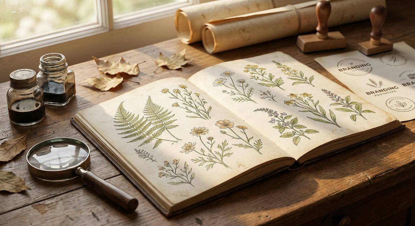
Herbarium plates are pressed-specimen studies, mostly sepia and ink, made to document a plant rather than decorate a page. That restraint is exactly why they work for skincare, tea, and apothecary brands that want history without ornament.
Victorian herbarium plates pros:
- Neutral palette drops into almost any brand color system
- Visible paper texture reads as authentic on packaging and labels
- Simple compositions scale down to a bottle label without losing detail
Victorian herbarium plates cons:
- Limited color means the style can look flat on its own without a strong secondary palette
- Some plates carry age spotting that needs cropping around
Best for: wellness, skincare, and apothecary brand identities. Verdict: Buy — the most versatile starting point in the archive for a 2026 brand system.
2. Hand-tinted floral lithographs: best vintage botanical illustrations for wedding invitations and stationery
These plates start as line engravings, then get hand-tinted with layered watercolor washes, which gives them a depth flat prints can't match. Stationery and wedding invitation brands lean on this style because the color feels applied by hand rather than printed by a press.
Hand-tinted floral lithographs pros:
- Color depth photographs well on foil, letterpress, and embossed stock
- Feels bespoke, which matters for wedding and event branding
- Pairs naturally with a calligraphy font built for wedding invitations
Hand-tinted floral lithographs cons:
- Busier florals crowd a small business card if not cropped tightly
- Not ideal for brands wanting a stripped-down, minimal mark
Best for: wedding, event, and stationery brand identities. Verdict: Buy — the strongest pairing on this list between illustration and typeface.
3. Botanical line engravings: best vintage botanical illustrations for editorial and publishing identities
Line engravings use fine crosshatching instead of color to build form, which is exactly the restraint editorial and publishing brands need. A masthead or imprint mark built on this style holds up in black-and-white print runs where color plates fall apart.
Botanical line engravings pros:
- Crosshatch detail scales down cleanly to a spine or masthead
- Reads as literary and credible without extra styling
- Pairs well with a serif font built for editorial design
Botanical line engravings cons:
- Can look academic or dated if the rest of the brand system is too modern
- Needs a bold typeface counterweight or the mark disappears
Best for: publishing, editorial, and literary brand identities. Verdict: Buy for print-heavy brands; Skip for brands leaning purely digital.
4. Art Nouveau botanical illustrations: best vintage botanical illustrations for beauty and personal-care packaging
Art Nouveau botanical work uses the sinuous, whiplash line that defined turn-of-the-century decorative art, built for labels and packaging rather than plain documentation. Beauty and personal-care brands use it to signal craft over clinical.
Art Nouveau botanical illustrations pros:
- Decorative line adds visual interest to otherwise plain packaging
- Strong sense of movement suits fragrance and cosmetics labels
- Works well as a repeating pattern on secondary packaging
Art Nouveau botanical illustrations cons:
- The ornate line can clash with a clean, modern sans-serif logotype
- Harder to scale down to a favicon or app icon without losing detail
Best for: beauty, fragrance, and personal-care brand identities. Verdict: Hold — strong fit for packaging, weaker fit for a primary logo mark.
5. Antique seed catalog illustrations: best vintage botanical illustrations for food and farm-to-table brands
Seed catalog plates were built for print reproduction from the start, which means bold outlines and saturated color that survive a fast production run. Food, farm, and agricultural brands use them because the style already reads as "grown," not manufactured.
Antique seed catalog illustrations pros:
- Bold color holds up on labels, cans, and cartons at small sizes
- Reads as farm-sourced and seasonal without extra styling
- Original plates often include multiple varieties in one composition
Antique seed catalog illustrations cons:
- Source plates sometimes include price or catalog text that needs cropping out
- Style skews rustic — a poor fit for premium or minimalist food brands
Best for: farm-to-table, agricultural, and grocery brand identities. Verdict: Buy for rustic and seasonal branding; Skip for premium minimalist food brands.
6. Vintage wildflower field-guide illustrations: best vintage botanical illustrations for outdoor and lifestyle brands
Field-guide plates were drawn to be identified in the wild, so they carry loose, naturalistic rendering and sometimes handwritten specimen labels. Outdoor and garden brands use that looseness to feel less corporate than a photographed product shot.
Vintage wildflower field-guide illustrations pros:
- Naturalistic linework feels less staged than modern outdoor photography
- Handwritten labels add authenticity to trail, garden, and outdoor branding
- Works well as a background texture, not just a standalone mark
Vintage wildflower field-guide illustrations cons:
- Some original source plates scan at lower resolution than later engravings
- Loose linework doesn't compress well to a tiny app icon
Best for: outdoor, garden, and lifestyle brand identities. Verdict: Hold — solid for texture and background use, weaker as a standalone primary mark.
How this ranking works
Each style is scored against the six criteria above: source authenticity, restoration quality, licensing clarity, print scalability, typographic cohesion, and format range. Herbarium plates and floral lithographs rank highest because they cross the most use cases without a strong style clash; seed catalog and field-guide illustrations rank lower because they carry more source-plate quirks that need cleanup before use.
“A plate restored from an original 19th-century source carries paper grain and ink bleed that no image generator has learned to fake.”
Which vintage botanical illustration style should you choose?
Start with Victorian herbarium plates if you're unsure — the sepia palette drops into almost any brand system built in 2026 without fighting a logotype. Move to hand-tinted floral lithographs the moment the project is stationery or wedding-adjacent, and reach for botanical line engravings anytime the brand needs to survive a black-and-white print run.
Browse the botanical illustration archive
50,000+ restored vintage illustrations, fonts and patterns for commercial brand work.
FAQ
What are the best vintage botanical illustrations for brand identity in 2026?
Victorian herbarium plates rank best overall for 2026 brand identity work, with hand-tinted floral lithographs leading for wedding and stationery brands and botanical line engravings leading for editorial identities.
Are vintage botanical illustrations better than AI-generated florals for branding?
Restored historical plates carry paper grain, ink bleed, and uneven linework that signal genuine age, which AI-generated florals still approximate rather than reproduce in 2026.
Which vintage botanical style works best for packaging design?
Art Nouveau botanical illustrations and antique seed catalog illustrations both work well for packaging, with Art Nouveau suited to beauty and fragrance and seed catalog plates suited to food and farm brands.
Can vintage botanical illustrations be used commercially?
Yes, as long as the source carries clear commercial licensing terms — check the licensing terms on the specific archive before using a plate in a brand identity project.
What's the difference between a botanical engraving and a lithograph?
An engraving builds form through fine crosshatched linework, while a lithograph is typically hand-tinted with color washes layered over a printed base, giving it more depth.
Do vintage botanical illustrations work for digital-first brands?
Line engravings and herbarium plates scale down cleanly for app icons and favicons, while ornate Art Nouveau or loose field-guide illustrations lose detail at small digital sizes.
How do I pair a vintage botanical illustration with a typeface?
Match the illustration's density to the typeface weight — a fine-line engraving pairs with a light serif, while a bold seed-catalog plate needs a heavier typeface to avoid getting overpowered.
One last thing
None of the six styles ranked here are AI-generated — every botanical plate is scanned from an original historical source and restored by hand, which is the detail most brand builders check for last and regret not checking first. The seed catalog and field-guide styles look the most "vintage botanical illustration" at a glance, but they're also the two most likely to need cropping around original catalog text or a low-resolution scan before they're production-ready in 2026.