Best overall for packaging design: Acanthus Scroll Borders. Best for wine, spirits and label centerpieces: Cartouche Frame Borders. Best for minimalist premium accents: Ornamental Rule Borders. Six hand-restored baroque border styles from the Century Library archive, ranked by which packaging job each one actually solves in 2026.
- Acanthus Scroll Borders win overall for rigid gift box packaging in 2026 - dense, corner-anchored, structural.
- Cartouche Frame Borders are the pick for wine, spirits and any label needing a center medallion for a crest or wordmark.
- Ornamental Rule Borders are the only style built for small-format labels and foil stamping without detail loss.
- All six baroque borders for packaging come hand-restored from 17th-18th century source material, zero AI-generated linework.
- Rocaille Foliate Borders soften baroque's symmetry for confectionery and bakery boxes that need warmth over formality.
Why this matters
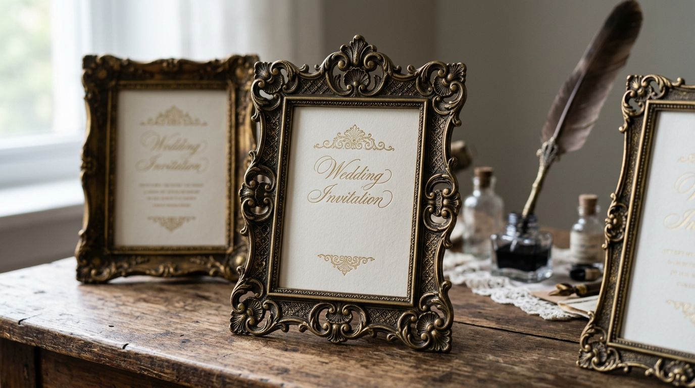
Baroque ornament survived four centuries because it does one thing packaging design still needs in 2026: it signals weight and history without a single word of copy. A cartouche or an acanthus scroll tells a shopper "this brand has been around" even when the brand launched last year.
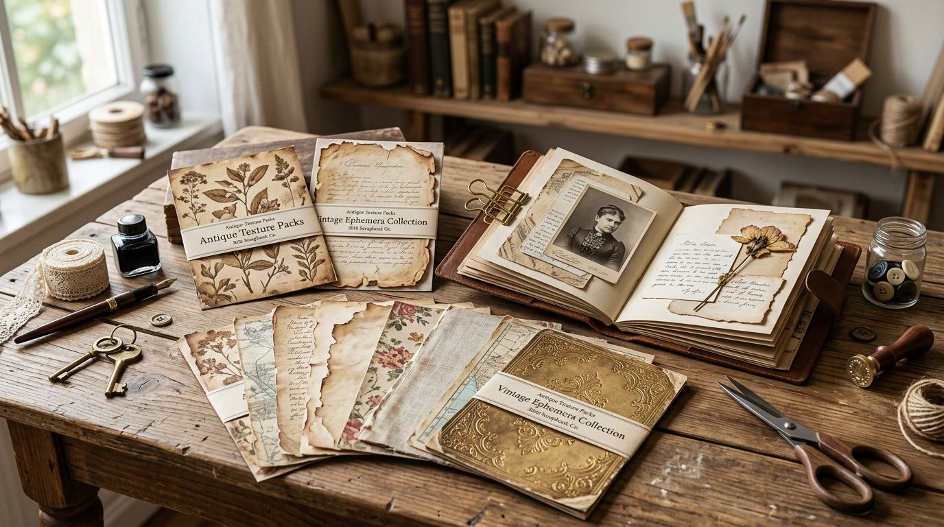
The problem is that most "vintage border" downloads online are low-res scans or AI-smoothed reproductions that fall apart the moment a print shop tries to scale them onto a die line. Century Library restores its border plates from real 17th and 18th century engravings and specimen books, which is the difference between a border that dies at 300 DPI and one that holds a clean edge on foil stamping.
This guide ranks six baroque border categories in the archive by packaging use case, not by which one "looks best" in isolation.
What makes the best baroque borders for packaging design
- Line weight consistency - packaging print (offset, foil, embossing) punishes inconsistent stroke widths more than screen design does
- Corner and edge behavior - a border has to resolve cleanly at box corners, not just repeat as a flat strip
- Restoration fidelity - hand-cleaned from an original engraving, not an AI upscale that invents detail
- Scalability - works from a 1-inch spice tin down or a 12-inch shipping box up without re-drawing
- Commercial licensing clarity - usable on a product you sell, not just a mockup or a mood board
- Historical accuracy of motif - acanthus, strapwork, cartouche and rocaille are distinct baroque vocabularies, and mixing them without knowing the difference reads as costume-party baroque instead of considered design
Baroque borders for packaging at a glance
| Border style | Best for | Standout feature | Key limitation |
|---|---|---|---|
| Acanthus Scroll Borders | Rigid gift box packaging | Corner-anchored scrollwork holds structure at scale | Too dense for anything under 3 inches |
| Cartouche Frame Borders | Wine, spirits & label centerpieces | Built-in medallion frame for a crest or wordmark | Needs a centered layout, doesn't work as a repeating strip |
| Strapwork Panel Borders | Tea tins & apothecary packaging | Geometric interlace reads clean at small scale | Feels cold on anything meant to look handmade |
| Rocaille Foliate Borders | Confectionery & bakery boxes | Asymmetric shell-and-leaf softens formal baroque | Asymmetry means no simple mirror-and-repeat |
| Engraved Plate Borders | Cosmetics & skincare packaging | Fine hatching gives a monochrome, etched look | Loses detail in single-color spot printing below fine line screens |
| Ornamental Rule Borders | Minimalist packaging accents | Single-line weight survives foil and emboss | Too plain to carry a design on its own |
1. Acanthus Scroll Borders: best baroque border for rigid gift box packaging
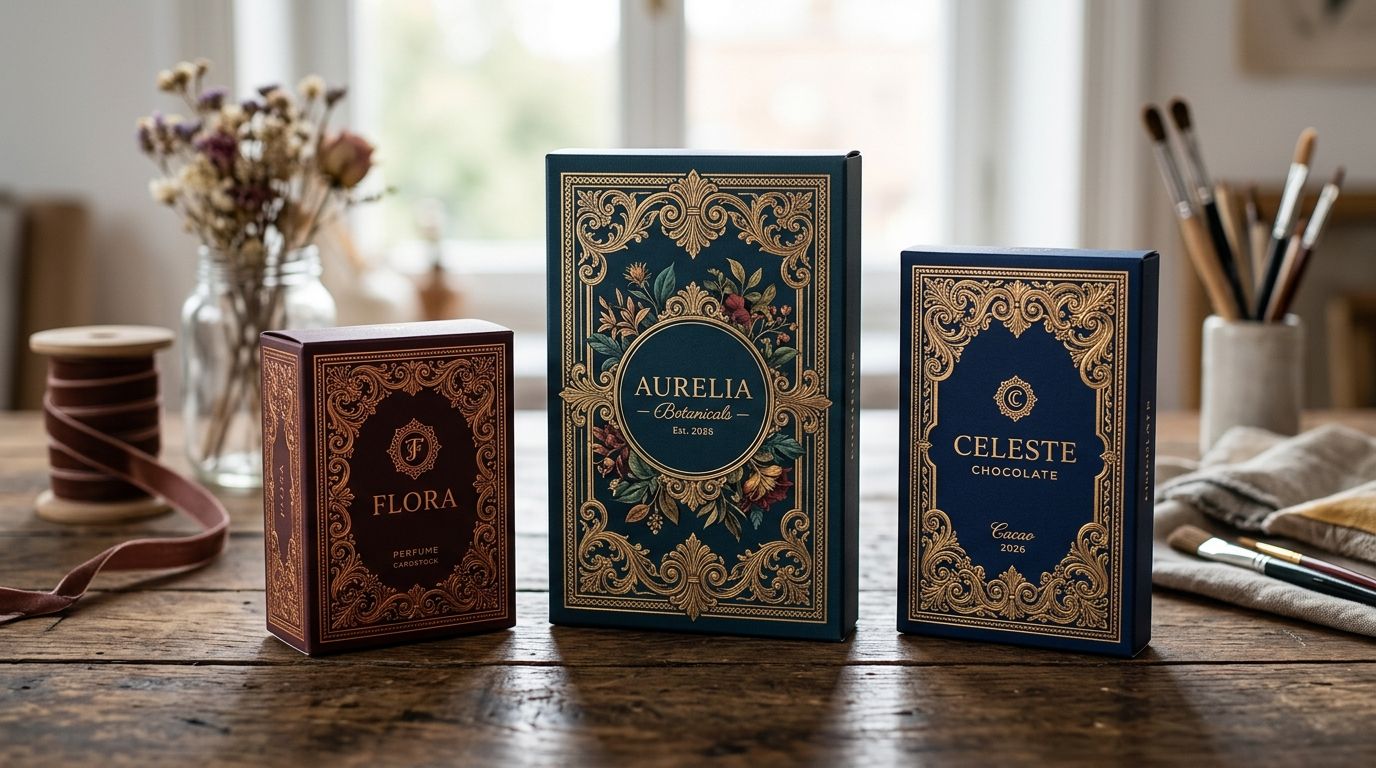
Acanthus Scroll Borders pull from the leaf-and-scroll ornament that anchored baroque architecture and bookplates through the 1600s and 1700s. Each corner carries a full scroll rather than a cropped repeat, which is what makes this style read as structural instead of decorative filler.
Acanthus Scroll Borders pros:
- Corner motifs resolve cleanly, no stretching or awkward cropping at box edges
- Dense enough to carry a plain kraft or matte box without additional graphics
- Restored at high enough resolution to hold detail on a 12-inch shipping box
- Reads as premium/heritage without needing supporting copy
Acanthus Scroll Borders cons:
- Too dense for packaging under 3 inches - detail collapses into a smudge
- Not a repeating pattern, so layout has to be planned around the four corners rather than dropped in
Best for: rigid gift boxes, candle packaging, anything with real surface area to work with. Verdict: Buy.
2. Cartouche Frame Borders: best baroque border for wine, spirits & label centerpieces
A cartouche is a framed ornamental panel, usually oval or shield-shaped, designed to hold a crest, initials or a short line of text. This is the border baroque mapmakers and engravers used to sign their plates, and it translates directly onto a wine label or spirits bottle where the brand name needs a formal frame.
Cartouche Frame Borders pros:
- Built-in center space means no fighting the border for room to place a wordmark
- Reads as established and formal, which suits alcohol, fragrance and heritage food packaging
- Available in multiple density levels within the archive, from ornate to restrained
Cartouche Frame Borders cons:
- Doesn't repeat as a strip border, so it's a centerpiece decision, not a strip decision
- Ornate versions can overpower a small label if the brand name is long
Best for: wine and spirits labels, fragrance packaging, formal single-focal-point designs. Verdict: Buy.
3. Strapwork Panel Borders: best baroque border for tea tins & apothecary packaging
Strapwork borders use interlocking geometric bands rather than organic foliage - think of it as baroque ornament's more disciplined cousin. It comes from the same 17th century engraving tradition but reads more architectural than botanical.
Strapwork Panel Borders pros:
- Geometric repeat holds up cleanly at small scale, tins and apothecary bottles included
- Pairs well with restrained serif type for a pharmacy-label or spice-tin aesthetic
- Consistent line weight makes it forgiving for foil and letterpress
Strapwork Panel Borders cons:
- Reads cold or clinical if the brand wants a warmer, handmade feel
- Less visually distinctive than acanthus or cartouche styles at a glance
Best for: tea tins, apothecary bottles, spice packaging, anything wanting order over ornament. Verdict: Buy.
4. Rocaille Foliate Borders: best baroque border for confectionery & bakery boxes
Rocaille sits at the hinge between late baroque and early rococo - shell forms, asymmetric leaf clusters, a softer hand than acanthus scrollwork. For confectionery and bakery packaging, that asymmetry reads as warmth rather than formality.
Rocaille Foliate Borders pros:
- Softer, more playful than strict baroque symmetry - suits sweets, pastry and gift confectionery
- Works well as an accent rather than a full frame, so it doesn't demand a large surface
- Restored with enough tonal range to work in single-color or full duotone print
Rocaille Foliate Borders cons:
- Asymmetric layout means it can't be mirrored corner-to-corner like a formal border
- Less "authoritative" feeling than acanthus or cartouche, which matters for heritage-brand positioning
Best for: confectionery boxes, bakery packaging, gift wrap accents. Verdict: Buy.
5. Engraved Plate Borders: best baroque border for cosmetics & skincare packaging
These borders come straight off fine engraving plates - dense hatching, cross-hatched shading, the kind of linework that gave baroque book illustration its etched, almost silver look. On cosmetics and skincare packaging, that monochrome precision reads clinical-luxury rather than antique-fussy.
Engraved Plate Borders pros:
- Fine hatching gives a genuinely etched, non-digital look that's hard to fake with vector tools
- Monochrome by nature, so it drops cleanly into single-color spot printing
- Distinct from the more common foliate baroque styles, useful for standing out on a crowded skincare shelf
Engraved Plate Borders cons:
- Fine hatching needs a high enough line screen in print or it muddies into gray
- Not the right register for a warm, artisanal brand voice - reads formal and technical
Best for: skincare, cosmetics, fragrance packaging with a clinical or apothecary angle. Verdict: Buy.
6. Ornamental Rule Borders: best baroque border for minimalist packaging accents
Ornamental Rule Borders strip baroque down to a single filigree line - a thin, continuous motif instead of a full ornamental frame. It's the style most likely to survive foil stamping and embossing without losing detail, because there's simply less detail to lose.
Ornamental Rule Borders pros:
- Single-weight line holds up under foil stamp and emboss where denser styles blur
- Works at small format - labels, cards, spice jar lids
- Reads as "heritage detail" without dominating the packaging
Ornamental Rule Borders cons:
- Too plain to carry a design alone - needs supporting typography or illustration
- Can read as an afterthought if placed without intention
Best for: small-format labels, minimalist premium packaging, foil-stamped accents. Verdict: Buy for this specific use case, skip if you need a full frame.
How we ranked
Each baroque border style is ranked against the six criteria above, weighted toward line weight consistency and restoration fidelity, since those two determine whether a border survives real packaging print production in 2026 rather than just looking good on a screen. No style was scored against the others as a generic "best baroque border" - each earns its slot by solving a distinct packaging problem.
Browse the baroque border archive
50,000+ hand-restored illustrations, fonts and patterns for commercial packaging work.
Which baroque border style should you choose?
If you only need one baroque border for packaging design in 2026, Acanthus Scroll Borders is the default - dense enough to carry a box on its own, historically accurate, and restored to hold detail at real print scale. Go with Cartouche Frame Borders the moment your layout needs a defined center for a crest or wordmark, especially on wine and spirits. And if the packaging is small-format or foil-stamped, skip the dense styles entirely and use Ornamental Rule Borders - they're the only category in this list built for that constraint.
A baroque border pulled from a genuinely restored 17th or 18th century plate, rather than an AI-smoothed reproduction, still looks like the strongest packaging signal you can add without writing a single word of copy.
FAQ
What is a baroque border in graphic design?
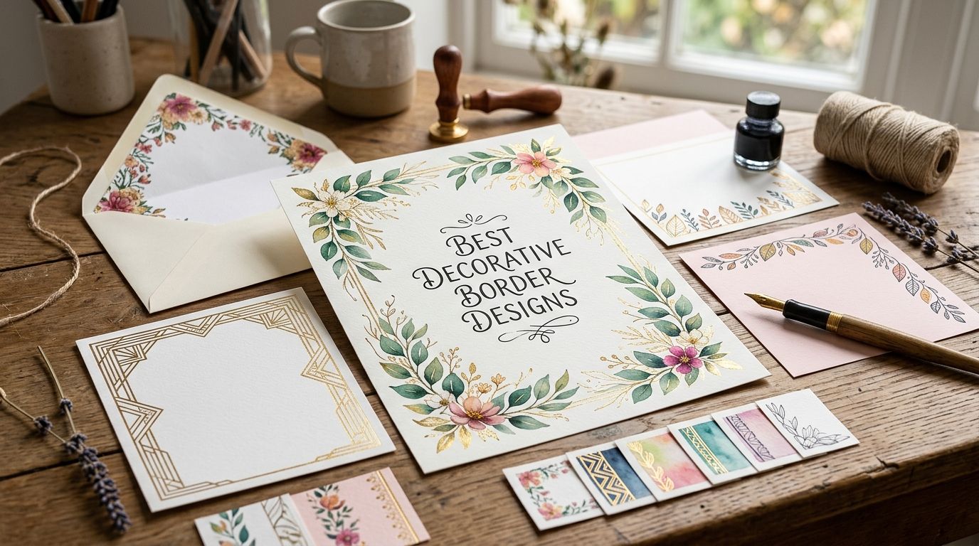
A baroque border is an ornamental frame or edge motif drawn from 17th and 18th century European engraving traditions - acanthus scrolls, strapwork, cartouches and rocaille shell forms are the main baroque border families. Designers use them on packaging, invitations and branding to add historical weight without extra copy.
What's the difference between baroque and rococo border styles?
Baroque borders lean symmetrical and heavy - acanthus scrolls, strapwork panels, formal cartouches. Rococo and rocaille borders that followed are asymmetric and lighter, built from shell and leaf clusters rather than strict repeats.
Are baroque borders for packaging design royalty-free?
Licensing depends on the source - restored archives sold through a subscription typically grant commercial use rights, while free scan repositories often carry unclear or public-domain-adjacent terms that don't cover resale packaging. Check the specific license before printing.
Do I need to vectorize baroque borders before using them on packaging?
For die-cut edges or foil stamping, yes - a raster scan needs vector conversion to hold a clean cut line. Hand-restored archive files that already separate line work from paper texture make that conversion faster.
Which baroque border style works best for premium retail packaging?
Acanthus Scroll Borders and Cartouche Frame Borders both read as premium, but acanthus suits a full-box treatment while cartouche suits a labeled centerpiece like a bottle or jar.
Can baroque borders be used on food and beverage packaging?
Yes - Rocaille Foliate Borders suit confectionery and bakery boxes, while Cartouche Frame Borders are the standard choice for wine and spirits labels needing a formal center panel.
Where can I find hand-restored baroque borders with commercial licensing?
Century Library curates baroque borders alongside 50,000+ other restored vintage illustrations, fonts and patterns, sourced from real historical plates rather than AI-generated imagery.
Do baroque borders work on small-format packaging like labels?
Only the lighter styles - Ornamental Rule Borders and Strapwork Panel Borders hold detail at small scale, while dense acanthus or engraved plate styles need at least 3 inches of surface to read cleanly.
One last thing
The detail most designers miss in 2026: foil stamping and embossing don't fail because a border is "too ornate" in the abstract - they fail because of stroke-width inconsistency, which is exactly where dense acanthus and engraved plate borders struggle and single-line ornamental rules don't. If a packaging run includes foil or emboss, pick the lightest baroque border that still reads as baroque, not the heaviest one that looks best on screen.