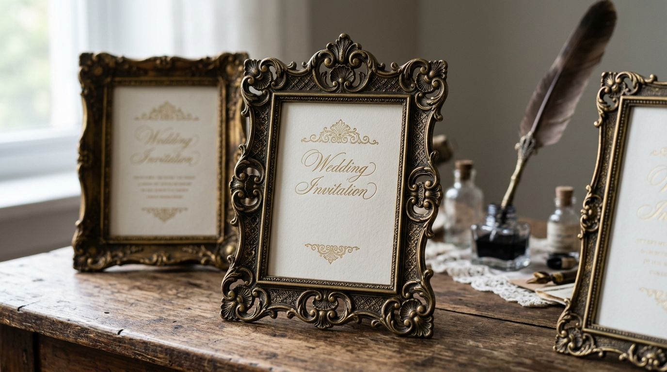
Victorian ornamental frames — the cherub vignettes, cartouche scrollwork, and foliate borders lifted from 19th-century specimen books — are the fastest way to make an invitation suite look inherited rather than printed. This guide ranks the six styles worth building a 2026 invitation set around, and tells you which one to skip.
- Rococo cherub and label frames are the best overall victorian ornamental frames for wedding invitation suites in 2026.
- Cartouche and scroll panel frames read more formal than floral styles for corporate and black-tie invitations.
- Oval cameo frames work best framing a single portrait or monogram, not full-page invitation copy.
- Blackletter gothic panel frames suit alternative wedding stationery, not traditional formal sets.
- Hand-restored scans keep engraving lines crisp at print size — AI-filled vector versions blur under 4-inch cards.
Why this matters
An invitation is read at arm's length, often under bad lighting, and printed at a fixed size that can't be resized after the fact. A frame with fine hairline engraving that looked sharp on a 27-inch monitor can turn to mush once it's shrunk onto a 5x7 card — that's the single most common failure in stationery design pulled from generic stock sites.
Century Library restores its victorian ornamental frames from original specimen plates at high resolution specifically so the line weight survives that shrink. Not every source does the same restoration work, and the difference shows up the moment a proof comes back from the printer.
Best overall: Rococo cherub and label frames. Best for formal corporate or black-tie sets: cartouche and scroll panel frames. Best for a single portrait or monogram: oval cameo frames. The rest of this guide breaks down why, style by style.
What makes the best victorian ornamental frame
- Engraving fidelity — hairline detail that stays legible after the frame is scaled down to invitation size
- Closed border geometry — corners and midpoints that meet cleanly instead of leaving visible seams
- Historically accurate motifs — cherubs, foliate scrollwork, and cartouches pulled from real specimen plates, not AI-generated fills mimicking the style
- Restoration quality — moiré-free scans with clean paper tone, not a jpeg of a jpeg
- Commercial licensing clarity — a plain answer on whether the frame can go on a printed, sold, or gifted product
- Scalability — works as a full border, a corner ornament, and a standalone vignette without redrawing
Victorian ornamental frames at a glance
| Style | Best For | Standout Feature | Key Limitation |
|---|---|---|---|
| Rococo cherub and label frames | Wedding invitation suites | Figural vignettes read as heirloom, not decorative filler | Busy at very small sizes under 3 inches |
| Cartouche and scroll panel frames | Corporate and black-tie invitations | Symmetrical scrollwork holds formal typesetting well | Less warmth than floral styles |
| Foliate wreath and floral corner frames | Garden and spring wedding suites | Corners work independently of the full border | Weakest as a complete enclosed frame |
| Oval cameo frames | Portrait-style save-the-dates | Built for a single image or monogram, not paragraphs of text | Poor fit for text-heavy invitation copy |
| Blackletter gothic panel frames | Alternative and gothic wedding stationery | Pairs naturally with blackletter and gothic display type | Reads too heavy for traditional formal events |
| Geometric Art Nouveau border frames | Modern-vintage hybrid invitations | Cleaner lines than Rococo, still period-accurate | Least ornate option on this list |
1. Rococo Cherub & Label Frames: best for wedding invitation suites
These are the frames people picture when they hear "victorian ornamental frame" — cherubs and putti anchoring a label panel, usually pulled from German and French type foundry specimen books of the 1880s and 1890s. Century Library's archive includes a Schelter & Giesecke specimen page built around exactly this format: ornate label frames with figural vignettes, restored from the original horizontal plate rather than redrawn.
Rococo cherub and label frames pros:
- Reads as heirloom and personal, not templated
- Strong at 5x7 invitation size and larger
- Pairs well with calligraphy and script type for the invitation copy
Rococo cherub and label frames cons:
- Busy at anything smaller than about 3 inches
- Figural motifs can feel mismatched on non-wedding stationery
Best for: wedding invitation suites, save-the-dates with a formal tone. Verdict: default pick for 2026 wedding stationery.
2. Cartouche & Scroll Panel Frames: best for corporate and black-tie invitations
Cartouche frames swap cherubs for symmetrical scrollwork wrapped around a central panel — the format used historically for certificates, seals, and formal announcements. That symmetry is what makes them work for corporate galas and black-tie events where the cherub-and-cupid tone of Rococo frames feels off-brand.
Cartouche and scroll panel frames pros:
- Formal without feeling romantic or seasonal
- Clean enclosed border geometry, easy to typeset inside
- Ages well across an entire event's print materials, not just the invitation
Cartouche and scroll panel frames cons:
- Less warmth than floral or foliate styles
- Can look stiff on casual stationery like scrapbooking or party invites
Best for: corporate galas, formal fundraisers, black-tie event invitations. Verdict: situational pick — strong for formal corporate work, wrong tone for casual events.
3. Foliate Wreath & Floral Corner Frames: best for garden and spring wedding suites
Instead of a closed border, foliate wreath frames typically show up as standalone corner ornaments — a spray of leaves or flowers anchoring each corner rather than a continuous line running the full page. That makes them the most flexible style on this list for asymmetrical layouts.
Foliate wreath and floral corner frames pros:
- Corners work independently, so a designer isn't locked into a full enclosed border
- Suits garden, spring, and outdoor wedding themes without feeling costume-like
- Combines well with botanical illustration sets already in an archive
Foliate wreath and floral corner frames cons:
- Weakest option here as a complete, closed frame
- Needs a second element (a rule line, a monogram) to feel finished on formal stock
Best for: garden weddings, spring stationery, semi-formal invitation suites. Verdict: worth it as a corner accent, not a full border replacement.
4. Oval Cameo Frames: best for portrait-style save-the-dates
Oval cameo frames come from Victorian portrait photography mounts and locket engraving — a closed oval line built to frame a single image or monogram, not a block of invitation copy. That single-purpose design is exactly what makes them narrow but effective.
Oval cameo frames pros:
- Purpose-built for a portrait, photo, or monogram centerpiece
- Reads as antique without needing figural or floral motifs
- Scales cleanly from a small stamp-size use up to a full card centerpiece
Oval cameo frames cons:
- Poor fit for text-heavy invitation copy
- Limited use outside portrait or monogram-led layouts
Best for: save-the-dates built around a couple's photo, monogram stationery. Verdict: niche pick — excellent for its one job, not a general invitation frame.
5. Blackletter Gothic Panel Frames: best for gothic and alternative wedding stationery
These pair heavier, angular scrollwork with the visual weight of blackletter type traditions rather than the light Rococo line. For couples building an alternative, gothic, or Victorian-mourning-inspired suite, this is the frame that matches the tone instead of fighting it.
Blackletter gothic panel frames pros:
- Matches gothic and blackletter display type without visual conflict
- Reads distinctly different from the cherub-and-scroll mainstream
- Strong on dark or deep-colored card stock
Blackletter gothic panel frames cons:
- Reads too heavy for a traditional formal or garden wedding
- Smaller pool of matching complementary illustration sets
Best for: gothic weddings, alternative event stationery, dark-stock invitation suites. Verdict: niche pick, strong when the theme calls for it.
6. Geometric Art Nouveau Border Frames: best for modern-vintage hybrid invitations
Art Nouveau borders trade cherubs and cartouches for cleaner geometric linework and stylized botanical repetition. They're the least ornate style here, which is exactly why they work for couples who want a period feel without a fully maximalist frame.
Geometric Art Nouveau border frames pros:
- Cleaner and more restrained than Rococo or cartouche styles
- Still period-accurate, not a modern imitation
- Pairs well with minimalist serif or slab serif invitation type
Geometric Art Nouveau border frames cons:
- Least ornate option on this list — a poor fit if the brief calls for "maximalist Victorian"
- Fewer matching accent elements in most archives
Best for: modern-vintage hybrid invitation suites, minimalist formal stationery. Verdict: situational pick for couples splitting the difference between modern and antique.
“If the frame's corners don't close into a continuous line, the border reads unfinished no matter what size you print it at.”
How we ranked
Each style was judged against the six criteria above: engraving fidelity, closed border geometry, motif accuracy, restoration quality, licensing clarity, and scalability across print sizes. Rococo cherub and label frames rank first because they score well on all six at once — the other five styles each trade one criterion for a narrower use case, which is why the list reads as a decision tree by event type rather than a single leaderboard.
Which victorian ornamental frame should you choose?
For most 2026 wedding invitation suites, Rococo cherub and label frames remain the default — they carry the heirloom weight most couples are after and hold up at standard invitation sizes. Choose cartouche and scroll panel frames the moment the event is corporate or black-tie. Choose oval cameo frames only when the layout is built around a portrait or monogram, not paragraphs of copy. Everything else on this list is a deliberate style choice for a specific theme, not a general substitute.
FAQ
What are victorian ornamental frames used for in invitation design?
Victorian ornamental frames are decorative borders and vignettes — cherub label frames, cartouche panels, foliate corners — restored from 19th-century specimen books and used to enclose invitation text, monograms, or photos. They give a printed invitation a historical, engraved feel instead of a flat digital look.
Are victorian ornamental frames better than modern floral borders for weddings?
For a formal or heirloom-toned wedding, victorian ornamental frames read more distinctive than generic modern floral borders because the engraving detail and figural motifs carry real historical weight. Modern floral borders still work better for casual or minimalist suites where a heavy Victorian frame would clash.
Which victorian ornamental frame style suits a corporate event?
Cartouche and scroll panel frames suit corporate or black-tie events because their symmetrical scrollwork reads formal without the romantic tone of cherub or floral styles. They hold up across an entire event's print materials, not just the invitation.
Do victorian ornamental frames work at small print sizes?
Rococo cherub and cartouche frames can turn busy under about 3 inches, so oval cameo frames or geometric Art Nouveau borders scale down more cleanly for smaller cards, stamps, or favor tags.
Can victorian ornamental frames be used commercially on printed invitations?
That depends entirely on the license attached to the specific frame source — always check the commercial terms before printing and selling invitation products, since terms vary between archives and individual specimen restorations.
What's the difference between a cartouche frame and a cameo frame?
A cartouche frame encloses a panel meant for text or a seal, built around symmetrical scrollwork. A cameo frame is an oval built specifically to frame a single portrait or monogram, not blocks of copy.
Do victorian ornamental frames need to be hand-restored or is AI-generated fine?
Hand-restored scans keep the original hairline engraving intact at print size, while AI-generated imitations of the style tend to blur or distort fine detail once scaled down onto an invitation-sized card.
One last thing
The cherub-and-label format that tops this list didn't start as wedding stationery at all — it comes from German and French type foundry specimen books from the 1880s and 1890s, originally printed to sell display type and ornament sets to other printers, not couples. That's worth knowing before pairing one with modern script type: the frame was engraved to sit next to blackletter and Old English display faces, so victorian display fonts for stationery design tend to match its weight more naturally than a delicate modern script.