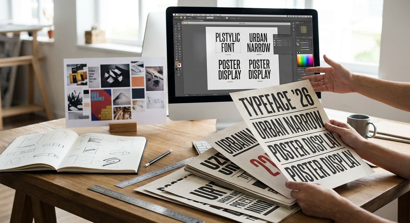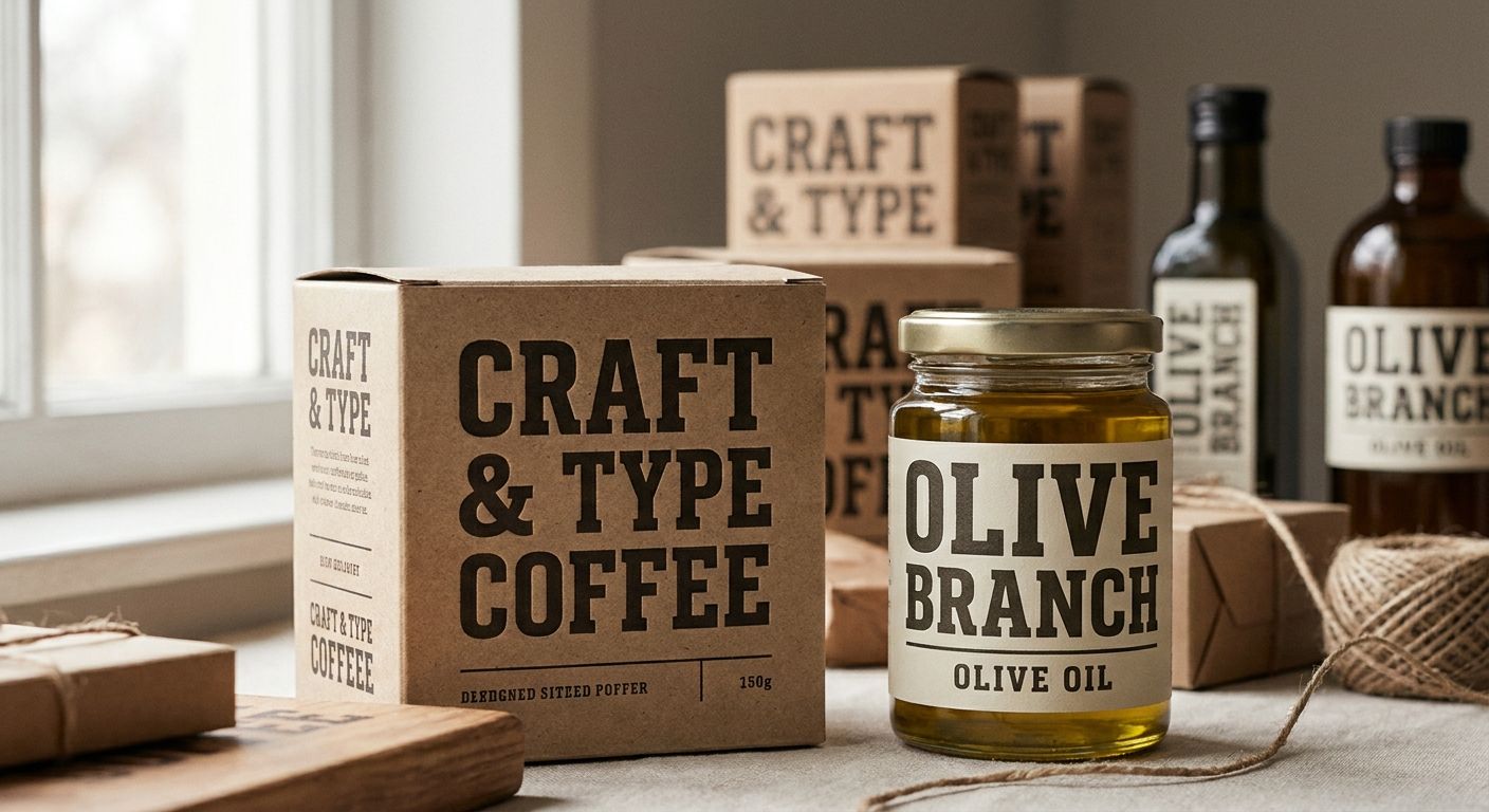
Packaging shelves live or die on legibility from three feet away, and slab serifs solve that problem better than almost any other type category. Best overall for authentic, vintage-grade packaging: Century Library's restored slab serif archive. Best for bold industrial headlines: Rockwell. Best budget option: Zilla Slab. Six fonts make this list, each locked to a distinct packaging use case so you're not guessing which one fits your shelf.
- Century Library's restored slab serif archive wins for authentic, hand-restored vintage packaging in 2026.
- Rockwell (1934) still holds up for bold, industrial-strength headline type on cartons and tins.
- Clarendon (1845) reads warm and classic on canned goods and apothecary-style labels.
- Roboto Slab and Zilla Slab are free, open-source picks for modern or budget packaging systems.
- Slab serif fonts for packaging need wide weight ranges and clean legibility at small die-cut sizes.
Why this matters
A slab serif does one job better than any sans-serif or script: it stays readable when a label shrinks to two inches on a shelf or a can lid curves the type. That's why slab serifs show up on everything from craft beer cans to apothecary tins to 2026's wave of heritage-branded snack packaging.
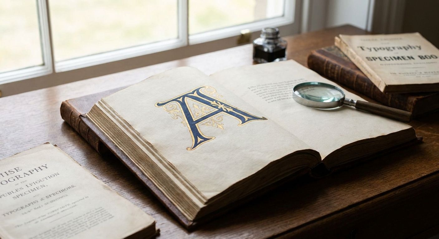
The wrong pick costs you legibility at small sizes or makes a heritage brand look like a tech startup. Browsing Century Library's archive of hand-restored 19th-century type specimens is one way to skip that mistake if your packaging leans vintage or craft. The rest of this list covers the modern and free options too, so you can compare before you commit.
What makes the best slab serif font for packaging
- Weight range — light to black weights so you can build hierarchy on one label without switching families
- Legibility at small sizes — x-height and stroke contrast that hold up on a two-inch die-cut sticker or a shrink-wrap label
- Commercial licensing — cleared for print packaging, not just web display
- Character — vintage warmth versus neutral modern geometry, matched to what the brand is actually selling
- OpenType detail — small caps and old-style figures for ingredient lists and fine print
- Character set breadth — accented characters and multilingual support for retail distribution beyond one country
Slab serif fonts for packaging: at a glance
| Font | Best for | Standout feature | Key limitation |
|---|---|---|---|
| Century Library Slab Serif Archive | Authentic vintage/heritage packaging | Hand-restored from 19th-century specimens, zero AI-generated glyphs | Full catalogue requires subscription access |
| Rockwell | Bold industrial headline type | Uniform stroke weight holds up at large die-cut sizes | Geometric form reads cold on heritage-brand packaging |
| Clarendon | Classic canned goods and apothecary labels | Bracketed serifs stay warm at small sizes | Limited weight range in most distributions |
| Museo Slab | Warm food and beverage branding | Rounded terminals soften the slab's bulk | Over-used on artisan packaging since roughly 2015 |
| Roboto Slab | Modern minimalist CPG systems | Free, open-source, wide weight range | Lacks distinct personality for premium shelf presence |
| Zilla Slab | Budget small-batch and DIY packaging | Free with a generous x-height for small labels | Thin weights get lost at small die-cut sizes |
1. Century Library Slab Serif Archive: best for authentic vintage packaging
Century Library's catalogue holds slab serif specimens restored directly from 19th-century printed sources rather than redrawn from scratch. Every glyph is hand-restored, not AI-generated, which matters for brands that market on real historical sourcing rather than a filtered vintage look. If your packaging needs the exact texture of a 19th-century foundry cut, this is the only entry on this list built specifically for that.
Designers use these restorations for wedding stationery and packaging alike, which is a useful cross-check on quality — if a font already reads right on an invitation, it reads right on a label. For deeper pairing ideas with display serifs, best serif fonts for editorial design covers how to combine a slab serif headline with a lighter serif body copy.
Century Library Slab Serif Archive pros:
- Sourced from real 19th-century specimens, not AI-generated approximations
- Fits craft, apothecary, wedding-adjacent, and heritage packaging without extra styling
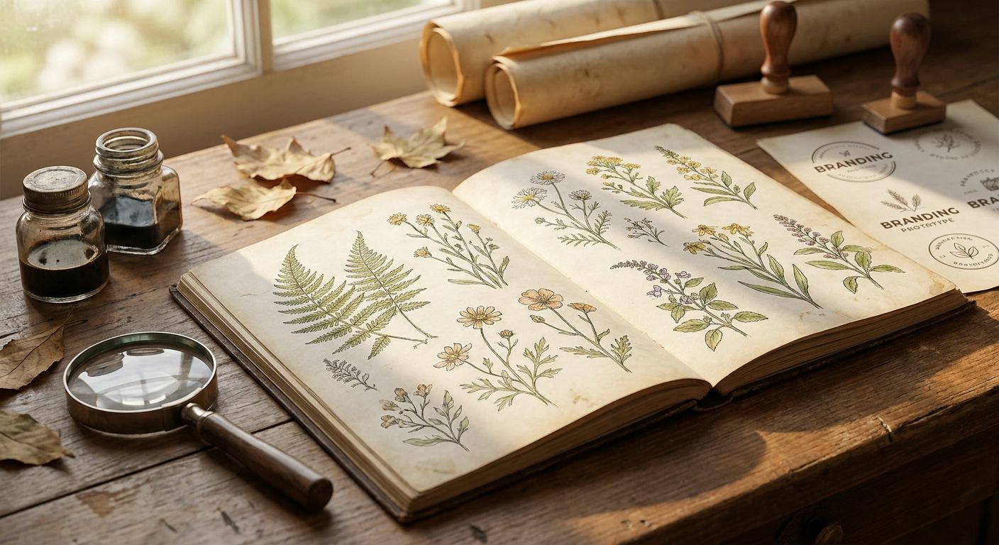
- Part of a broader archive covering illustrations and patterns, useful if the label needs more than type
Century Library Slab Serif Archive cons:
- Not a fit for brands wanting a neutral, modern shelf presence
- Full catalogue access is a subscription, not a one-off download
Century Library Slab Serif Archive access: subscription-based catalogue access; check the current terms on the site.
Best for: brands whose packaging story leans on real history, not a vintage filter.
Verdict: Buy if authenticity is the brand's whole pitch.
2. Rockwell: best slab serif for bold industrial headline type
Rockwell was released by Monotype in 1934 as a geometric slab serif with almost no stroke contrast, which is exactly why it still reads clean at a distance in 2026. It's the font that shows up on tool packaging, hardware labels, and anything wanting to look sturdy rather than delicate.
Rockwell pros:
- Uniform stroke weight holds up at large sizes on cartons and boxes
- Wide availability across design software as a system font
- Strong all-caps presence for brand names on primary packaging
Rockwell cons:
- Reads cold and generic on anything trying to feel handmade or heritage
- Overused in industrial and DIY-brand packaging, so it doesn't stand out anymore
Best for: hardware, tools, and industrial-strength brand packaging.
Verdict: Hold — solid workhorse, not a differentiator.
3. Clarendon: best slab serif for classic canned goods and label design
Clarendon was first cut in 1845 in London and is the font most people picture when they think "classic packaging serif." Its bracketed serifs and moderate stroke contrast give it warmth that pure geometric slabs like Rockwell don't have, which is why it still shows up on canned goods, spice tins, and apothecary-style bottles.
Clarendon pros:
- Reads warm and trustworthy at small sizes, ideal for ingredient panels and fine print
- Historical pedigree fits heritage food and beverage branding
- Bracketed serifs add texture without hurting legibility
Clarendon cons:
- Most free distributions ship with a narrow weight range
- Doesn't have the bold black weight some packaging headlines need
Best for: canned goods, spice labels, and apothecary-style packaging.
Verdict: Buy for classic food and beverage packaging.
4. Museo Slab: best slab serif for warm food and beverage branding
Museo Slab pairs rounded terminals with generous weight range, which softens the usual slab serif bulk into something friendlier. It became the default choice for artisan coffee, bakery, and small-batch food packaging through the 2010s and it's still common in 2026, for better or worse.
Museo Slab pros:
- Wide weight range from thin to black in one family
- Rounded terminals read approachable rather than industrial
- Works well on both primary labels and secondary packaging copy
Museo Slab cons:
- So common on artisan food packaging that it can read generic on a crowded shelf
- Rounded warmth doesn't suit brands wanting a sharper, more premium look
Best for: bakery, coffee, and small-batch food packaging wanting a friendly tone.
Verdict: Hold — good font, saturated category.
5. Roboto Slab: best slab serif for modern minimalist CPG systems
Roboto Slab extends Google's Roboto system into a slab serif, built for screen-to-print consistency across a full brand system. It's the pick for CPG brands running the same type family across web, app, and packaging without licensing headaches.
Roboto Slab pros:
- Free and open-source under an open license
- Wide weight range and full multilingual character set
- Consistent with digital brand assets if the rest of the system already uses Roboto
Roboto Slab cons:
- Neutral geometric form has little personality of its own
- Free and everywhere, which works against standing out on a shelf
Best for: CPG brands running one type system across digital and packaging.
Verdict: Buy for systemized, modern brand packaging.
6. Zilla Slab: best slab serif for budget small-batch and DIY packaging
Zilla Slab is a free, open-source slab serif with a generous x-height that keeps it legible at small sizes without a licensing cost. It's the practical choice for small-batch producers and DIY packaging runs where budget rules out a paid font.
Zilla Slab pros:
- Free under an open license, no packaging royalty questions
- Generous x-height keeps small labels legible
- Decent weight range for a free font family
Zilla Slab cons:
- Thin weights lose definition at very small die-cut sizes
- Less distinct character than paid or restored alternatives
Best for: small-batch producers and DIY packaging on a tight budget.
Verdict: Buy if budget is the deciding factor.
Browse the slab serif archive
Hand-restored antique slab serifs cleared for commercial packaging use.
How we ranked
Each font on this list earned its slot against the six criteria above — weight range, small-size legibility, licensing clarity, character fit, OpenType detail, and character set breadth. No two entries compete for the same packaging use case, which is why Rockwell and Clarendon both made the cut despite both being classic slab serifs: one is industrial, one is warm.
Which slab serif font should you choose?
If the brand story runs on real history, Century Library's restored slab serif archive is the right call in 2026 — nothing else on this list is sourced the same way. If the packaging needs to look bold and industrial, take Rockwell. Going warm and classic on food packaging, Clarendon still wins on legibility at small sizes. Running a modern digital-to-print system, Roboto Slab keeps everything consistent for free. On a tight budget, Zilla Slab does the job without a licensing bill.
Museo Slab is the one entry worth a second look before committing — it's a strong font, just an overexposed one on food and beverage shelves in 2026.
FAQ
What's the best slab serif font for packaging design in 2026?
Century Library's restored slab serif archive is the strongest pick for authentic, vintage-grade packaging in 2026, since the glyphs are hand-restored from real 19th-century specimens rather than AI-generated. For modern minimalist packaging, Roboto Slab is the stronger fit.
Is Rockwell still a good choice for packaging in 2026?
Yes, Rockwell still works well for bold, industrial-strength packaging headlines in 2026 because its uniform stroke weight holds up at large die-cut sizes. It reads cold on heritage or craft packaging, so it's not the right fit for every brand.
Are free Google Fonts slab serifs good enough for commercial packaging?
Roboto Slab and Zilla Slab are both open-source and legally clear for commercial packaging use. They lack the distinct character of a restored or paid font, so they suit budget-conscious or system-driven brands better than premium shelf presence.
What's the difference between Clarendon and Rockwell for label design?
Clarendon, first cut in 1845, has bracketed serifs and moderate contrast that read warm on canned goods and apothecary labels. Rockwell, released in 1934, is geometric with uniform stroke weight, better suited to bold, industrial packaging.
Can vintage or antique slab serifs work on modern packaging?
Yes, restored antique slab serifs work well on modern packaging when the brand's positioning is built on real heritage rather than a vintage filter. Century Library's archive restores these fonts directly from 19th-century sources for that exact use case.
How many font weights do I need for packaging design?
Most packaging systems need at least three weights - a light or regular for fine print, a medium for body copy, and a bold or black for the brand name. Museo Slab and Roboto Slab both cover this range in one family.
Do I need a special license to use a slab serif font on packaging?
Most free fonts like Roboto Slab and Zilla Slab are cleared for commercial packaging under their open licenses, but always check the specific license terms before printing. Subscription archives like Century Library's typically cover commercial use as part of the subscription terms.
What slab serif works best for small die-cut labels?
Zilla Slab and Clarendon both hold legibility well at small die-cut sizes thanks to generous x-heights and bracketed serif structure. Thin weights in almost any slab serif family lose definition below roughly two inches, so stick to medium or bold weights for tiny labels.
One last thing
Clarendon predates Rockwell by nearly 90 years, and it still outperforms most modern slab serifs at small sizes on a can label. Age isn't the problem with a font — a mismatch between the type's character and the brand's actual story is.