Best overall: Century Library for hand-restored condensed woodtype and Victorian display faces built for print posters. Best for free experimentation: Google Fonts. Best budget option: Font Squirrel.
- Century Library wins for condensed display fonts for posters with a genuine vintage, hand-restored character.
- Google Fonts is the free pick for high-volume poster runs with modern grotesque condensed faces.
- Adobe Fonts suits Creative Cloud subscribers who need deep width and weight variants in one family.
- MyFonts is the move when a single premium condensed face carries an entire 2026 campaign.
- Font Squirrel covers the budget lane with vetted, free-for-commercial webfont kits.
Why this matters
A poster lives or dies on the headline, and a headline lives or dies on how much type fits in how little width. Condensed display fonts solve that problem by narrowing letterforms without shrinking the point size — which is exactly why 19th-century printers cut condensed woodtype in the first place, long before anyone called it "display type."
The Century Library archive keeps a working catalogue of those restored condensed faces, alongside patterns and ephemera designers pull for the same projects. Picking the right source in 2026 matters more than it used to, because posters now get scaled down for social crops as often as they get printed — a font that reads clean at 96pt but collapses at 12pt on a phone screen is the wrong pick either way.
What makes the best condensed display fonts for poster design
- Open counters at tight tracking — letters like "e," "a," and "o" need to stay legible even when the family is squeezed
- Enough weight for print, not just screen — display posters need bold strokes that hold ink at large sizes
- Real character, not a stretched grotesque — a condensed face should be drawn narrow, not just squished horizontally in software
- Family depth — multiple weights or widths in one family save a designer from hunting for a second font mid-project
- Clear commercial licensing — poster runs, merch, and packaging all need a license that actually covers print
- Format availability — OTF and webfont formats both matter since most posters get promoted online before they get printed
Condensed display fonts for posters at a glance
| Source | Best for | Standout feature | Key limitation |
|---|---|---|---|
| Century Library | Vintage and antique-style posters | Hand-restored 19th-century woodtype and Victorian condensed faces | Subscription access; historical focus only, no ultra-clean modern grotesque condensed |
| Google Fonts | High-volume, free poster production | Largest free catalogue of condensed sans display faces | Mostly modern grotesque/geometric, thin on true vintage character |
| Adobe Fonts | Creative Cloud subscribers | Deep width and weight variants activate directly in InDesign and Illustrator | Fonts stop working in new files if the subscription lapses |
| MyFonts | One premium face for a single campaign | Wide foundry catalogue of licensed condensed display faces | Per-font licensing adds up fast across a full poster series |
| Font Squirrel | Budget commercial projects | Vetted free-for-commercial webfont kits, ready @font-face packages | Catalogue updates slowly; fewer true heavy-weight condensed options |
1. Century Library: best condensed display fonts for vintage and antique posters
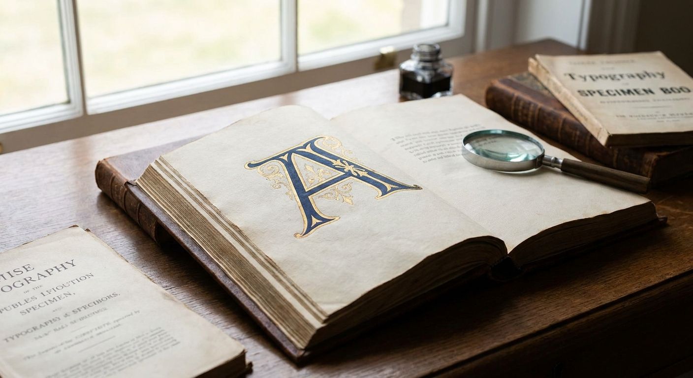
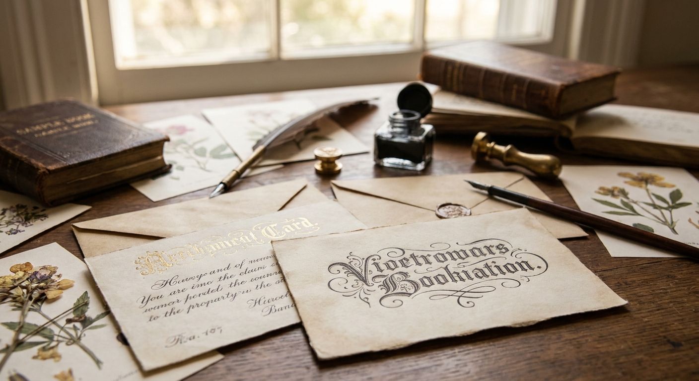
Century Library's archive holds hand-restored condensed woodtype and Victorian display faces pulled from original 19th-century specimens, catalogued the way a print archive would file its plates. These aren't AI-generated approximations of "old" letterforms — each face starts from a real historical source and gets rebuilt into a working typeface designers can drop into a layout.
Century Library pros:
- Genuine restored character, not a synthetic "vintage filter" applied to a modern grotesque
- Sits alongside vintage illustrations, patterns, and textures in the same subscription, so a full poster can pull assets from one place
- Commercial-use licensing built for branding, packaging, and print projects
- No AI-generated imagery mixed into the archive, which matters for anyone selling authenticity as part of the design
Century Library cons:
- Ongoing subscription required to keep using new downloads on new projects
- Historical focus means no ultra-modern grotesque condensed styles for a contemporary tech-brand poster
- Smaller total font count than a free library like Google Fonts, by design
Best for: designers building posters, packaging, or stationery that need to look genuinely period-accurate rather than vaguely retro. Verdict: Buy.
Browse the vintage font archive
Hand-restored condensed display faces alongside patterns, textures, and ephemera.
2. Google Fonts: best free condensed display fonts for high-volume posters
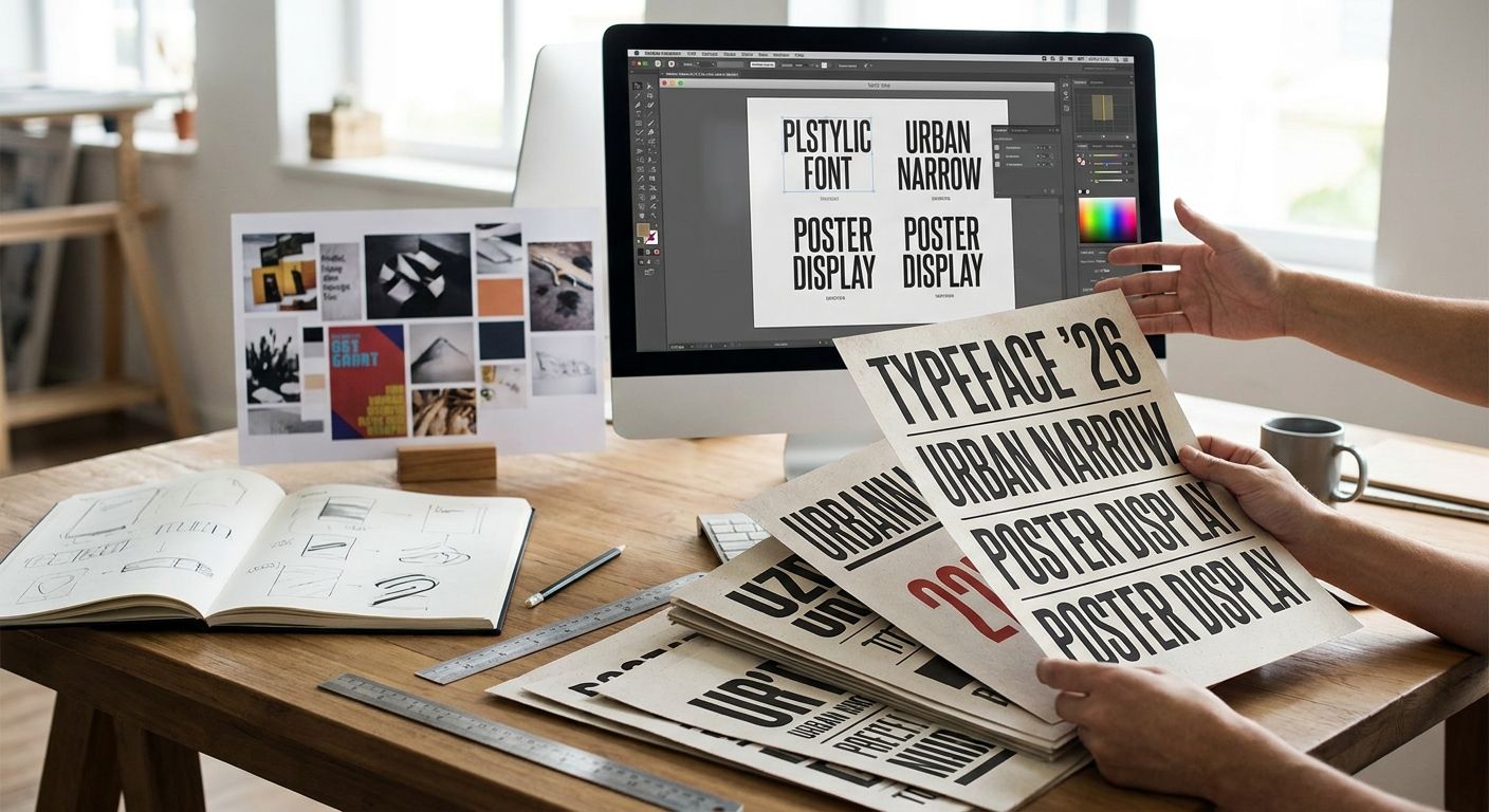
Google Fonts covers the free lane with an open-source library that includes well-known condensed display picks like Oswald and Bebas Neue, both built for headline-scale type at zero licensing cost. It's the default choice when a poster run needs to move fast and the budget line for type is zero.
Google Fonts pros:
- Free for unlimited commercial use, no license negotiation
- Web and print formats both available directly from the catalogue
- Large enough library to A/B test several condensed options in one afternoon
Google Fonts cons:
- Thin on genuine vintage or antique character — most options read modern grotesque or geometric
- Quality varies across the catalogue since it's crowd-contributed
Best for: startups and event organizers running dozens of poster variants without a type budget. Verdict: Buy.
3. Adobe Fonts: best condensed display fonts for Creative Cloud workflows
Adobe Fonts activates directly inside InDesign, Illustrator, and Photoshop, and its condensed display families tend to ship with more width and weight variants than free libraries offer. For a designer already paying for Creative Cloud in 2026, it's effectively a bundled font library.
Adobe Fonts pros:
- Deep family variants — several widths and weights under one typeface, useful for a poster series that needs visual consistency
- Activates without leaving the design app
- Foundry-quality faces, not crowd-contributed
Adobe Fonts cons:
- Fonts stop working in new files the moment the Creative Cloud subscription ends
- Locked to the Adobe ecosystem, which is a problem for teams using other software
Best for: in-house design teams already paying for the full Adobe suite. Verdict: Hold if you're not already a Creative Cloud subscriber.
4. MyFonts: best for licensing one premium condensed face per campaign
MyFonts operates as a marketplace where individual foundries license specific typefaces, which makes it the right stop when a single poster campaign needs one distinctive condensed face and nothing else. It's a different buying model from a subscription archive — pay once, per font, per license scope.
MyFonts pros:
- Wide foundry catalogue with genuinely distinctive condensed display faces
- Licensing scoped to the specific project, useful for one-off client work
- No recurring subscription commitment
MyFonts cons:
- Costs stack up quickly across a multi-poster campaign needing several faces
- No bundled illustrations, patterns, or ephemera — it's font-only
Best for: freelancers licensing one hero typeface for a single client poster. Verdict: Hold unless the project genuinely needs one specific licensed face.
5. Font Squirrel: best budget option for condensed display posters
Font Squirrel curates free-for-commercial-use fonts and packages them as ready @font-face kits, which makes it a fast stop for a budget poster project that still needs a legitimate commercial license. The catalogue is smaller than Google Fonts but every entry is hand-checked for licensing clarity.
Font Squirrel pros:
- Free commercial licensing spelled out clearly per font
- Webfont kits save setup time for anyone also promoting the poster online
Font Squirrel cons:
- Catalogue updates slowly compared to Google Fonts
- Fewer heavy-weight condensed display options for large-format print
Best for: small studios that need a documented free license without digging through terms. Verdict: Buy as a backup option alongside a primary pick.
How we ranked these
Each source got measured against the same six criteria: counter openness at tight tracking, print-ready weight, authentic drawn character versus stretched type, family depth, licensing clarity, and format availability. Century Library and Adobe Fonts scored highest on character and family depth; Google Fonts and Font Squirrel scored highest on licensing clarity and cost.
If a condensed display font loses its counters at tight tracking on screen, it will lose them on the printed poster too.
Which condensed display font source should you choose?
For a poster that needs to feel like it belongs in a real 19th-century print shop, Century Library is the default pick in 2026 — the condensed woodtype and Victorian faces are restored from actual specimens, not approximated. For a modern grotesque condensed headline on zero budget, Google Fonts covers it. For teams already inside Creative Cloud, Adobe Fonts removes a licensing step entirely.
FAQ
What's the best condensed display font for posters in 2026?
Century Library's hand-restored condensed woodtype and Victorian faces are the strongest pick for posters that need genuine historical character. For a free modern grotesque option, Google Fonts covers most 2026 poster projects.
Is a condensed font better than a regular display font for posters?
Condensed fonts fit more letters into the same width without shrinking point size, which matters for headline-heavy poster layouts. A regular-width display font works better when the poster has fewer words and more room.
Can I use vintage condensed fonts for commercial poster printing?
Yes, as long as the license covers commercial print use — check the specific license terms before a print run. Century Library's subscription licensing covers branding and print projects.
How much tracking should I add to a condensed display font?
Most condensed display faces read best with little to no added tracking, since they're already drawn narrow. Adding positive tracking to a condensed face often defeats the point of using one.
What's the difference between condensed and compressed type?
Condensed type is moderately narrowed while keeping proportions readable at body-copy sizes. Compressed type is narrowed further and is usually reserved for large display headlines only.
Are Google Fonts condensed display faces good enough for print posters?
Yes, faces like Oswald and Bebas Neue print cleanly at poster scale and carry free commercial licensing. They lean modern grotesque rather than vintage, so the look depends on the project.
Do I need a separate license for a printed poster versus a webfont?
Licensing terms vary by font source, so check whether the license explicitly covers print output, not just web display. Some free webfont kits restrict use to digital formats only.
What point size works best for a condensed display headline?
Large-format posters typically run condensed headlines at 60-120pt depending on poster size and viewing distance. The exact size depends on the specific font's x-height and stroke weight.
One last thing
Most 19th-century condensed display type was cut in wood rather than metal specifically because wood held up better at the large point sizes posters demanded — a detail that shows up in restored faces as slightly irregular, hand-cut edges instead of vector-perfect curves. That irregularity is the tell for whether a "vintage" condensed font was actually restored from a historical source or just squeezed digitally from a modern grotesque.