Best overall Victorian font for stationery: Victorian slab serif — the safest, most legible choice for business cards, letterhead and formal invitations. Best for wedding suites: Victorian copperplate script. Best for monograms and drop caps: Victorian ornamental capitals. Best budget-safe pick for playful event stationery: Victorian Tuscan display. Six style categories cover nearly every stationery use case in 2026, and picking the wrong one is the fastest way to make a design look like a costume instead of a craft.
- Victorian slab serif wins for formal business stationery — legible at small sizes, restrained ornament.
- Victorian copperplate script is the standard choice for wedding invitations in 2026.
- Victorian ornamental capitals work best as drop caps or monograms, never as full body text.
- Tuscan display and ribbon-shaded letters suit playful, event-driven stationery, not corporate work.
- Century Library restores Victorian-era font specimens from real 19th-century source material, not AI-generated approximations.
Why this matters
Stationery design lives or dies on legibility at small sizes and on whether a typeface reads as genuinely old or just "vintage-flavored." A Victorian display font picked for its ornament alone often collapses at business-card scale or clashes with modern print processes like foil stamping.
Designers searching for victorian fonts for stationery in 2026 are usually solving one of three problems: matching a heritage brand identity, building a wedding suite with period-correct flourish, or adding texture to packaging without looking like a costume shop. Each problem points to a different style family, which is why a single "best Victorian font" answer doesn't hold up.
Century Library's archive holds antique fonts alongside its restored illustrations, patterns and ephemera — all sourced from real historical material, with zero AI-generated imagery mixed in. That distinction matters for stationery work sold as authentic: a font hand-restored from an 1880s specimen book reads differently than a generic "Victorian-style" font drawn from scratch.
What makes the best Victorian font for stationery
- Legibility at small sizes — must hold up on a business card or RSVP line, not just a poster
- Historical authenticity — restored from real 19th-century specimens rather than a modern pastiche
- Ornamental balance — decorative enough to read as period-correct without fighting the layout
- Commercial licensing clarity — clear terms for branding, packaging and print runs
- Versatility across formats — works in foil stamping, letterpress and digital print alike
- Restoration quality — clean vector work with no scanning artifacts left in the strokes
Victorian fonts for stationery, at a glance
| Style | Best for | Standout feature | Key limitation |
|---|---|---|---|
| Victorian slab serif | Formal business stationery | Reads clean at 8pt and below | Less decorative than other Victorian styles |
| Victorian ornamental capitals | Monograms and drop caps | High detail per letterform | Unusable as body text |
| Victorian copperplate script | Wedding invitations | Formal, flowing connected strokes | Needs generous letter spacing to stay legible |
| Victorian Tuscan display | Playful event stationery | Bold, carnival-era character | Too loud for corporate identity work |
| Victorian ribbon and shaded letters | Packaging labels | Built-in dimensional shading | Doesn't scale down well |
| Victorian blackletter revival | Gothic-themed stationery | Strong historical weight | Reads heavy and can hurt legibility fast |
1. Victorian slab serif: best Victorian font for formal business stationery
Slab serif type from the Victorian era — the Clarendon and Egyptian families that dominated 19th-century advertising — carries thick, squared-off serifs that hold their shape at small point sizes. It's the closest thing to a workhorse in this list: designers reach for it when a brand needs to feel established without tipping into decorative overload.
Victorian slab serif pros:
- Holds legibility down to business-card scale
- Pairs cleanly with a serif body font for letterhead and stationery suites
- Reads as credible and established rather than novelty
- Works across foil, letterpress and digital print
Victorian slab serif cons:
- Less ornamental than other Victorian styles, so it won't carry a wedding-invite brief on its own
- Overused in modern branding, so restoration quality matters more here than anywhere else on this list
Best for: law firms, heritage brands, formal letterhead and business cards. Verdict: Use it as the default Victorian pick when the brief calls for credibility over flourish.
2. Victorian ornamental capitals: best Victorian font for monograms and drop caps
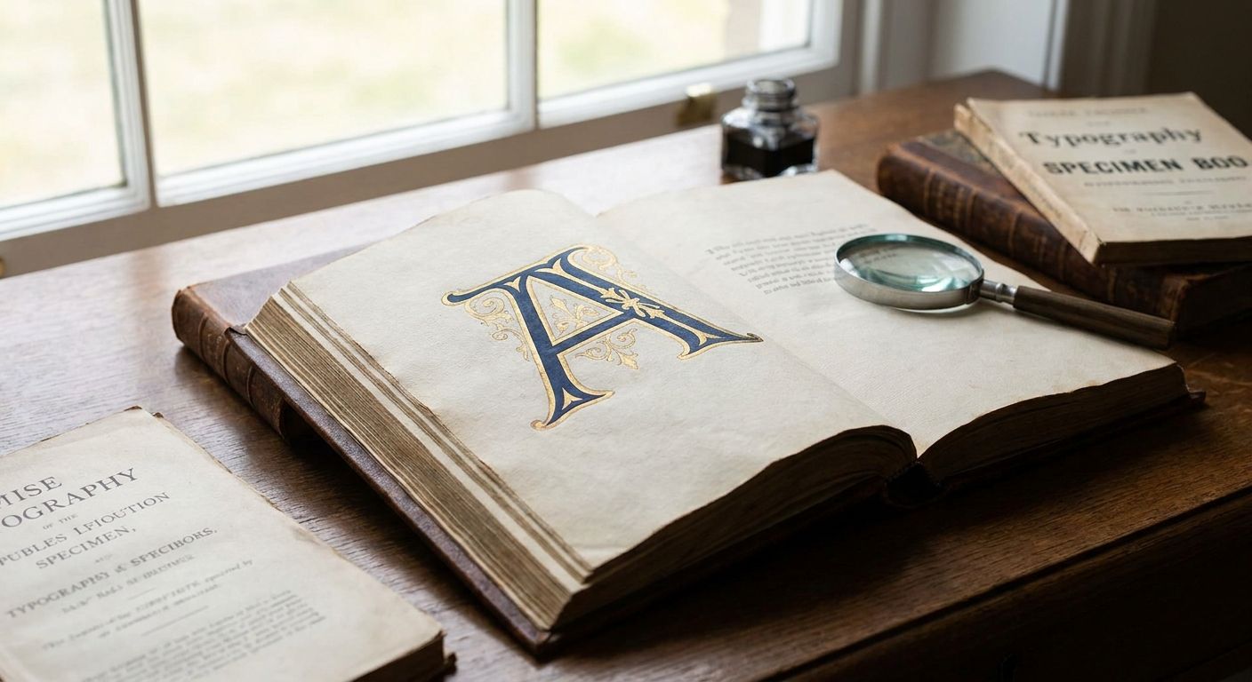
Ornamental capital sets from the Victorian era were built for initial letters and title pages, not paragraphs. Each character carries dense internal detail — filigree, shading, sometimes a full illustrative scene inside the letterform.
Victorian ornamental capitals pros:
- Unmatched detail for a single-letter monogram or wax-seal-style mark
- Instantly signals "heirloom" or "archival" on packaging and stationery
- Pairs well with a plainer body typeface so the contrast does the work
Victorian ornamental capitals cons:
- Completely unusable as running text
- Can overwhelm a small layout if used at more than one point in the design
Best for: monogram stationery, drop caps on invitation suites, wax-seal-adjacent branding. Verdict: Use it sparingly — one capital per page, never a full word.
3. Victorian copperplate script: best Victorian font for wedding invitations
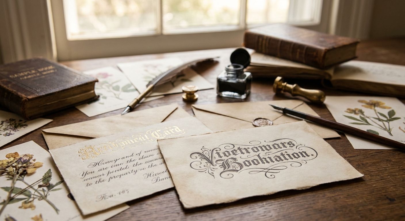
Copperplate script comes from engraved invitation plates of the 1800s — flowing, connected strokes with thick downstrokes and hairline upstrokes that mimic a metal nib. It's the closest match to what most couples picture when they say "vintage wedding font."
Victorian copperplate script pros:
- Formal and immediately recognizable as wedding-appropriate
- Pairs naturally with a calligraphy-driven invitation suite
- Restored versions keep the hairline detail that cheap script fonts flatten out
Victorian copperplate script cons:
- Needs generous letter and line spacing or it turns into a smudge at small sizes
- Not a good fit for anything that needs to be read quickly, like a menu or program
Best for: wedding invitations, save-the-dates, formal RSVP cards. Verdict: Use it for the invitation itself; skip it for supporting cards with dense text.
4. Victorian Tuscan display: best Victorian font for playful event stationery
Tuscan lettering split from the wood-type tradition of 19th-century circus and carnival posters — forked or notched serifs, heavy weight, built to shout from a distance. It's the loudest style on this list by design.
Victorian Tuscan display pros:
- Instant period character for event stationery — save-the-dates, party invites, menu headers
- Strong at large sizes, which suits headline use
- Distinct enough that a single word carries the whole design's tone
Victorian Tuscan display cons:
- Too loud for corporate identity or formal business stationery
- Poor legibility below display size, so it belongs in headlines only
Best for: birthday stationery, carnival or circus-themed events, playful branding. Verdict: Use it for headlines; skip it entirely for body copy.
5. Victorian ribbon and shaded letters: best Victorian font for packaging labels
Ribbon and shaded lettering styles use built-in dimensional effects — a drop shadow or a folded-ribbon look baked directly into the letterform — a technique lithographers leaned on heavily for product labels in the late 1800s.
Victorian ribbon and shaded letters pros:
- Adds dimension to packaging without extra design work
- Reads as an authentic product-label style rather than a modern effect
- Strong on jars, tins, and craft packaging
Victorian ribbon and shaded letters cons:
- Doesn't scale down well; detail disappears below a couple of inches
- Limited to short words or single lines
Best for: packaging labels, apothecary-style branding, craft product tags. Verdict: Use it on primary label text only, never fine print.
6. Victorian blackletter revival: best Victorian font for gothic-themed stationery
Victorian-era blackletter revival type borrowed the dense, angular forms of medieval manuscript hands and reworked them for print. It carries heavy historical weight and reads as formal or ceremonial rather than playful.
Victorian blackletter revival pros:
- Strong period and ceremonial character
- Distinct from every other style on this list, so it doesn't compete visually with softer scripts
- Pairs well with a plainer sans for contrast, similar to how gothic fonts work in band logo design
Victorian blackletter revival cons:
- Legibility drops fast at small sizes
- Wrong tone for anything meant to feel warm or celebratory
Best for: gothic-themed wedding stationery, formal certificates, ceremonial invitations. Verdict: Skip it unless the brief specifically calls for a heavier, ceremonial tone.
How this list was ranked
Each style earned its slot by matching one of the six criteria above to a distinct stationery use case, not by general popularity. Legibility at working size ruled out styles that look great as a poster but fail as a business card. Historical authenticity — real 19th-century specimen sourcing rather than a modern reinterpretation — separated genuinely restored Victorian type from generic "vintage-style" fonts built without a source document.
Browse the Victorian font archive
Restored 19th-century specimens for commercial stationery and branding work.
Which Victorian font should you choose?
For most stationery briefs in 2026, Victorian slab serif is the default — it's legible, credible, and versatile across formal and semi-formal projects. Reach for Victorian copperplate script specifically for wedding suites, and treat Victorian ornamental capitals as an accent, never a workhorse. Save Tuscan display, ribbon-shaded letters and blackletter revival for the projects that specifically call for their louder, narrower tone.
The fastest way to get this wrong is picking one Victorian style and forcing it to do every job on a stationery suite — slab serif for headers, script for signature lines, ornamental capitals for a single monogram, never more than two styles per piece.
FAQ
What's the best Victorian font for wedding invitations in 2026?
Victorian copperplate script is the standard pick for wedding invitations in 2026. It carries the formal, engraved-plate look couples associate with vintage weddings, though it needs generous spacing to stay legible.
Are Victorian fonts free to use commercially?
It depends on the source. Many original 19th-century typefaces are in the public domain as historical artifacts, but digitized, restored versions carry their own commercial licensing terms that vary by provider.
What's the difference between Victorian and Gothic fonts?
Victorian fonts cover a broad range of 19th-century display styles including slab serif, script and ornamental capitals, while Gothic typically refers specifically to blackletter forms derived from medieval manuscript lettering. Victorian blackletter revival sits at the overlap of both categories.
How do I keep Victorian display fonts readable in stationery design?
Reserve heavily ornamental Victorian styles for headlines, monograms or single words, and pair them with a plain, legible body font for anything a reader needs to scan quickly. Add extra letter spacing on connected scripts.
Is Victorian ornamental type good for logos?
Victorian ornamental capitals work well as a logo mark or monogram, but not as a full wordmark since the detail becomes unreadable at small sizes and in single-color reproduction.
What's the difference between Victorian slab serif and Clarendon?
Clarendon is a specific 1845 typeface within the broader Victorian slab serif category. Most Victorian slab serif fonts used in stationery today descend from the same square-serif, high-contrast design tradition Clarendon popularized.
Can I mix Victorian fonts with modern fonts on the same invitation?
Yes, and it's usually the safer choice. Pairing one Victorian display font for headlines with a clean modern sans or serif for body text keeps the layout readable while still carrying period character.
Where can I find authentic Victorian fonts restored from historical specimens?
Century Library restores antique fonts, including Victorian-era display styles, directly from 19th-century specimen material rather than generating vintage-style type from scratch, alongside its broader archive of restored illustrations and ephemera.
One last thing
The biggest mistake in Victorian stationery design isn't picking the wrong style — it's picking two styles that compete for the same job. A slab serif headline fighting an ornamental capital for visual weight on the same card reads as cluttered, not curated. Pick one display style per piece, let a plain body font carry the rest, and the whole suite reads intentional instead of decorative.