Six restored drop cap styles cover nearly every book and editorial layout you'll build in 2026, from gilded literary openers to clean geometric initials for magazine spreads. Best overall for book and editorial design: illuminated manuscript drop caps. Best for gothic and dark fantasy covers: blackletter drop caps. Best for nonfiction and long-form journalism: classic antique serif drop caps.
- Illuminated manuscript drop caps win overall for literary fiction and poetry openers in 2026.
- Blackletter drop caps signal genre instantly on gothic and dark fantasy covers but overwhelm contemporary titles.
- Classic antique serif drop caps are the safest default when legibility matters more than decoration.
- Art Nouveau floral and Art Deco geometric drop caps fill narrower lifestyle and luxury-magazine niches.
- Century Library's archive restores every style from real 19th-century and Renaissance plates, not AI-generated art.
Why this matters
A drop cap is the first thing a reader's eye lands on before they read a single word of your text. Pick the wrong style and a memoir reads like a horror paperback, or a literary novel opens looking like a corporate report.
Most "drop cap font" roundups online show generic clip-art initials with no sourcing behind them. The Century Library archive works from the opposite direction: every drop cap style below traces back to a real historical plate, catalogued and hand-restored rather than generated. That matters for a book cover or editorial spread that has to survive close inspection at full print resolution in 2026.
What makes the best drop cap font
- Historical sourcing — restored from an actual printed specimen, not synthesized from scratch
- Legibility at the size you'll actually use it — 3 to 5 lines deep, not a thumbnail preview
- Weight balance — the initial shouldn't fight the body serif it sits next to
- Full character coverage — enough restored letterforms to finish an entire manuscript, not just A through E
- Margin tolerance — some styles need generous white space; others don't
- Reproduction range — works from a single ebook page to a full broadsheet feature
Drop cap fonts at a glance
| Style | Best for | Standout feature | Key limitation |
|---|---|---|---|
| Illuminated Manuscript | Literary fiction & poetry | Dense gilded flourish reads as prestige | Needs print-quality reproduction |
| Blackletter | Gothic & dark fantasy | Strong silhouette holds up at small sizes | Weak legibility outside true drop-cap use |
| Art Nouveau Floral | Lifestyle & wedding-adjacent editorial | Curling floral motif softens dense pages | Fine detail blurs at low resolution |
| Victorian Ornamental | Memoir & heritage branding | Full alphabet sets for long manuscripts | Needs generous margin space |
| Art Deco Geometric | Luxury magazine spreads | Clean reproduction at any size | Less flourish than ornamental rivals |
| Classic Antique Serif | Nonfiction & long-form journalism | Highest legibility of the six | Least distinctive on its own |
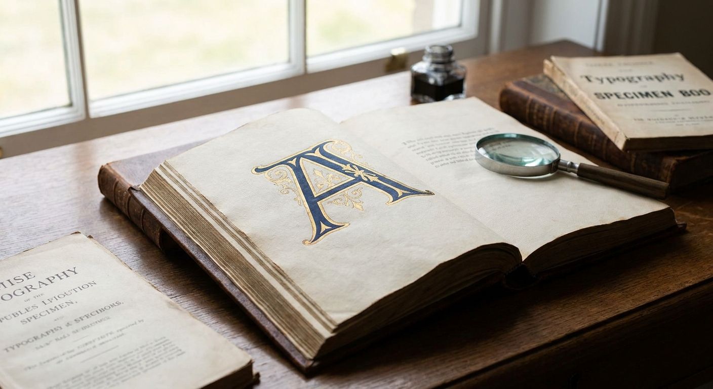
1. Illuminated Manuscript drop caps: best for literary fiction and poetry
These initials trace back to medieval and Renaissance illuminated manuscripts — gilded strokes with dense flourish work packed inside the letterform, restored from real plate scans rather than drawn from memory. They span 3 to 5 lines of body text comfortably, which is what a hardcover chapter opener usually needs.
Illuminated Manuscript drop caps pros:
- Signals literary prestige without adding an illustration to the page
- Full flourish detail holds up at large drop-cap sizes
- Pairs cleanly with antique serif body text
Illuminated Manuscript drop caps cons:
- Density falls apart if reproduced under 10-point equivalent print quality
- Competes with busy cover typography if margins are tight
Best for: literary fiction, poetry anthologies, prestige nonfiction openers. Verdict: Buy for hardcover literary releases; skip for text-dense paperback interiors where margin space is scarce.
2. Blackletter drop caps: best for gothic and dark fantasy novels
Sharp vertical strokes and broken curves, lifted from 19th-century blackletter specimens and restored into working display initials. This is the one style that reads as genre from ten feet away.
Blackletter drop caps pros:
- Immediate genre signal for horror, gothic romance, dark fantasy
- Strong silhouette reads even at small trade-paperback sizes
- Consistent with the blackletter fonts for tattoo design already restored for full cover-to-interior matching
Blackletter drop caps cons:
- Legibility drops sharply if used as running text instead of a true drop cap
- Reads heavy-handed on contemporary or literary fiction
Best for: gothic fiction, dark fantasy, horror imprints, goth zine editorial. Verdict: Buy for genre-specific covers; skip for anything aiming at a light, contemporary tone.
3. Art Nouveau Floral drop caps: best for lifestyle and wedding-adjacent editorial
Curling vine and floral motifs wrapped around the letterform, drawn from restored Art Nouveau plates rather than modern vector illustration. Sits well against cream or ivory stock, which is common in lifestyle and stationery print in 2026.
Art Nouveau Floral drop caps pros:
- Softens a page without reading as childish
- Full alphabet available for consistent openers across a whole issue
- Complements ornamental script pairings used across bridal and lifestyle print
Art Nouveau Floral drop caps cons:
- Floral detail can blur at low-resolution digital reproduction
- Wrong fit for hard news or technical editorial
Best for: lifestyle magazines, wedding-stationery-adjacent spreads, poetry. Verdict: Buy for print-forward lifestyle titles; hold for screen-only digital editions until resolution is confirmed.
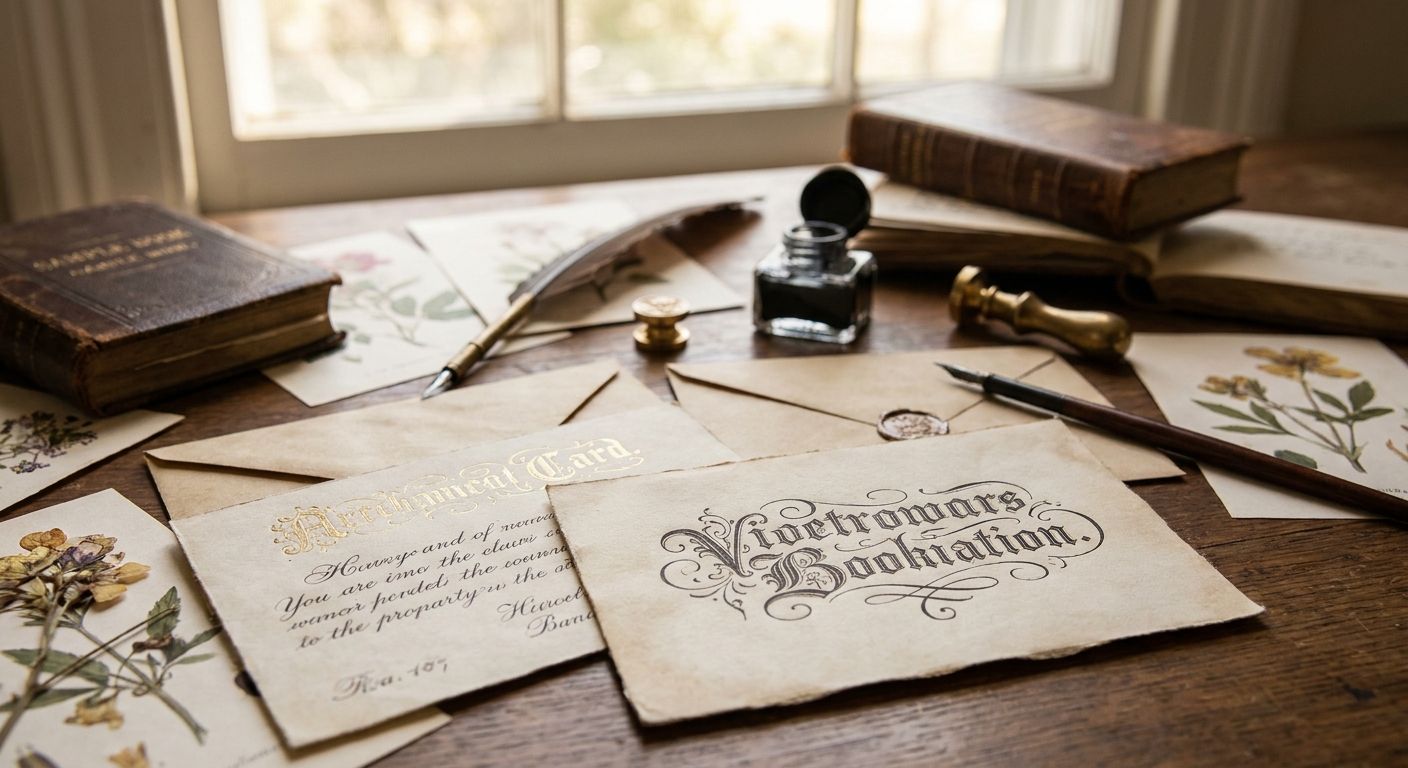
4. Victorian Ornamental drop caps: best for memoir and heritage branding
Dense scrollwork and shading typical of Victorian print catalogues, restored from 19th-century type foundry plates. Reads well in sepia or duotone treatments, which suits memoir and family-history print work.
Victorian Ornamental drop caps pros:
- Signals heritage and craft without an accompanying illustration
- Full alphabet sets, so a 300-page manuscript never runs short of matching initials
- Holds detail in duotone and sepia print
Victorian Ornamental drop caps cons:
- Can look dated on titles aimed at readers under 30
- Needs at least a full line of white space around the cap
Best for: memoir, family history, heritage branding, craft catalogues. Verdict: Buy for memoir and heritage projects; skip for YA or contemporary commercial fiction.
5. Art Deco Geometric drop caps: best for luxury magazine spreads
Angular, symmetrical letterforms drawn from 1920s and 1930s type specimens, restored with clean geometric strokes instead of organic flourish. This is the drop cap style behind most of the "modern-vintage" luxury print revivals showing up in 2026 editorial.
Art Deco Geometric drop caps pros:
- Reads as luxury and modern-vintage at once
- Geometric shapes reproduce cleanly at both large and small sizes
- Pairs without visual clash against most antique serif body fonts
Art Deco Geometric drop caps cons:
- Limited flourish looks plain next to more ornamental rivals on the same shelf
- Fewer decorative variants than illuminated or Victorian styles
Best for: luxury lifestyle magazines, 1920s-themed editorial, fashion catalogue openers. Verdict: Buy for design-forward magazine work; hold for projects that need heavier ornamentation.
6. Classic Antique Serif drop caps: best for nonfiction and long-form journalism
Minimal ornament, pulled straight from antique serif type specimens. This functions as a clean, oversized first letter rather than an illustrated initial, and it's the closest thing to a neutral default in this whole list. It sits alongside the broader serif fonts for editorial design already in the archive, so pairing body text and drop cap from the same restoration lineage is straightforward.
Classic Antique Serif drop caps pros:
- Highest legibility of the six styles here
- Works from a single-column pull-quote to a full broadsheet feature
- Lowest risk of clashing with existing brand typography
Classic Antique Serif drop caps cons:
- Least distinctive option on its own
- Wrong choice when the drop cap is meant to carry visual weight
Best for: nonfiction, long-form journalism, minimalist editorial layouts. Verdict: Buy as the safe default; skip only if the whole point of the drop cap is decorative impact.
How we ranked
Each style above is scored against the same six criteria: historical sourcing, legibility at working size, weight balance against body text, character coverage, margin tolerance, and reproduction range from screen to print. Illuminated Manuscript and Classic Antique Serif top the list because they clear all six without a real weak point; the other four each win a specific use case but lose points somewhere else, which is why the list reads as a decision tree rather than a leaderboard.
Browse the restored font archive
50,000+ hand-restored illustrations, fonts, patterns and ephemera, zero AI-generated imagery.
Which drop cap font should you choose in 2026?
If you're opening a literary novel or a poetry collection, illuminated manuscript drop caps are the default — the flourish reads as prestige and the full alphabet coverage means you won't run short mid-manuscript. If the project is genre fiction, blackletter drop caps signal gothic or dark fantasy before a reader gets to the first line. For nonfiction, journalism, or anything where the drop cap should stay out of the way, classic antique serif drop caps are the safer call for 2026 print and digital work alike.
FAQ
What is a drop cap font?
A drop cap font is an oversized decorative first letter that drops down into the body text at the start of a chapter or article, usually spanning 2 to 5 lines. Drop cap fonts range from plain serif initials to heavily ornamented illuminated-manuscript styles.
What's the best drop cap font for a novel cover in 2026?
Illuminated manuscript drop caps are the strongest default for literary fiction covers in 2026, while blackletter drop caps work better for gothic and dark fantasy titles. The right choice depends on genre more than trend.
Are blackletter drop caps still used in 2026 book design?
Yes, blackletter drop caps remain the standard genre signal for gothic fiction, horror, and dark fantasy in 2026. They read poorly on contemporary or literary titles, so genre fit matters more than trend.
How big should a drop cap be relative to body text?
Most drop caps span 3 to 5 lines of body text. Ornamental styles like illuminated manuscript or Victorian drop caps need the larger end of that range to keep their detail legible.
Can drop cap fonts be used in ebook layouts?
Yes, but resolution-sensitive styles like Art Nouveau floral drop caps can blur on lower-resolution e-readers. Classic antique serif and Art Deco geometric drop caps reproduce more reliably on screen.
What's the difference between a drop cap and an initial cap?
A drop cap sits within the body text and drops below the first line's baseline, while an initial cap (or raised cap) sits above the baseline and doesn't sink into the paragraph. Most editorial and book design in 2026 uses true drop caps for chapter openers.
Do drop cap fonts need a special license for commercial book covers?
Licensing terms vary by source, so check the specific usage rights before publishing a commercial cover. Century Library's subscription covers commercial use of its restored assets for graphic design and stationery projects.
How many lines should a drop cap span in a printed book?
Three lines is standard for most trade fiction, while ornamental styles like illuminated manuscript drop caps often run 4 to 5 lines to keep their flourish detail readable.
One last thing
The most common mistake with drop cap fonts isn't picking the wrong style — it's pairing an ornamental initial with a body serif from a completely different era. An illuminated manuscript drop cap next to a thin modern sans creates a visible seam the reader feels even if they can't name it. Match the drop cap's restoration lineage to the body serif sitting next to it, and half the "why does this look off" feedback in editorial review disappears before it starts.