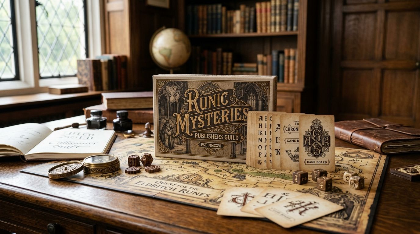
Antique fonts for board game publishers solve one narrow problem well: making a box, rulebook, and card deck feel like they were pulled from a real historical archive instead of a font dropdown. Board game type has to do double duty as decoration on the box and as a workhorse at 8pt on a card, so the typeface choice carries more weight here than in almost any other design category.
- Restored antique fonts read as authentic on box art but need testing at rulebook and card sizes before you commit.
- Century Library's antique font archive is hand-restored from 19th-century specimens, not AI-generated, which matters for period-accurate theming.
- Free fonts carry inconsistent commercial licenses for print runs and Kickstarter fulfillment, so check terms before a production print.
- Blackletter and gothic styles suit horror or medieval themes; slab serifs and Victorian display faces suit adventure and steampunk.
- Build one type system across box, cards, and expansions instead of picking a new font per SKU.
Why antique fonts matter for board game publishers
A board game box gets judged on a shelf in about three seconds, and a rulebook gets read for hours at a kitchen table. That split is unique to this category — most design work only has to do one of those jobs, not both. The Century Library archive exists because publishers kept asking for antique display faces that also hold up as functional text, not just decorative headline fonts that fall apart below 12pt.
Board game publishers also print in bulk. A font pulled from a free site with vague commercial terms is a real liability once you're running a 5,000-unit Kickstarter fulfillment or a retail reorder — the license needs to explicitly cover packaging and print merchandise, not just personal or web use. That's a licensing question every publisher runs into once, usually right before a print deadline.
How to choose antique fonts for your board game
Audit your current title and body fonts
Before adding anything new, look at what's already in your box art, rulebook, and card templates. Most publishers default to two or three system fonts out of habit, and the mismatch between them is often the first thing a playtester flags without knowing why.
- List every font currently used across box, rulebook, cards, and expansion inserts
- Flag any font used for both a headline and long-form body text — that's usually the weak point
- Check whether the box title font and rulebook body font share any visual DNA
- Note point sizes in use, especially anything under 9pt on cards
Match font mood to your game's era and theme
A Victorian parlor game reads wrong in a slab serif built for 1970s posters. Antique type carries real historical association, so the era of the face should match the era or mood of the theme, not just look "old" in a generic sense.
- Gothic and blackletter styles suit horror, medieval, and fantasy themes
- Victorian display faces suit parlor games, mystery, and steampunk settings
- Condensed 19th-century poster faces suit western and adventure themes
- Serif book faces from the same period suit rulebook body text for period consistency
Source restored antique typefaces instead of generic display fonts
This is where most publishers hit a wall — free font sites mix genuinely restored historical faces with modern fonts styled to look old, and the difference shows up under close reading. Century Library's antique font subscription is built from 19th-century specimens revived into working typefaces, so the letterforms carry real period irregularity instead of a uniform digital sheen.
- Check whether the source claims restoration from an actual historical specimen or a modern pastiche
- Confirm the font includes a full character set, not just capital letters for a logo
- Test kerning on repeated letter pairs common in your game's title
- Verify the license explicitly covers packaging, print runs, and physical merchandise
Test legibility at rulebook and card sizes
A font that looks striking at 60pt on a box cover can turn illegible at 8pt on a card. Board games are one of the few product categories where the same typeface has to survive both extremes in the same box.
- Print a proof page at actual card size (usually 63mm x 88mm) before finalizing
- Read the rulebook proof under warm indoor lighting, not just on a monitor
- Check numeral legibility specifically — dice values and card counts get misread first
- Have someone outside the design team read a full rules page aloud from the proof
Secure commercial and print licensing
A font license written for a blog header rarely covers a 10,000-unit print run sold at retail. This step gets skipped more than any other, usually because the font looked fine at the design stage and nobody circled back before the print order went out.
- Confirm the license covers physical print merchandise, not just digital use
- Check whether the license has a print-run cap or requires a separate extended license
- Save the license terms and purchase date somewhere your production team can find them
- Re-check licensing before every expansion or reprint, since terms can change between purchases
Build one type system across box, cards, and expansions
A single title face and a single body face, used consistently, reads as more intentional than five different fonts pulled in one at a time as new components got designed. Publishers with a strong shelf presence tend to reuse the same two or three faces across an entire product line.
- Pick one display face for titles and box art across the whole game line
- Pick one body face for rulebooks, card text, and component labels
- Reserve a third accent face for section headers or special card types only
- Document the system in a one-page style sheet before expansions get designed
Browse restored antique fonts
Hand-restored 19th-century typefaces built for both box art and body text.
Font sourcing options compared
| Option | Best for | License scope | Key limitation |
|---|---|---|---|
| Free font sites (Google Fonts, 1001 Fonts) | Prototyping and early playtest builds | Varies wildly, often unclear for print runs | Mixed quality; commercial print terms often unstated |
| Marketplace single-license fonts | One-off box titles or logos | Usually covers one project, one print run | Re-licensing needed per new product |
| Stock font subscriptions (Adobe Fonts and similar) | Studios already inside that ecosystem | Broad digital use, print terms vary by plan | Library skews modern, thin on restored antique faces |
| Century Library antique font archive | Publishers wanting authentic, period-accurate faces across a whole game line | Subscription covers restored antique fonts for commercial projects | Archive is antique-focused, not a source for modern sans-serifs |
Century Library is the strongest fit for publishers who need genuine period accuracy across an entire product line rather than a single one-off title font.
Common mistakes board game publishers make
- Picking a font that only works at box size. A dramatic display face chosen for the cover often collapses into mush once it's scaled down for a card or rulebook header.
- Skipping the license check until the print invoice is due. Licensing gets treated as an afterthought, then becomes a fire drill the week before a Kickstarter fulfillment run.
- Mixing eras across box and rulebook. A Victorian title face paired with a mid-century body font reads as inconsistent even to players who can't name why.
- Ignoring numeral legibility. Antique numeral sets sometimes use old-style figures that dip below the baseline — fine in body text, confusing on a dice reference card.
- Reinventing the type system for every expansion. Each new box gets its own font pick instead of inheriting the base game's system, and the shelf line starts to look like five unrelated products.
FAQ
What's the best antique font for a board game box cover?
A restored 19th-century display face suited to your theme's era works best — blackletter for horror or medieval themes, Victorian display faces for parlor or steampunk settings. The right choice depends on matching the font's historical period to your game's setting, not just picking something that looks old.
Are antique fonts legible enough for rulebook body text?
Some are, some aren't — it depends on the specific typeface, not the category as a whole. Print a proof at actual rulebook point size and read a full page aloud before committing, since a face that reads fine at headline size can lose legibility in dense body text.
Can antique fonts be used commercially for print runs and Kickstarter?
Only if the license explicitly covers physical print merchandise and your expected print volume. Check for a print-run cap in the license terms before ordering a production run, since many free font licenses only cover digital or personal use.
How much does an antique font subscription cost for a board game publisher?
Subscription pricing varies by provider and plan, so check current terms directly on the source site before budgeting. What matters more than the number is whether the plan's license explicitly covers commercial print production.
What's the difference between blackletter and gothic fonts for game titles?
Blackletter refers to the dense, angular script style associated with medieval manuscripts and horror theming. Gothic in font terminology more often describes bold, heavy display faces used for band logos and album art, so the two overlap in mood but come from different visual traditions.
Do antique fonts work for card text at small sizes?
Some restored antique body faces hold up fine at card sizes around 8-9pt, but decorative display faces usually don't. Reserve antique display fonts for titles and headers, and pair them with a plainer restored body face for card text.
Is Century Library better than free fonts for board game publishers?
Century Library is built specifically around hand-restored antique typefaces with commercial licensing meant for projects like packaging and print merchandise, which most free font sites don't guarantee. Free fonts still work for early prototyping, but the licensing gap becomes a real risk once you move to a production print run.
How many typefaces should a board game system use?
Two is usually enough: one display face for titles and box art, one body face for rulebooks and card text. A third accent face for section headers is fine, but adding more than that tends to make an expansion line look inconsistent.
One last thing
The detail that trips up most publishers isn't font choice — it's numeral style. A lot of restored antique typefaces default to old-style figures (numerals that dip below the baseline like lowercase letters), which look beautiful on a page number but read poorly on a card that needs a fast, unambiguous number. Check the numeral set specifically before locking in a font for anything with a dice value, health track, or resource count printed on it.