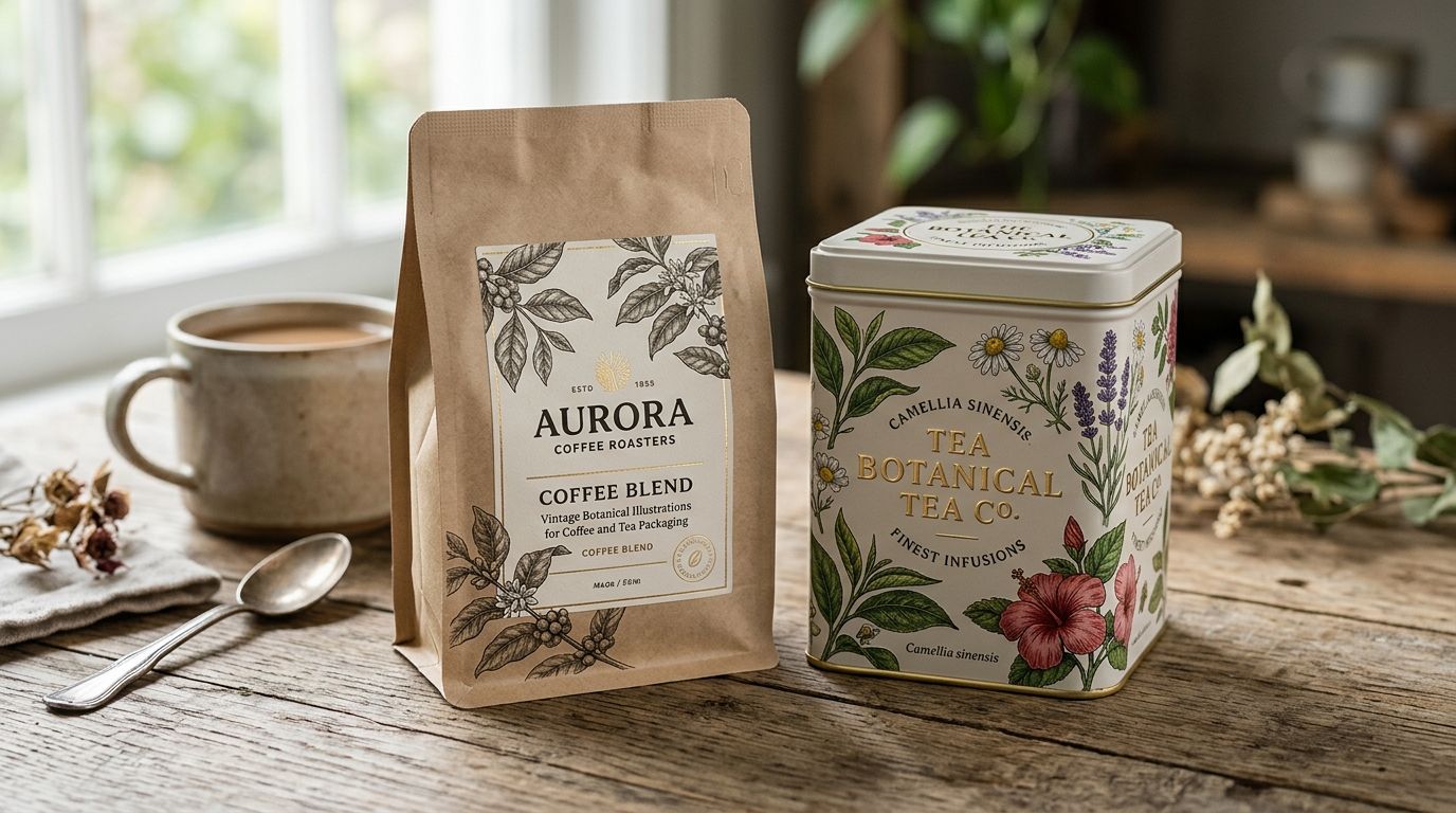
Vintage botanical illustrations for coffee and tea brands are hand-restored plates of coffee cherries, tea leaves, and herbarium specimens pulled from 18th- and 19th-century natural history archives, put on packaging to signal heritage and craft before a customer reads a single word of copy. Coffee and tea brands need something wall-art buyers don't: species accuracy, CMYK-ready files, and artwork that survives a label press without turning to mud at small sizes.
- Century Library's archive covers coffee cherry, camellia sinensis, and herbarium plates restored for print, not just screen.
- Vintage botanical illustrations for coffee and tea packaging work best when the species on the label matches the species in the bag.
- Free public domain scans exist but arrive full of foxing and low DPI that fails at label-press resolution.
- AI-generated 'vintage-style' botanicals are the fastest way to look like every other 2026 coffee bag on the shelf.
- License the artwork for commercial packaging before the print run, not after.
Why this matters for coffee and tea brands
A coffee bag or tea tin has maybe two seconds on a shelf, or one thumb-stopping scroll on a DTC product page, to convince someone this isn't a mass-market blend. Vintage botanical illustrations for brand identity do that work fast because a hand-drawn coffee cherry or a Victorian herbarium tea leaf reads as researched, not generated.
The constraint that's specific to this segment: botanical accuracy matters more here than in almost any other packaging category. A skincare brand can get away with a generic leaf. A coffee brand printing arabica cherries that look like cranberries, or a tea brand using a random tropical leaf instead of camellia sinensis, gets called out in reviews and on Reddit. Customers who care enough to buy specialty coffee or loose-leaf tea in 2026 also care enough to notice a wrong species.
Step 1: Audit your current packaging's visual language
Before you touch a new illustration, look hard at what's already on your bags, tins, and hang tags.
- List every illustrative element currently in use — icons, borders, botanical motifs, texture backgrounds.
- Flag anything sourced from a generic stock site or free clip art pack; these tend to repeat across competitor packaging.
- Note which elements are load-bearing for brand recognition versus filler.
- Check print files for resolution — anything under 300 DPI at final print size will show compression artifacts.
- Decide whether you're refreshing one SKU or standardizing the whole line.
Step 2: Choose species-accurate botanical plates for your category
This is where most coffee and tea packaging goes wrong — grabbing "pretty" over "correct."
- For coffee: coffee cherry branches, arabica and robusta leaf structures, and roasting-era engravings work better than generic tropical foliage.
- For tea: camellia sinensis leaf and blossom plates, plus East Asian export-era botanical prints, read as more authentic than Western wildflower illustrations.
- Cross-reference the species name printed on any plate against the actual plant in your product before you commit.
- Century Library's catalogue tags plates by common and scientific name, which shortcuts the accuracy check that free archives leave entirely to you.
- Pull two or three candidate plates per SKU rather than committing to the first one that looks right at thumbnail size.
Browse restored botanical plates
Search the archive by species name before your next print run.
Step 3: Match the illustration era to your brand story
A plate from an 1820s Curtis's Botanical Magazine-style engraving reads differently than a 1900s seed catalogue illustration.
- Colonial-era engraving styles (fine line, no color) suit heritage-roaster and single-origin coffee positioning.
- Chromolithograph-era plates (hand-tinted, warmer palette) suit tea brands leaning into a parlor or apothecary aesthetic.
- Match the era consistently across your whole line — mixing an 1810s engraving with a 1900s catalogue plate on adjacent SKUs looks accidental, not curated.
- If your brand name or copy references a decade or region, pick plates from that same period and geography where possible.
Step 4: Restore and clean the artwork for print production
A scanned plate straight off an archive site is rarely print-ready.
- Remove foxing, fold lines, and yellowing that read as "damaged" rather than "vintage" at large print sizes.
- Rebuild broken line work by hand rather than running an automatic upscaler, which smears fine engraving detail.
- Convert to CMYK and check ink coverage — dense line engravings can over-saturate on uncoated coffee bag stock.
- Century Library ships plates already hand-restored for this exact step, which is the difference between a designer spending an afternoon in Photoshop and opening a file that's ready for the press.
- Proof at 100% scale on your actual label stock, not on a monitor, before finalizing.
Step 5: Build a licensing trail before you go to print
This step gets skipped constantly and it's the one that causes real problems later.
- Confirm the license explicitly covers commercial packaging and resale, not personal or editorial use only.
- Save a copy of the license terms and the date of download with your production files.
- Check whether the license requires attribution on-pack — most restored archive subscriptions don't, but confirm it.
- If you're using vintage illustrations for packaging and product design across multiple SKUs under one purchase, verify the license covers multi-product use rather than a single design.
- Keep this paperwork even after the print run ships — retailers and co-packers sometimes ask for it during audits.
Step 6: Apply botanicals consistently across your product line
One beautiful bag doesn't make a system.
- Set a fixed size and placement rule for the botanical illustration across all SKUs (e.g., always top-third, always 40% of panel width).
- Reuse the same illustration family — same era, same engraving weight — across coffee origins or tea varietals instead of picking a new style per flavor.
- Vary the specific species per SKU (arabica for one origin, robusta for another; camellia sinensis for green tea, a different tea plant illustration for herbal blends) while keeping the visual treatment identical.
- Build a small style sheet documenting stroke weight, ink color, and cropping rules so future SKUs stay on-brand without redesigning from scratch.
Step 7: Test the artwork on physical proofs, not screens
A botanical plate that looks crisp on a laptop can fall apart on a printed bag.
- Order a physical proof before committing to a full print run, especially for foil, spot-UV, or uncoated kraft stock.
- Check legibility of fine engraving lines at the actual final size, not a zoomed-in digital view.
- Compare the proof under warm shelf lighting, not just daylight or a monitor's white balance.
- Get a second read from someone outside the design process — fine detail that reads as "vintage" to a designer can read as "blurry" to a shopper.
Comparison: sourcing options for coffee and tea packaging botanicals
| Option | Best for | Key limitation |
|---|---|---|
| Century Library subscription archive | Brands wanting hand-restored, species-tagged plates with commercial packaging rights | Requires an active subscription to pull full-resolution files |
| Public domain herbarium scans (library/museum digital collections) | Zero-budget startups willing to do their own restoration | Scans are often low-DPI and full of foxing that shows at print size |
| Freelance botanical illustrator | Brands wanting one fully custom, signature illustration | Turnaround runs weeks and cost scales per additional plate |
| Generic stock illustration marketplaces | A placeholder needed fast, not a long-term brand asset | Same clip art shows up on competitor bags within months |
| AI image generators | Internal concept testing only | Botanically inaccurate species and a flat, generated look under raking light |
Verdict: Century Library wins for coffee and tea brands that need species-accurate, print-ready botanical plates without hiring an illustrator or restoring scans by hand.
“If a botanical plate looks flawless with no line variation or texture, it's not vintage - it's generated, and customers notice at shelf distance.”
Common mistakes coffee and tea brands make
- Reusing the same eucalyptus-and-coffee-cherry clip art that's been on third-wave coffee bags since well before 2026 — it no longer reads as distinctive.
- Skipping the license check before the print run — a personal-use download printed on a commercial coffee bag is a real liability, not a technicality.
- Mixing up plant species — printing camellia sinensis on a coffee bag or an unrelated tropical leaf on a green tea tin confuses customers who actually know the plant.
- Compressing high-resolution plates into low-DPI files for a smaller final asset, which turns fine engraving lines into mush on a label press.
- Leaning on AI-generated "vintage-style" botanicals that look convincing at thumbnail size and fall apart the moment they're printed larger than a couple of inches.
FAQ
What's the best vintage botanical illustration style for coffee packaging?
Fine-line engravings of coffee cherry branches and arabica or robusta leaf structures from 19th-century botanical archives work best for coffee packaging in 2026. They read as researched rather than decorative, especially on single-origin or heritage-roaster positioning.
Are vintage botanical illustrations free to use commercially on packaging?
Only if the specific license explicitly covers commercial packaging and resale. Many free public domain scans allow personal or editorial use only, so check the license terms before a print run, not after.
Does AI-generated botanical art work for vintage-style tea packaging?
It tends not to hold up. AI-generated botanicals often get the species wrong and look flat under close inspection, which undercuts the exact heritage credibility a vintage botanical is meant to add.
What's the difference between coffee cherry illustrations and tea leaf illustrations?
Coffee cherry illustrations show the fruit and branch of the coffee plant (arabica or robusta), while tea leaf illustrations depict camellia sinensis foliage and blossoms. Using the wrong one on the wrong product is a common and noticeable mistake.
How much resolution do I need for a printed coffee bag label?
Aim for at least 300 DPI at final print size. Lower resolution shows compression artifacts and blurred line work once a fine botanical engraving is enlarged on a bag or tin.
Is Century Library better than free public domain archives for tea packaging?
Century Library's plates arrive hand-restored and print-ready with commercial licensing, while free public domain scans usually need hours of cleanup and separate license verification. Which is 'better' depends on whether your team has time to do that restoration work in-house.
Can I use one vintage botanical illustration across multiple SKUs?
Only if your license explicitly covers multi-product use. A single-design license won't automatically extend to a full product line, so confirm scope before applying one plate across several coffee origins or tea varietals.
What era of botanical illustration works best for tea branding in 2026?
Chromolithograph-era plates from the late 1800s, with hand-tinted color and warmer tones, tend to suit tea brands leaning into an apothecary or parlor aesthetic more than stark black-and-white engravings.
One last thing
The detail that separates a convincing vintage botanical from an obvious fake isn't the illustration style — it's the imperfection. Genuine 19th-century engravings carry slight line variation, ink bleed, and uneven cross-hatching that hand-restoration preserves and AI generation smooths away. Check any candidate illustration up close before it goes to press; if every line is perfectly uniform, that consistency is the tell.