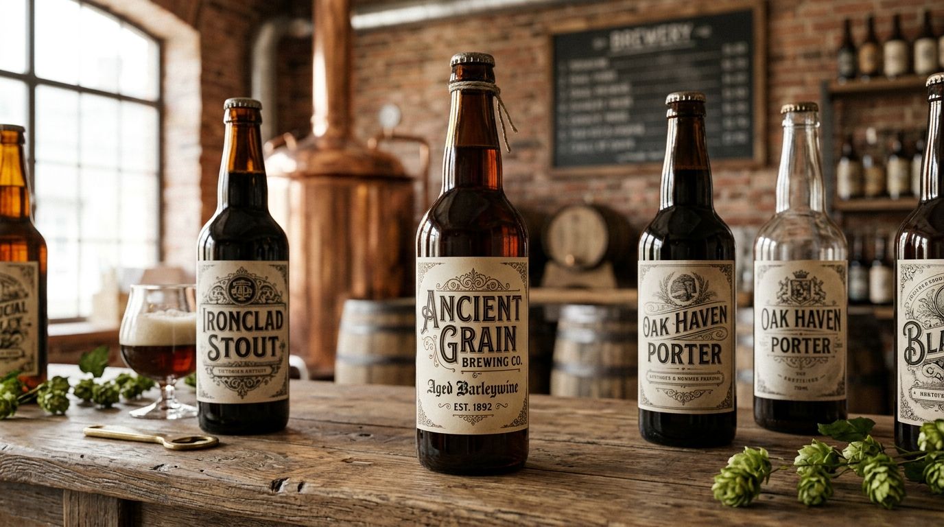
Antique fonts for craft brewery labels are hand-restored 19th and early 20th-century typefaces used to give a beer brand instant shelf-cred, the kind that makes a taproom regular assume your seasonal stout has been on the menu since before Prohibition. Brewery labels carry a harder job than most packaging: they need a display font punchy enough to read from three feet away, a body font clean enough to carry mandatory federal copy at 6 points, and a whole system that survives condensation, kraft stock, and a six-month print run without falling apart.
- Antique fonts for brewery labels work best paired: one restored display face for the name, one plain serif for the fine print.
- The Century Library archive holds antique fonts with commercial licensing already cleared for packaging, no AI-generated substitutes.
- TTB-mandated copy (net contents, alcohol by volume, government warning) needs a legible, non-decorative face at small sizes.
- Slab serifs and Victorian display faces test better on kraft label stock than thin script fonts.
- Buy or subscribe to fonts before the can run ships — free "vintage-style" fonts often carry no commercial license at all.
Why antique fonts matter for craft brewery labels
A brewery label is read in under two seconds, usually across a cooler door or a bar top, which means the type has to do the storytelling that a wine label does with a paragraph. Restored 19th-century display faces (think circus posters, patent medicine labels, and pre-Prohibition beer advertising) carry texture and irregularity that modern geometric fonts can't fake without looking like a filter.
The constraint that trips up most brewery designers is legal copy. The Alcohol and Tobacco Tax and Trade Bureau requires specific disclosures on every label, and a heavily decorative antique font that looks great on the brand name becomes unreadable at the size required for a government warning. That's a font-pairing problem, not a font-selection problem, and it's the first thing to solve before you touch a single plate or fig. number in an archive catalogue.
Build the label system, not just the font
Audit your label hierarchy before picking a font
Before opening any font archive, map out every text element the label needs to carry. Most craft brewery labels break into four or five tiers, and each one has a different legibility floor.
- Brand or brewery name (largest, most decorative slot)
- Beer name or series name (second-largest, needs to pair with the brand mark)
- Style descriptor (IPA, stout, saison) at a mid-size weight
- TTB-mandated copy: net contents, ABV, government warning
- Batch number, brewed-on date, or QR code for the taproom app
Write these five tiers down with approximate point sizes before you touch a font archive. A hierarchy audit takes fifteen minutes and saves a redesign later.
Choose a display font for the brand or beer name
The brand name slot is where a restored antique font earns its keep. Victorian display faces, 19th-century woodblock letterforms, and hand-lettered Prohibition-era script all read as "this brewery has history" in a way no modern typeface fakes convincingly.
- Pull three to five candidate faces from the same decade or region so the letterforms feel like one family, not a grab bag
- Test at the actual can or bottle width, not full-screen on a monitor
- Check for extreme letterforms (long descenders, tall ascenders) that clip against a label's die-cut edge
- Favor faces with a full character set if the brewery name has numerals or an ampersand
- Avoid faces restored from a single decorative specimen with no lowercase set \u2014 you'll need one eventually for a tagline
The antique font subscriptions for logo designers collection is a reasonable starting filter here, since brewery brand marks function almost exactly like a logo lockup.
Pick a supporting serif or slab serif for descriptors
The style descriptor ("IPA," "Barrel-Aged Stout," "Session Saison") needs a face that's legible at a smaller size but still period-correct. Slab serifs restored from 19th-century broadsides and patent labels do this job well because their heavy strokes hold up on textured paper stock.
- Match the slab serif's stroke weight to the display font's boldest weight, not its thinnest
- Test the descriptor in all caps and title case \u2014 antique slab serifs often look better in caps at small sizes
- Check kerning on double letters ("ALE," "ALL") since restored fonts sometimes carry uneven original spacing
- Confirm the face includes numerals if the descriptor includes an ABV percentage
The slab serif fonts for packaging design archive covers this exact pairing use case, restored from period packaging rather than digital-first slab revivals.
Set the TTB-mandated copy in a plain restored serif
This is the step most brewery label projects skip, and it's the one that gets labels bounced back from the printer or flagged by the TTB. The government warning, net contents, and ABV statement need a face that's decorative in spirit but boring in execution \u2014 legible at 6 to 8 points on matte or kraft stock.
- Choose a restored serif with even, low-contrast strokes rather than a high-contrast display serif
- Set mandatory copy no smaller than the legal minimum for your label size (check current TTB guidance directly, it varies by container size)
- Run a proof print at 100% scale before sign-off, not a screen zoom
- Avoid italic or script styling anywhere in the mandatory copy block
Test the type at print size and paper stock
A font that looks period-perfect on a 27-inch monitor can fall apart on a matte can wrap or an uncoated kraft label. Antique fonts restored from letterpress or woodblock originals often carry fine hairlines that vanish on textured stock.
- Print a physical proof on the actual label stock, not just a laser printer test sheet
- Check legibility under bar lighting, not daylight-balanced studio light
- Fold or curve the proof around a can shape to catch letters that distort on the seam
- Compare a coated versus uncoated stock proof if the brewery hasn't locked print vendor yet
Build a texture layer that doesn't fight the type
Distressed textures and grain overlays are a brewery-label staple, but layered on top of an already-textured antique font, the combination turns to visual noise fast.
- Apply texture at low opacity (10 to 25%) behind the type layer, never directly on top of small text
- Pick a single grain source and reuse it across the whole label family for consistency across seasonal releases
- Skip texture entirely on the mandatory copy block \u2014 legibility outranks mood there
- Test the texture at print size since screen previews exaggerate grain visibility
The distressed grunge textures for graphic design set is built for exactly this kind of restrained background layering rather than full-bleed overlays.
License the fonts for commercial packaging use
This is the step that gets breweries into trouble. A font downloaded free from a personal-use font site is not cleared for a commercial product that ships to retail shelves, and a cease-and-desist letter after a can run has already printed is an expensive lesson.
- Confirm the license explicitly covers packaging and print runs, not just digital or personal use
- Check whether the license caps units printed or requires a per-SKU add-on
- Save the license certificate or subscription confirmation with the brand's production files
- Re-check licensing before every seasonal or collaboration release, since terms can differ by product
A subscription route through the Century Library archive clears this at the account level rather than per download, which matters when a brewery runs six or eight label SKUs a year.
Save a style sheet for seasonal and limited releases
Once the flagship label system is locked, document it so seasonal releases don't drift into a different decade of typography by accident.
- Record the exact font names, weights, and point sizes used per tier
- Note the texture opacity and source file used for the background layer
- Keep one saved proof file per paper stock the brewery uses
- Flag which fonts are display-only versus body-safe for future designers on the account
Comparison: where craft breweries source antique fonts
| Option | Best for | Key limitation |
|---|---|---|
| Free "vintage-style" font sites | Quick mockups and internal pitches | Commercial packaging license often missing or unclear |
| Single-font marketplace purchase | A one-off flagship label | No archive access for future seasonal releases |
| Century Library subscription | Ongoing label systems across a full seasonal lineup | Requires an active subscription rather than a one-time buy |
| Custom type design or lettering | A brewery building a fully proprietary brand mark | Slower turnaround and higher upfront cost than an archive pull |
“A brewery label only needs one decorative font — everything else on the can should read like it was set to be read, not admired.”
Common mistakes craft breweries make with label typography
- Mismatching font eras. Pairing an 1890s circus display face with a 1970s slab serif reads as costume, not history \u2014 keep the display and supporting fonts within a few decades of each other.
- Styling the mandatory copy. Running the TTB government warning in an italic script is both a legibility failure and a compliance risk.
- Skipping the print proof. Screen previews flatten paper texture; a font that looks crisp on a monitor can smear on uncoated kraft stock.
- Ignoring license scope. Free font downloads rarely cover commercial packaging runs \u2014 confirm this before the can order ships, not after.
- Overloading texture on small text. Grain and distress layers look great behind a brand name and unreadable behind an ABV percentage.
Build your brewery label type system
Browse hand-restored antique fonts cleared for commercial packaging use.
FAQ
What are the best antique fonts for brewery labels?
Restored 19th-century display faces — Victorian letterforms, woodblock lettering, and patent-medicine slab serifs — work best for the brand name slot on a brewery label. Pair them with a plainer restored serif for the mandatory copy so the label stays legible at small sizes.
Can I use a free vintage font on a commercial beer label in 2026?
Only if the license explicitly covers commercial packaging and print runs. Most free "personal use" font downloads don't clear this, and a brewery running a can order under an unlicensed font risks a legal claim after the fact.
How small can the TTB-mandated copy be on a beer label?
The exact minimum depends on container size, so check current TTB label requirements directly before finalizing type size. Regardless of the legal minimum, a heavily decorative antique font rarely holds up at that size — use a plain restored serif for this block.
Do antique fonts print well on kraft or uncoated label stock?
Slab serifs and heavier Victorian display faces print more reliably on kraft stock than thin script fonts, since fine hairlines tend to vanish on textured, uncoated paper. Always run a physical proof at 100% scale before final sign-off.
Should every beer in a lineup use the same font?
The brand name font should stay consistent across the lineup for recognition, but the style descriptor font can vary slightly by series as long as it stays within the same type era to avoid a mismatched look.
Is a font subscription worth it for a small brewery?
If the brewery runs more than two or three label SKUs a year, a subscription clears licensing at the account level instead of per font, which is usually cheaper and faster than repeat one-off purchases.
What font pairing mistake shows up most on brewery labels?
Mismatched font eras — pairing a font restored from an 1890s poster with a 1970s slab serif reads as costume rather than authentic history. Keep display and supporting fonts within the same general decade.
Do textures affect font legibility on cans versus bottles?
Yes — can labels wrap around a curved seam, which distorts texture and letterforms near the edge more than a flat bottle label does. Test any texture-and-type combination on the actual can shape before finalizing.
One last thing
The detail that separates a brewery label that reads as "authentic" from one that reads as "trying" is almost never the display font \u2014 it's the government warning block. A crisp, plain, legible mandatory-copy line signals a brand that respects the format it's working in; a decorative font crammed into that space at 6 points signals a rush job, and shoppers clock it even if they can't name what's off. Get that one line right and the rest of the label's antique styling reads as confident rather than costumed.