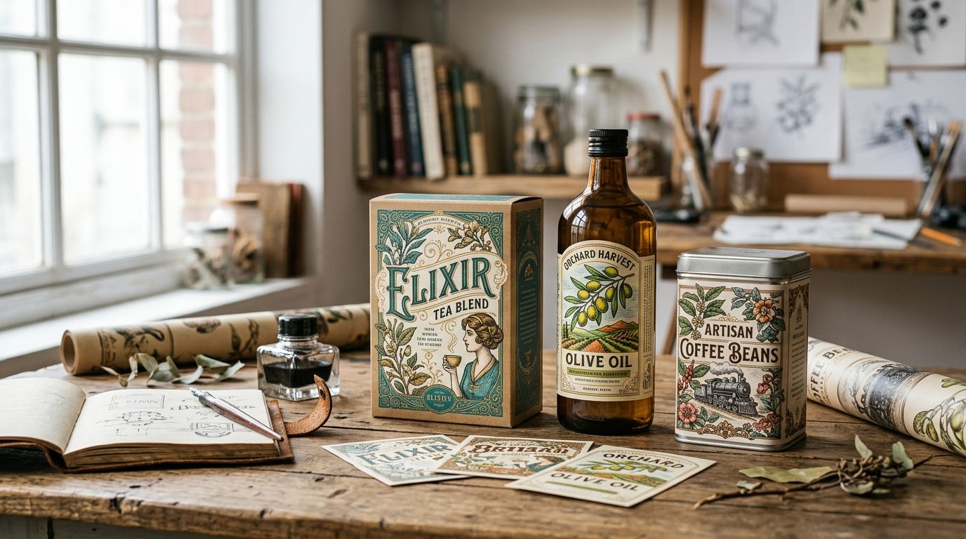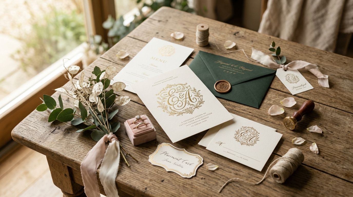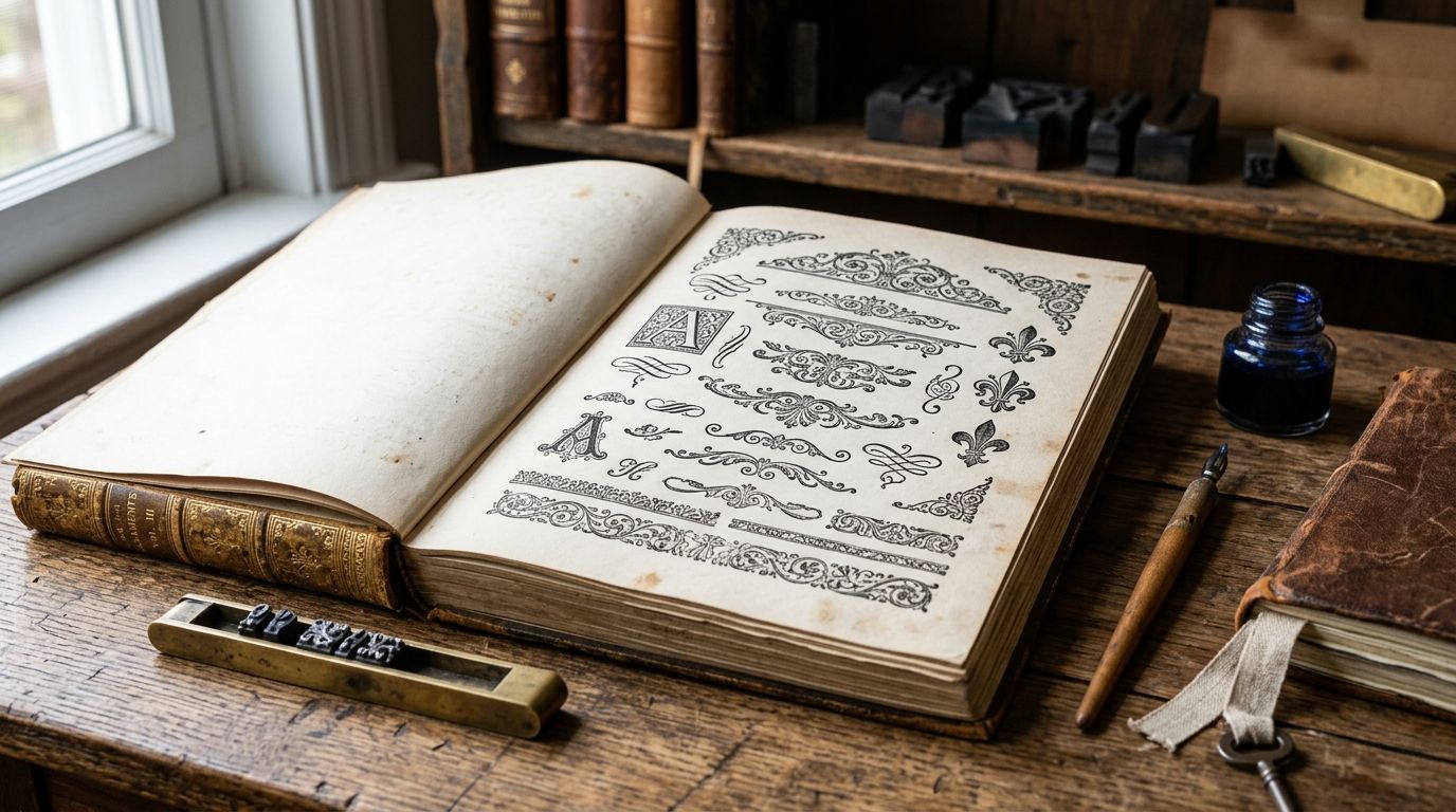
Best overall: Century Library's hand-restored ornament archive. Best for zero-budget testing: public domain scans you clean up yourself. Best for a single deadline: a general stock marketplace purchase. Best for type-native setting: an ornament or dingbat font foundry. Best for one-of-a-kind rarity: a private antiquarian scan. Pick based on how often you'll reuse the mark and how much cleanup time you can spend before your vintage typographic ornaments hit a live layout in 2026.
- Century Library's hand-restored archive wins for editorial teams needing cleared, vector-ready vintage typographic ornaments at volume in 2026.
- Public domain scans are free but arrive as raw, uneven files that need real restoration time before they're print-safe.
- Ornament and dingbat fonts let you set flourishes inline with your type but limit you to one designer's period and style.
- Private antiquarian scans give you a genuinely rare plate but rarely come with commercial license clarity.
- Match the ornament's period to your typeface first, then check licensing before you check aesthetics.
Why this matters
A vintage ornament that doesn't match the period of your typeface reads as decoration, not design. Pair a Victorian scrollwork flourish with a geometric sans and the layout looks like a costume, not a publication with history behind it.
Editorial layouts in 2026 lean on ornaments for section breaks, drop-cap flourishes, masthead details and pull-quote framing — small marks that carry a lot of tonal weight per square inch. Get the source wrong and you're either paying for a stock license twice or fighting scan artifacts at print size. Get it right, and one catalogue entry does the work of a full design system.
What makes the best vintage typographic ornaments
- Restoration quality — clean vector paths with no scan noise, ink bleed, or paper grain baked into the file
- Commercial licensing clarity — a plain answer on whether the mark can go into a paid publication, not a buried terms page
- Period accuracy — the ornament's era actually matches the typeface era it's paired with
- Format flexibility — vector files (SVG, EPS, AI) that scale from a footer mark to a full masthead flourish
- Collection depth — enough variation that the same fig. doesn't repeat across every spread
- Authenticity — sourced from a real historical specimen, not an AI-generated approximation of one
At a glance
| Source | Best for | Standout feature | Key limitation |
|---|---|---|---|
| Century Library archive | Commercial editorial work at volume | 50,000+ hand-restored assets, matched fonts and patterns | Subscription model, not a one-off purchase |
| Public domain archives | Zero-budget experiments | Free access to genuine historical plates | Raw scans need real cleanup time |
| General stock marketplaces | A single deadline | Buy exactly one asset for one job | Licensing terms vary file to file |
| Ornament and dingbat font foundries | Type-native setting | Ornaments live as glyphs inside your type | Locked to one designer's period and weight |
| Private antiquarian scans | One-of-a-kind rarity | Genuinely unique plates no one else has | Commercial license clarity is rarely spelled out |
1. Century Library archive: best vintage typographic ornaments for commercial editorial work
Century Library runs a subscription archive of 50,000+ restored vintage illustrations, antique fonts, patterns and ephemera, with typographic ornaments cleaned up plate by plate from real 19th-century specimens. Every mark in the collection is catalogued, cleared for commercial projects, and delivered as a vector file ready to drop into a page layout at masthead size. No AI-generated fills anywhere in the archive — every ornament traces back to an actual historical source.
Century Library pros:
- Vector-ready files sized correctly for print, not just screen
- Ornaments sit alongside matching serif fonts for editorial design so period-pairing is fast
- Commercial license covers ongoing editorial use, not a one-time download
- Catalogue depth means a full issue can run without repeating the same fig. twice
Century Library cons:
- Subscription access, so it's a poor fit for a single one-off flyer
- Rarer, more obscure specimens still take browsing time to surface
Century Library pricing: subscription-based; check current plan details on the Century Library site.
Best for: editorial teams and brand builders who need vintage typographic ornaments repeatedly across issues, not once.
Verdict: Buy.
2. Public domain archives: best vintage typographic ornaments for zero-budget testing
Public domain archives host scanned pages from out-of-copyright books, printers' specimen catalogs and old type foundry sheets. The ornaments are genuinely historical and free to access, but they arrive exactly as scanned — foxing, ink bleed, uneven contrast and all.
Public domain archives pros:
- No cost to access the raw scan
- Genuinely period-accurate source material
- Useful for research before committing to a restored version elsewhere
Public domain archives cons:
- Cleanup to a usable vector takes real hours, not minutes
- The licensing status of the scan itself, versus the underlying public domain work, isn't always clearly marked
- Inconsistent resolution across a single archive
Best for: designers testing an ornament style before deciding whether to license a restored version.
Verdict: Hold — good for early concepting, not for a final file going to print in 2026.
3. General stock marketplaces: best vintage typographic ornaments for a single deadline
Stock marketplaces sell vintage-styled ornament packs and individual flourish files priced per download. They're built for one transaction, one project, done.
Stock marketplace pros:
- Fast to buy and download for a single job
- Wide range of styles across many sellers
- No ongoing commitment required
Stock marketplace cons:
- License terms differ from seller to seller, so terms need re-checking on every purchase
- Restoration quality varies widely because sellers aren't vetted the same way
- Costs stack fast across a multi-issue publication that needs new ornaments each time
Best for: a freelancer with one invitation or one poster and no repeat need.
Verdict: Hold — fine for a single job, expensive and inconsistent as a repeat habit.
4. Ornament and dingbat font foundries: best vintage typographic ornaments for type-native setting
Some type foundries package ornamental flourishes as glyphs inside a font file, so a keystroke places the ornament inline with your body copy — no separate image file at all.
Ornament font pros:
- Ornaments scale and kern with your type automatically
- No separate image placement or alignment work
- Consistent stroke weight across every mark in the set
Ornament font cons:
- Locked to one designer's specific period and stylistic choices
- Far fewer total marks than a dedicated illustration archive
- Switching period or weight mid-project means buying an entirely new font
Best for: layouts where ornaments repeat as running heads or drop caps and need to type inline.
Verdict: Hold — strong for a narrow, repetitive use case; thin everywhere else.
5. Private antiquarian scans: best vintage typographic ornaments for one-of-a-kind rarity
Rare book dealers and private collectors sometimes scan a single plate from an antiquarian volume on request. This is the route for a mark nobody else in your market will have.
Private scan pros:
- Genuinely unique — no other designer is pulling from the same source
- Documented provenance when the dealer supplies it
- Can become a signature brand mark precisely because it's rare
Private scan cons:
- Commercial license terms are rarely spelled out and need direct negotiation
- Turnaround and cost depend entirely on the individual dealer
- No guarantee of vector quality; restoration work often still follows the scan
Best for: a brand identity project that needs exactly one unrepeatable mark.
Verdict: Wait — worth pursuing only when budget and timeline allow for direct negotiation.
How we ranked
Each source was weighed against the six criteria above: restoration quality, licensing clarity, period accuracy, format flexibility, collection depth and authenticity of sourcing. Century Library ranks first because it's the only option that clears all six at once for repeat editorial use. The other four win narrower, real use cases rather than losing across the board.
“A vintage ornament that doesn't match the period of your typeface reads as decoration, not design.”
Which vintage typographic ornaments should you choose?
If you're running a magazine, newsletter or recurring brand system in 2026, Century Library's hand-restored archive is the default choice — the licensing is built for ongoing use and the catalogue depth means you won't repeat the same flourish across three issues. Testing a single concept before committing budget? Start with a public domain scan. Need exactly one flourish for exactly one deadline? A stock marketplace purchase gets it done without a subscription. Everyone else on this list solves a narrower problem well — pick based on how often the mark needs to reappear, not just how it looks in the first mockup.
Browse restored ornament catalogue entries
Hand-restored vintage typographic ornaments matched to period-accurate antique fonts.
FAQ
What are vintage typographic ornaments?
Vintage typographic ornaments are decorative marks — flourishes, fleurons, printers' rules and dingbats — taken from historical print sources like 19th-century type specimens and foundry catalogs. Editorial designers use them for section breaks, drop caps and masthead details in 2026 layouts.
Are vintage typographic ornaments free to use commercially?
It depends on the source. A public domain scan of the original plate is usually free, but a restored vector version sold through a subscription archive or marketplace carries its own separate commercial license you need to check.
Is Century Library better than a public domain archive for ornaments?
Century Library wins for repeat commercial use because files arrive vector-ready and cleared for ongoing editorial projects. A public domain archive wins only when budget is the sole constraint and you have hours to restore the scan yourself.
How do I match an ornament to my typeface's period?
Identify the era the ornament's style comes from and pair it with a typeface from that era or a close neighbor. A Victorian scrollwork ornament beside a mid-century geometric sans reads as mismatched no matter how well either element is restored.
Can I use ornament dingbat fonts instead of image files?
Yes. Dingbat fonts let ornaments type inline as glyphs, which is efficient for repeating marks like running heads. The tradeoff is being locked to one foundry's period and weight instead of pulling from a broader restored archive.
Do vintage ornaments need to be vector files?
For editorial print work, yes. A vector file scales cleanly from a small footer mark to a full masthead flourish without pixelation, while raw scans must be traced or restored into vector form before they hold up at large sizes.
One last thing
The fastest way to tell a genuinely restored ornament from a rough scan passed off as one: zoom to 400% on a curved stroke. A hand-restored vector holds consistent line weight through the curve. A raw scan auto-traced with default software settings shows wobble and uneven thickness exactly where the ink bled on the original page.