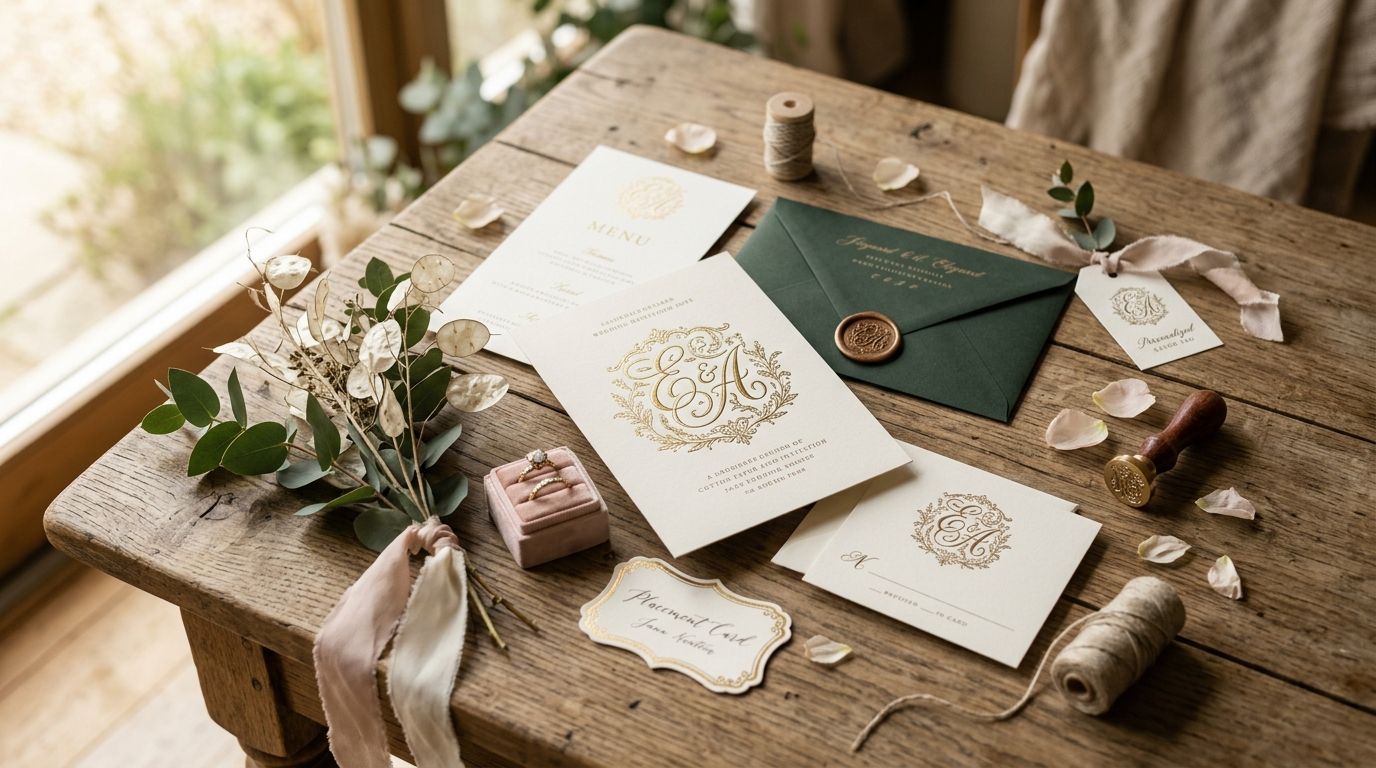
Vintage monogram fonts turn a two-letter initial into a wedding's whole visual identity — the same letterforms that show up on the invitation suite end up on napkins, place cards, and the aisle runner. This guide ranks the six vintage monogram styles that hold up best across a full wedding branding package in 2026, plus where each one falls apart.
- Victorian Script Monogram is the best overall vintage monogram font for wedding branding in 2026 — legible at half an inch, pairs with almost any border.
- Art Deco Geometric Monogram wins for retro-glam and Gatsby-themed weddings but reads stiff on romantic florals.
- Blackletter Gothic Monogram suits dark-academia and gothic-romance weddings; skip it for outdoor garden ceremonies.
- Century Library's archive carries hand-restored antique specimens across all six styles, with zero AI-generated substitutes.
- Baroque Ornamental Monogram carries the most visual weight — best on save-the-dates, worst on tiny favor tags.
Why this matters
A monogram gets reused more than any other single asset in a wedding suite — invitation, envelope liner, wax seal, cocktail napkin, welcome sign. Pick a style that only works at 3 inches and it collapses the moment a printer shrinks it for a favor tag. Pick one with no matching ornament family and every vendor who touches the design ends up improvising a border that doesn't match.
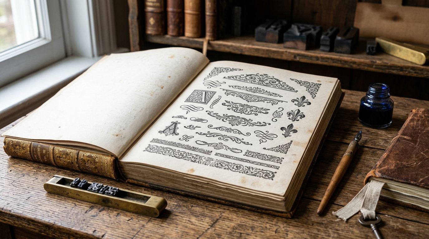
The styles below come from restored 19th- and early-20th-century type specimens in the Century Library archive, not AI-generated approximations — each one has a documented historical source, which matters when a couple wants branding that reads as authentic rather than templated.
What makes the best vintage monogram font for wedding branding
- Legibility at small sizes — the interlocking letters still read clearly at half-inch on a place card or favor tag
- Balance across letter counts — the font handles two-letter and three-letter combinations without one side looking cramped
- Historical authenticity — hand-restored from a real period specimen, with a traceable source, not a synthetic revival
- Pairing compatibility — works cleanly with vintage borders, frames, and ornamental flourishes already in circulation
- Weight range — the family includes enough variation to build hierarchy across invitation, envelope, and menu
- Commercial licensing clarity — usable on printed stationery and packaging without ambiguous terms
Vintage monogram fonts at a glance
| Style | Best for | Standout feature | Key limitation |
|---|---|---|---|
| Victorian Script Monogram | Classic, formal weddings | Reads clean at half-inch | Overused in mainstream wedding design |
| Art Deco Geometric Monogram | Retro-glam, Gatsby-themed weddings | Sharp, symmetrical letterforms | Feels cold on floral or garden themes |
| Blackletter Gothic Monogram | Dramatic, gothic-romance weddings | Strong visual weight, high contrast | Legibility drops fast under 1 inch |
| Baroque Ornamental Monogram | Maximalist, luxury weddings | Dense flourish detail reads as opulent | Illegible on small favor tags |
| Federal Colonial Script Monogram | Heirloom, traditional weddings | Restrained flourishes, high readability | Limited weight range for hierarchy |
| Art Nouveau Flourish Monogram | Botanical, garden weddings | Organic curves pair with floral motifs | Weak on angular or industrial venues |
1. Victorian Script Monogram: best vintage monogram font for classic wedding branding
Victorian script monograms descend from 19th-century engraving plates built for formal correspondence and calling cards — the same letterforms that later became the default for wedding stationery. The interlocking strokes stay legible even when a printer shrinks the monogram down for a wax seal or favor tag.
Victorian Script Monogram pros:
- Reads clean from 3-inch invitation crest down to half-inch place card
- Pairs with nearly every vintage border and frame style in circulation
- Handles two- and three-letter combinations without crowding
Victorian Script Monogram cons:
- So widely used it can feel like the default choice rather than a distinctive one
- Weaker fit for modern or minimalist wedding branding
Best for: couples wanting a traditional, timeless monogram that works across every printed piece. Verdict: Buy — the safest, most versatile pick for full-suite wedding branding in 2026.
2. Art Deco Geometric Monogram: best vintage monogram font for retro-glam weddings
Art Deco geometric monograms draw from 1920s-30s architectural lettering — symmetrical, angular, built for stamped metal and etched glass as much as paper. On a wedding suite, this style reads immediately as period-specific rather than generically old-fashioned.
Art Deco Geometric Monogram pros:
- Sharp symmetry photographs well on foil-stamped invitations
- Strong pairing with geometric border patterns and metallic accents
- Distinct from the Victorian script look that dominates most wedding branding
Art Deco Geometric Monogram cons:
- Rigid geometry feels stiff against floral or garden-party themes
- Fewer weight variants than script-based families, limiting hierarchy options
Best for: speakeasy, ballroom, or 1920s-themed weddings. Verdict: Buy — for the right theme, nothing else on this list reads as sharply period-accurate.
3. Blackletter Gothic Monogram: best vintage monogram font for dramatic gothic-romance weddings
Blackletter monograms trace back to medieval manuscript lettering, later revived for 19th-century ecclesiastical and formal documents. The heavy strokes and dense verticals give a monogram real visual weight on a save-the-date or invitation crest.
Blackletter Gothic Monogram pros:
- Unmatched visual presence on large-format pieces like welcome signs
- Distinct from every other style on this list — no risk of blending in
- Pairs naturally with dark palettes and candlelit venue photography
Blackletter Gothic Monogram cons:
- Legibility drops sharply below 1 inch, ruling out favor tags and place cards
- Reads too heavy for outdoor, daytime, or garden-style weddings
Best for: evening, gothic-romance, or dark-academia wedding themes. Verdict: Hold — striking on large pieces, but budget a second, more legible font for small-format printing.
“If a monogram doesn't hold up at half an inch on a place card, it won't hold up on the aisle runner either.”
4. Baroque Ornamental Monogram: best vintage monogram font for maximalist luxury weddings
Baroque ornamental monograms come from 17th- and 18th-century engraved plates, dense with scrollwork built directly into the letterforms. This is the style for couples who want the monogram itself to function as decoration, not just an initial.
Baroque Ornamental Monogram pros:
- Reads as luxurious and layered on save-the-dates and menu cards
- Flourish detail doubles as ornament, reducing the need for a separate border
- Strong presence in photography of stationery flat-lays
Baroque Ornamental Monogram cons:
- Illegible at small sizes — the density collapses on favor tags and place cards
- Can overwhelm minimal or modern layouts
Best for: black-tie, maximalist weddings where the invitation suite is a centerpiece. Verdict: Buy for large-format pieces, skip for anything under 2 inches.
5. Federal Colonial Script Monogram: best vintage monogram font for heirloom traditional weddings
Federal-era colonial script pulls from early American engraving traditions — restrained flourishes, upright stems, built for legibility on formal documents rather than decorative display. It gives a wedding suite an heirloom quality without the density of baroque styles.
Federal Colonial Script Monogram pros:
- High legibility across a wide size range
- Restrained flourish keeps the monogram from competing with other branding elements
- Reads as authentically historical rather than costume-y
Federal Colonial Script Monogram cons:
- Narrower weight range than Victorian script families limits hierarchy on multi-page suites
- Less visually distinctive than baroque or gothic options
Best for: couples wanting understated, historically grounded branding. Verdict: Buy — a strong second choice for anyone who finds Victorian script too common.
6. Art Nouveau Flourish Monogram: best vintage monogram font for botanical garden weddings
Art Nouveau monograms borrow the organic, whiplash curves of early 1900s poster and book design. The letterforms bend and taper the way botanical illustration does, which makes this the natural monogram pairing for a floral-heavy wedding theme.
Art Nouveau Flourish Monogram pros:
- Organic curves pair directly with botanical illustration and floral motifs
- Distinct visual identity for garden, greenhouse, or vineyard venues
- Works well layered over watercolor or pressed-flower backgrounds
Art Nouveau Flourish Monogram cons:
- Weak fit for angular, industrial, or urban venue branding
- Curved strokes lose crispness on very small print runs
Best for: botanical, garden, and outdoor wedding branding. Verdict: Buy — for a floral theme, this pairs better than any script-based alternative.
Browse the vintage font archive
Hand-restored monogram, script, and display fonts for wedding branding.
How we ranked
Each style was weighed against the six criteria above: legibility at small print sizes, balance across letter counts, historical authenticity of the restoration source, pairing compatibility with existing border and ornament styles, weight range for building hierarchy, and licensing clarity for commercial stationery use. Victorian Script Monogram led on the combination of legibility and pairing versatility; Blackletter and Baroque scored high on visual weight but lost points on small-size legibility.
Which vintage monogram font should you choose?
For most weddings in 2026, Victorian Script Monogram is the default pick — it's legible at every size a wedding suite requires and pairs with almost any border style already in circulation. If the theme leans retro-glam, Art Deco Geometric Monogram reads more period-specific. Garden and botanical weddings should lean toward Art Nouveau Flourish Monogram, and anyone building a maximalist, black-tie suite should reserve Baroque Ornamental Monogram for large-format pieces only, backed up with a more legible style for small print.
For pairing a monogram with a full invitation border system, the Victorian ornamental frame guide breaks down which frame styles match which monogram weights. Couples building the rest of the suite around calligraphy can cross-reference the calligraphy fonts for wedding invitations roundup for body-copy pairings.
FAQ
What's the best vintage monogram font for a wedding in 2026?
Victorian Script Monogram is the strongest overall pick for 2026 wedding branding because it stays legible from a 3-inch invitation crest down to a half-inch place card. It also pairs cleanly with most existing vintage border styles.
Is Art Deco or Victorian better for monogram wedding branding?
Art Deco Geometric Monogram suits retro-glam or 1920s-themed weddings, while Victorian Script Monogram works better across traditional and formal themes. Pick Art Deco only if the venue and theme are period-specific.
How small can a vintage monogram font go before it stops being legible?
Victorian Script and Federal Colonial Script both hold up down to around half an inch, which covers favor tags and place cards. Blackletter Gothic and Baroque Ornamental lose legibility well before that size and should stay on larger-format pieces.
Can vintage monogram fonts be used for commercial wedding stationery?
Fonts sourced through a subscription archive like Century Library carry commercial licensing intended for stationery, packaging, and branding projects. Check the specific license terms attached to the subscription before production printing.
What's the difference between blackletter and baroque monogram styles?
Blackletter Gothic Monogram draws from medieval manuscript lettering with heavy, angular strokes, while Baroque Ornamental Monogram uses dense scrollwork built into the letterforms themselves. Both carry strong visual weight but neither performs well at small sizes.
Do vintage monogram fonts work for modern minimalist weddings?
Federal Colonial Script Monogram is the best fit among vintage styles for a more minimalist wedding, since its flourishes are restrained compared to baroque or gothic options. Art Deco Geometric Monogram also works if the minimalism leans geometric rather than organic.
How do I choose a monogram font for a two-letter couple's initial?
Look for a font family tested for balance across both two- and three-letter combinations, since some scripts crowd badly with only two letters. Victorian Script and Federal Colonial Script both handle two-letter monograms without visual gaps.
One last thing
The styles that look best in a flat-lay photo — Baroque Ornamental, Blackletter Gothic — are usually the ones that fail first on small-format printing. Test any monogram at the smallest size it will actually appear (favor tag, not save-the-date) before committing to a full suite.