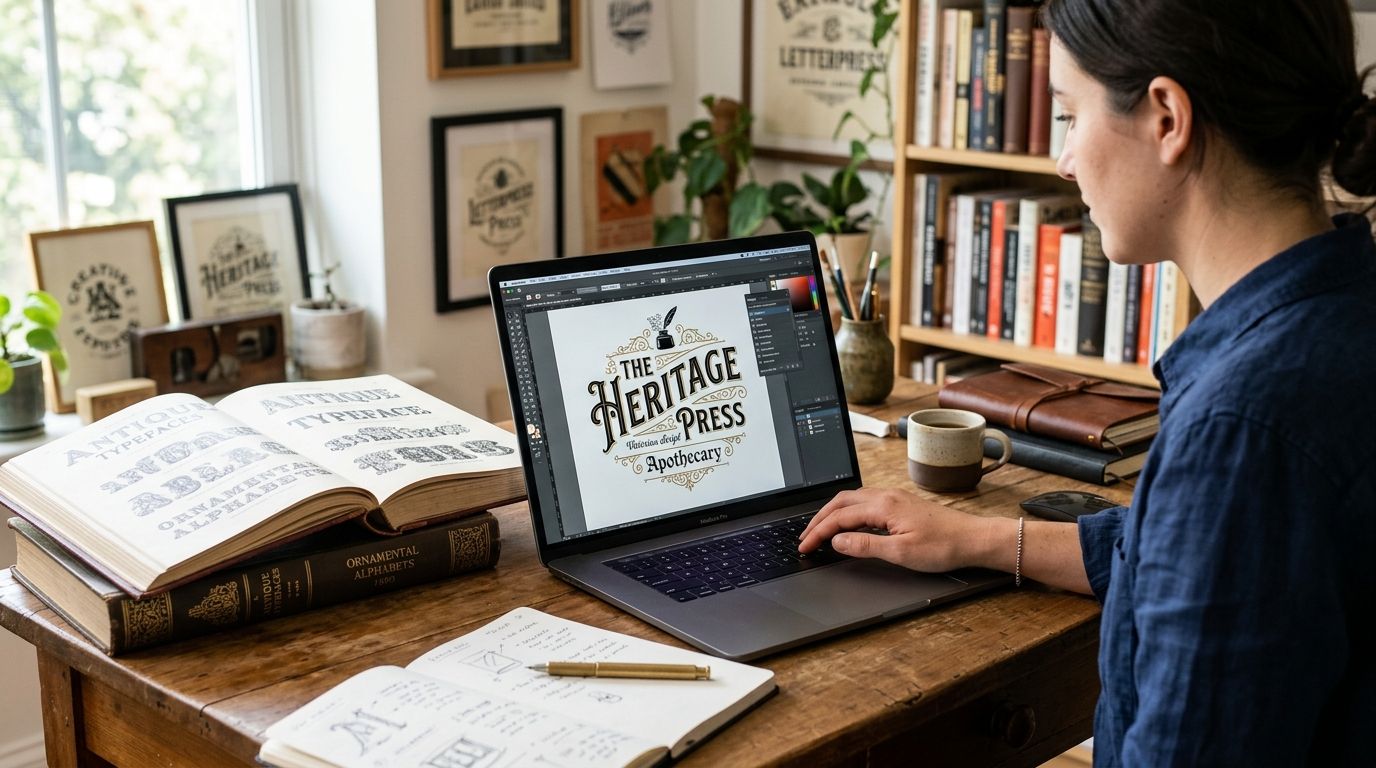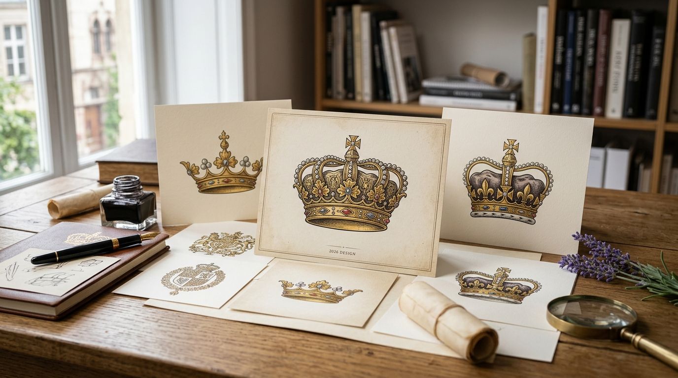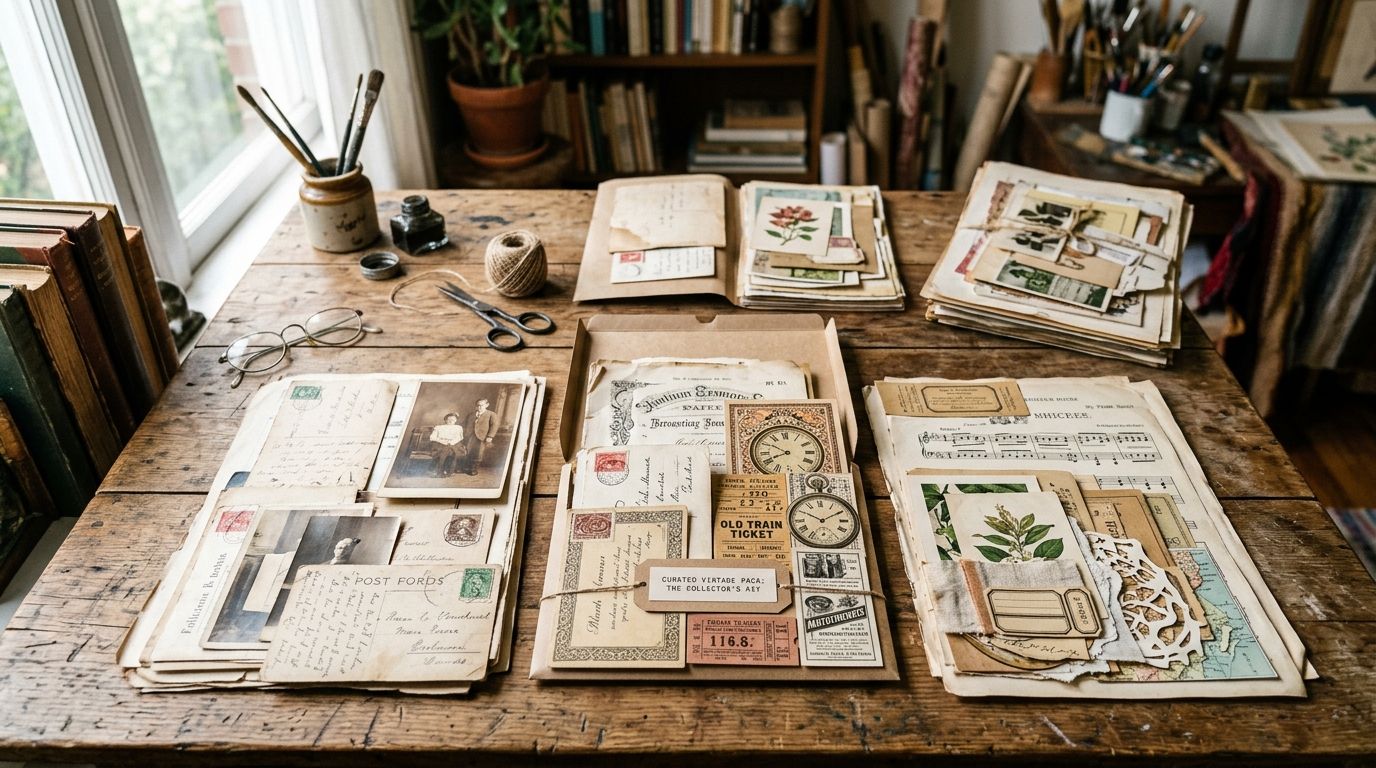
Vintage textures for social media graphics range from smoky grunge overlays to soft parchment backdrops, and the right pick in 2026 depends on the platform, the post format, and whether the texture or the copy is supposed to grab attention first.
- Distressed grunge textures win for high-contrast Reels covers and Story overlays in 2026.
- Vintage paper textures suit warm, quiet feed backgrounds and photo overlays.
- Antique texture packs fit scrapbook-style Story highlights and craft brand promos.
- Toile patterns and decorative borders work best for lifestyle carousels and quote graphics.
- None of these vintage textures are AI-generated - every plate is scanned from a real historical source.
Why this matters
Flat color blocks scroll past unnoticed. A grunge overlay behind a headline, a parchment backdrop behind a product quote, a toile repeat behind a lifestyle carousel - texture is what makes a post look designed instead of dumped into a template.
Century Library's archive holds more than 50,000 restored illustrations, fonts, patterns and textures pulled from real 19th- and early 20th-century sources. Nothing in it is AI-generated, which matters once you're layering a texture behind text at Instagram's 1080x1080 grid size or a Story's 9:16 frame - a real scanned surface holds up at both sizes; a generic preset filter usually falls apart at the edges.
The six vintage texture types below aren't competing brands. They're distinct catalogue categories, and each one earns its spot for a different social format.
What makes the best vintage textures for social media
- Legibility behind text - the texture can't fight your caption or CTA for attention.
- Resolution that survives compression - platforms recompress heavily, so files need to start sharp, ideally 300 dpi or higher.
- Tileable or full-bleed flexibility - works as a background at 1080x1080 and 1080x1920 without a visible seam.
- Commercial license clarity - cleared for paid ads, product mockups and client work, not personal use only.
- Authentic grain, not a filter - actual scanned paper, cloth or print texture reads differently than a preset vintage overlay under zoom.
- Format range - layered files or high-res exports so designers can drop the texture straight into whatever tool they're already using.
Vintage textures for social media, at a glance
| Texture type | Best for | Standout feature | Key limitation |
|---|---|---|---|
| Distressed Grunge Textures | High-contrast Reels covers & Story overlays | Deep blacks that hold up on OLED phone screens | Can overpower thin, light body copy |
| Vintage Paper Textures | Feed backgrounds & photo overlays | Warm, quiet tone that doesn't fight product photography | Too subtle for scroll-stopping thumbnails |
| Antique Texture Packs | Scrapbook-style Story highlights & craft promos | Layered ephemera feel - stamps, ledger lines, ink blots | Busy at small sizes if overused |
| Vintage Toile Patterns | Lifestyle & home-brand carousels | Repeating pattern tiles cleanly edge to edge | Reads dated outside home/lifestyle niches |
| Decorative Border Textures | Quote graphics & testimonial posts | Built-in frame pulls the eye to centered text | Limited use outside quote-card format |
| Vintage Clip Art & Ephemera Textures | Niche craft & junk-journal audiences | Individual motifs you can scatter and layer freely | Needs a steady hand to avoid clutter |
1. Distressed Grunge Textures: best vintage texture for Reels covers and Story overlays
These are ink-stained, cracked, ash-and-scorch surfaces restored from period print stock - the kind of surface that reads as texture even when it's crushed to a phone-sized thumbnail. They're built for the format where attention lasts under a second.
Distressed Grunge Textures pros:
- Deep blacks stay deep on OLED screens instead of washing to gray
- Reads at thumbnail size, which matters for Reels and Story covers
- Pairs cleanly with bold sans headlines for high-contrast branding
Distressed Grunge Textures cons:
- Too heavy behind long-form captions or dense body copy
- Not the right mood for soft, pastel or minimalist brand accounts
Best for: brands posting bold, high-contrast Reels covers and Story hooks in 2026. Verdict: Buy. Start with the distressed grunge textures for graphic design breakdown if you want the full range.
2. Vintage Paper Textures: best vintage texture for feed backgrounds and photo overlays
Scanned parchment, ledger stock and aged book pages give a feed a consistent, warm base tone without competing with product photography sitting on top of it. This is the texture most brands reach for when the goal is a cohesive grid rather than a single scroll-stopping post.
Vintage Paper Textures pros:
- Neutral enough to sit behind product shots without clashing
- Consistent warmth across a full feed grid, which helps brand recognition
- Works as a low-opacity overlay on real photography, not just a flat background
Vintage Paper Textures cons:
- Too subtle to function as a thumbnail hook on its own
- Needs a second visual element (type, border, product) to carry the post
Best for: brands prioritizing a cohesive grid aesthetic over single-post stopping power. Verdict: Buy. The same files double as vintage paper textures for photo editing.
3. Antique Texture Packs: best vintage texture for scrapbook-style Story highlights
These packs bundle stamps, ledger lines, ink blots and aged fragments into one layered set - the visual language of a scrapbook, not a single flat surface. They work best where the format allows layering, like Story highlight covers or a craft brand's promo tile.
Antique Texture Packs pros:
- Layered ephemera adds depth without needing extra design elements
- Matches the aesthetic craft, stationery and paper-goods brands already use
- Multiple motifs per pack means variety across a Highlights row
Antique Texture Packs cons:
- Can look cluttered at small sizes if every element is used at once
- Less versatile outside craft, wedding and stationery niches
Best for: craft brands and stationery sellers building Story highlight covers. Verdict: Hold - situational but strong when it fits. See the antique texture packs for scrapbooking guide for what's inside a typical pack.
4. Vintage Toile Patterns: best vintage texture for lifestyle and home-brand carousels
Toile's repeating scenic print - figures, foliage, pastoral motifs - tiles edge to edge without a visible seam, which makes it a clean full-bleed background for multi-slide carousel posts. It carries a specific, recognizable mood that not every account wants.
Vintage Toile Patterns pros:
- Tiles seamlessly across carousel slides without repeat artifacts
- Instantly signals a home, textile or heritage-brand aesthetic
Vintage Toile Patterns cons:
- Reads dated fast outside lifestyle, home and textile niches
- Busy patterns compete with product photography if not used as a border accent
Best for: home goods, textile and heritage-leaning lifestyle brands. Verdict: Hold - niche but distinct.
5. Decorative Border Textures: best vintage texture for quote graphics and testimonials
Ornamental frame textures give a quote card structure without needing a separate graphic element - the border does the framing job a designer would otherwise build from scratch. This is a narrow use case, but it's a common one.
Decorative Border Textures pros:
- Frames centered text automatically, saving layout time
- Adds a credibility signal to testimonials and review graphics
Decorative Border Textures cons:
- Limited outside the quote-card and testimonial format specifically
- Ornate borders can crowd longer quotes if the type size isn't adjusted
Best for: testimonial posts, review graphics and pull-quote content. Verdict: Hold - narrow but reliable.
6. Vintage Clip Art & Ephemera Textures: best vintage texture for niche craft and junk-journal audiences
Individual restored motifs - botanical cuttings, stamps, handwriting fragments - that you scatter and layer rather than apply as a single flat surface. This is the slowest texture type to work with but the most distinctive result for a niche craft or junk-journal audience.
Vintage Clip Art & Ephemera Textures pros:
- Highly distinctive look that generic stock libraries don't offer
- Individual motifs give full control over composition
Vintage Clip Art & Ephemera Textures cons:
- Takes longer to compose than a single drop-in texture file
- Overloading a post with too many motifs reads as clutter fast
Best for: junk-journal creators and niche craft communities. Verdict: Hold - best for audiences who already know the aesthetic.
“If a texture fights with your caption for attention, it's already too loud for that platform.”
How the ranking works
Every pick above is measured against the same six criteria: legibility behind text, compression-proof resolution, tileable flexibility, commercial license clarity, authentic grain, and file format range. Distressed Grunge Textures and Vintage Paper Textures rank at the top because they satisfy the widest range of formats - Reels, feed, and Stories - while the other four earn their place by solving one format precisely.
Browse the vintage texture archive
50,000+ restored assets, none of it AI-generated.
Which vintage textures should you choose in 2026?
For most social accounts posting across Reels, feed and Stories, start with Distressed Grunge Textures for cover art and Vintage Paper Textures for feed backgrounds - that combination covers the two formats carrying the most weekly volume. Add Antique Texture Packs once Story highlights need a consistent look, and reach for toile, borders or ephemera only once you've identified a specific niche format they solve.
FAQ
What are vintage textures used for in social media graphics in 2026?
Vintage textures fill backgrounds, overlays and Story covers so a post reads as designed rather than a flat template. In 2026, the most common uses are grunge overlays for Reels covers and paper textures for feed backgrounds.
Are vintage textures free to use commercially?
That depends on the source - a texture is only safe for paid ads and client work if the license explicitly covers commercial use. Check the license terms attached to the specific texture pack before using it in branded content.
What is the difference between grunge textures and paper textures?
Grunge textures are high-contrast, distressed surfaces built to read at thumbnail size, while paper textures are softer, warmer surfaces meant to sit quietly behind photography. Grunge suits Reels covers; paper suits feed backgrounds.
Do vintage textures work at Instagram Story size?
Yes, if the file is high enough resolution to stretch to a 9:16 frame without pixelating. Antique texture packs and grunge textures both hold up well at that aspect ratio.
Is a texture pack the same as a vintage illustration subscription?
No - a texture pack is a surface or background element, while an illustration subscription includes standalone artwork, fonts and ephemera alongside textures. Most design archives bundle both under one subscription.
How do I keep a vintage texture from looking dated in a bad way?
Pair one vintage texture with a modern typeface and plenty of negative space rather than stacking multiple ornate elements. A single toile pattern or border reads intentional; five vintage elements on one post reads cluttered.
What resolution do I need for a vintage texture background?
Start at 300 dpi or higher so the file survives the compression most social platforms apply on upload. Anything scanned below that will show visible artifacts once the platform recompresses it.
Are these vintage textures AI-generated?
No - Century Library's archive is scanned and restored from real 19th- and early 20th-century sources, not generated. That distinction matters for brands avoiding AI imagery in their visual identity.
One last thing
The most overlooked combination in this list is pairing a paper texture at low opacity behind a decorative border for text-heavy quote posts. Because both come from the same archive, the grain matches instead of clashing the way mixed stock sources usually do - a small detail, but it's the difference between a post that looks curated and one that looks assembled.