Vintage toile patterns range from single-color pastoral scenes to dense chinoiserie repeats, and picking the wrong one can make a heritage brand look costume-y instead of credible. This guide ranks the six vintage toile pattern styles designers reach for most in 2026, tells you what each one is actually good at, and where the honest limits sit.
- Pastoral Toile de Jouy is the most versatile vintage toile pattern for brand identity work in 2026.
- Chinoiserie toile suits luxury packaging; monochrome two-color toile suits wedding stationery.
- Century Library's archive holds hand-restored toile patterns sourced from 18th- and 19th-century textiles, never AI renders.
- Marine toile and menagerie toile cover narrower niches: coastal branding and nursery goods.
- Floral trailing toile works best as fabric yardage, not as a small-scale packaging motif.
Why this matters
Toile isn't one pattern — it's a printing tradition, and the six styles below behave differently under a logo, a wallpaper repeat, or a fabric bolt. A single-color pastoral toile that reads as elegant on an invitation can turn muddy at packaging scale. A dense chinoiserie repeat that looks rich on wallpaper can overwhelm a small product label.
Designers pulling vintage toile patterns from a hand-restored pattern archive get source-accurate line weight and color depth that AI-generated "vintage-style" patterns can't replicate — the plates were engraved by hand, and the restoration keeps that texture instead of smoothing it away.
What makes the best vintage toile pattern
- Motif scale — how large the repeat is relative to the surface it's printed on
- Color depth — single-plate monochrome versus multi-color layered prints
- Historical accuracy — sourced from an actual 18th- or 19th-century textile or engraving, not a modern pastiche
- Production adaptability — does it hold up on fabric, paper, and digital screens without losing detail
- Licensing clarity — clear commercial-use terms for branding, packaging, and stationery
- Restoration quality — cleaned scans with intact line work, no AI upscaling artifacts, no blur
Vintage toile patterns at a glance
| Style | Best for | Standout feature | Key limitation |
|---|---|---|---|
| Pastoral Toile de Jouy | Brand storytelling & heritage stationery | Balanced scene density, reads at multiple sizes | Can feel generic if overused without a color twist |
| Chinoiserie Toile | Luxury packaging & wallpaper backdrops | Rich, layered repeat with strong visual weight | Too busy for small labels or single-line logos |
| Monochrome Two-Color Toile | Wedding invitations & stationery suites | Single-plate print look, high legibility at small scale | Limited color flexibility for multi-brand systems |
| Floral Trailing Toile | Apparel & textile yardage | Continuous repeat built for cut-and-sew production | Doesn't compress well into square packaging panels |
| Marine / Nautical Toile | Coastal branding & home goods | Narrative scenes (ships, coastlines) with built-in theme | Niche subject matter limits use outside coastal categories |
| Botanical & Menagerie Toile | Nursery goods & children's branding | Animal and plant motifs soften the historical tone | Reads as playful, not formal — wrong fit for corporate work |
1. Pastoral Toile de Jouy: best vintage toile pattern for brand storytelling
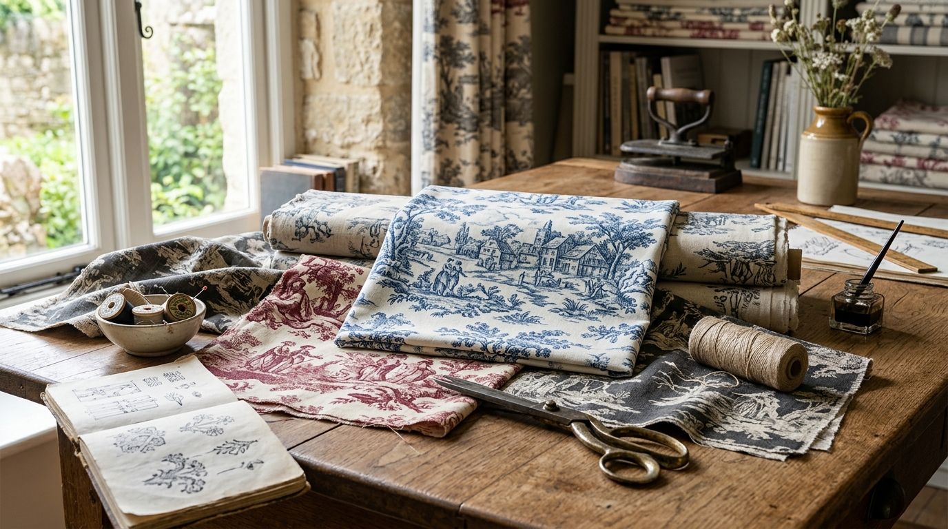
Pastoral toile is the original template — countryside scenes, figures, and landscapes engraved in a single ink color and repeated across a field. It's the style most people picture when they hear "toile," and it's the safest starting point for a brand trying to signal heritage without leaning on an obvious antique cliché.
Pastoral Toile de Jouy pros:
- Reads clearly at both large (wallpaper) and small (label) scale
- Neutral enough to recolor without losing the historical feel
- Works across stationery, packaging, and digital brand assets
Pastoral Toile de Jouy cons:
- Overexposed in home decor, so differentiation depends on color choice
- Dense scene versions lose detail when printed under one inch wide
Best for: heritage and craft brands building a stationery or packaging system. Verdict: Buy.
2. Chinoiserie Toile: best vintage toile pattern for luxury packaging
Chinoiserie toile layers pagodas, birds, and stylized landscapes into a denser, more ornamental repeat than pastoral toile. It carries more visual weight per square inch, which is exactly why it works on packaging that needs to feel premium from across a shelf.
Chinoiserie Toile pros:
- High perceived value at retail shelf distance
- Strong fit for wallpaper, gift wrap, and box liners
- Multi-color versions give more brand-palette flexibility than monochrome toile
Chinoiserie Toile cons:
- Too dense for small logos or single-line packaging copy
- Requires a clean background color to avoid visual noise
Best for: luxury packaging, gift sets, and premium home goods. Verdict: Buy.
3. Monochrome Two-Color Toile: best vintage toile pattern for wedding invitations
This is toile stripped to its printing roots — a single copperplate color on a plain ground, the same process Oberkampf used at Jouy-en-Josas in the 1760s. The restraint is the appeal: it photographs well, prints cleanly, and never competes with foil or letterpress detail.
Monochrome Two-Color Toile pros:
- Cleanest legibility of any toile style at invitation scale
- Pairs naturally with calligraphy and engraved-style type
- Low ink coverage keeps letterpress and foil printing crisp
Monochrome Two-Color Toile cons:
- Limited to one or two colors by definition, which restricts multi-SKU branding
- Can feel austere for brands wanting a warmer, busier look
Best for: wedding stationery suites and formal invitation sets. Verdict: Buy.
4. Floral Trailing Toile: best vintage toile pattern for apparel and textile yardage
Floral trailing toile swaps pastoral scenes for a continuous vine-and-blossom repeat, built for fabric rather than for framing. It's the style closest to what most people mean when they say "vintage floral toile," and it's built to run edge-to-edge across a bolt of cloth.
Floral Trailing Toile pros:
- Seamless repeat designed for continuous fabric printing
- Softer, less scene-driven than pastoral toile, so it layers well with solids
- Works across apparel, home textiles, and scrapbooking paper
Floral Trailing Toile cons:
- Doesn't compress cleanly into square or small packaging panels
- Multi-directional florals can clash with structured logo lockups
Best for: apparel prints and continuous textile yardage. Verdict: Hold — strong for fabric, weak for packaging.
5. Marine / Nautical Toile: best vintage toile pattern for coastal branding
Marine toile swaps countryside figures for ships, harbors, and coastline scenes, keeping the same engraved-line tradition. It's a narrower tool than pastoral or chinoiserie toile, built for a specific narrative rather than general-purpose brand texture.
Marine Toile pros:
- Built-in narrative for coastal, nautical, or maritime-history brands
- Historical engraving detail holds up well on larger surfaces like wallpaper or tote bags
- Distinct enough to stand out from the more common pastoral and floral styles
Marine Toile cons:
- Subject matter doesn't translate outside coastal or maritime categories
- Fewer restored variants exist compared to pastoral or floral toile
Best for: coastal home goods, nautical apparel, and seaside hospitality branding. Verdict: Wait — only pull this one if the brand story is genuinely coastal.
6. Botanical & Menagerie Toile: best vintage toile pattern for nursery and children's branding
This style folds vintage animal illustrations and botanical motifs into the toile repeat structure — rabbits, birds, and garden scenes instead of human figures. It keeps the antique engraving texture but softens the tone considerably.
Botanical & Menagerie Toile pros:
- Softer, warmer feel than formal pastoral toile
- Strong pairing with restored vintage botanical illustrations for a cohesive nursery or gift-line system
- Works well on soft goods: blankets, wallpaper, gift wrap
Botanical & Menagerie Toile cons:
- Reads as playful rather than formal — wrong fit for corporate or luxury positioning
- Smaller category of restored source material than pastoral or floral toile
Best for: children's product lines, nursery decor, and gift branding. Verdict: Skip for corporate work; Buy for children's and gift categories.
Browse the restored pattern archive
Hand-restored toile, florals, and ephemera cleared for commercial use.
How we ranked
Each style was weighed against the six criteria above — motif scale, color depth, historical accuracy, production adaptability, licensing clarity, and restoration quality. Pastoral and chinoiserie toile scored highest on adaptability across formats; marine and menagerie toile scored lower simply because their subject matter narrows the audience, not because the restoration quality is weaker.
Which vintage toile pattern should you choose?
Start with pastoral Toile de Jouy if you need one pattern to carry a brand across packaging, stationery, and digital assets in 2026 — it's the most forgiving at different scales. Move to chinoiserie toile the moment the project shifts toward premium packaging or wallpaper. Reach for monochrome two-color toile specifically for wedding and formal invitation work, and treat marine and menagerie toile as narrow-purpose tools for coastal or children's categories rather than general brand patterns.
FAQ
What is a vintage toile pattern?
A vintage toile pattern is a repeating scenic print originally produced by copperplate engraving, most famously at the Oberkampf manufactory near Jouy-en-Josas, France, starting in the 1760s. Classic toile uses one ink color on a plain ground, though later variants added multiple colors and denser motifs.
What's the difference between toile de Jouy and chinoiserie toile?
Toile de Jouy depicts pastoral countryside scenes in a single color, while chinoiserie toile layers pagodas, birds, and stylized Asian-inspired landscapes in a denser, often multi-color repeat. Chinoiserie carries more visual weight and suits packaging; toile de Jouy is more neutral and versatile.
Are vintage toile patterns still popular in 2026 design?
Yes, toile remains a steady choice for heritage branding, wedding stationery, and packaging in 2026, particularly when paired with hand-restored source material instead of generic stock reproductions.
Can I use vintage toile patterns commercially?
Commercial use depends on the source's licensing terms, so check the specific license before applying a pattern to a product for sale. Subscription archives like Century Library clear their restored patterns for commercial branding and craft projects.
What colors are traditional in toile patterns?
Traditional toile de Jouy used a single ink color on an off-white or cream ground, commonly red, blue, black, or sepia. Later chinoiserie and floral variants introduced multi-color layered prints.
How do I find high-resolution vintage toile patterns for printing?
Look for an archive that scans and restores from original engravings or textiles rather than one built on AI-generated imagery, since hand-restored files hold line detail better at large print sizes.
Is toile pattern better for wallpaper or fabric?
Chinoiserie and pastoral toile suit wallpaper and packaging surfaces well, while floral trailing toile is built specifically for continuous fabric yardage and cut-and-sew production.
Do vintage toile patterns work for modern minimalist brands?
Monochrome two-color toile is the closest fit for minimalist branding since it uses one ink color and a plain ground, keeping the visual footprint light.
One last thing
The original Jouy-en-Josas manufactory printed toile from hand-engraved copperplates in the 1760s, and that single-plate process is exactly why monochrome toile still prints cleanest today — it was designed around one ink pass, not layered color. Restored versions that keep that plate texture will outperform smoothed-out modern imitations every time you print at scale.