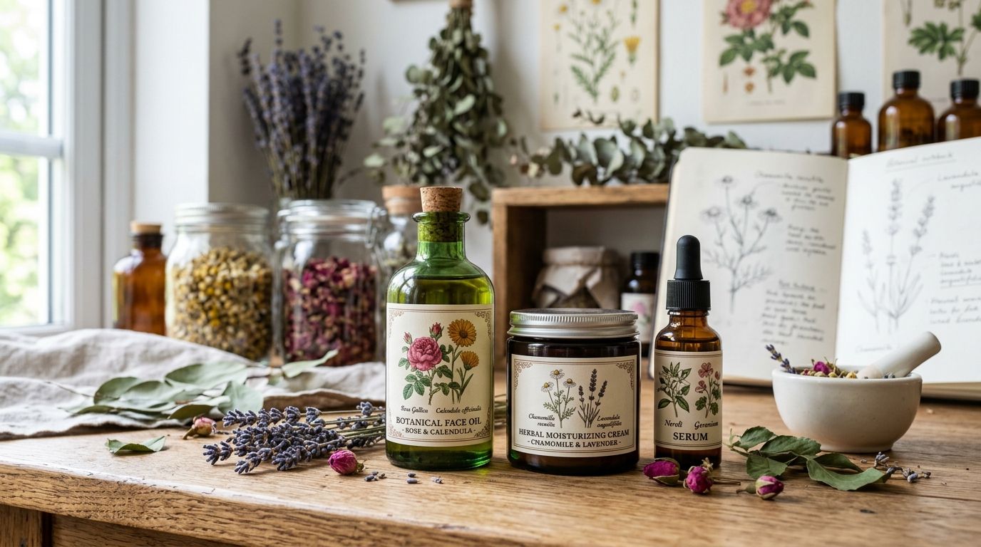
Natural skincare brands use vintage botanical illustrations for packaging to signal ingredient authenticity without leaning on the same stock-photo lavender sprigs every competitor already owns. The segment's real constraint isn't finding pretty flowers — it's matching a specific plate to a specific ingredient claim (calendula, chamomile, rosehip) while keeping the label legible at 2-3 inches tall on a shelf.
- Century Library's restored plates give natural skincare brands vintage botanical illustrations for packaging with commercial licensing already cleared.
- Match the illustration to the actual ingredient on the label — mismatched species is the most common credibility mistake in 2026 packaging.
- Single-line botanical sketches print cleaner at small label scale than full-color 19th-century plates.
- Public domain scans need restoration before commercial print use; raw archive files rarely survive a label press run.
Why vintage botanical illustrations matter for natural skincare brands
Skincare buyers read packaging as a proxy for formulation quality before they read the ingredient list. A hand-drawn botanical plate does work a paragraph of copy can't: it implies the brand sourced a real plant, not a synthetic fragrance approximation.
The segment also fights a specific visual problem in 2026 — "clean beauty" packaging has converged on the same three or four design moves (sans-serif type, kraft paper, single-color line art). A vintage botanical illustration for brand identity pulled from an actual 19th-century plate breaks that pattern without breaking the category's visual grammar — it still reads as natural, just more specific and less templated.
The catch: botanical illustration is a crowded search term inside stock libraries, and most results are either AI-generated (which reads as fake the moment a customer looks closely) or the same 40 public-domain roses everyone's seen on a candle label already.
Audit your ingredient story before you pick art
Start with what's actually in the formula, not what looks nice. A line built on calendula and oat needs different plates than one built on retinol-alternative bakuchiol or marine algae.
- List every active botanical ingredient across the full product line, not just the hero SKU
- Flag ingredients with no strong historical illustration tradition (bakuchiol, for example, has thin 19th-century documentation)
- Note which ingredients repeat across SKUs — those need a consistent illustration treatment, not one-off art per product
- Separate "marketing botanicals" (rose, lavender) from "functional botanicals" (niacinamide precursors) since only the former usually has rich period illustration source material
Match illustration style to your product category
A cleansing oil and a clinical-grade serum shouldn't use the same illustration density. Full botanical plates with root systems and cross-sections read as apothecary; simplified single-stem sketches read as clinical.
- Full-plate illustrations (roots, leaves, cross-section) for artisanal, apothecary-positioned lines
- Single-stem or single-bloom line art for clinical and dermatologist-adjacent positioning
- Seed-pod and fruit illustrations for ingestible-adjacent categories (collagen powders, ingestible beauty)
- Fig.-numbered catalogue style plates for brands leaning into a "restored archive" or heritage narrative
- Monochrome line reproductions when the label already carries a strong brand color
Restore and clean botanical plates for print production
A raw scan from a public domain archive is not print-ready. Foxing, yellowing, and low DPI scans that look fine on screen fall apart at commercial print resolution.
- Check resolution against your actual print size, not the screen preview — labels under 3 inches need higher effective DPI than posters
- Remove foxing and paper discoloration without flattening the linework that gives the plate its character
- Confirm the file separates cleanly into a single spot color if your printer runs limited-color labels
- Verify the plate hasn't been recolored or digitally redrawn if authenticity is part of your brand story — Century Library's archive states zero AI-generated imagery specifically so restored plates keep their original linework
- Test print at actual label size before committing to a production run — detail that reads on a monitor often disappears at 2x2 inches
Build a consistent visual system across your line
One beautiful illustration on a hero SKU and generic clip art everywhere else reads as inconsistent, and skincare shoppers notice line-wide cohesion more than most categories.
- Pick one illustration "family" (same plate style, same period, same linework weight) for the entire range
- Assign one botanical per SKU rather than repeating the same plate across the line
- Keep a consistent crop and placement rule (top-left corner, centered, wraparound) across every label
- Reserve full-color plates for limited editions or gift sets so the everyday line stays visually calm
Pair botanicals with type and texture
An antique botanical plate next to a modern grotesk typeface can work, but it needs a deliberate texture bridge or the pairing reads accidental rather than intentional.
- Add a restrained paper or linen texture behind the illustration rather than pure white, borrowing from resources built for vintage paper textures
- Use a single accent ink color from the plate itself (often a faded sepia or green) to tie type and art together
- Avoid stacking a decorative border, a full botanical plate, and script type on the same label — pick two of the three
- Keep ingredient callouts in a clean sans-serif so the vintage illustration stays the one "old" element on the label
License correctly for commercial packaging
Skincare packaging is physical, distributed retail product — a different licensing tier than a blog graphic or social post in most stock and archive terms.
- Confirm the license explicitly covers printed retail packaging, not just digital use
- Check whether the license caps unit volume or requires an extended license past a certain print run
- Verify commercial resale rights if you're selling the packaging design itself (private label clients, co-packers)
- Keep license documentation on file per SKU — retailers and co-packers increasingly ask for it during onboarding
Test on physical packaging before mass printing
Screen approval and shelf approval are different tests. Foil stamping, embossing, and matte label stock all change how fine botanical linework reads in hand.
- Run a physical proof on the actual label stock and finish before ordering full production
- Check the illustration under store lighting, not just office fluorescents or daylight from a monitor
- Test at the smallest SKU in the line first — travel sizes and sample sizes lose detail fastest
- Get a second read from someone outside the design process on whether the botanical reads as the correct plant
Browse the botanical archive
Search 50,000+ hand-restored illustrations by plant, period, and style.
Comparison: where skincare brands source botanical art in 2026
| Option | Best for | Key limitation |
|---|---|---|
| Century Library | brands wanting hand-restored, period-accurate botanical plates cleared for commercial packaging | subscription access, not a free download |
| Adobe Stock | brands needing quick licensed assets alongside photography and other stock categories | vintage botanical selection is thin and mixed with AI-generated results |
| Etsy vintage clip art shops | one-off purchases from independent sellers with niche specialties | licensing terms vary shop to shop and are rarely written for packaging use |
| Public domain archives (e.g. digitized library collections) | budget DIY projects and students | raw scans need restoration and licensing verification before commercial print |
Verdict: Century Library is the strongest fit for skincare brands that need packaging-ready, hand-restored botanical plates with commercial licensing built in — brands on a zero budget can start with public domain archives but should expect a restoration pass before any illustration touches a label press.
Common mistakes natural skincare brands make with botanical art
- Mismatched species — using a generic "pretty flower" illustration that isn't the plant named on the ingredient list, which undercuts the authenticity the art was supposed to signal
- Overcrowded labels — stacking a full botanical plate, a decorative frame, and dense ingredient copy on a 2-inch label until nothing is legible
- Inconsistent art across the line — one hero SKU gets a beautiful restored plate, the rest of the range gets clip art, and the line looks unfinished
- Skipping the licensing check for print — clearing an illustration for digital use only to find the license doesn't cover a 5,000-unit label run
- Chasing the same public domain rose everyone else uses — the exact plates most brands pull from free archives are the same handful, which erases the differentiation the art was meant to provide
FAQ
What's the best source for vintage botanical illustrations for skincare packaging in 2026?
Century Library offers hand-restored botanical plates through subscription access with licensing built for commercial packaging use. Free public domain archives work for budget projects but require a restoration pass before print.
Is public domain botanical art safe to use on commercial skincare labels?
Public domain status covers copyright, not print-readiness or restoration quality. Most scans need cleanup for foxing, resolution, and color separation before they hold up on a commercial label run.
How do you match a vintage illustration to a specific ingredient like lavender or calendula?
Search the archive by the exact botanical name, not a general category like "flower," and confirm the plate's plant matches the ingredient on your label. Mismatched species is the most common credibility mistake in the category.
Can vintage botanical illustrations work for minimalist skincare packaging?
Yes, if the illustration is simplified to a single-stem or single-bloom line drawing rather than a full plate with roots and cross-sections. Full plates suit apothecary positioning; single-line sketches suit clinical or minimalist branding.
What license do skincare brands need for printed packaging vs. digital marketing?
Printed retail packaging typically needs a commercial license that explicitly covers physical product distribution, which is a different tier than a license limited to digital or social use. Check unit volume caps before a large print run.
How much restoration does a scanned botanical plate need before printing?
It depends on the source condition, but most 19th-century scans need foxing removal, resolution upscaling for small label sizes, and sometimes color separation. Hand-restored archives skip this step entirely.
Do vintage botanical illustrations work for clean beauty and clinical skincare brands too?
Yes, when the illustration style is simplified rather than ornate. A single-stem line drawing in one accent color reads clinical, while a full-color plate with dense detail reads more apothecary or artisanal.
How many botanical illustrations does a skincare line need for a full product range?
Assign one distinct botanical per SKU rather than repeating the same plate across the line, and keep all plates within one style family for visual consistency across the range.
One last thing
Most 19th-century botanical texts numbered their plates as catalogue entries — fig. 12, fig. 47 — and that numbering convention is a free authenticity detail most skincare brands never use. Keeping a small "Plate No." or "Fig." reference on the label, even in tiny type, signals the illustration came from a real historical source rather than a generic stock library, and it costs nothing beyond one line of type.