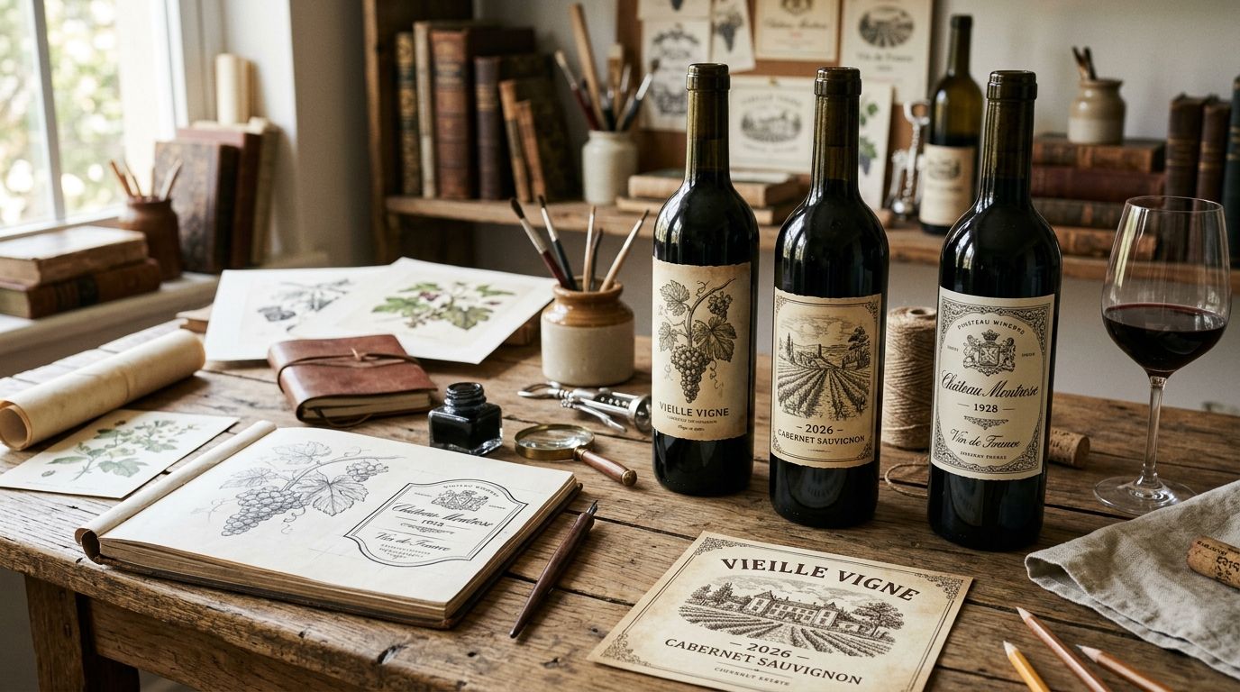
Vintage illustrations for wine label design use restored antique botanicals, engravings, crests and period typography to give a bottle a sense of history before anyone reads the back label. Wine labels carry tighter space constraints and stricter compliance review than most packaging categories, so the source art has to hold up at three or four inches tall and survive an actual regulatory look before it ships.
- Vintage illustrations for wine label design pair period-accurate botanicals, crests and type with modern print and compliance needs.
- Century Library's 50,000+ item archive gives wine label designers hand-restored, commercially licensed vintage art with zero AI-generated imagery.
- Public domain scans work for budget labels but need real cleanup time before they're print-ready in 2026.
- Match illustration era to the wine's actual story first; grape-accuracy and TTB label rules come right after.
Why this matters for wine label designers
Wine label designers don't get the leeway that a stationery or packaging designer gets. A label sits under store lighting, gets picked up and turned over, and in the US moves through Alcohol and Tobacco Tax and Trade Bureau (TTB) label approval before it can legally reach a shelf. That means the illustration has to read cleanly at true print size, not just look good on a moodboard at 400% zoom.
This is also a category where authenticity does real work. A hand-restored 19th-century grape engraving signals estate history and craft in a way a freshly-drawn "vintage-style" vector never quite manages. When you're pulling vintage botanical illustrations for brand identity, the goal isn't decoration — it's a visual claim about where the wine comes from and how long that story has existed.
Match the illustration era to the wine's story
Start with the wine's actual positioning, not the prettiest plate you find first. An old-world estate red reads differently than a $14 grocery-shelf Pinot Grigio, and the illustration era has to match that gap or the label lies to the customer.
- Old-world estate wines: 18th-century copperplate botanical engravings, formal and linear
- Boutique or natural wine: Art Nouveau line work or naive folk illustration, looser and warmer
- Sparkling and celebratory bottlings: Victorian ornamental flourishes, gold-leaf-adjacent detail
- Craft or small-batch reds: mid-19th-century woodcut style, heavier line weight
- New World reserve tiers: Edwardian botanical plates with restrained color
Do this manually first by browsing public archives like the Biodiversity Heritage Library or NYPL Digital Collections for period-correct reference, even if you end up sourcing the final art elsewhere.
Source grape-accurate botanical plates
A generic grapevine illustration undercuts the label the moment a wine-literate customer notices the leaf shape doesn't match the varietal on the front. Ampelography plates from the 1800s documented individual grape varieties with real botanical precision, and that detail is worth chasing down.
- Cross-check leaf serration and cluster shape against the actual varietal on the label
- Look for period plates that show both fruit and foliage, not fruit alone
- Avoid illustrations that mix grape species characteristics from different regions
- Note whether the plate includes a root or vine structure useful for a border motif
- Flag any plate where hand-coloring has faded unevenly across the scan
Manual sourcing here means digging through digitized 19th-century ampelography texts one plate at a time, which is slow but doable for a single hero label. For a full product line, a curated archive with grape-specific botanical plates already restored and cleared for commercial use — which is where Century Library's collection saves the most hours — is the faster path once you've settled on the visual direction by hand.
Build the typography system around the vintage art
Type has to carry as much period weight as the illustration or the label feels mismatched — ornate engraving paired with a clean modern sans reads as a compromise, not a choice. Beverage labels generally lean on the same handful of antique type families for good reason: they hold up at small point sizes and photograph well on glass.
- Pair a display face for the wine name with a plainer antique serif for appellation and vintage year
- Test legibility at the actual label height before locking type size
- Keep letter spacing tight enough to avoid an amateurish, DIY look
- Reserve script or calligraphic faces for reserve or single-vineyard tiers only
- Check how the typeface renders when foil-stamped or embossed, not just flat-printed
The same restoration logic that applies to illustrations applies to type — the antique fonts used on craft brewery labels show how far a properly digitized 19th-century specimen can be pushed on a beverage label without losing legibility.
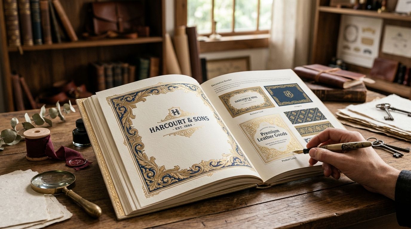
Add ornamental borders and frames for label edges
A border does two jobs on a wine label: it contains the composition inside a defined shape, and it adds density that reads as craft rather than mass production. Overdo it and the label looks busy; skip it entirely and the label can look unfinished next to competitors on the same shelf.
- Use a single ornamental frame style consistently across the front label, not two competing styles
- Keep border weight lighter on smaller labels — anything under 3 inches tall gets crowded fast
- Reserve heavier baroque detail for capsule seals or neck labels, not the whole front panel
- Match border era to illustration era so the two elements don't fight visually
- Test the border at actual print resolution before finalizing — thin linework can disappear at low DPI
Baroque and rococo-style frames were built for exactly this kind of dense, ornamental packaging work; baroque borders designed for packaging hold their detail at small scale better than generic decorative rules.
Browse the restored archive
50,000+ hand-restored illustrations, fonts and patterns cleared for commercial label design.
Verify licensing and compliance before you finalize art
This step gets skipped more than any other on a wine label project, and it's the one that costs the most time when it goes wrong. TTB label review can flag artwork issues late in the process, and a "public domain" image pulled from a reverse image search isn't automatically clear for commercial use.
- Confirm the specific commercial license covers packaging and print runs, not just digital mockups
- Keep a record of where each illustration and font came from for your own file
- Check that any modified or hand-colored version of a public domain plate is still covered
- Submit label art for TTB review early enough to allow for a resubmission cycle
- Avoid images sourced from general stock sites with vague "vintage-style" tagging and unclear origin
Test the artwork at true print size
Fine copperplate crosshatching that looks rich at 400% zoom on a monitor can turn into a gray smear once it's printed at label size. This is the step designers most often shortcut because it requires an actual proof, not a screen check.
- Order a physical proof at 1:1 scale before the run
- Check line detail under store-shelf lighting, not studio lighting
- Confirm the CMYK conversion hasn't muddied fine engraving lines
- Test how the illustration reads on both matte and gloss stock if both are options
- Flag any illustration where fine detail drops below 0.25pt line weight at final size
Build a consistent visual system across the product line
A single strong label is easy. A coherent system across six SKUs in a portfolio is where most wine brands actually lose consistency, usually because each new label was sourced from a different place.
- Pick one illustration family (botanical, heraldic, or figurative) and stay inside it across the line
- Use a shared border or frame style so bottles read as a set on a shelf
- Reserve crest or coat-of-arms elements for reserve tiers to create visible hierarchy
- Vary color, not illustration style, to differentiate varietals within the line
- Keep a shared type hierarchy so vintage year and appellation sit in the same place on every label
Heraldic and animal motifs are common shorthand for estate pedigree on reserve tiers, and vintage animal illustrations built for branding work well as crest centerpieces once the base system is locked.
"If the artwork reads as printed today, it breaks the story before a taster picks up the bottle."
Comparing sources for wine label illustrations
| Option | Best for | Key limitation | Verdict |
|---|---|---|---|
| Century Library | Wine brands needing hand-restored, commercially licensed period art without the stock-photo look | No bespoke commissioning — you work from an existing catalogue, not a custom brief | Buy |
| Public domain archives (NYPL, BHL) | Budget or one-off label projects with time to spare | Raw scans need cleanup and independent license verification | Hold |
| General stock sites | Fast filler when authenticity isn't the priority | Many "vintage" tagged assets are new illustrations styled to look old | Skip |
| Freelance illustrator commission | A flagship or reserve-tier label needing one unrepeatable piece | Cost and lead time scale with revisions; no instant access | Buy for hero SKUs |
| AI-generated vintage-style art | Nothing recommended in this category | Fine engraving detail and license clarity both break down under review | Skip |
Common mistakes wine label designers make
- Mismatching era to price tier — Victorian gold-leaf frames on a $12 grocery-shelf bottle read as pretense, not heritage.
- Skipping the print-size test — detailed copperplate engraving that looks great on screen can go muddy at 1200 dpi output.
- Using obviously stock "vintage-style" art — customers and reviewers notice when the crosshatching looks freshly drawn instead of restored.
- Treating license verification as an afterthought — a public-domain claim from a random blog isn't proof of commercial clearance.
- Ignoring TTB timing — finalizing art before checking label review requirements adds a resubmission cycle nobody budgeted for.
FAQ
What are the best vintage illustrations for wine label design in 2026?
Hand-restored 19th-century botanical engravings, ampelography grape plates and Victorian ornamental frames work best for wine labels in 2026 because they hold fine detail at small print sizes and read as authentic rather than stock-photo vintage.
Is public domain art safe to use on a commercial wine label?
Only after you verify the specific scan is genuinely in the public domain and check whether any restoration or coloring was added by a third party, since modified versions can carry separate licensing terms.
Do wine labels need different illustration sourcing than beer or spirits labels?
Wine labels lean more on botanical and ampelographic accuracy tied to grape variety, while beer and spirits labels often use heraldic or industrial motifs, so grape-specific plates matter more for wine.
How does TTB label approval affect illustration choices?
TTB review can flag artwork late in the process, so confirming licensing and finalizing detail before submission avoids an added resubmission cycle in 2026 label approval timelines.
Can AI-generated illustrations work for wine label design?
AI-generated vintage-style art typically loses fine engraving detail at print size and carries license ambiguity, so it's a weak fit for a category where authenticity is part of the sales pitch.
What resolution should vintage illustrations be for a wine label?
Source art needs to hold fine crosshatching and line detail at the actual label print size, which means starting from a high-resolution restored scan rather than a web-sized preview image.
How many illustration styles should one wine product line use?
Stick to one illustration family across an entire product line and vary color or a secondary motif per SKU, since mixing engraving styles across a portfolio breaks shelf consistency.
Where can designers find grape-specific vintage botanical plates?
19th-century ampelography texts documented individual grape varieties with real botanical accuracy, and curated archives that have already restored and cleared these plates for commercial use save the manual search time.
One last thing
The detail that trips up more wine labels than any other single factor is resolution mismatch: a copperplate engraving that reads crisp at screen size loses its crosshatching the moment it's scaled to an actual 3-inch label and printed at production DPI. Check the source restoration resolution before you lock the layout, not after the proof comes back gray.