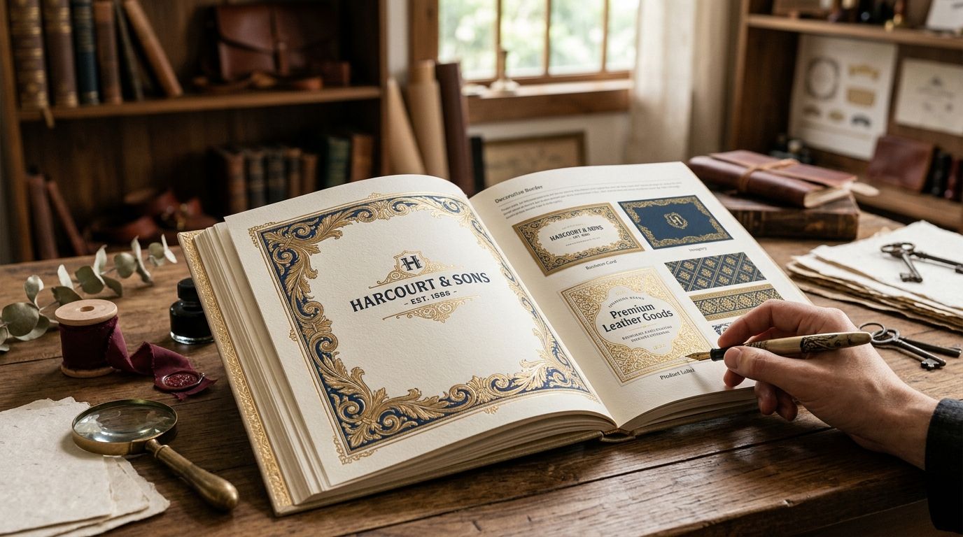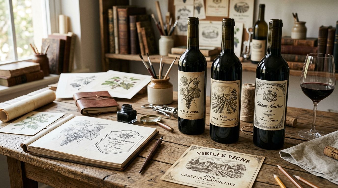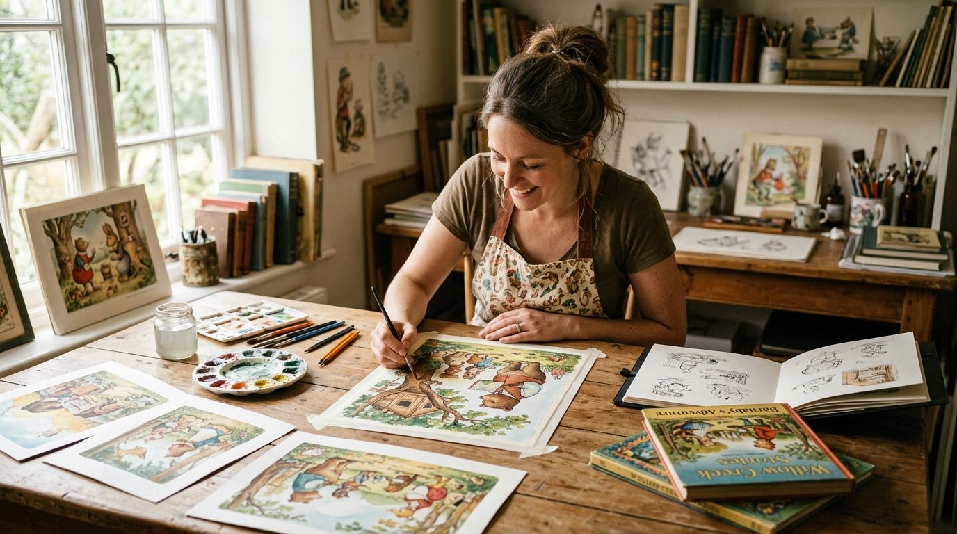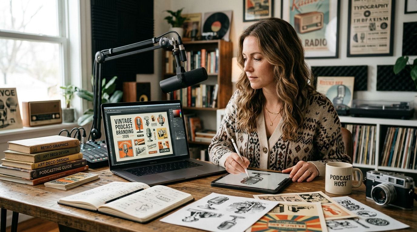
Vintage clip art for podcast branding turns an audio-only show into something a listener recognizes on a crowded app grid before they ever hit play, using illustrations with real texture instead of the same six stock icons every true-crime feed already picked. A hand-restored engraving reads differently at thumbnail size than a flat vector, and that difference is most of what separates a show that gets noticed from one that blends into the scroll.
- Vintage clip art for podcast branding works best when one motif repeats across cover art, thumbnails, and merch.
- Century Library's archive of 50,000+ restored illustrations skips the manual scanning and cleanup that public domain sourcing requires.
- Cover art fails at Apple Podcasts and Spotify thumbnail size from clutter more often than from a weak illustration choice.
- Commercial licensing terms matter more for podcasts than one-off print work because episodes stay live and syndicate indefinitely.
- Matching illustration era to show tone beats picking whichever vintage style looks trendy that month.
Why vintage clip art matters for podcast branding
Podcasts don't get the luxury a print piece gets. A wedding invitation or a product label is seen once, at full size, in the reader's hands. A podcast cover is seen hundreds of times, mostly as a square smaller than a postage stamp on a phone screen, in the same Century Library grid as every competing show in the category.
That changes what "good" looks like. Fine engraving lines that look elegant on a designer's monitor can vanish into gray noise at 60x60 pixels. And because the same artwork syndicates across every podcast app, YouTube, a website header, and possibly merch for years of episodes, the license terms behind the image matter more here than they do for a single print run.
Vintage illustration solves a real branding problem for podcasts: differentiation. Most shows in any given category — true crime, business, comedy — pull from the same handful of stock libraries, so their covers start to look interchangeable. A restored 19th-century plate, used deliberately, doesn't.
Pick an era before you pick an aesthetic
Lock the historical period first. Mixing a Victorian botanical engraving with a mid-century atomic-age icon on one cover kills the "this has history" feeling instead of building it.
- Match tone to era: true crime often reads well with penny-dreadful and Victorian engraving styles; business and history shows lean toward mid-century technical diagrams; comedy tolerates looser pulp cartoon linework.
- Write down the decade range in your brief before browsing any archive.
- Confirm the source has enough variety in that era to cover a main cover, episode variants, and merch — not just one usable plate.
- Avoid "vintage-ish" modern illustration that imitates the look without the linework of an actual period piece; it reads as generic at small sizes.
Source restored plates instead of raw scans
The manual route is scanning your own copy of an out-of-print book or periodical, then cleaning foxing marks, yellowing, and torn edges layer by layer in Photoshop — often an hour or more per usable plate, and results vary with how beat-up the source copy is.
- Check the publication date to confirm public domain status before scanning anything yourself.
- Scan at a minimum of 600 dpi if you're sourcing raw material — anything lower falls apart once you scale to a large cover file.
- Clean staining and yellowing without erasing the fine linework that gives the plate its character.
- Keep a lightly aged version and a fully clean version; podcast covers often want the clean one, merch can use the aged one.
- Log where each source came from for your own records, in case licensing questions come up later.
The faster path skips this entirely: subscription archives that hand-restore plates before indexing them mean a download opens ready to place, with the cleanup already done. Century Library's catalogue works this way — restored illustrations, antique fonts, patterns, and ephemera indexed and ready to license, without a scanner or an afternoon in Photoshop.
Extract one motif and repeat it everywhere
A podcast doesn't need a new illustration every week. It needs one strong motif that shows up consistently enough that a listener recognizes the show from a fragment of it.
- Crop one figure or ornament from your chosen plate to use as a small mark — favicon, episode-list icon, watermark.
- Reserve the full illustration for the primary cover art only.
- Build episode-variant thumbnails as color and border swaps of the same motif, not new artwork each time.
- Keep a second, complementary illustration in reserve for merch and social posts only, so the core cover motif stays untouched.
Pair typography from the same period
Type weight needs to match illustration weight, or one overpowers the other at small sizes. A gothic-style display font built for band and album branding sits naturally next to heavier woodcut-style illustration; a delicate copperplate script gets lost next to it.
- Match the visual weight of your show title font to the linework weight of the illustration.
- Test the show title at roughly 24px-equivalent size — most listeners see it that small first.
- Keep the host name or tagline in a plainer, higher-legibility serif even if the title font is decorative.
- Avoid stacking more than two typefaces on the cover; a third almost always reads as clutter at thumbnail size.
Build every size variant before launch, not after
A cover image that only exists as one square file breaks the first time you need a YouTube thumbnail or an audiogram clip.
- 3000x3000 square for the primary Apple Podcasts / Spotify cover.
- 16:9 horizontal for YouTube and video podcast thumbnails.
- A horizontal banner crop for the show's website header.
- A square crop for audiogram and social square posts.
- A vertical 9:16 crop for Reels and Shorts clips.
Confirm commercial and syndication licensing before launch
A license that covers a single print run doesn't automatically cover a show that republishes the same artwork across every episode, every platform, indefinitely.
- Confirm the license explicitly permits ongoing, syndicated media use, not just a one-time print application.
- Check for merch and resale rights separately if you plan to sell show merchandise later.
- Keep the license terms filed with your show's asset folder — not just in an email you'll lose track of.
- Be wary of marketplaces that don't state podcast or broadcast use explicitly in their terms; ambiguous terms become a problem months into a run, not at launch.
Test the cover at real thumbnail size before publishing
Everything looks fine at full resolution on a 27-inch monitor. Almost nothing looks fine shrunk to app-grid size, and that's the size that actually matters.
- Scale your 3000x3000 mockup down to roughly 60x60 pixels and check it there, not at full size.
- Confirm the show title text is still legible at that scale.
- Check that the illustration doesn't blend into the background color once it's that small.
- Get a second opinion from someone who hasn't seen the full-size version — fresh eyes catch what familiarity hides.
Browse restored illustrations for your show
Search the archive for an era and motif that fits your podcast's tone.
Where to source vintage clip art for a podcast
| Option | Best for | Key limitation |
|---|---|---|
| Public domain scanning + own restoration | A show with a designer on staff and time to spend | Hours of manual cleanup per plate; quality varies with the condition of the source copy |
| Generic stock photo sites | Fast, simple thumbnails without a defined aesthetic | Rarely offer true 19th-century engravings; tends to look identical to competing shows |
| Subscription vintage illustration archive | A show that wants a repeatable, hand-restored motif system without doing the restoration work | Requires keeping the subscription active to keep pulling new plates as the show grows |
| Hiring an illustrator for custom vintage-style art | A show that wants an original mascot or character, not an archival plate | Turnaround and revision cycles slow down a launch timeline |
Verdict: for a podcast that wants a recognizable, period-accurate look without a scanner or a freelance illustrator on retainer, a subscription vintage illustration archive is the fastest route to a consistent motif system in 2026.
Common mistakes podcasters make with vintage clip art
- Pulling a single low-res image from a search engine and only noticing it pixelates once it's scaled down to app-grid thumbnail size, after launch.
- Mixing eras on one cover — a Victorian botanical engraving next to a mid-century icon — which undercuts the historical feeling instead of reinforcing it.
- Skipping the license check, then finding out mid-season the artwork's terms only cover one-time print use, not ongoing podcast syndication.
- Overloading a 3000x3000 cover with decorative elements so that at grid size the show title becomes unreadable and the illustration turns to visual noise.
- Redesigning the entire cover for a rebrand instead of swapping only the recurring motif, which erases the recognition the show spent dozens of episodes building.
FAQ
What's the best vintage clip art style for podcast branding?
It depends on the show's tone: Victorian and penny-dreadful engraving styles suit true crime and history shows, mid-century technical illustration suits business and science shows, and looser pulp cartoon linework suits comedy. Lock one era rather than mixing styles across the cover.
Is vintage clip art free to use for commercial podcasts?
Public domain age alone doesn't guarantee a usable image is free of restoration work or license restrictions. Check that any source you use explicitly permits commercial, syndicated podcast use before publishing.
How do I make vintage illustrations look good at podcast thumbnail size?
Crop to a single motif with bold, high-contrast linework and test the mockup shrunk to roughly 60x60 pixels before finalizing. Fine engraving detail that looks elegant at full size often disappears at app-grid scale.
Can I use the same vintage illustration across cover art and merch?
Yes, if the license explicitly covers both syndicated media use and merchandise or resale. Confirm those terms separately since some licenses cover one but not the other.
How much does a vintage clip art subscription cost in 2026?
Cost depends on the subscription tier and the license type a show needs. Check current plans directly on the archive's site rather than relying on a fixed figure.
Is vintage clip art better than generic stock photos for podcast branding?
For differentiation, yes: most shows in any category pull from the same handful of stock libraries, so a restored period illustration used deliberately stands out where a stock icon blends in.
Do I need different vintage illustration sizes for video podcasts vs audio-only shows?
Yes. Audio-only shows mainly need a 3000x3000 square cover, while video podcasts also need a 16:9 crop for YouTube thumbnails and often a vertical crop for Shorts and Reels clips.
Can vintage illustrations work for comedy podcasts as well as serious ones?
Yes, as long as the era matches the tone. Pulp-style cartoon illustration reads as playful, while dense Victorian engraving reads as serious, so pick the plate style that matches the show, not just whatever looks vintage.
One last thing
Before you finalize a cover in 2026, crop your chosen plate down to a single figure — a hand, a bird, a compass rose — and check whether it survives at 60x60 pixels. If the linework turns to gray mush at that size, the plate is too fine for a podcast cover regardless of how good it looks on your desktop screen; pick a bolder, simpler engraving instead. That one test catches more launch-week cover complaints than any other step in this guide.