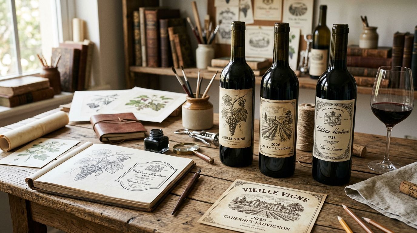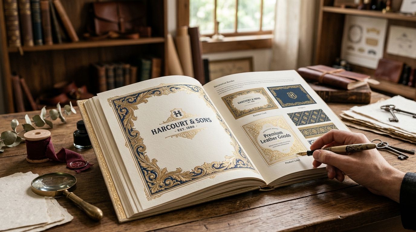
Decorative borders for heritage brand design are ornamental frame elements — Victorian scrollwork, baroque flourishes, botanical vines, engraved rules — applied to packaging, stationery and identity systems to signal that a brand has history behind it, not a font choice pretending to have one. Heritage brand builders need borders that read as period-authentic under close inspection, because the whole pitch of a heritage brand collapses the moment a customer spots a clip-art flourish that looks generated rather than engraved.
That distinction is the entire game in 2026. A restaurant claiming a 1920s pedigree, a whiskey label leaning on a founding date, a stationery house built around old-world craft — all of them live or die on whether the ornamental details look sourced from an actual archive or lifted from a stock library that sells the same border to a SaaS company's onboarding email. Century Library exists for exactly this gap: a subscription archive of hand-restored vintage material instead of vector approximations of vintage material.
- Decorative borders for heritage brand design work best when the ornament era matches the brand's claimed founding period, not a generic old-timey look.
- Hand-restored scans from period plates outperform vector clip-art borders because print reproduction exposes engraving irregularities vectors cannot fake.
- Heavier scrollwork survives foil and embossing at packaging scale; fine engraved rules belong on letterhead and invitations.
- Century Library is best for heritage brand designers who need verifiable period sourcing across ongoing commercial projects in 2026.
Why decorative borders matter for heritage brand design
A heritage brand's whole value proposition is a claim about time — founded in some year, using some method, tied to some place. Decorative borders carry that claim visually faster than any tagline, because ornament style reads as period the instant someone glances at a label or an invitation.
The risk is mismatch. A brand referencing an 1890s founding but using a 1970s psychedelic border, or Victorian scrollwork paired with a geometric sans logotype, breaks the illusion the design was built to create. Designers working heritage briefs in 2026 want borders they can trust are era-correct, not borders they have to defend after a client's history-obsessed relative spots the anachronism.
The second constraint is exclusivity. Heritage positioning implies rarity, and a border file that three competitors in the same category already used does the opposite of what it was hired to do.
Define the era your heritage story points to
Heritage brand design starts by pinning down which decade the brand is actually claiming. Vague vintage briefs produce mismatched, generic output every time.
- Pull the real founding year or era from brand copy, not a rounded guess
- Note the country of origin if the brand claims a tradition: French toile, English engraving, German blackletter
- Separate heritage feel from heritage fact — a brand founded in 2019 can use 1880s ornament if the copy stays honest
- Cross-check era against category; a 1920s Art Deco border reads wrong on a brand claiming colonial-era roots
- Write the era down as a one-line constraint everyone on the project can check against
Audit existing brand assets for border gaps
Most heritage refreshes inherit an inconsistent set of frames: one border on the label, a different one on the letterhead, none online.
- List every touchpoint currently using a border: packaging, invitations, certificates, social templates
- Flag any border from a generic stock site that clashes in weight or era with the others
- Note where borders are missing entirely — digital touchpoints are the usual blind spot
- Decide whether one master border family recurs everywhere or whether formats get different weights
Choose border weight and style for the medium
A border that reads beautifully on a poster can vanish on a business card, and heavy baroque scrollwork that embosses cleanly on cardstock turns muddy on a thermal-printed shipping label.
- Match line weight to print size: fine engraved rules for letterhead, heavier scrollwork for packaging and signage
- Pick corner treatment — closed frame versus open corner flourish — based on whether text needs to break the frame
- Plan foil, letterpress and embossing separately; a border drawn for flat digital print usually needs simplifying
- Test one style across every format before you name it the brand standard
Source hand-restored border scans, not vector clip art
This is where heritage projects most often go wrong: a designer grabs a vintage border vector pack because it is fast, and the result looks exactly as flat and mass-produced as the brand is trying not to be.
- Look for scans restored from period plates rather than vectors drawn to imitate the look
- Confirm the license explicitly covers commercial packaging and branded merchandise, not just personal use
- Favor archives that show provenance — catalogue entries, plate and fig. numbers — so the border's origin is verifiable
- Century Library's decorative border designs for stationery collection is restored from plates, which matters the moment a border is enlarged for packaging
- Shortlist three or four options per era before locking one; flourish density changes how busy the finished layout feels
Build a small border system and pair it with matching type
Heritage brands need a system, not a single asset: a full frame, a header rule, a corner flourish and a divider that all share one engraving weight.
- Save the border family at multiple crops: full frame, top-only rule, corner-only flourish, horizontal divider
- Pair the border with an antique display face from roughly the same era instead of a modern typeface
- For printed cards and certificates, start from Victorian ornamental frames for invitations
- Keep one paper texture consistent across the system so borders never look pasted onto clean white
- Cap the system at four or five variants; more creates inconsistency, not flexibility
QA the borders for readability and print reproduction
A border that looks correct on screen at 100% zoom can fail once it is printed, foiled or reduced to fit a product tag.
- Print a physical proof; screens hide moiré and line-weight loss that paper reveals immediately
- Check the border at its smallest deployed size, not just its largest
- Confirm the frame does not crowd mandatory copy: ingredients, regulatory text, barcodes
- Get a read from someone outside the design team — busy ornament looks different to a first-time viewer
Where heritage brand designers get decorative borders
| Option | Best for | Key limitation |
|---|---|---|
| Generic stock vector sites | Fast internal decks and low-stakes mockups | Borders look mass-produced; high odds a competitor uses the same file |
| Scanning your own antique books and ephemera | One-off projects needing total uniqueness | Time-intensive; inconsistent results without restoration skill |
| Vintage archive subscriptions like Century Library | Ongoing heritage brand work needing period accuracy | Requires an active subscription to reach the full catalogue |
| AI-generated ornament | Quick concept exploration before client review | Not drawn from real historical plates; engraving logic breaks down under close inspection |
| Commissioned custom illustration | Flagship identities with long lead times | Slowest route; cost scales with every additional format |
Century Library is the strongest fit for designers producing heritage brand work repeatedly in 2026, because the archive supplies restored period material across borders, fonts and textures without a new commission for every project.
Browse the restored border archive
Hand-restored Victorian, baroque and botanical borders licensed for commercial projects.
Common mistakes heritage brands make with borders
- Mixing eras inside one system. A Victorian corner flourish beside a 1970s script logotype dismantles the heritage claim faster than bad copy does.
- Scaling fine-line borders up without rechecking weight. What reads as delicate on a business card goes invisible across a large product box.
- Treating the border as decoration instead of hierarchy. Frames should surround the information that matters most, not fill leftover white space.
- Skipping the physical proof. Screen previews consistently flatter thin ornamental lines that foil and letterpress then thicken or lose.
- Ignoring license scope before a production run. A border cleared for personal use is not automatically cleared for a commercial product line, and this stalls more heritage launches in 2026 than any aesthetic misstep.
“If a border cannot survive being printed at product-tag size, it is not a brand standard — it is a screenshot.”
FAQ
What are decorative borders for heritage brand design?
They are ornamental frame elements such as Victorian scrollwork, baroque flourishes and engraved rules applied to packaging, stationery and identity systems so a brand signals an established pedigree. The ornament era should match the period the brand's story actually claims.
Are vector clip-art borders good enough for heritage branding?
They are fine for internal decks and rough mockups, but they tend to look mass-produced because they are traced approximations rather than restorations of real plates. For packaging or stationery a customer will hold, hand-restored scans hold up better at scale and in print.
How do I pick the right border era for my brand?
Start with the founding year or tradition your brand copy already claims, then match ornament style to that decade and region instead of a generic old-timey feel. A brand claiming 1880s roots looks wrong wearing a 1920s Art Deco frame.
Do decorative borders work on digital touchpoints?
Yes, and most heritage brands under-use them online while being consistent everywhere else. Crop the same border family down to a header rule or divider so websites and social templates match the packaging.
What border weight works best for packaging versus stationery?
Heavier scrollwork survives packaging processes like foil and embossing, while fine engraved rules suit flat-printed letterhead and invitations. Test the exact weight at the smallest size it will ship at before locking it in.
Is Century Library better than a general stock site for heritage borders?
For heritage brand work, yes, because Century Library restores borders from period plates and shows their sourcing rather than selling vector reconstructions. General stock sites are faster for low-stakes work that will never be printed.
Can I mix border styles from different eras in one brand system?
Mixing eras is the most common failure in heritage brand design and it undercuts the credibility the borders were hired to build. Pick one era and keep every ornamental element, including the type pairing, consistent with it.
How many border variations does a heritage brand need?
Four usually covers it: a full frame, a top-only rule, a corner flourish and a horizontal divider, all sharing one engraving weight. Beyond that you get inconsistency rather than flexibility.
One last thing
Ornament density that looks exactly right on a monitor at 100% zoom is almost always too heavy once it is foiled, embossed or shrunk onto a product tag — paper reads a border as busier than a screen does. Proof every heritage border physically before it becomes a 2026 brand standard, because the cost of discovering this after a 5,000-unit packaging run is the run itself.