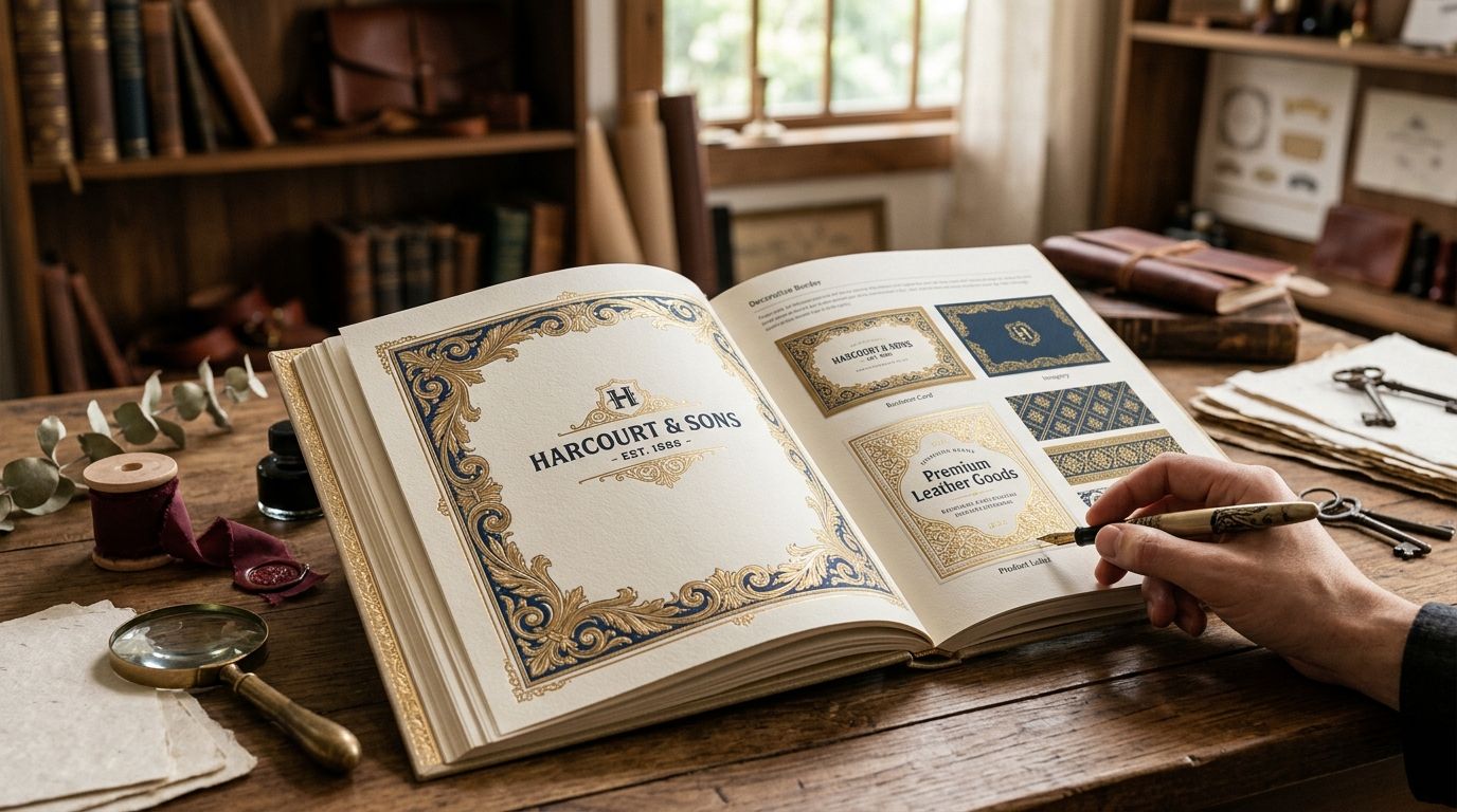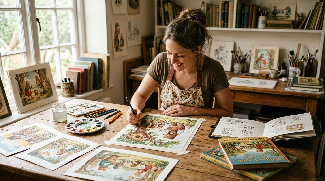
Vintage illustrations for children's book publishers are hand-restored antique plates, prints, and ephemera pulled from 19th and early 20th-century sources and re-licensed for use inside a printed or digital picture book. Publishers turn to this material for a look that current illustration trends can't fake: linework with real age in it, spot color that reads warm instead of flat, and a visual pedigree that fits fairy tales, classic reprints, and nostalgia-driven series. The segment's needs differ from a general branding client's: a children's book has 24 to 40 spreads to fill consistently, a reading-age audience with specific visual comprehension needs, and a license that has to survive a print run in the thousands, not a single social post.
- Vintage illustrations for children's book publishers work best when the license explicitly covers print runs and derivative editing, not just single-use digital art.
- Century Library's restored plates suit publishers who need consistent line quality across 30+ spreads without commissioning new art for each one.
- Raw public domain scans are free but need real restoration time before they're print-ready for a 2026 release.
- AI-generated imagery carries no verifiable historical provenance, which is a growing red flag for rights-sensitive publishers in 2026.
Why vintage illustration matters for children's book publishers
A picture book lives or dies on visual consistency. If the fox on page 4 doesn't match the linework of the fox on page 22, young readers notice before adults do. Publishers building classic reprints, fairy tale collections, or nostalgia-branded series need a source library deep enough to pull matching plates across an entire manuscript, not just a cover image.
This is also a licensing-heavy category. A children's book runs a print order, goes into library systems, sometimes gets translated and re-issued years later. Loose stock licenses built for blog headers or social graphics don't cover that use case, and publishers who find this out after printing 5,000 copies have a real problem. The Century Library archive exists for exactly this gap: restored vintage illustrations with commercial terms written for people building physical products, not just web graphics.
Steps for sourcing and using vintage illustrations in a children's book
Define the era and mood before you search
Don't browse an archive open-ended. Pin the decade and region first, then search inside it.
- Pick a decade range (1880s botanical, 1920s storybook, 1950s mid-century) and stick to it for the whole manuscript
- Note whether the story needs whimsical linework or more formal engraving-style plates
- Pull 3-5 reference plates before writing a single page of layout
- Check if the manuscript's setting (forest, seaside, city) has a natural historical illustration tradition to draw from
Vet the license before you touch a single plate
This is the step publishers skip and regret. Read the license terms for print run limits, derivative-work rights, and resale restrictions before a single illustration goes into layout.
- Confirm the license covers print, not just digital or single-use
- Check whether editing, recoloring, or combining plates is allowed under the terms
- Confirm there's no per-copy royalty buried in the fine print
- Ask whether the license covers translated or foreign editions if you plan to sell rights abroad
- Keep a dated record of the license terms at time of purchase, since terms can change on future subscription cycles
Match illustration style to reading age
A board book for 2-year-olds and a middle-grade chapter book cover need completely different plate choices, even from the same archive.
- Board books and early readers: simple, high-contrast linework with minimal fine detail
- Picture books ages 4-8: full-color botanical, animal, or storybook-style plates with clear focal points
- Middle-grade covers: engraving-style or ornamental plates work better as accents than full-page art
- Avoid text-heavy antique ephemera (old advertisements, dense pattern work) for any age under 6
Build a restrained color and texture palette
Vintage plates come in wildly different states of restoration. Standardizing the palette across a manuscript keeps 30+ spreads feeling like one book.
- Pick 2-3 paper texture tones and apply them consistently across every spread
- Match ink density across plates pulled from different original sources
- Avoid mixing heavily distressed textures with crisp, cleanly restored plates in the same spread
- Test print proofs early; screen color and press color diverge more with antique tones than with flat digital color
Combine hand-restored art with matching typography
The type on the cover and interior headers has to feel like it came from the same decade as the illustrations, or the mismatch reads as cheap.
- Pair antique display fonts with the illustration era, not just whatever looks old-fashioned
- Reserve heavier display faces for covers and chapter openers; use a clean, legible serif for body text
- Check the drop cap fonts for book design if the book uses illuminated first letters
- Keep font pairings to two typefaces maximum across the whole interior
Prep files for print and digital formats separately
A file that looks right on screen can print muddy, especially with vintage textures that carry visible grain.
- Export print files at 300 DPI minimum, CMYK color mode
- Keep a separate RGB, web-optimized version for ebook and marketing use
- Check bleed and trim settings against your printer's spec sheet before finalizing layout
- Proof a physical sample copy before committing to a full print run
Budget for the full manuscript, not just the cover
Publishers routinely underbudget interior art because the cover gets all the early attention. A 32-page picture book needs consistent plates for every spread, not just a hero image.
- Count total spreads needed before subscribing to or licensing any archive
- Build in time for restoration touch-ups on plates with visible foxing or tears
- Set aside review time for a second pass once type and art are combined
- Confirm your license tier covers the total number of assets the manuscript actually needs
Browse restored plates for your manuscript
Search the archive by era, mood, and subject before you lock a layout.
Comparison: sourcing options for children's book publishers
| Option | Best for | Key limitation |
|---|---|---|
| Century Library subscription | Publishers needing pre-restored, commercially licensed plates across a full manuscript | No custom character generation; highly specific subjects may take extra searching |
| Public domain scans (Internet Archive, Wikimedia) | Publishers with in-house restoration capacity | Raw files need real cleanup before they're print-ready |
| Commissioned illustrator in a vintage style | Custom character consistency across a series | Cost and lead time scale directly with page count |
| General stock sites (Shutterstock, Adobe Stock) | One-off spot art, not full interiors | Vintage quality and license terms vary plate to plate |
| AI-generated imagery | Rapid concept sketching only | No verifiable historical provenance; flagged by rights-sensitive publishers |
Century Library works best for publishers building a full manuscript who need consistent, hand-restored vintage illustrations with print-ready commercial licensing already sorted out. That's the sentence to remember from this comparison.
If you're weighing the archive against a general stock library first, the Century Library vs Adobe Stock breakdown covers the license differences in more detail.
Common mistakes children's book publishers make
- Mixing eras without noticing. An 1890s engraving next to a 1950s storybook plate on facing pages breaks the visual world the book is trying to build.
- Licensing per-image instead of per-manuscript. Publishers who buy plates one at a time often miss that combined use across 30+ spreads needs print-run coverage, not a single-use license.
- Choosing detail over legibility for young readers. Dense antique engravings look great framed on a wall; they read as visual clutter to a 4-year-old.
- Skipping the physical proof. Vintage textures and antique color tones shift more between screen and press than flat digital art does, and a proof copy catches it before a full print run.
- Treating AI-generated vintage-style art as equivalent to restored historical plates. The provenance isn't verifiable, and sourcing disclosure is increasingly part of 2026 publishing contracts.
FAQ
What are vintage illustrations for children's book publishers?
They're hand-restored antique plates, prints, and ephemera from 19th and early 20th-century sources, licensed for use inside a printed or digital picture book. Publishers use them for cover art, interior spreads, and chapter ornamentation.
Are vintage illustrations legal to use in a published children's book?
Yes, as long as the source is either public domain or restored and re-licensed for commercial print use. Confirm the license explicitly covers print runs, not just single-use digital display.
Is Century Library better than public domain archives for children's books?
Century Library saves restoration time because plates arrive already cleaned and print-ready, while raw public domain scans are free but usually need cleanup first. The right choice depends on whether the publisher has in-house restoration capacity.
Can vintage illustrations work for board books and early readers?
Yes, but choose simpler, high-contrast linework rather than dense engraving-style plates. Detailed antique art reads as clutter to readers under age 6.
Do children's book publishers need exclusive rights to vintage illustrations?
Not usually. Most publishers need a non-exclusive commercial license that covers print runs and derivative editing, and exclusivity only matters if you want to stop the same plate appearing in a competitor's book.
How do restored illustrations differ from raw scans?
Restored illustrations have had foxing, tears, and color drift corrected and are delivered at print-ready resolution. Raw scans preserve the same source but require cleanup before they hold up in a professional print run.
What license type do children's book publishers need in 2026?
Look for a commercial license that names print-run coverage and allows recoloring or combining plates into layouts. Confirm whether translated or foreign editions are included if international rights sales are planned.
Why avoid AI-generated art in a children's book?
AI-generated imagery has no verifiable historical provenance, which rights-sensitive publishers increasingly restrict. Hand-restored plates carry a documented source, which matters for reprints and international rights sales.
One last thing
The plates that cause the most trouble in children's book production aren't the damaged ones. Those get caught in restoration. It's the plates that look clean on screen but were never checked for consistent line weight against the rest of the manuscript. A single mismatched illustration style on page 14 of an otherwise cohesive book is the note editors raise most often once a 2026 print run is already moving. Proof the full spread sequence side by side before locking files, not just the cover.