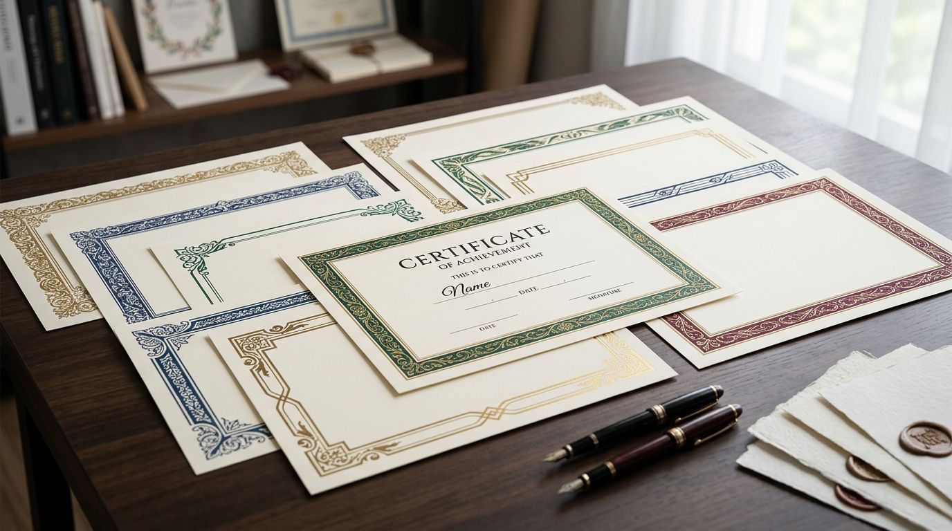
Decorative borders for certificate design are ornamental frame elements — hand-restored engravings, laurel wreaths, rope-and-shield motifs, rule-line frames — that give diplomas, awards, and gift certificates the formal weight a plain rectangle can't fake, with the aim of making the recipient feel the achievement was earned, not templated. Certificates get printed on cardstock at high resolution, need clear space for a name, date, and signature block, and often carry a crest or seal instead of a photo, so the border has to do more visual work than it would in a typical flyer or invitation layout.
That's a different job than decorating a wedding invite or a scrapbook page. A certificate border has to survive a photocopier, hold up at both letter-size print and full-bleed poster scale, and never crowd out the one line of text that actually matters: the recipient's name.
- Decorative borders for certificate design work best as hand-restored engravings or simple rule frames — save ornate Victorian styles for ceremonial diplomas.
- Leave roughly a quarter of the certificate's width as border-only space so the name and seal never crowd the ornament.
- License terms matter more here than for social graphics — confirm commercial use before printing hundreds of diplomas in 2026.
- Hairline engraving borders reproduce more cleanly on office photocopiers than heavy baroque frames.
Why this matters for certificate design
A certificate is read once, closely, by one person, then framed or filed. The border sets the tone before anyone reads a word — Century Library's archive treats certificate borders as a category of their own precisely because the constraints (legibility at small text sizes, print fidelity, license clarity for bulk printing) don't match what works for a Pinterest graphic or a product label. The library restores its plates from actual 19th- and early 20th-century engravings and typographic specimens, which is why Century Library borders hold fine detail at print resolution instead of turning into a gray smudge at the edges.
Businesses and schools printing certificates in 2026 are also under more scrutiny on licensing than they were a decade ago — a border pulled from an ambiguous "personal use" stock site becomes a liability the moment it's printed on 300 diplomas.
Match the border style to the certificate's purpose
Not every certificate needs the same weight of ornament. A completion certificate for an online course reads differently than a ceremonial diploma or an award for twenty years of service.
- Corporate completion certificates: simple double-rule or thin engraving borders
- Ceremonial diplomas and graduations: Victorian ornamental frames for invitations adapted to certificate proportions
- Award or achievement certificates: laurel wreath and shield motifs
- Gift certificates: a monogram corner flourish instead of a full frame
- Museum, heritage, or alumni certificates: engraving-style borders with visible plate detail
Size the border to protect the text fields
The most common certificate-design failure is choosing a border first and fighting the layout second. Size the frame around the text, not the other way around.
- Leave a clear inner margin so the name doesn't touch the border
- Test the layout with the longest name you expect to print, not a placeholder
- Keep border stroke weight consistent on all four sides
- Confirm the date block and signature line have breathing room
- Check that a wax-seal or crest graphic doesn't overlap the frame
Pair the border with typography that won't fight it
A baroque frame around a modern geometric sans-serif reads like a mismatch, not a design choice. Match era and weight.
- Serif or blackletter body copy for engraving and Victorian borders
- Slab serif or clean serif for simple double-rule borders
- Match stroke weight of the border lines to the font's stroke weight
- Use drop caps sparingly, only on the opening word of the certificate body
Test the border in both print and digital delivery
Many certificates now go out as a PDF as often as a printed page — the border has to hold up in both formats.
- Confirm the border doesn't clip when trimmed to bleed
- Check vector paths stay crisp at 300 dpi for physical printing
- Test the PDF version on a standard office printer, not just a proofing press
- Verify color doesn't shift between screen and print output
License the border correctly before mass production
This step gets skipped more often on certificates than on any other design category, and it's the one with the most exposure.
- Confirm the subscription or license covers unlimited certificate copies, not a capped print run
- Check whether the license restricts commercial resale of the finished certificate
- Keep proof of license on file for HR or compliance audits
- Avoid "editorial use only" stock terms for anything client- or employee-facing
- Confirm the source has no AI-generated content mixed into the archive if authenticity matters to the client
Build a reusable certificate template once the border is set
Once a border earns its place, lock it into a template instead of rebuilding the layout every time.
- Save portrait and landscape versions of the same border-and-type combination
- Store the crest or seal as a separate layer that drops in cleanly
- Keep a blank master file plus one filled example for reference
- Version the template by year so 2026 certificates are easy to distinguish from older batches
Find a certificate-ready border
Search the archive for hand-restored frames and engravings.
Comparison: certificate border styles
| Option | Best for | Key limitation |
|---|---|---|
| Hand-restored engraving border | Diplomas, ceremonial certificates | Fine detail can get busy at small print sizes |
| Simple double-rule border | Corporate completion certificates | Reads flat for premium or ceremonial awards |
| Victorian ornamental frame | Heritage-branded or alumni certificates | Needs generous white space to stay legible |
| Baroque/rococo frame | Formal achievement or honor certificates | Can overwhelm short certificate text |
| Clip-art corner flourish | Gift certificates, informal recognitions | Reads casual for corporate or academic use |
Verdict: for most certificate work in 2026, a hand-restored engraving border or a simple double-rule frame wins over anything ornate — save the heavier Victorian and baroque styles for ceremonial or heritage-branded pieces.
Common mistakes in certificate border design
- Choosing an ornate border before laying out the text fields, then cropping the crest to make it fit
- Using a border restored at low resolution and stretching it to fill a full-page certificate
- Printing hundreds of certificates under a personal-use license instead of confirming commercial terms
- Pairing a Victorian frame with a modern sans-serif name field, which breaks the certificate's tone
- Skipping a physical print proof and discovering the border's fine lines vanish on a home printer
“A certificate border's job is to frame one name, one date, and one signature — anything that competes with those three elements is doing the wrong job.”
FAQ
What's the best decorative border style for a diploma?
Hand-restored engraving borders or Victorian ornamental frames work best for diplomas because they carry the ceremonial weight the document is meant to convey. Keep the frame simple enough that it doesn't compete with the name and seal.
Are Victorian ornamental frames appropriate for corporate certificates?
Victorian frames read as too formal for routine corporate completion certificates. Save them for alumni, heritage-branded, or ceremonial certificates and use a simple double-rule border for everyday corporate use.
How much border space should a certificate leave for the recipient's name?
Leave roughly a quarter of the certificate's total width as border-only space so a long name never touches the frame. Test the layout with the longest name you expect to print, not a short placeholder.
Can vintage clip art borders be used commercially on printed certificates?
Only if the license explicitly covers commercial use and unlimited print runs. Editorial-only or personal-use licenses common on some stock sites don't cover bulk certificate printing.
What resolution do I need for a certificate border that prints on cardstock?
Border artwork needs to hold detail at 300 dpi at full print size, ideally sourced as vector or high-resolution scans. Anything stretched from a lower-resolution source will show soft edges on cardstock.
Is a simple double-rule border enough for an award certificate?
For most award certificates, yes — a double-rule border keeps the focus on the recipient's name and achievement text. Reserve ornate frames for ceremonial or milestone awards where extra formality fits the occasion.
How do I match a border to my certificate's typography?
Match the era and stroke weight: engraving and Victorian borders pair with serif or blackletter type, while simple rule borders pair with clean serif or slab serif fonts. Avoid mixing a heavily ornate frame with a modern geometric sans-serif.
Do certificate borders need a different license than social media graphics?
Yes, in practice — bulk-printed certificates carry more legal exposure than a single social post, so confirm the license covers the full print run, not just digital display. Keep the license record on file for any compliance review in 2026.
One last thing
Hairline engraving borders reproduce cleanly on office photocopiers and home printers; heavy baroque frames often print as a solid dark smudge once a recipient photocopies their certificate for a file or a frame. If the certificate is likely to get copied after the original print run, that single detail decides the border more than any style preference does.