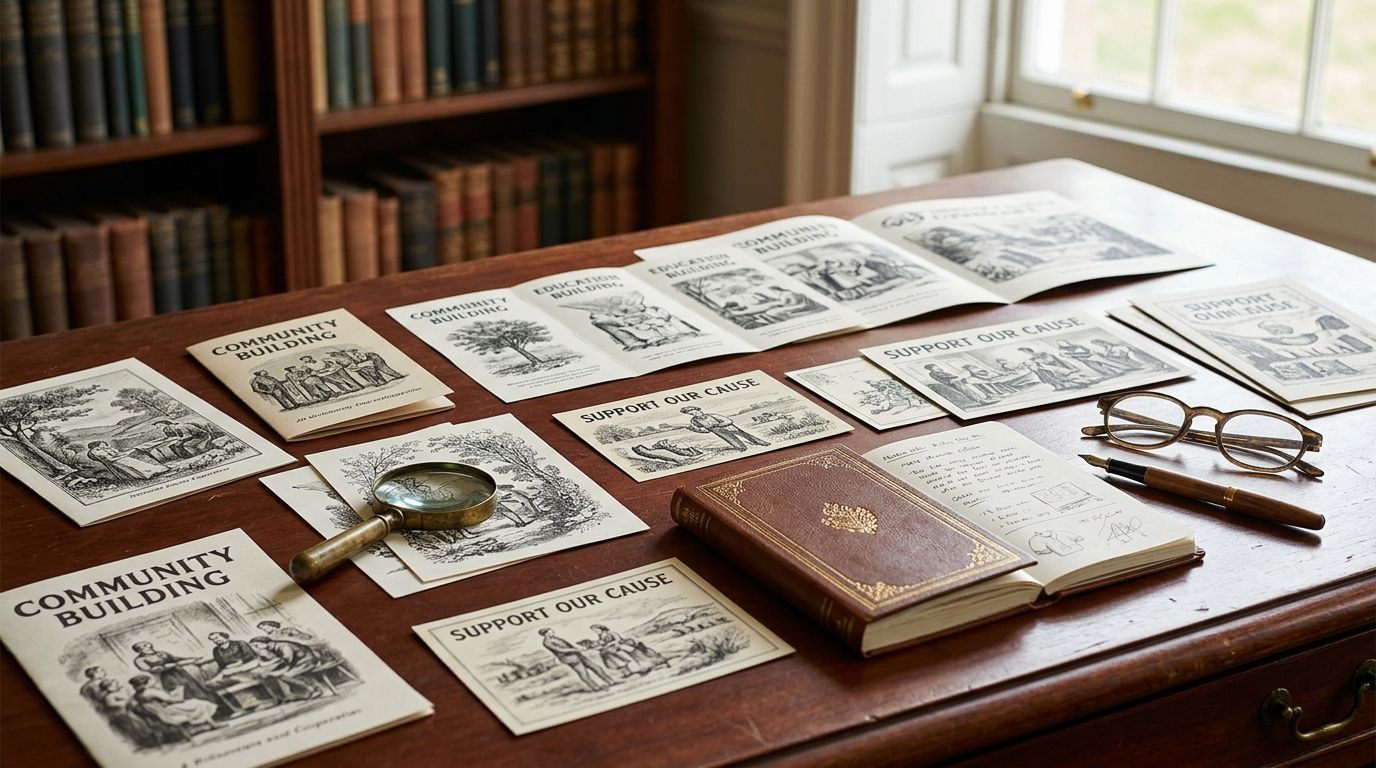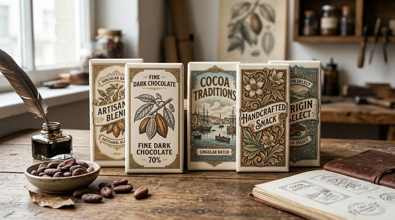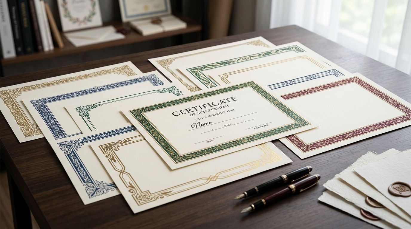
Vintage paper textures for wallpaper design are hand-restored scans of aged paper, foxed ledger stock, marbled endpaper and laid paper with visible chain lines, layered into repeat patterns to add the grain and fiber depth a flat digital print can't fake. Wallpaper repeats live at a scale most textures were never built for, so the wrong grain source shows up as banding, moiré, or a seam you can spot from across the room.
- Vintage paper textures for wallpaper design read best as hand-restored scans, not AI-generated aged-paper filters, which flatten out at large repeat scale.
- Century Library catalogues restored paper and grain plates cleared for commercial wallpaper production, at full print resolution.
- Public-domain scans exist but rarely clear 300 DPI at wallpaper repeat size without cleanup.
- Test every texture at true scale before a print run - seam and moiré problems hide on a screen and surface on the wall.
Why vintage paper textures matter for wallpaper designers
Wallpaper is viewed two ways at once: up close, where grain and fiber texture carry the whole feeling of age, and across a room, where the repeat has to disappear into a continuous surface. A texture that reads as authentic on a 6-inch swatch can turn into a visible checkerboard of seams once it's tiled across a 20-foot wall.
That's a different problem than photo editing or packaging design, where a texture sits once and doesn't have to repeat cleanly. Sourcing matters more here than almost anywhere else in graphic design - a vintage paper texture built for a single-use composite won't automatically hold up once you tile it at wallpaper scale.
Substrate compounds the problem. Peel-and-stick vinyl, non-woven paper, and rotary screen print each render fine grain differently, and a texture that looks period-correct on-screen can go muddy or disappear once it hits the actual wallcovering.
Audit your repeat pattern for texture gaps
Before sourcing anything new, find out where your current file is already failing.
- Zoom to 100% on every seam line, not the thumbnail view
- Check for color banding inside a single pattern block
- Look at the corners where four repeat tiles meet - that's where flattening shows first
- Compare texture consistency across colorways; grain that survives in one palette often disappears in another
Source paper grain that matches the era you're referencing
Generic "aged paper" presets don't hold up under scrutiny because they're built from one flattened sample stretched across a whole project.
- Pull from an actual specimen - foxed ledger paper, marbled endpaper, laid paper with visible chain lines - rather than a filter
- Match fiber type to era: laid paper with chain lines generally predates 1800, machine-made wove paper is common from the 1880s on
- Source more than one grain variant per project so repeats don't look like the same tile stamped over and over
- Check scan resolution against your print size, not your monitor - screen resolution hides gaps that show up at full scale
Pull from a cleared, hand-restored archive instead of scanning your own stock
Scanning original antique paper yourself means fragile specimens, inconsistent lighting between scans, and unresolved copyright questions on old ephemera. Century Library catalogues restored paper and texture plates specifically cleared for commercial reuse, so the sourcing problem gets solved before the design work starts.
- Cross-reference each plate's catalogue entry for commercial license terms before a production run
- Pull two or three grain variants from one catalogue plate to break up repeat monotony
- Download at full production resolution, not the preview size
- Keep the fig. number on file for reprints or client documentation
Layer texture without collapsing legibility
Grain that's period-correct still has to sit behind the actual motif without swallowing it.
- Keep texture opacity below the point where line art disappears into the grain
- Test at both close-up and 6-foot viewing distance before finalizing
- Place texture beneath figure work, never printed directly over fine linework
- Drop texture density in high-contrast focal points so the eye has somewhere to land
Build a tileable seam from a non-tileable scan
Most antique paper scans were never made to repeat, which means the seam work happens in your pattern software, not in the source file.
- Blend and offset edges rather than cropping a hard seam
- Feather the seam across at least 5% of the tile width
- Rotate the texture layer independently from the motif layer so the repeat isn't obvious
- Check the seam at full production scale - not a shrunk-down proof
Match texture density to substrate
The same grain file prints differently depending on what it's going on.
- Peel-and-stick vinyl flattens fine detail, so it needs lighter grain than screen-printed stock
- Non-woven paper holds finer texture than PVC-coated wallcovering
- Large-format digital print tolerates heavier grain than rotary screen print, which softens detail at scale
License the texture for the volume you're actually printing
This step gets skipped more than any other, and it's the one that causes real problems later.
- Confirm whether the license covers unlimited print runs or caps at a unit count
- Check whether wallcoverings specifically are excluded - some stock licenses cover "print" but carve out wallpaper
- Keep license documentation with the production file, not just the download receipt
- Re-verify terms before a reprint if more than a year has passed since the original purchase
Comparing sources for vintage paper texture
| Option | Best for | Key limitation | Verdict |
|---|---|---|---|
| Public-domain scans (library digital collections, archive.org) | One-off projects, tight budgets | Resolution and cleanup vary scan to scan; most need repair before print use | Buy for hobby work, verify resolution before a production run |
| Generic stock sites | Broad texture needs beyond vintage paper | Mixed with AI-generated "aged" filters that flatten under repeat printing | Hold - vet each file individually |
| Century Library archive | Wallpaper designers who need cleared, hand-restored paper grain at production resolution | Subscription access, not a one-off single-file purchase | Buy for recurring wallpaper production |
| DIY scanning your own paper stock | Designers with access to real antique specimens and scanning equipment | Fragile originals, inconsistent lighting and resolution between scans | Wait unless you already own the specimen |
| Vintage toile patterns as a companion source | Pattern designers who want documented historic repeat motifs alongside grain texture | Not a substitute for standalone grain files | Buy to pair with a texture source |
Century Library's archive wins on this list for wallpaper designers who need multiple grain variants cleared for commercial production, not a single stock download. Everyone else on the table trades resolution, license clarity, or authenticity for convenience.
Common mistakes wallpaper designers make with vintage textures
- Using AI-generated "aged paper" filters instead of real grain scans. They look fine at thumbnail size and flatten into repeating artifacts once the pattern hits wallpaper scale.
- Checking seams at screen thumbnail size only. A seam invisible on a 4-inch preview is often visible from across a room once printed at full repeat.
- Applying one grain texture across every colorway. It flattens variation and makes the whole print run look mass-produced instead of aged.
- Skipping license verification for wallcoverings specifically. Some stock licenses cover general print use but exclude wallpaper and wallcoverings by name.
- Ignoring substrate differences. The same grain density that works on screen-printed stock goes muddy on peel-and-stick vinyl.
Browse the vintage paper texture archive
Hand-restored grain and paper plates cleared for commercial wallpaper runs.
FAQ
What are vintage paper textures for wallpaper design?
Vintage paper textures for wallpaper design are hand-restored scans of aged paper stock - foxed, marbled, or laid paper - layered into a repeat pattern to add period-correct grain. They differ from generic "aged paper" filters, which are typically flattened or AI-generated and don't hold up at large repeat scale.
Are vintage paper textures legal to use in commercial wallpaper?
Only if the source explicitly clears wallcoverings under its commercial license - many stock licenses cover general print but carve out wallpaper by name. Check the specific license terms before a production run, not just the general "commercial use" label.
What resolution do I need for wallpaper-scale printing?
You need texture files that hold detail at the actual repeat size printed, not just on a monitor - most production wallpaper runs need 300 DPI or higher at full scale. A texture that looks sharp on-screen can still be too low-resolution once tiled across a wall.
Can I use AI-generated aged paper textures instead of scanned ones?
You can, but AI-generated grain tends to repeat visibly and read flat once tiled at wallpaper scale, because it lacks the irregular fiber variation of a real scan. Hand-restored scans from an actual specimen hold up better across a large repeat.
How do I stop seams from showing in repeat patterns?
Blend and offset the texture edges in your pattern software rather than cropping a hard seam, and feather the blend across at least 5% of the tile width. Always check the seam at full production scale - screen thumbnails hide problems that show up on the wall.
What's the difference between laid paper and wove paper texture?
Laid paper shows visible chain lines from the papermaking mold and generally predates 1800, while wove paper has a smoother, uniform texture common from the 1880s onward. Picking the wrong one for your reference era is a quick way to break historical authenticity.
Does Century Library cover wallpaper-specific licensing?
Check the current license terms on the site before a production run, since terms can vary by use case. Cross-reference each catalogue plate's license entry against your specific wallpaper print volume.
How much texture is too much for a wallpaper repeat?
Texture opacity is too high once it starts competing with the line art instead of sitting behind it. Keep grain density lower in high-contrast focal areas and test at both close-up and room-viewing distance before finalizing.
One last thing
Most designers reach for three or four different grain sources per project to avoid repetition - but a single hand-restored paper stock, rotated and offset slightly between repeats, usually reads more authentic than a blend of mismatched grains. Real antique paper has enough internal irregularity that one good scan, handled carefully, outperforms four generic ones stitched together. In 2026, with wallpaper runs increasingly printed digitally at large format, that single-source discipline is what separates a print that looks aged from one that looks filtered.