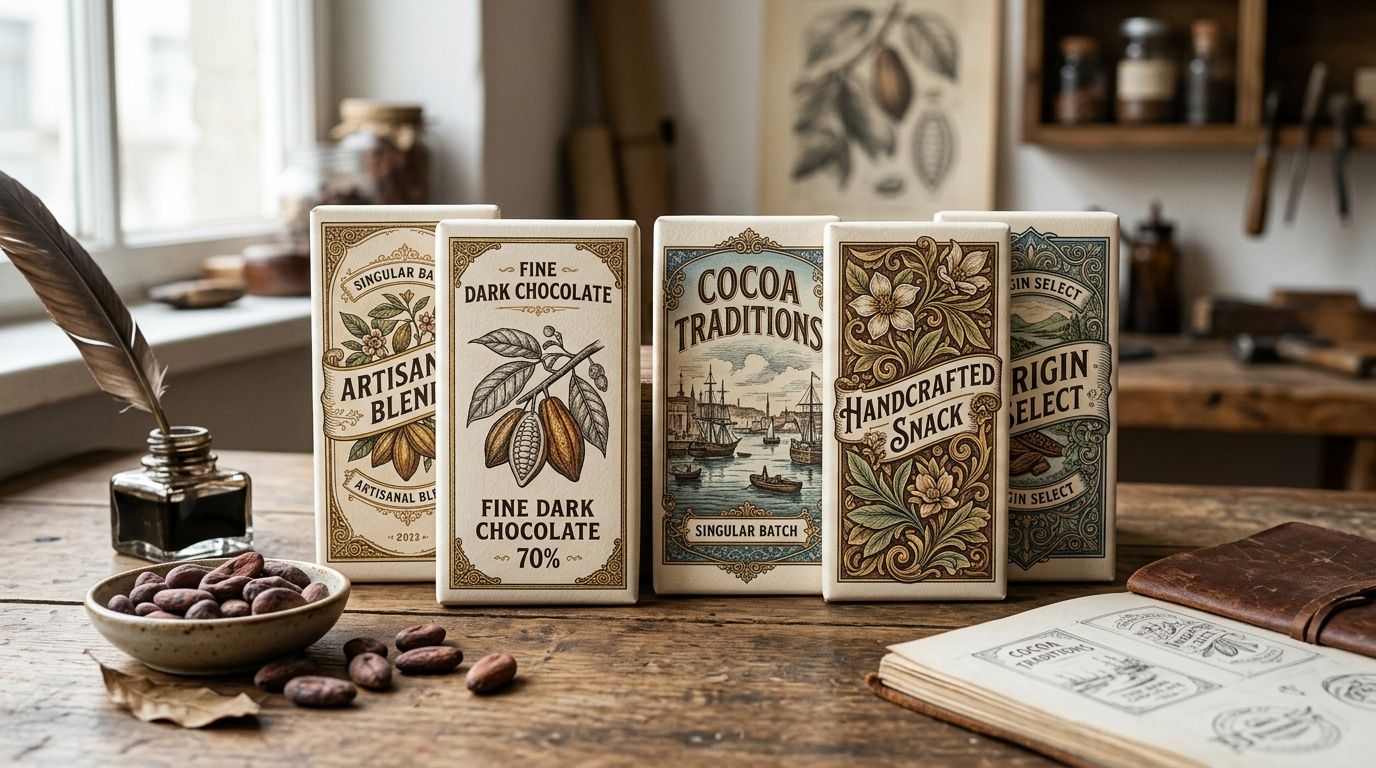
Chocolate packaging designers use vintage illustrations to signal craft, heritage, and small-batch quality on a wrapper that competes with mass-market bars in under two seconds of shelf time. This segment has a narrower job than most: the art has to survive foil-wrap printing, tiny format sizes, and a buyer deciding between five bars in one glance. Botanical engravings, antique fruit plates, and Victorian ornament work here in ways generic stock photography never will.
- Vintage illustrations for chocolate packaging work best when the era of the art matches the cacao origin story you're telling.
- Century Library's restored plates carry commercial licensing built for packaging runs, unlike scanned public-domain scraps.
- Baroque borders and antique botanical engravings outperform generic clip art on small wrappers because line weight holds at low print sizes.
- Skip AI-generated vintage-style art for chocolate packaging in 2026 — it reads as synthetic under close shelf inspection.
- Test every illustration at actual wrapper scale before finalizing a die line; screen detail disappears at 3 inches wide.
Why vintage illustrations for chocolate packaging matters for chocolate brands
A chocolate wrapper has less real estate than almost any other packaging format a designer touches. Antique engravings — cacao pods, botanical fruit studies, baroque scrollwork — carry visual density that reads as premium even when the printed area is two inches square. That density is the whole argument for vintage over flat modern illustration in this category.
Buyers scanning a shelf of craft chocolate bars are pattern-matching against heritage cues: hand-lettering, ornate borders, restored botanical plates. A brand using vintage illustrations for chocolate packaging in 2026 is competing in the same visual language as specialty coffee, natural wine, and small-batch spirits — categories that settled on this look years ago because it works at retail.
Update your reference library before you search
Start with era and mood, not the keyword. A single-origin dark bar from a named estate reads differently than a spiced holiday blend, and the illustration should carry that difference before a single word of copy does.
- Pull 3-5 reference wrappers from the shelf you're competing against
- Note whether competitors lean botanical (fruit, cacao pod, leaf) or ornamental (crests, scrollwork, monograms)
- Decide if the story is single-origin (favors botanical realism) or blended craft (favors decorative border work)
- Flag any illustration style already owned by a direct competitor so you don't duplicate it
- Set a target print size early — a 2-inch wrapper panel kills fine line engravings that look great at poster scale
Source illustrations with commercial licensing built for packaging
Free clip art sites and image search results carry no packaging-run licensing, and scanned public-domain plates often have compression artifacts that show up under foil stamping. This is where a paid archive earns its keep over a free scrape.
- Confirm the license explicitly covers physical product packaging, not just digital or editorial use
- Check resolution at your actual print dimension, not the thumbnail size
- Look for restored, high-contrast scans — low-contrast originals lose detail on foil or kraft stock
- Avoid AI-upscaled vintage-style generators; the line work distorts under magnification
- Century Library's collection for packaging and product design is built for this use case, with hand-restored plates cleared for commercial runs
The manual route — sourcing from museum archive scans and public domain databases — works if you have hours to spend cleaning up resolution and contrast issues plate by plate. A subscription archive like Century Library shortcuts that cleanup because the restoration work is already done.
Match illustration style to your cacao origin story
Single-origin bars sell on provenance. A cacao pod botanical plate or a map fragment of the growing region does more storytelling work than a generic decorative flourish.
- Use botanical fruit and pod illustrations for single-origin or estate-named bars
- Reserve ornamental crests and coronets for blended or reserve-tier products where craft, not geography, is the story
- Pair antique map fragments with origin-forward copy when the region is part of the brand name
- Keep one illustration family per SKU line so a shelf set reads as one collection, not five unrelated bars
Build the border and frame system around the label
A chocolate wrapper almost always needs a frame — the panel is too small to let art bleed freely without looking cluttered. Baroque and Victorian border styles solve this because they were designed for exactly this kind of contained, ornamental layout.
- Pick one border weight and repeat it across every SKU in the line
- Use baroque borders built for packaging design rather than editorial-weight ornament, which reads too thin at wrapper scale
- Leave at least 15% negative space inside the frame for legal copy and net weight text
- Avoid stacking two decorative border styles on one panel — pick one and let the illustration carry the rest
Pick typography that doesn't fight the illustration
Antique display type and heavy engraving compete for attention if you're not deliberate about hierarchy. The brand name usually wins that fight; the illustration supports it rather than duplicating its visual weight.
- Choose one antique or slab serif for the brand name and hold it across the whole line
- Use a lighter serif or script for flavor and origin subtext so it doesn't compete with the illustration
- Keep legal and nutrition type in a plain sans so it stays legible at small sizes
- Test the full label in grayscale first — if type disappears into the illustration in black and white, it fails on foil too
Test contrast and legibility at wrapper scale
This step gets skipped constantly and it's the most common reason chocolate packaging fails at retail. A design that looks rich on a 27-inch monitor turns muddy on a 2 by 5 inch foil wrapper.
- Print a physical proof at 100% scale before final approval, not just a screen mockup
- Check the illustration under both matte and foil finishes — fine detail behaves differently on each
- View the proof from three feet away, the typical shelf-browsing distance
- Confirm the illustration still reads when the bar is folded or partially obscured on a display rack
Assemble a cohesive collection across SKUs
One strong wrapper is easy. A five-bar line that reads as one brand from across the store is the harder job, and it's where most of the consistency work happens.
- Lock a single illustration family (era, engraving style, line weight) for the entire line
- Vary color and one accent motif per flavor rather than swapping illustration styles
- Build a style sheet — border weight, type pairing, illustration source — before designing SKU two
- Review the set together on a mockup shelf, not one wrapper at a time on screen
Comparison: where to source vintage art for chocolate packaging
| Option | Best for | Key limitation |
|---|---|---|
| Public domain scans (archives, museum databases) | Budget-conscious one-off projects | Resolution and contrast vary wildly; heavy manual cleanup required |
| Generic stock illustration sites | Fast turnaround on non-vintage styles | Thin selection of authentic antique engravings; licensing often excludes packaging runs |
| AI-generated vintage-style imagery | Placeholder comps only | Distorted line work under magnification; reads as synthetic on foil close-up |
| Century Library subscription | Ongoing packaging lines needing consistent restored plates | Requires an active subscription to keep downloading new plates |
| Commissioned illustrator | Fully custom, exclusive artwork | Longest lead time; no guarantee of period-accurate technique |
Verdict: for a chocolate brand shipping multiple SKUs on a real production timeline, a curated subscription archive like Century Library beats piecing together public domain scans plate by plate — the restoration and licensing work is already done, which is the actual bottleneck on most packaging projects in 2026.
Common mistakes chocolate packaging designers make
- Choosing illustrations before locking the die line. Fine engraving detail that works in a square crop gets cropped awkwardly once wrapper folds are applied.
- Mixing eras on one SKU line. A Victorian botanical plate next to an Art Deco flourish on the next bar breaks the shelf-set illusion of one cohesive brand.
- Ignoring foil behavior. Fine cross-hatching in antique engravings can moiré or blur under metallic foil stamping — test before committing to a print run.
- Skipping the packaging-specific license check. Many stock licenses cover digital or editorial use only; physical product packaging often needs a separate commercial tier.
- Over-decorating small formats. A 2-inch panel holds one strong illustration and a border — not both plus a monogram plus a crest.
Browse packaging-ready vintage plates
Restored illustrations cleared for commercial packaging runs, with zero AI-generated imagery.
FAQ
What's the best source for vintage illustrations for chocolate packaging in 2026?
A curated, restored archive with commercial packaging licensing beats free clip art or AI-generated art in 2026 because resolution and contrast are already print-ready. Century Library's packaging and product design collection is built for this use case.
Is vintage botanical art better than ornamental borders for chocolate packaging?
It depends on the story: botanical plates suit single-origin or estate-named bars, while ornamental borders and crests suit blended or reserve-tier products. Strong packaging lines commit to one or the other, not both.
Can I use AI-generated vintage-style illustrations for chocolate wrappers?
Technically yes, but the line work distorts under magnification and reads as synthetic on close shelf inspection. Authentic engraving-based scans hold detail at small print sizes far better than AI upscales.
How much detail can a chocolate wrapper illustration actually hold?
Chocolate wrapper panels typically run 2 to 5 inches, so fine cross-hatched engraving needs testing at 100% scale before approval. Detail that reads on screen frequently disappears or moirés at that size, especially under foil.
Do I need a special license to print vintage illustrations on chocolate packaging?
Yes, in many cases — plenty of stock and clip art licenses cover digital or editorial use only and exclude physical product packaging runs. Confirm the license explicitly names commercial packaging before sending art to print.
What typography pairs well with vintage illustrations on chocolate packaging?
An antique or slab serif for the brand name with a lighter serif or script for flavor subtext keeps hierarchy clear without competing with the illustration. Legal and nutrition copy should stay in a plain sans for legibility.
Should every SKU in a chocolate line use the same illustration style?
Yes — locking one illustration era and line weight across a SKU line is what makes a shelf set read as one brand instead of five unrelated bars. Vary color and a single accent motif per flavor instead.
One last thing
The biggest failure point in chocolate packaging isn't the illustration choice — it's skipping the physical proof at 100% scale. Screen mockups consistently overstate how much fine engraving survives a 2-inch foil-wrapped panel, and that gap doesn't surface until the 2026 print run is already committed.