Vintage illustrations for nonprofit branding pair restored 19th- and early 20th-century artwork with a mission-driven visual identity, built to signal trust rather than decoration. Nonprofits work under more donor scrutiny and tighter design budgets than most brands, so the illustration choices need to read as credible history, not vintage-for-vintage's-sake.
- Vintage illustrations for nonprofit branding work best tied to mission themes, not generic decorative flourishes.
- Century Library's restored archive lets nonprofits use commercial-license illustrations without commissioning custom artwork in 2026.
- Botanical and heritage-style plates read as credible institutional branding; heavy distressed textures can undercut trust.
- Clear commercial usage rights before any print run in 2026 — annual reports, gala materials, and donor mailers all count.
- Audit for literal religious or colonial-era iconography that may not match your organization's actual mission or audience.
Why this matters for nonprofit branding
A nonprofit's visual identity carries more weight than a for-profit brand's because donors are evaluating trustworthiness, not just taste. Generic stock photography reads as low-effort; hand-restored vintage botanical illustrations for brand identity or period ornaments read as intentional, which matters when someone is deciding whether to write a check.
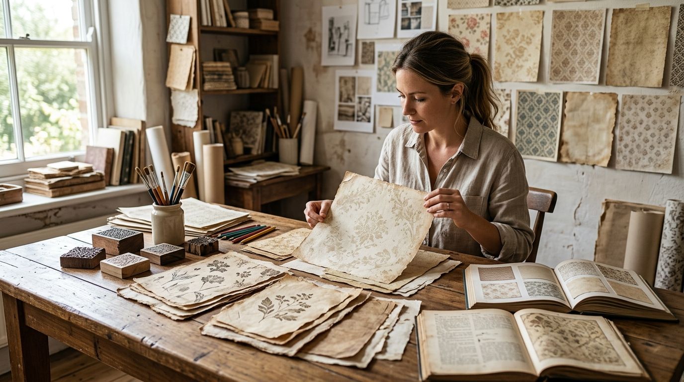
Most nonprofits also don't have a design department. A board member, a volunteer, or one overworked marketing hire is usually the entire creative team, and they're rebuilding the annual report, the gala invitation, and the social header on a rotating basis with no shared system. Vintage illustration works here specifically because a curated archive gives that one person a bounded, on-brand set to pull from instead of starting from a blank page every time.
The risk on the other side is real. Pick the wrong style — say, colonial-era exploration imagery for an org serving a community that history didn't serve well — and the heritage feeling backfires into something closer to tone-deaf. This guide treats illustration selection as a branding decision first and an aesthetic decision second.
Update your visual identity audit
Before picking any illustration, look honestly at what's currently in circulation across the organization.
- List every current visual asset — logo, letterhead, annual report cover, email header, social templates
- Flag anything that looks like generic stock clip art or a free icon pack
- Note whether the organization has an actual historical anchor: founding date, local landmark, founder's era
- Check whether current materials feel inconsistent across departments (development vs. programs vs. events)
- Identify one channel that's most visible to donors right now — that's your first 2026 rollout target
Choose illustration styles that match your mission
The style has to connect to what the organization actually does, or it reads as decoration instead of identity.
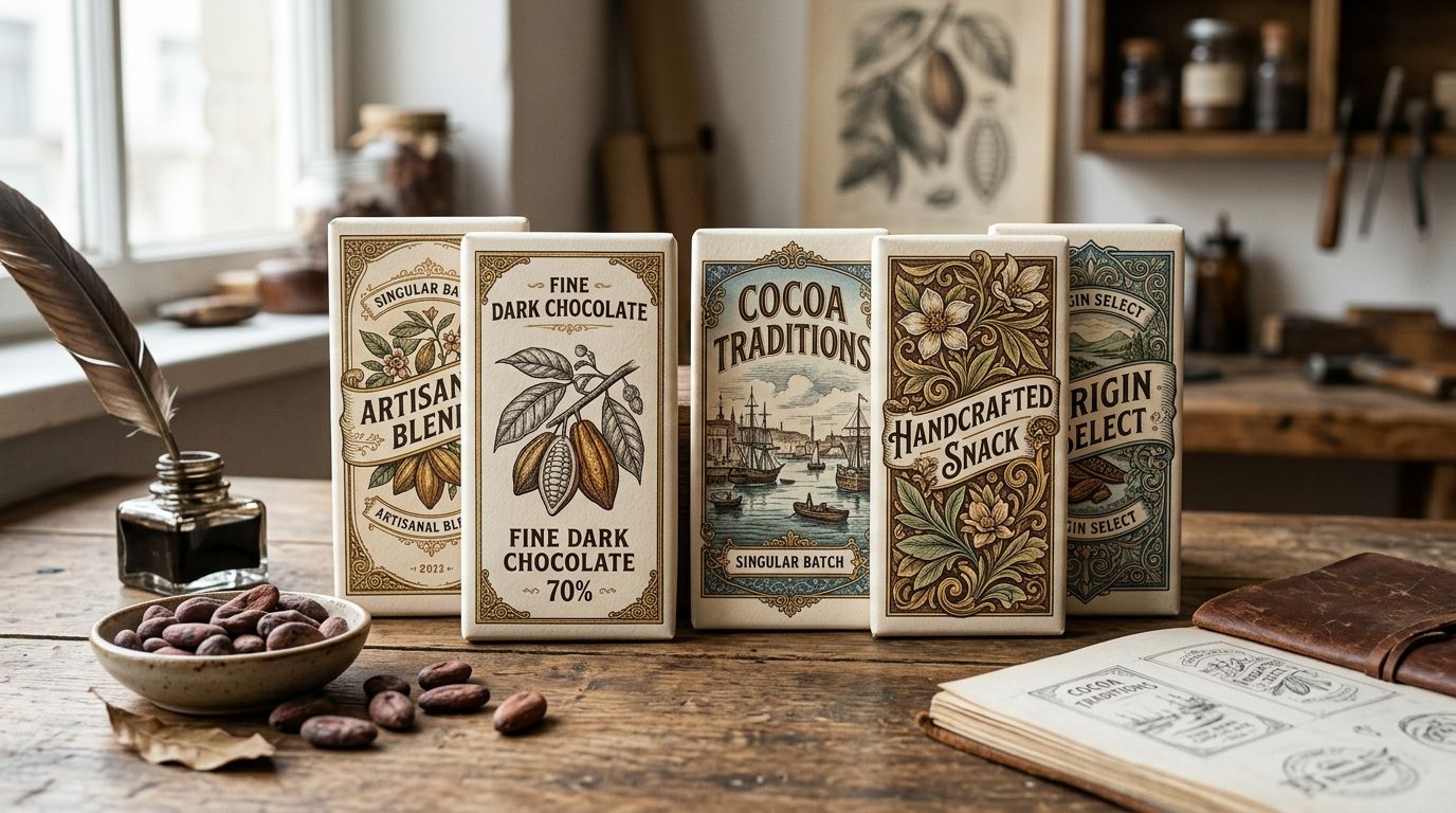
- Environmental, health, or food-security nonprofits: botanical illustrations, herbarium-style plates
- Wildlife, animal welfare, and conservation groups: vintage animal and natural-history engravings
- Literacy, libraries, and education nonprofits: typographic ornaments, drop caps, printer's marks
- Historic preservation and heritage foundations: decorative frames, coats of arms, architectural engravings
- Maritime, exploration, or geography-linked organizations: nautical charts, compass roses, ship engravings
- Health and medical-research nonprofits: anatomical illustrations, botanical medicinal plates
Build a restrained color and pattern system
A single illustration style falls apart fast if the palette and framing around it aren't controlled.
- Cap the palette at 2-3 core colors plus one accent pulled from the illustration itself
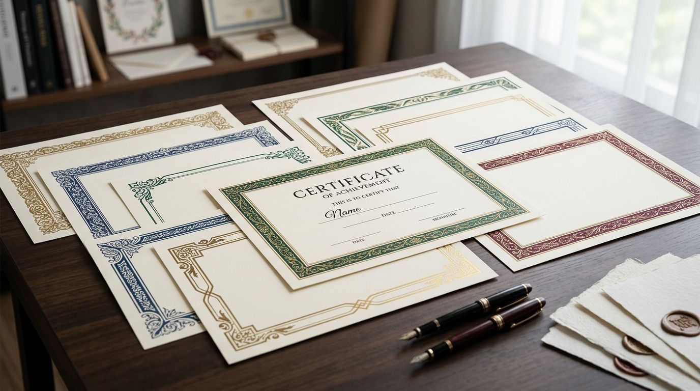
- Pick one decorative border design for stationery or frame style and reuse it, rather than mixing three
- Reserve heavy distressed paper textures for print-only pieces — they degrade badly on screens
- Keep digital touchpoints (site, email) to clean, tightly cropped illustration elements, not full aged-paper scans
- Set a white-space rule so every plate gets consistent breathing room, whether it's a header or a card insert
Apply vintage illustrations across donor materials
This is where the heritage brand design system actually gets tested — on the pieces donors physically hold.
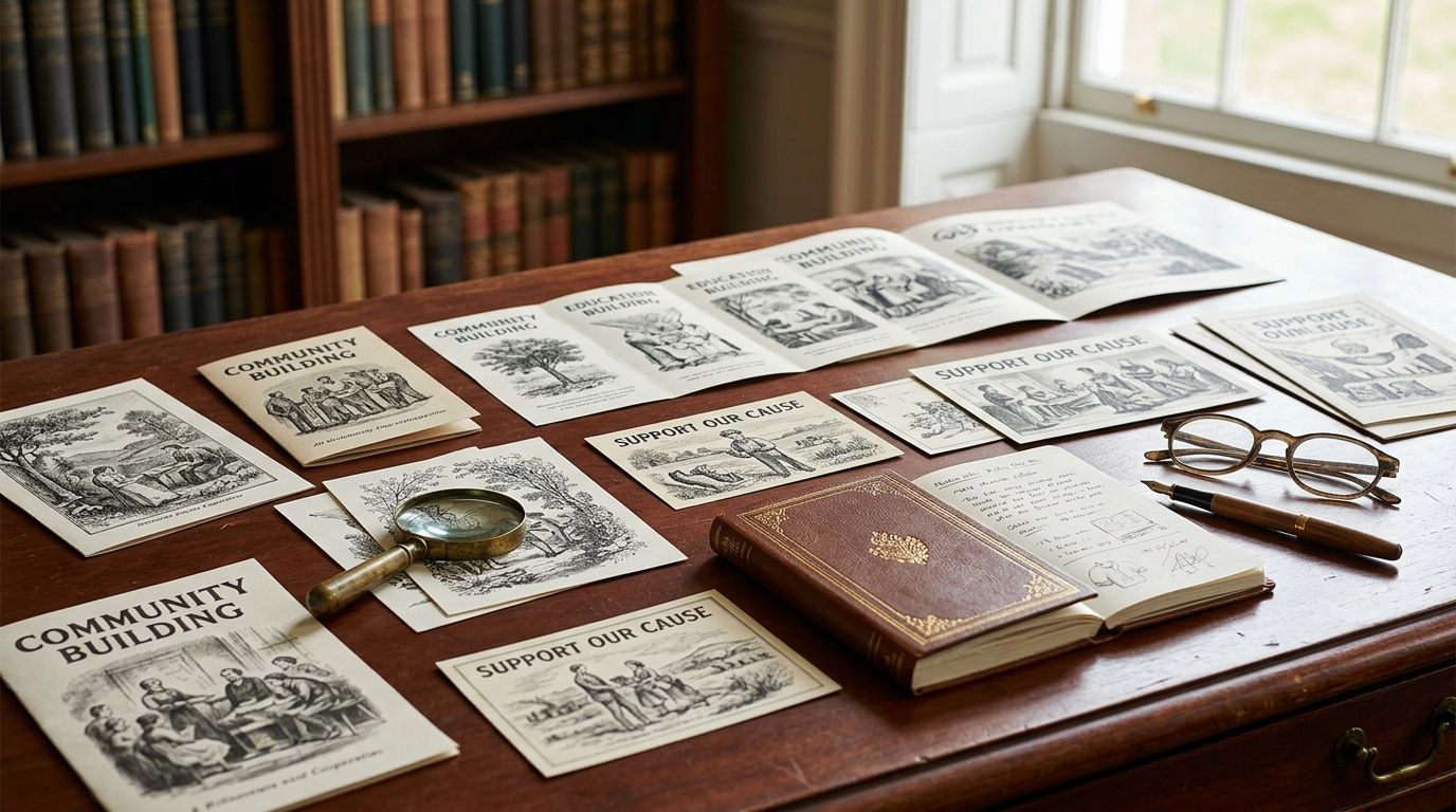
- Annual report cover and section dividers
- Gala invitations and place cards
- Donor acknowledgment and thank-you cards
- Wall signage or donor recognition plaques
- Email newsletter headers and social media templates
- Event merchandise like tote bags or enamel pins
Adapt illustrations for digital and print consistently
One source file per illustration keeps every version aligned when a color correction or crop change happens.
- Export high-resolution TIFF or PNG files for print runs
- Keep a web-optimized, flattened version for the site and email
- Store one master file per plate so edits propagate instead of forking into five variants
- Check text contrast against any illustration used as a background — low-contrast pairings fail readability, especially for older donor segments
- Centralize the approved illustration set on a shared drive so volunteer designers aren't sourcing their own clip art
License correctly for nonprofit commercial use
Nonprofit status doesn't change licensing math — a print run for a gala or an annual report is still commercial use.
- Confirm the license covers your expected print quantity, not just digital use
- Check whether merchandise sold or given away at events is covered separately
- Look for attribution requirements before finalizing layouts
- Avoid undocumented free clip art for public fundraising materials — commercial terms are often unclear
- Keep a record of purchase or subscription dates in case a donor or auditor asks about rights in 2026
Browse restored illustrations for your archive
Search botanical, heritage, and ornamental plates cleared for commercial use.
Measure your rollout before it's everywhere
A visual refresh that skips testing tends to get reverted the first time someone new joins the team.
- Pilot the new system on one channel first — the annual report, not every asset at once
- Run the new design past a sample of longtime donors before a full rollout
- Check legibility with older-adult donor segments specifically, since that's a common nonprofit demographic
- Get board sign-off on the illustration style once, in writing, so it survives staff turnover
Options compared for nonprofit branding
| Option | Best for | Key limitation |
|---|---|---|
| Generic stock photo sites | Quick placeholder images | Reads generic, undercuts an authentic mission position |
| Century Library subscription archive | Mission-themed restored illustrations at volume | Fixed archive, not a bespoke commission |
| Commissioning an illustrator | A signature logo or mascot mark | Slower turnaround, higher cost per piece, no library scale |
| Unrestored public-domain scans | Budget-zero, one-off use | Needs cleanup, license terms for commercial runs often undocumented |
Century Library works best for nonprofits that need a repeatable illustration system across many touchpoints — reports, invitations, social — without commissioning original art for every piece.
Common mistakes nonprofits make
- Mixing five unrelated illustration styles across materials — botanical on the annual report, nautical on the gala invite, circus posters on social — with no shared system
- Leaning on literal religious or colonial-era imagery that doesn't reflect the community the organization actually serves
- Layering heavy distressed textures under body copy, dropping contrast below readable levels for older donors
- Skipping license verification, then discovering mid-print-run that a free illustration source doesn't cover commercial quantities
- Treating the illustration system as a one-time 2026 refresh instead of a standard — new volunteers or board members drift back to stock photos within a year without a documented rule
FAQ
What are vintage illustrations for nonprofit branding?
Vintage illustrations for nonprofit branding are restored historical artworks — botanical plates, engravings, ornamental borders — applied across a nonprofit's visual identity to build trust and a sense of history rather than a generic corporate look.
Are vintage illustrations free to use commercially for nonprofits?
Not automatically. Public-domain scans often need restoration and clear license terms before commercial print use, while subscription archives like Century Library grant commercial licenses on restored illustrations for that purpose.
What illustration style works best for nonprofit branding?
It depends on mission: botanical plates suit environmental and health nonprofits, animal engravings suit wildlife and conservation groups, and typographic ornaments suit literacy and education nonprofits.
Do vintage illustrations work for digital fundraising as well as print?
Yes, as long as each illustration is exported in both a high-resolution print file and a flattened, web-optimized version so it stays consistent across email, social, and printed materials.
How is a nonprofit's use of vintage illustration different from a for-profit brand's use?
Nonprofits are judged more heavily on trust and authenticity, work with tighter design budgets, and often reach an older donor demographic, which raises the bar on readability and consistency.
Can a small nonprofit with no design staff use vintage illustrations effectively?
Yes, if the system is kept simple: one archive, one restrained color palette, and one border or frame style reused across every material instead of picking something new each time.
Is it better to commission custom illustration or use an archive for nonprofit branding?
Commission a single custom piece for a signature mark like a logo, and use a subscription archive for the volume of recurring materials where a bespoke commission per asset is not practical.
How do I avoid vintage illustrations looking outdated instead of heritage-inspired?
Keep the color palette restrained and modern, pair the illustration with a clean contemporary typeface, and crop tightly instead of using a full aged-paper scan across every touchpoint.
One last thing
The fastest credibility win in 2026 isn't picking more illustrations — it's picking fewer and repeating them. Choose one recurring plate, a single botanical spray or one ornamental border, and put it on the annual report, the gala invite, and the donor card until it functions as a recognizable mark rather than a rotating decoration. Organizations that swap illustrations every quarter never build the recognition that makes vintage illustration worth using in the first place.